Draw Boxplot with Means in R (2 Examples)
In this R tutorial you’ll learn how to draw a box-whisker-plot with mean values.
The table of content is structured as follows:
Let’s dive into it.
Creation of Exemplifying Data
Have a look at the following example data:
set.seed(2967358)                                          # Create example data
data <- data.frame(values = rnorm(100),
                   group = LETTERS[1:4])
head(data)                                                 # Head of example data
#       values group
# 1  0.5949582     A
# 2  0.9930561     B
# 3 -0.0228722     C
# 4  0.1745861     D
# 5  0.9405201     A
# 6 -1.1648994     B
The previous output of the RStudio console visualizes that our example data has two columns. The variable values contains numeric data and the variable group consists of a group indicator.
Example 1: Drawing Boxplot with Mean Values Using Base R
In Example 1, I’ll explain how to draw a boxplot with means using the basic features of the R programming language.
First, we have to apply the aggregate function to calculate mean values by group:
data_means <- aggregate(data$values,                       # Means by group
                        list(data$group),
                        mean)
data_means                                                 # Print means by group
#   Group.1           x
# 1       A  0.17191346
# 2       B -0.06744831
# 3       C -0.23547290
# 4       D  0.35031848
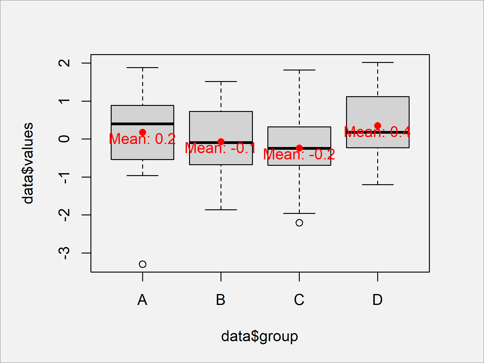
Now, we can apply the boxplot, points, and text functions to draw a boxplot with mean values in Base R:
boxplot(data$values ~ data$group)                          # Draw boxplot in Base R
points(x = 1:nrow(data_means),                             # Add points to plot
       y = data_means$x,
       col = "red",
       pch = 16)
text(x = 1:nrow(data_means),                               # Add text to plot
     y = data_means$x - 0.15,
     labels = paste("Mean:", round(data_means$x, 1)),
     col = "red")

Figure 1 shows the output of the previous R code – A box-and-whisker plot with mean values and text.
Example 2: Drawing Boxplot with Mean Values Using ggplot2 Package
In Example 2, I’ll illustrate how to use the functions of the ggplot2 package to add mean values to a boxplot in R.
We first need to install and load the ggplot2 package, if we want to use the corresponding functions:
install.packages("ggplot2")                                # Install & load ggplot2 package
library("ggplot2")
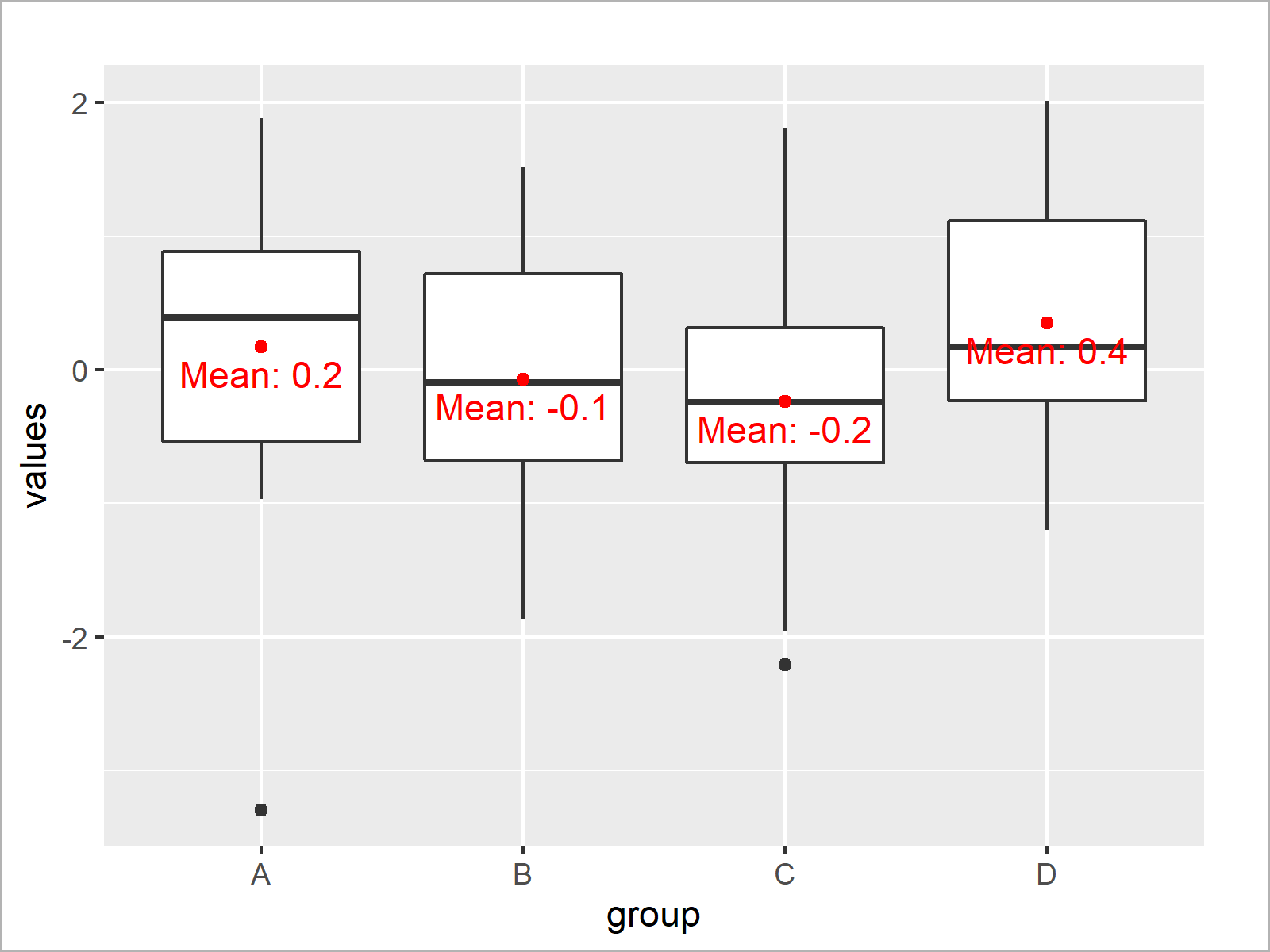
Now, we can use the geom_boxplot and stat_summary functions to draw our boxplots with means:
ggplot(data, aes(x = group, y = values)) +                 # Draw ggplot2 boxplot
  geom_boxplot() +
  stat_summary(fun = mean, geom = "point", col = "red") +  # Add points to plot
  stat_summary(fun = mean, geom = "text", col = "red",     # Add text to plot
               vjust = 1.5, aes(label = paste("Mean:", round(..y.., digits = 1))))

As shown in Figure 2, we have created a ggplot2 boxplot with mean values with the previously shown R code.
Video & Further Resources
I have recently released a video on my YouTube channel, which explains the R codes of the present article. You can find the video below.
Furthermore, you may want to have a look at the other tutorials on this website. Some related articles about boxplots and other graphics in R can be found below:
On this page you learned how to create a boxplot with means in R. In case you have additional questions, don’t hesitate to let me know in the comments. Furthermore, don’t forget to subscribe to my email newsletter in order to get updates on the newest tutorials.
Subscribe to the Statistics Globe Newsletter
Get regular updates on the latest tutorials, offers & news at Statistics Globe.
I hate spam & you may opt out anytime: Privacy Policy.
Thank you!
Welcome to the Statistics Globe newsletter. From now on, I’ll send you regular emails about statistics, data science, AI, and programming with R and Python.
I’m Joachim Schork. On this website, I provide statistics tutorials as well as code in Python and R programming.
Statistics Globe Newsletter
Get regular updates on the latest tutorials, offers & news at Statistics Globe. I hate spam & you may opt out anytime: Privacy Policy.
Thank you!
Please check your email inbox and click the confirmation link to complete your subscription. If you don’t see the email within a few minutes, please also check your spam/junk folder.


6 Comments. Leave new
Joachim:
Thank you very much for your explanation. With it I could draw boxplots (vertical and horizontal) with the mean value indicated (for one group) and with base R.
Thank you very much for the kind comment Isaías! Great to hear that the tutorial helped you to create some nice graphics 🙂
Regards
Joachim
Excellent explantation, I’ve been wandering a whole week trying to find the easiest way to draw mean and median in boxplots with ggplot2. Thank you !
Sofia
You are welcome, Sofia! Have a good one 🙂
One question, how can I have mean + standard deviation values shown above the box plots using ggplot 2? It would be visually more clear if the numbers are not inside the box plots. Thank you!
Hello Anni,
Would something like the following help?