geom_rect & alpha Using Hard Coded Values in ggplot2 Plot in R (3 Examples)
In this article, I’ll demonstrate how to apply geom_rect and alpha using hard-coded values in a ggplot2 plot in R programming.
The tutorial is structured as follows:
Let’s dive right in!
Example Data, Packages & Basic Graph
The first step is to construct some example data. In this tutorial, I used the built-in mtcars dataset of R.
data(mtcars)                       # Load Sample Data
head(mtcars)

Here you see that the dataset contains some float and integer numbers.
The next step is to install and load the ggplot2 software package to be used in the examples.
install.packages("ggplot2")        # Install ggplot2 package
library("ggplot2")                 # Load ggplot2 package
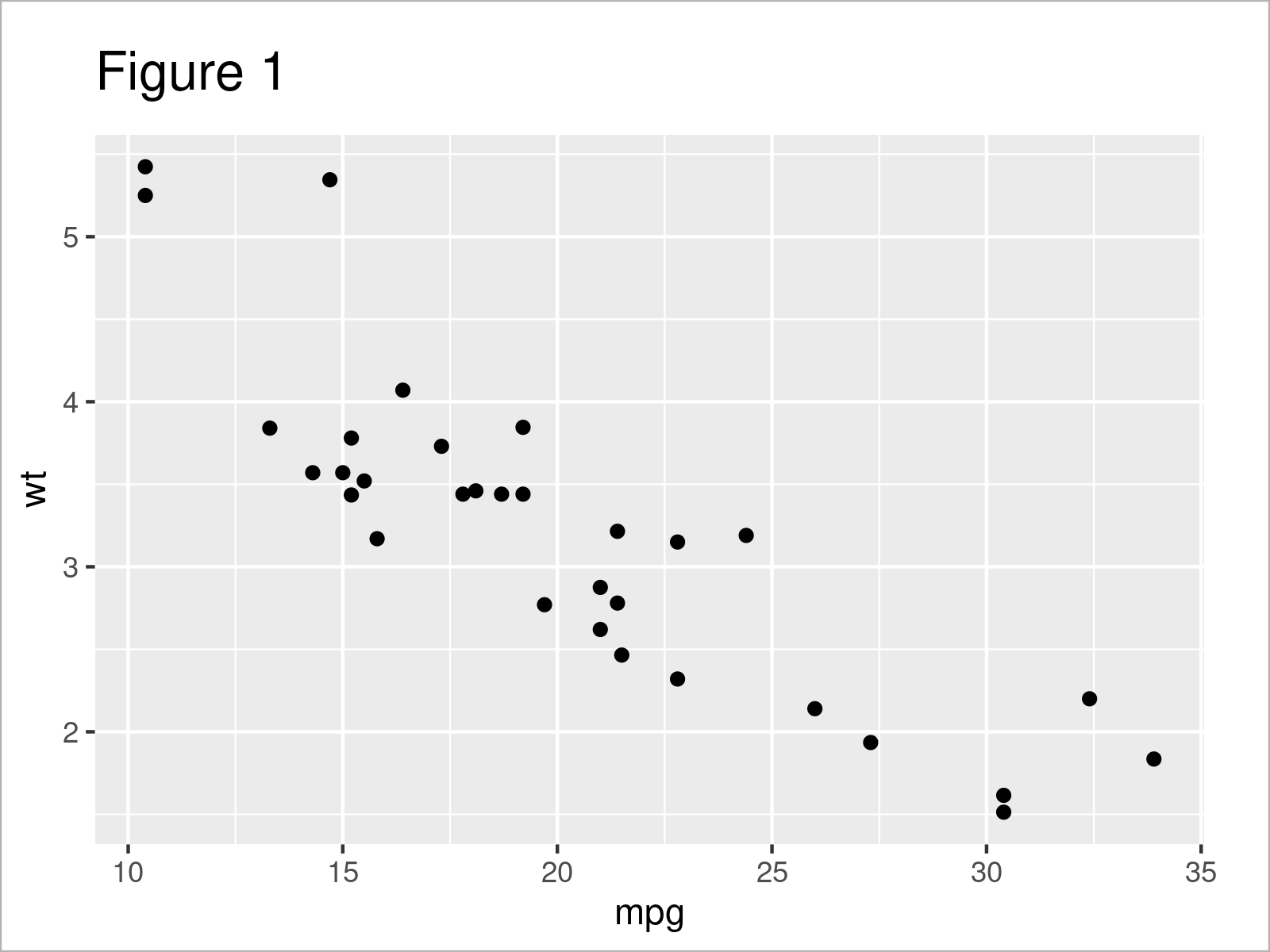
Now, we can draw a base plot, on which we will draw rectangles based on the given parameters. I chose the mpg and wt variables to plot a scatterplot as a base plot.
my_ggp <- ggplot(mtcars,           # Base Plot
                 aes(x = mpg,
                     y = wt)) +
  geom_point()
my_ggp                             # print plot

We got our scatterplot in Figure 1 as desired. Now it is time to show how to use geom_rect() to add rectangles to this graph. Let’s start with the first example!
Example 1: geom_rect by Default
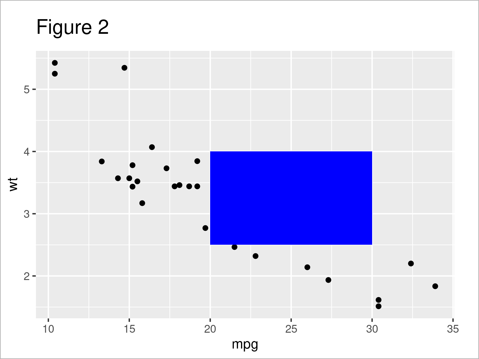
This example demonstrates calling the geom_rect() function to highlight some data points on our scatterplot.
my_ggp_new1 <- my_ggp +            # add rectangle
  geom_rect(aes(xmin = 20,
                xmax = 30,
                ymin = 2.5,
                ymax = 4),
            fill = "blue")
my_ggp_new1                        # print plot
As seen, the coordinates of the rectangle’s corners were determined by the xmin, xmax, ymin and ymax parameters, and the rectangle’s color was determined by the fill argument, which has been set to blue.

You can see in Figure 2 how the left bottom corner coordinates are 20 for x and 2.5 for y; how the right bottom corner coordinates are 30 for x and 2.5 for y, etc.
However, we have an issue here. We can not see the data points under the rectangle, which does not serve the purpose of highlighting the selected region. To solve this, in the next example, we will modify the transparency of this rectangle.
Example 2: geom_rect with Modified Transparency
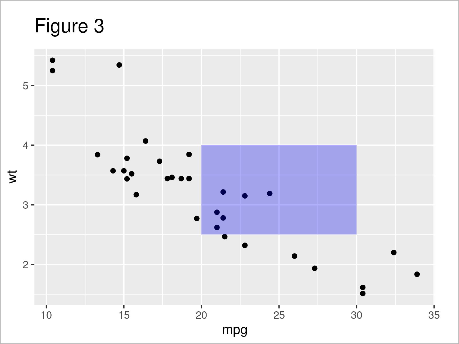
To change the transparency of the rectangle added to our graph, we will use the alpha parameter, which can take a value between 0 and 1, where a value of 0 indicates complete transparency and a value of 1 represents no transparency (fully opaque).
my_ggp_new2 <- my_ggp +            # add transparent rectangle
  geom_rect(aes(xmin = 20,
                xmax = 30,
                ymin = 2.5,
                ymax = 4),
            fill = "blue",
            alpha = 0.01)
my_ggp_new2                        # print plot
As seen, I have selected the value 0.01 to make sure that the data points are visible enough. See below how our plot looks now.

Apparently, the six data points were covered in Example 1, and now they are all visible. In the next example, I will show how to highlight the points with more than one rectangle. This might be useful to distinguish the highlighted points.
Example 3: geom_rect with Modified Transparency and Multiple Rectangles
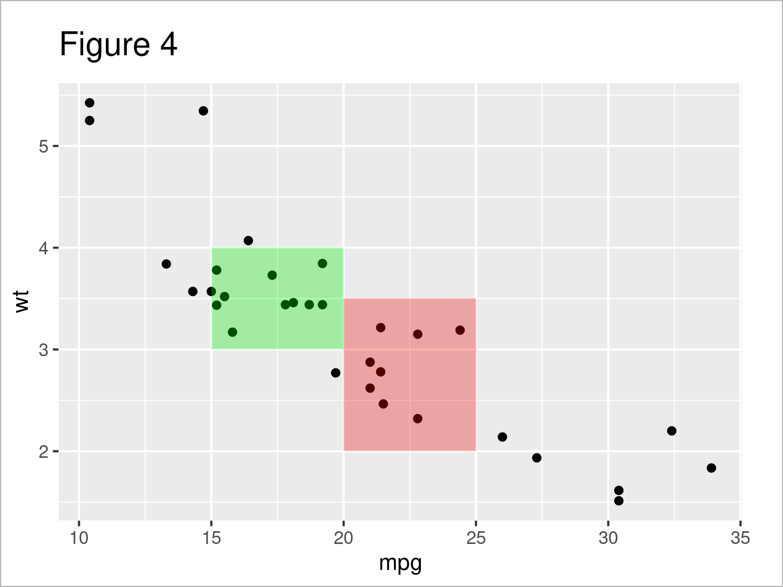
Calling the geom_rect() function multiple times with different parameter values will help to draw multiple rectangles on our scatterplot.
my_ggp_new3 <- my_ggp +            # add multiple transparent rectangles
  geom_rect(aes(xmin = 20,
                xmax = 25,
                ymin = 2,
                ymax = 3.5),
            fill = "red",
            alpha = 0.01) +
  geom_rect(aes(xmin = 15,
                xmax = 20,
                ymin = 3,
                ymax = 4),
            fill = "green",
            alpha = 0.01)
my_ggp_new3                        # print plot
You can see above how the different coordinate values and colors have been selected for each rectangle to be drawn.

As shown in Figure 4, the previous syntax has created a scatterplot with two transparent rectangles in red and green colors highlighting different groups of data points.
If you wonder if you can use geom_rect() to highlight other types of graphs, like barplot, the answer is yes! Feel free to share your experience with other types of plots in the comment section below. See you in the next tutorial!
Video & Further Resources
Would you like to know more about the ggplot2 package? Then you may have a look at the following video of my YouTube channel. I explain how to use the ggplot2 package in much more detail:
Besides the video, you may have a look at the other R tutorials on my website. You can find a selection of other tutorials below:
- Remove NA Values from ggplot2 Plot
- Cut Off Highest Values from ggplot2 Plot
- Connect Lines Across Missing Values in ggplot2 Line Plot
- Set Legend Alpha of ggplot2 Plot in R
- Drawing Plots in R
- All R Programming Tutorials
Summary: At this point, you should have learned how to use the geom_rect() function with the alpha argument to draw rectangles on a graph in R. If you have further questions, don’t hesitate to let me know in the comments.
This page was created in collaboration with Cansu Kebabci. Have a look at Cansu’s author page to get more information about her professional background, a list of all his tutorials, as well as an overview of her other tasks on Statistics Globe.
Subscribe to the Statistics Globe Newsletter
Get regular updates on the latest tutorials, offers & news at Statistics Globe.
I hate spam & you may opt out anytime: Privacy Policy.
Thank you!
Welcome to the Statistics Globe newsletter. From now on, I’ll send you regular emails about statistics, data science, AI, and programming with R and Python.
I’m Joachim Schork. On this website, I provide statistics tutorials as well as code in Python and R programming.
Statistics Globe Newsletter
Get regular updates on the latest tutorials, offers & news at Statistics Globe. I hate spam & you may opt out anytime: Privacy Policy.
Thank you!
Please check your email inbox and click the confirmation link to complete your subscription. If you don’t see the email within a few minutes, please also check your spam/junk folder.


![R ggplot2 geom_path Error in FUN(X[[i]], …) object not found (2 Examples)](https://statisticsglobe.com/wp-content/uploads/2022/08/ggplot2-geom_path-Error-FUNXi-...-object-n-TNN-350x197.png)
