Set Legend Alpha of ggplot2 Plot in R (Example)
In this R tutorial you’ll learn how to adjust the transparency of ggplot2 legend items.
The article consists of one example for the modification of alpha values. More precisely, the tutorial looks as follows:
Let’s dive right into the R syntax.
Example Data, Add-On Packages & Default Graphic
As a first step, we have to create some data that we can use in the following examples:
data <- data.frame(x = 1:10,                     # Create example data
                   y = 10:1,
                   group = LETTERS[1:5])
data                                             # Print data
#     x  y group
# 1   1 10     A
# 2   2  9     B
# 3   3  8     C
# 4   4  7     D
# 5   5  6     E
# 6   6  5     A
# 7   7  4     B
# 8   8  3     C
# 9   9  2     D
# 10 10  1     E
Have a look at the previous RStudio console output. It shows that our exemplifying data consists of ten rows and three columns. The variables x and y contain some numeric values and the variable group specifies the groups of our data points.
For the examples of this tutorial, we’ll also need to install and load the ggplot2 package.
install.packages("ggplot2")                      # Install ggplot2 package
library("ggplot2")                               # Load ggplot2
Now, we can draw our data with default legend items as follows.
ggp <- ggplot(data, aes(x, y, col = group)) +    # Example plot
  geom_point()
ggp                                              # Draw plot

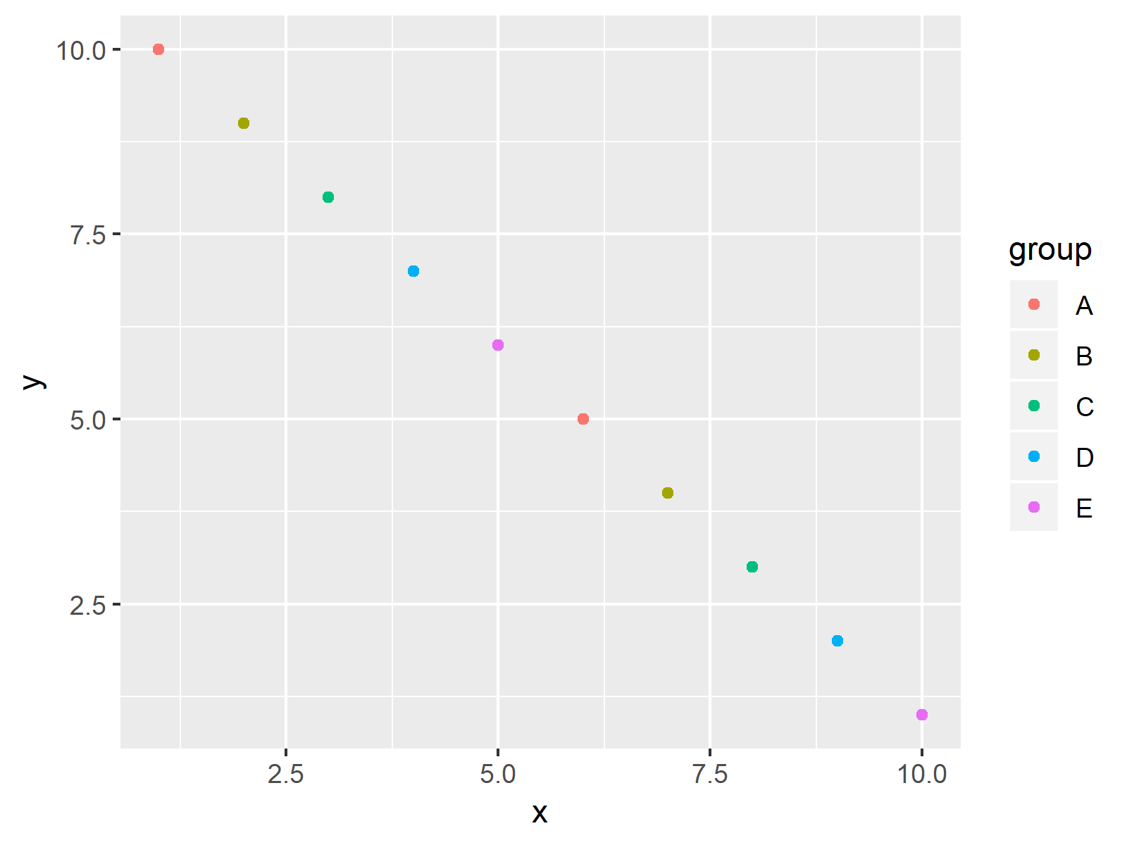
As shown in Figure 1, the previous R programming syntax plotted a ggplot2 scatterplot with solid legend items (i.e. default alpha value).
Example: Modifying Legend Alpha of ggplot2 Plot
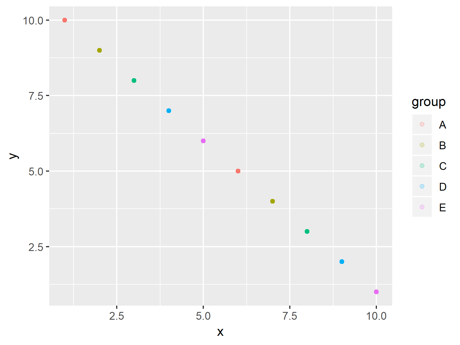
The following R syntax illustrates how to decrease the alpha (i.e. to increase transparency) of our legend symbols. For this, we have to change the alpha value within the guide_legend function. Have a look at the following R code and the resulting graph:
ggp +                                            # Adjust alpha argument
  guides(colour = guide_legend(override.aes = list(alpha = 0.2)))

The output of the previous R programming syntax is shown in Figure 2: It shows our ggplot2 graphic with transparent legend symbols.
Video & Further Resources
If you need further info on the R programming codes of this tutorial, you might want to have a look at the following video of my YouTube channel. In the video, I’m showing the R codes of this tutorial.
In addition, I can recommend to read the other tutorials of my website. You can find some posts here.
- Change Line & Color Type of ggplot2 Plot Legend
- Change Display Order of ggplot2 Plot Legend
- How to Create a ggplot2 Legend
- R Graphics Gallery
- The R Programming Language
In summary: At this point you should have learned how to increase or decrease the legend alpha of ggplot2 plots in the R programming language. In case you have further questions, please let me know in the comments below.


