Fill Area Under Line Plot in R (2 Examples)
In this post you’ll learn how to add a filling color below the line in a line graph in R programming.
The tutorial looks as follows:
Let’s jump right to the R syntax!
Creating Example Data
Consider the following example data:
data <- data.frame(x = 1:6,         # Create example data frame
                   y = c(2, 5, 6, 3, 5, 4))
data                                # Print example data frame
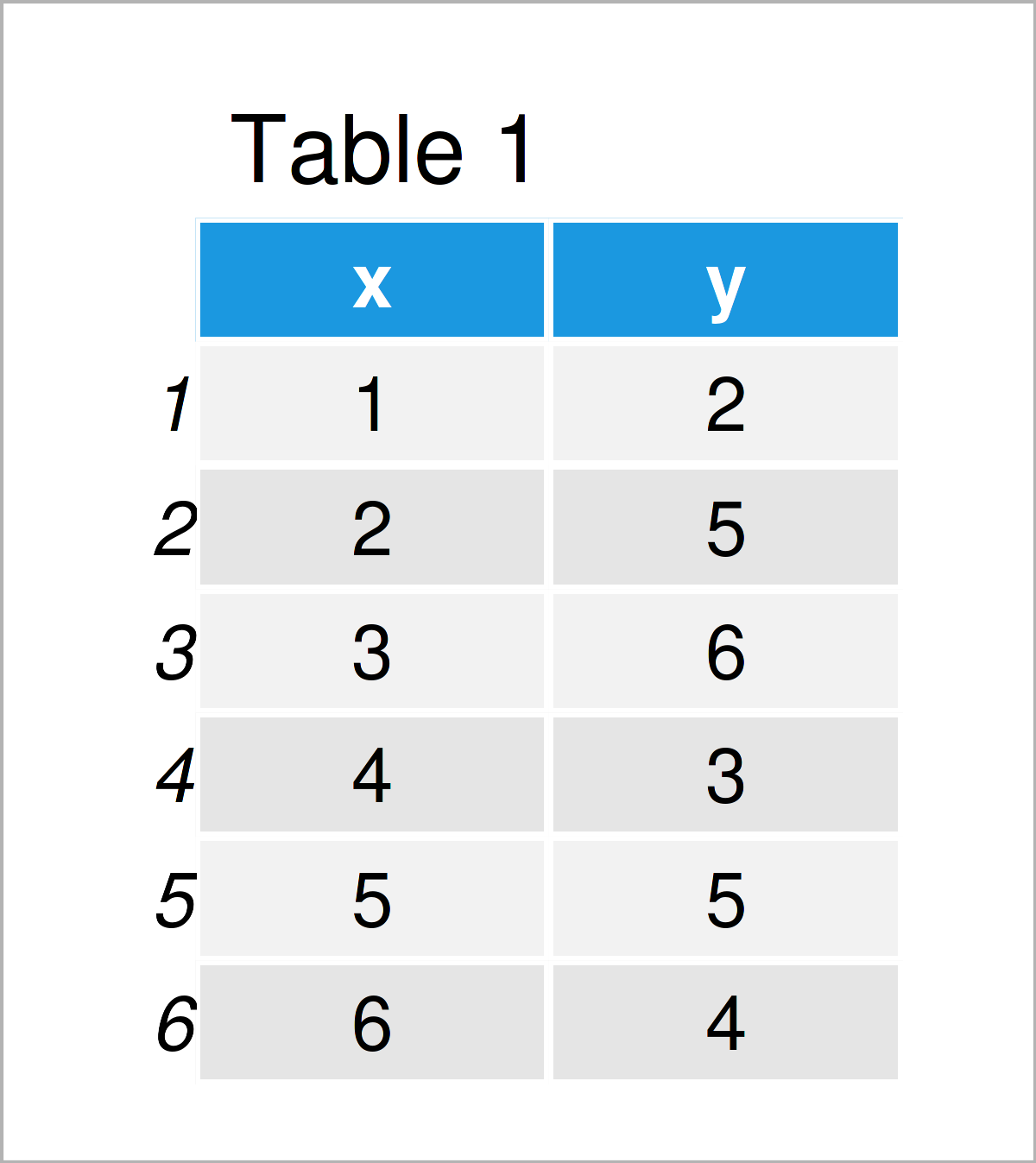
As you can see based on Table 1, our exemplifying data is a data frame consisting of six rows and two variables.
Example 1: Fill Area Under Line Plot Using Base R
Example 1 illustrates how to draw a Base R line graph with a filling color below the line.
Let’s first create a line plot without filling color:
plot(data, type = "l") # Draw Base R line plot without filled area
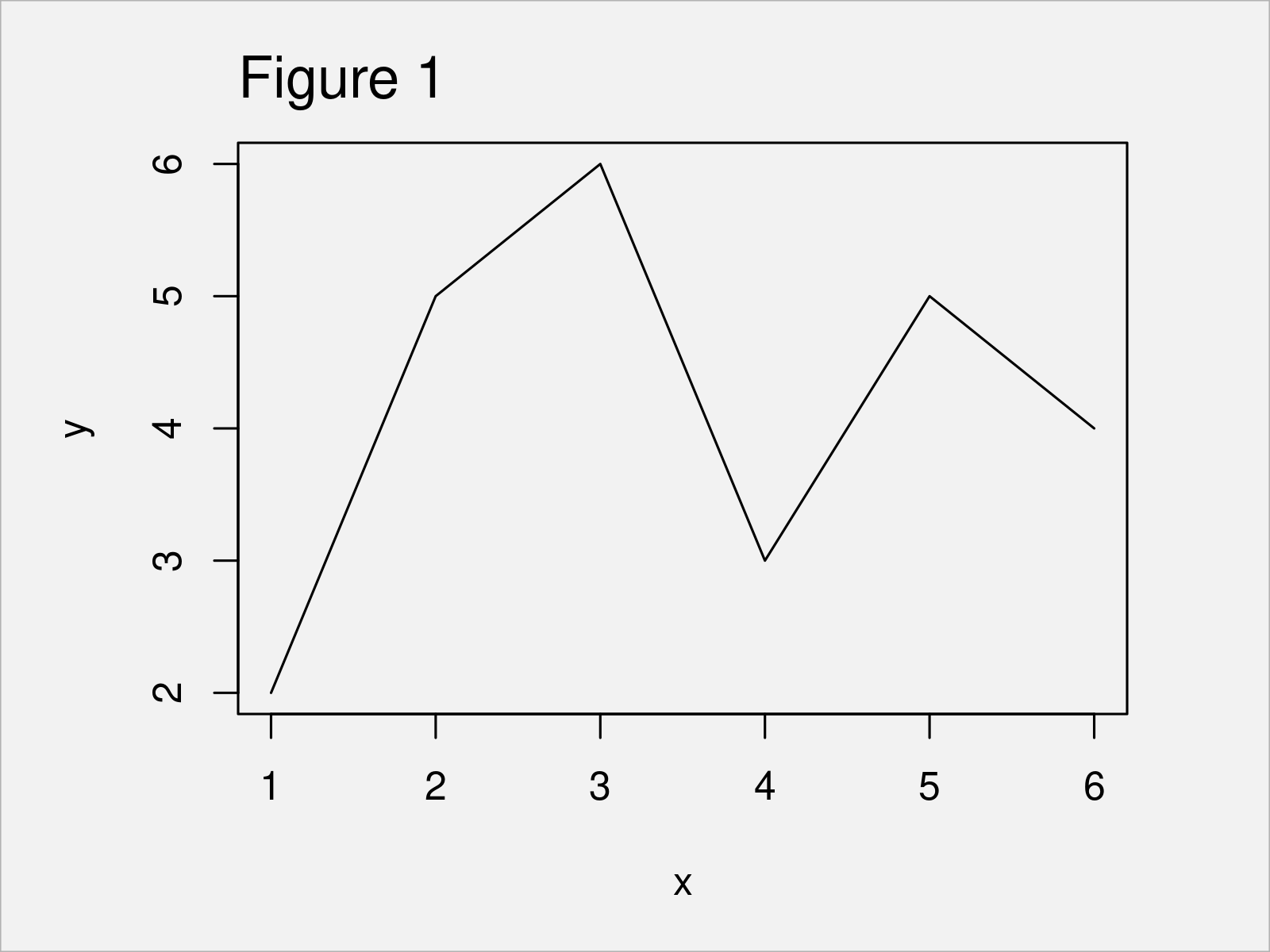
By running the previous R code, we have created Figure 1, i.e. a Base R line graphic without filling color.
Let’s add some color to the area under the line!
To accomplish this, we can use the polygon function as shown below:
plot(data, type = "l")              # Fill area below line
polygon(x = c(min(data$x), data$x, max(data$x)),
        y = c(0, data$y, 0),
        col = "#1b98e0")
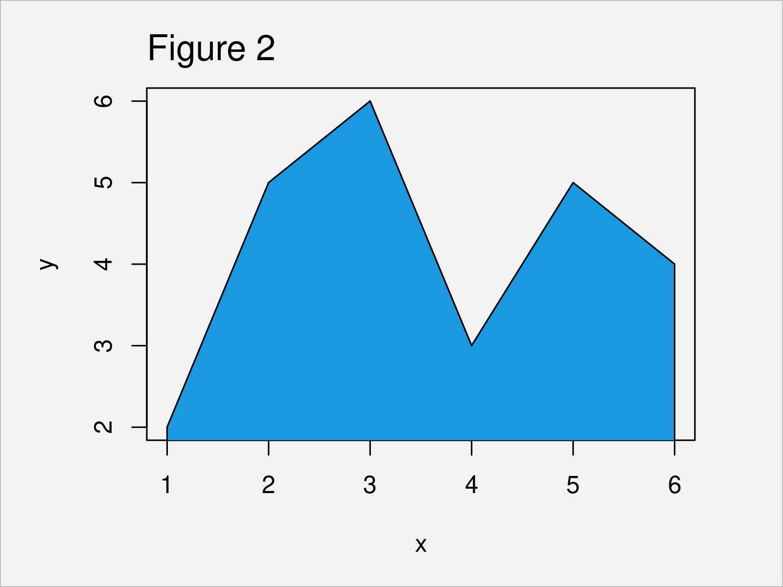
As shown in Figure 2, we have created a Base R line plot with color under the line curve.
Example 2: Fill Area Under Line Plot Using ggplot2 Package
In Example 2, I’ll illustrate how to add color below the line of a ggplot2 graphic.
First, we have to install and load the ggplot2 package:
install.packages("ggplot2")         # Install & load ggplot2
library("ggplot2")
Next, let’s draw a ggplot2 plot without colors:
ggp <- ggplot(data, aes(x, y)) +    # Draw ggplot2 line plot without filled area
  geom_line()
ggp
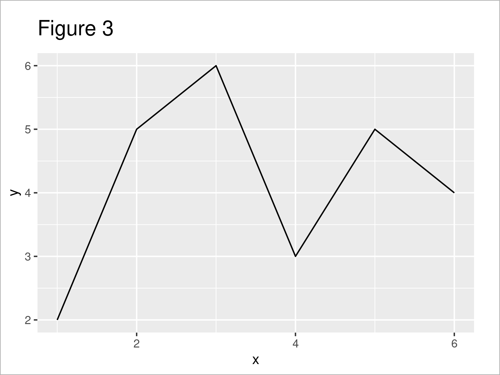
Figure 3 illustrates the output of the previous code – A ggplot2 plot without filling color.
Now, we can add color to the graph using the geom_area function:
ggp +                               # Fill area below line
  geom_area(fill = "#1b98e0")
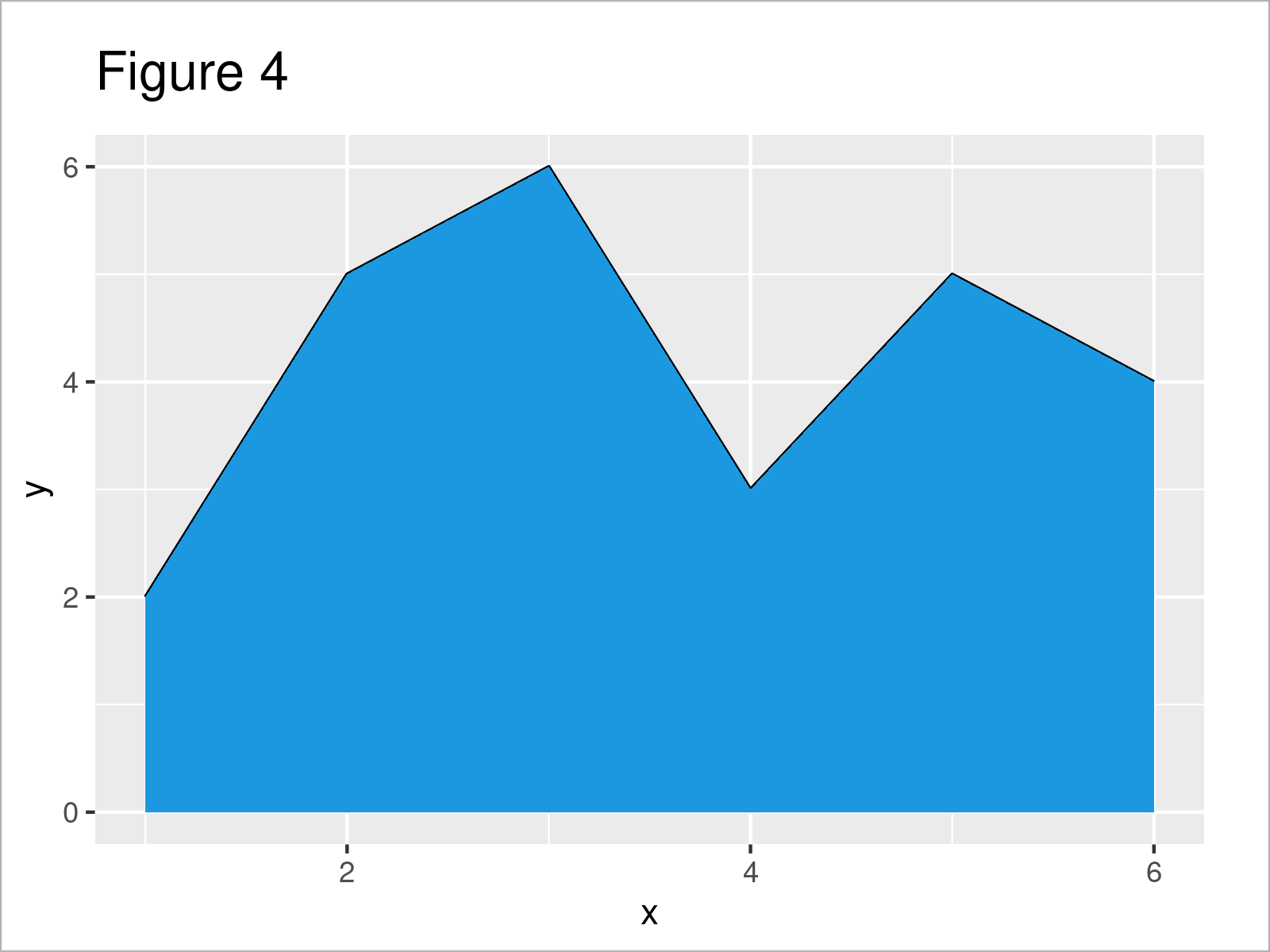
As shown in Figure 4, the previous R code has added some color below the line.
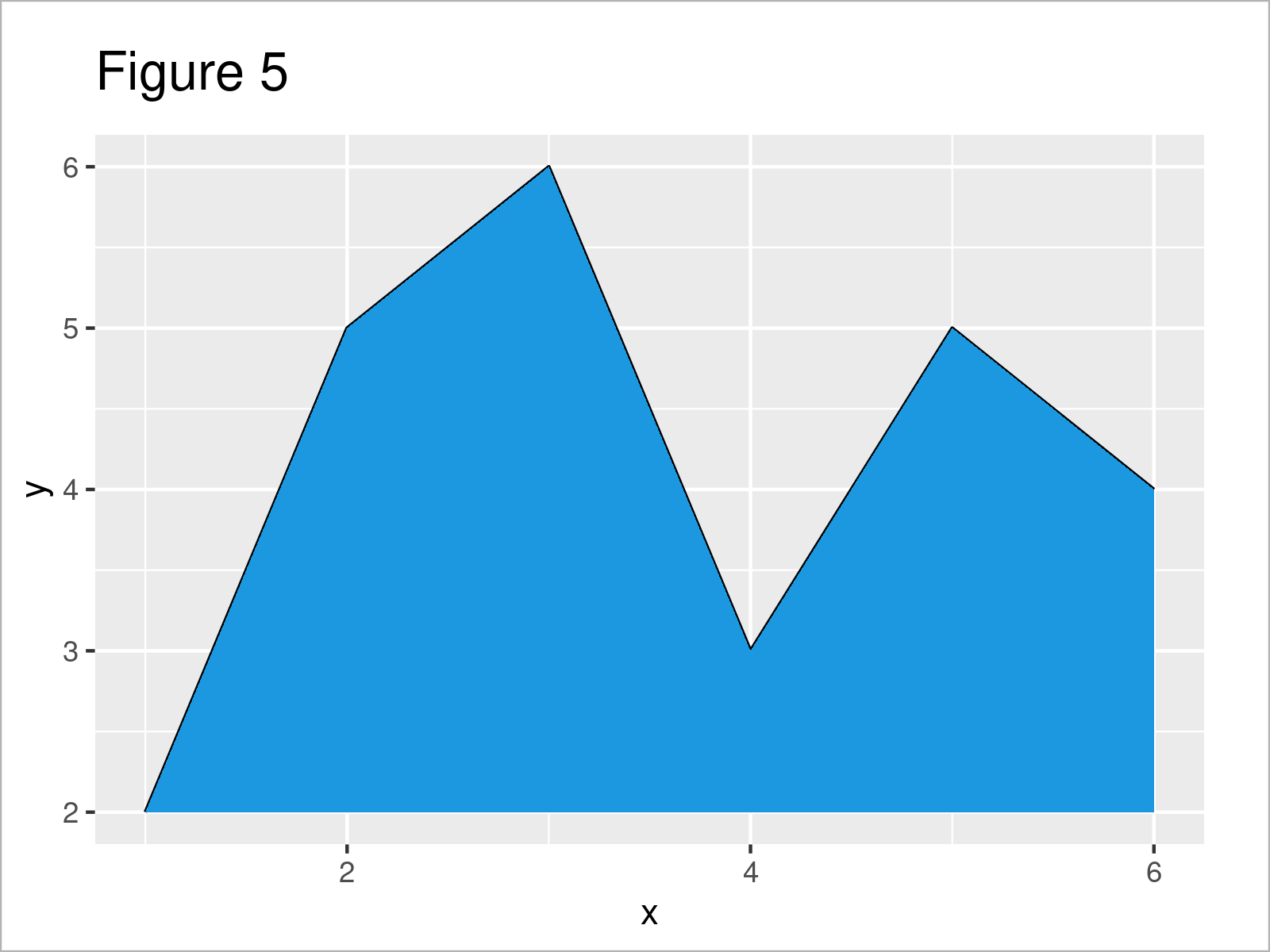
Note: The ggplot2 package changes the y-axis to start at zero when using the geom_area function. This is a difference compared to Base R.
In case you want to keep the y-axis limits, you may use the geom_ribbon function instead:
ggp +                               # Filled area with same y-axis limits
  geom_ribbon(aes(ymin = min(y),
                  ymax = y),
              fill = "#1b98e0")
Video & Further Resources
Have a look at the following video on my YouTube channel. In the video, I’m explaining the R programming code of this article in RStudio.
In addition, you might want to read the related tutorials on my website. I have released numerous tutorials on topics such as dates, plot legends, lines, and graphics in R:
- Add Grid Line Consistent with Ticks on Axis to Plot
- Draw Vertical Line to X-Axis of Class Date in ggplot2 Plot
- Add Labels at Ends of Lines in ggplot2 Line Plot
- Control Line Color & Type in ggplot2 Plot Legend
- R Graphics Gallery
- All R Programming Examples
In this post you have learned how to change the filling color below the line in a line plot in the R programming language. In case you have further comments or questions, let me know in the comments section below.
Subscribe to the Statistics Globe Newsletter
Get regular updates on the latest tutorials, offers & news at Statistics Globe.
I hate spam & you may opt out anytime: Privacy Policy.
Thank you!
Welcome to the Statistics Globe newsletter. From now on, I’ll send you regular emails about statistics, data science, AI, and programming with R and Python.
I’m Joachim Schork. On this website, I provide statistics tutorials as well as code in Python and R programming.
Statistics Globe Newsletter
Get regular updates on the latest tutorials, offers & news at Statistics Globe. I hate spam & you may opt out anytime: Privacy Policy.
Thank you!
Please check your email inbox and click the confirmation link to complete your subscription. If you don’t see the email within a few minutes, please also check your spam/junk folder.


2 Comments. Leave new
Is it possible to fill an area with two colours (that is, below zero in blue for example) and above zero in red (on the same graphic)?
Hello Ana,
Would you like to color a line graph like that? If so, unfortunately, I’ve not been able to find a solution despite my efforts. However, I found this solution for bar plots, in case such a graph would also work for you. If it doesn’t, then I suggest you consult our Facebook discussion group, where people can ask questions about R programming and statistics.
Best,
Cansu