Draw Vertical Line to X-Axis of Class Date in ggplot2 Plot in R (Example)
In this tutorial you’ll learn how to add a geom_vline to a ggplot2 plot with dates as x-axis in the R programming language.
The tutorial will contain one examples for drawing vertical lines. More precisely, the content of the post is structured as follows:
- Creating Exemplifying Data
- Example: Adding geom_vline at Specific Dates
- Video, Further Resources & Summary
Let’s dive right into the examples.
Creating Exemplifying Data
In the example of this R programming tutorial, we’ll use the following R data frame as basement:
set.seed(1510)                                                        # Create data frame
data <- data.frame(my_dates = seq(as.Date(0, origin="2015-01-01"),
                                      length = 72,
                                      by = "1 month"),
                   my_values = sample(1:100, 72, replace = TRUE))
head(data)                                                            # Print data frame
#     my_dates my_values
# 1 2015-01-01         8
# 2 2015-02-01        46
# 3 2015-03-01        79
# 4 2015-04-01        53
# 5 2015-05-01        53
# 6 2015-06-01        88
Our example data contains 72 rows and two columns. The variable my_dates has the class Date and the column my_values consists of random numeric values.
If we want to draw graphics with the ggplot2 package, we also need to install and load ggplot2:
install.packages("ggplot2")                                           # Install ggplot2
library("ggplot2")                                                    # Load ggplot2
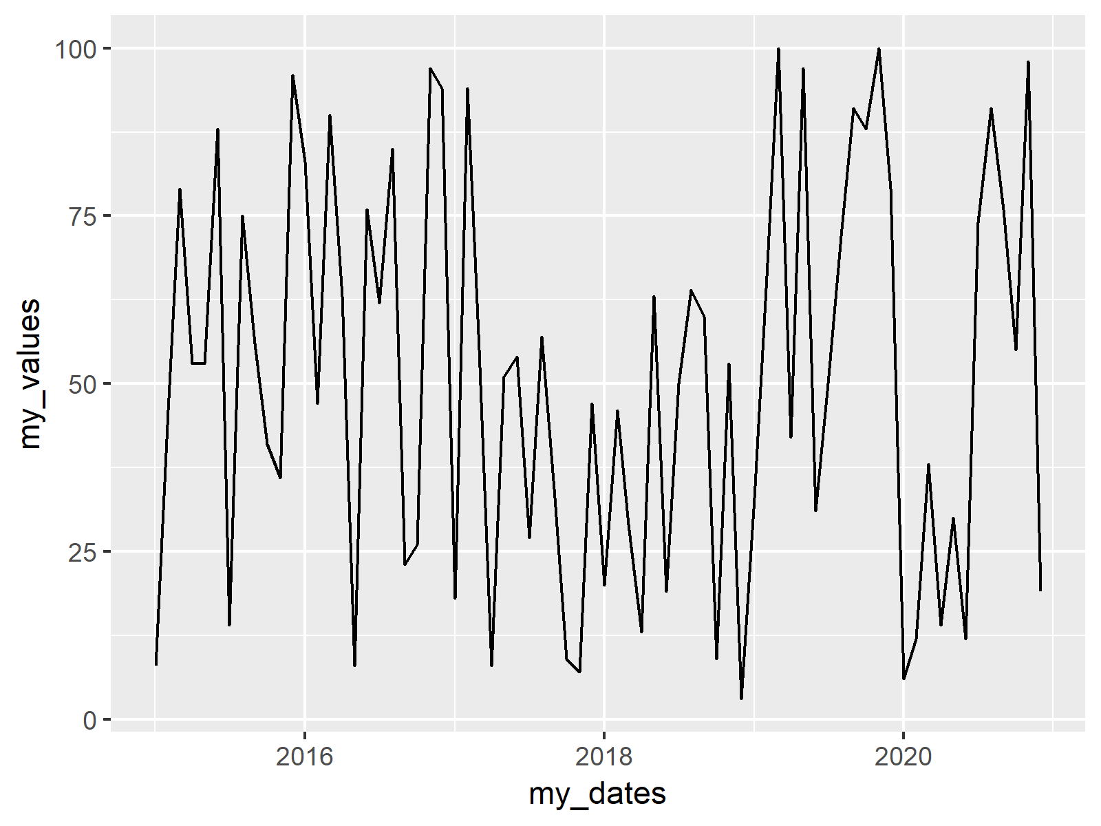
Now, we can draw a basic ggplot2 line plot without any vertical lines as follows:
ggp <- ggplot(data, aes(my_dates, my_values)) +                       # Create basic ggplot
  geom_line()
ggp                                                                   # Draw basic ggplot

Figure 1: ggplot2 Line Plot with Default Specifications.
Figure 1 illustrates the output of the previous R code – A basic line plot showing values corresponding to dates on the x-axis.
Example: Adding geom_vline at Specific Dates
If we want to add vertical lines at some specific dates to our plot, we first need to specify the dates and their positions in our data:
dates_vline <- as.Date(c("2015-11-01", "2018-03-01"))                 # Define positions of vline
dates_vline <- which(data$my_dates %in% dates_vline)
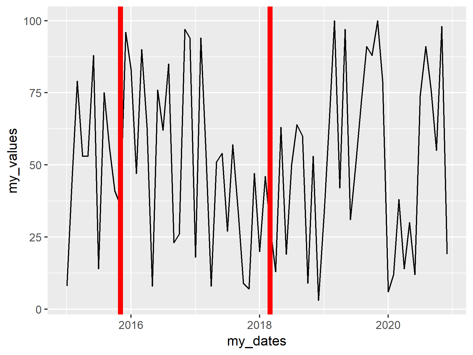
Now, we can add vertical lines with the geom_vline function to our plot:
ggp +                                                                 # Draw vlines to plot
  geom_vline(xintercept = as.numeric(data$my_dates[dates_vline]),
             col = "red", lwd = 2)

Figure 2: ggplot2 Line Plot with Vertical Lines at Date Positions.
Figure 2 shows the result: A ggplot2 line plot with two vertical lines.
Video, Further Resources & Summary
If you need more explanations on the R code of this tutorial, you might watch the following video of my YouTube channel. I’m explaining the R codes of this article in the video:
Furthermore, you might want to have a look at the other articles of my homepage. Some tutorials can be found below.
Summary: In this tutorial, I showed how to get a vertical geom_vline to an x-axis of class date in R programming. Don’t hesitate to let me know in the comments, in case you have further questions and/or comments.
Subscribe to the Statistics Globe Newsletter
Get regular updates on the latest tutorials, offers & news at Statistics Globe.
I hate spam & you may opt out anytime: Privacy Policy.
Thank you!
Welcome to the Statistics Globe newsletter. From now on, I’ll send you regular emails about statistics, data science, AI, and programming with R and Python.
I’m Joachim Schork. On this website, I provide statistics tutorials as well as code in Python and R programming.
Statistics Globe Newsletter
Get regular updates on the latest tutorials, offers & news at Statistics Globe. I hate spam & you may opt out anytime: Privacy Policy.
Thank you!
Please check your email inbox and click the confirmation link to complete your subscription. If you don’t see the email within a few minutes, please also check your spam/junk folder.


