Draw Plot with Circle in R (3 Examples)
This article demonstrates how to draw circles in the R programming language.
The page will consist of this:
Here’s the step-by-step process:
Example Data
Before we can create some graphics in R, we have to create some example data:
set.seed(394567)                        # Create example data
data <- data.frame(x = rnorm(100),
                   y = rnorm(100))
head(data)                              # Print example data
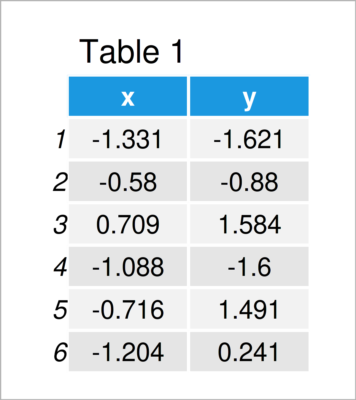
The output of the previous code is shown in Table 1 – We have created a data frame containing two numeric columns.
Example 1: Draw Plot with Circle Using Base R & plotrix Package
In this example, I’ll explain how to draw a Base R plot with circles.
Consider the following scatterplot:
plot(data$x, data$y) # Draw Base R plot without circle
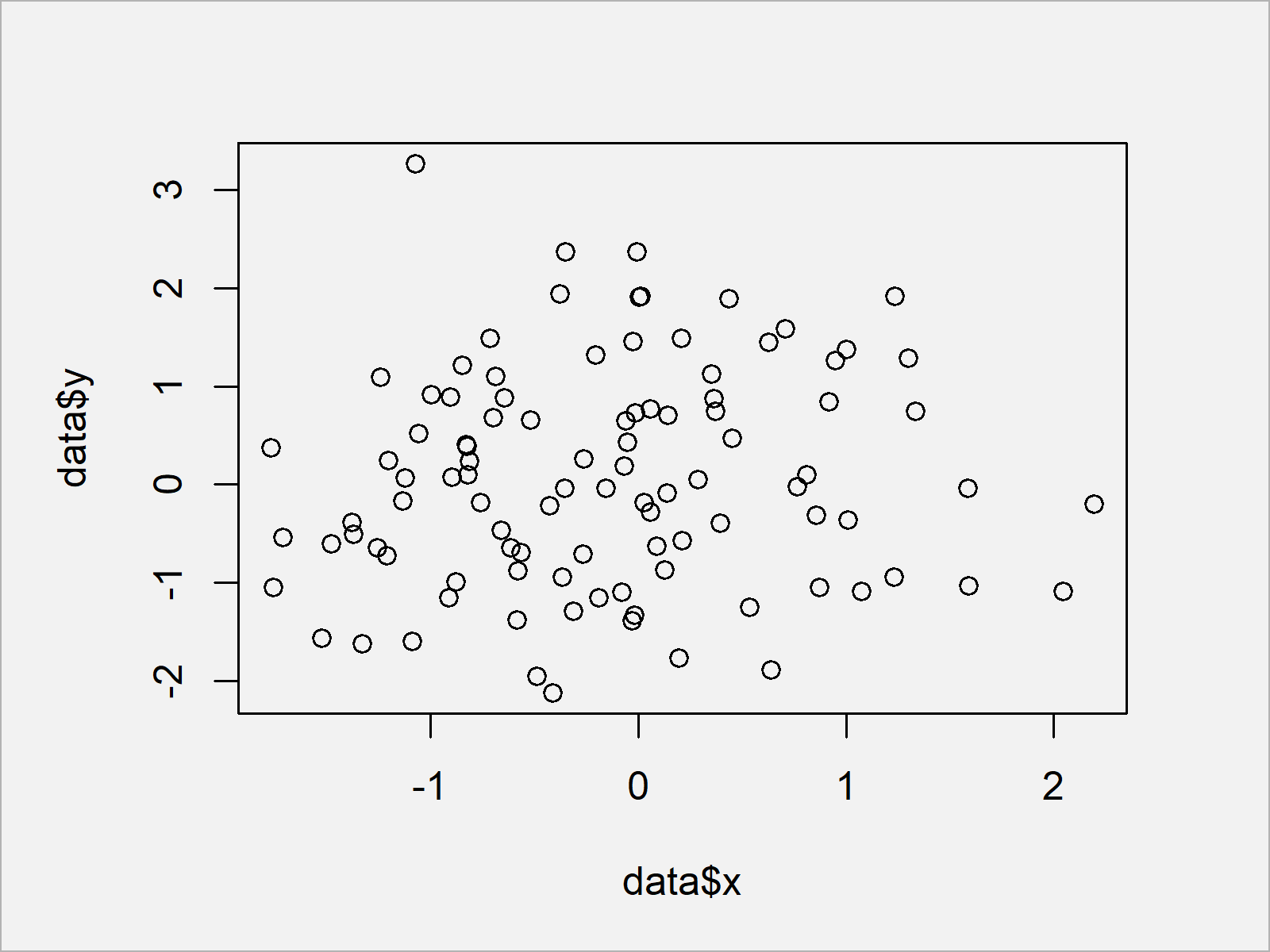
After executing the previous syntax the scatterplot shown in Figure 1 has been plotted.
Let’s assume that we want to add a circle to this plot. In this case, we can use the plotrix package.
If we want to use the functions of the plotrix package, we first have to install and load plotrix to R:
install.packages("plotrix")             # Install plotrix package
library("plotrix")                      # Load plotrix package
Next, we can use the draw.circle function of the plotrix package to add a circle to our Base R graph:
plot(data$x, data$y)                    # Draw Base R plot with circle
draw.circle(0, 0, 1)
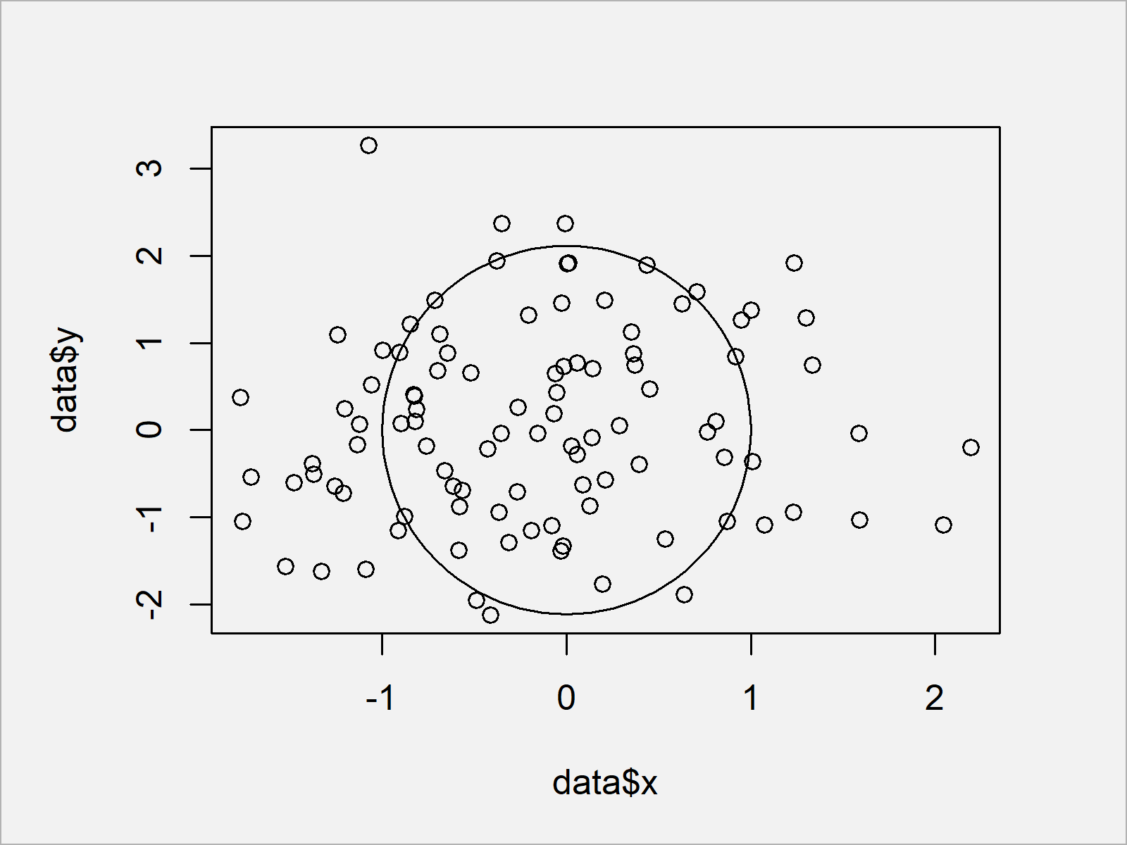
As you can see, we have added a circle to our plot.
Note that we have specified three values within the draw.circle function: The x-axis location, the y-axis location, and the radius of our circle.
Example 2: Draw Plot with Circle Using ggplot2 & ggforce Packages
In this example, I’ll illustrate how to annotate a circle to a ggplot2 plot.
In case we want to use the functions of the ggplot2 package, we first need to install and load ggplot2:
install.packages("ggplot2")             # Install & load ggplot2 package
library("ggplot2")
Next, we can draw a ggplot2 scatterplot as shown below:
ggplot(data, aes(x, y)) +               # Draw ggplot2 plot without circle
  geom_point()
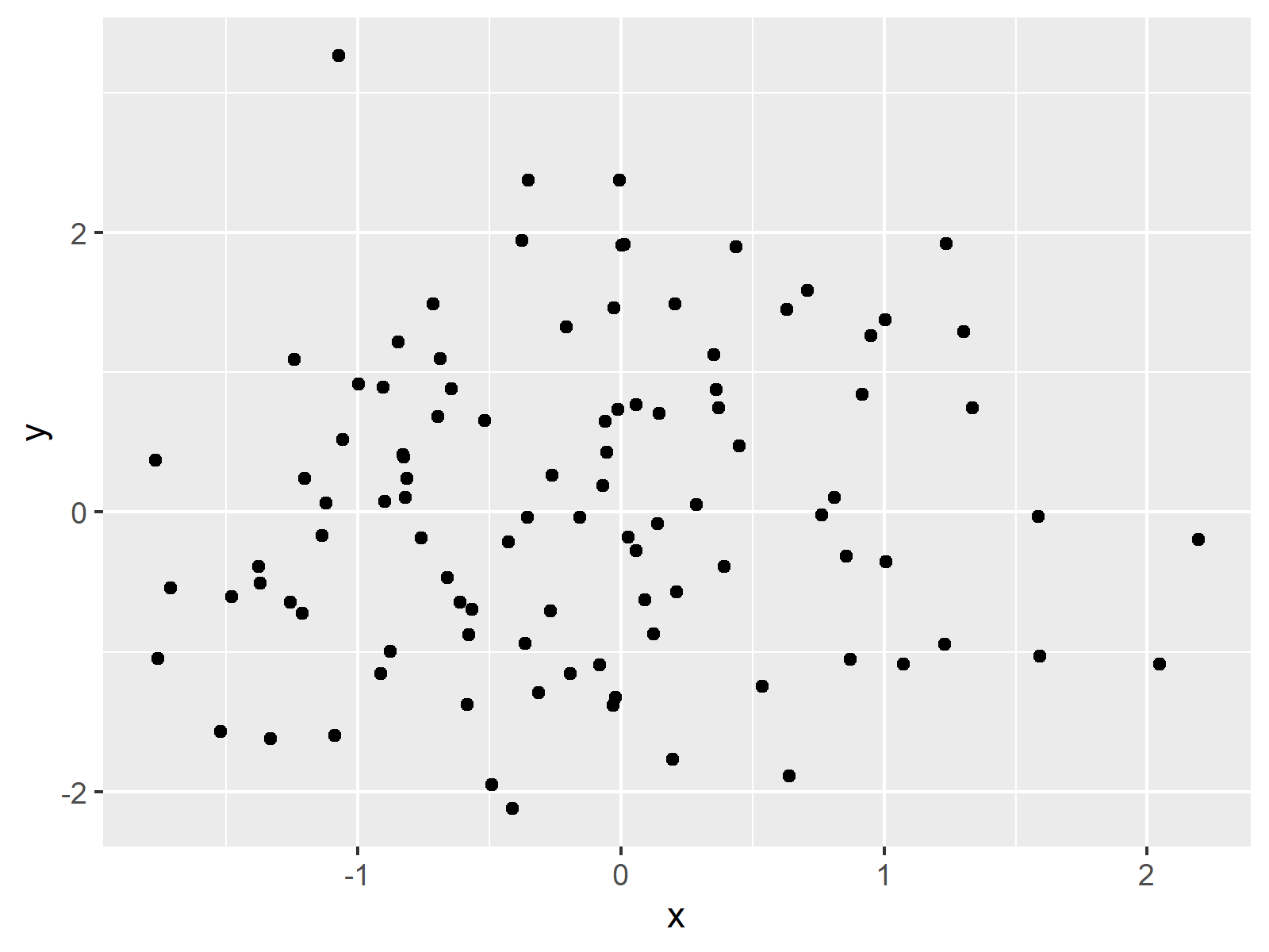
If we want to add a circle to this graph, we first have to install and load the ggforce package to RStudio:
install.packages("ggforce")             # Install ggforce package
library("ggforce")                      # Load ggforce package
Furthermore, we have to prepare a data set containing the position and the radius of our circle:
data_circle <- data.frame(x0 = 0,       # Create data for circle
                          y0 = 0,
                          r = 1)
data_circle                             # Print data for circle
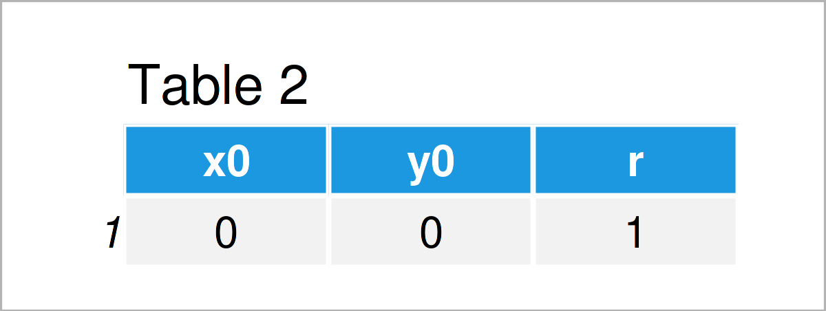
As shown in Table 2, the previously shown R programming syntax has created a data frame containing the circle location and radius.
Next, we can use the geom_circle function of the ggforce package to add a circle to our plot:
ggplot() +                              # Draw ggplot2 plot with circle
  geom_point(data = data, aes(x, y)) +
  geom_circle(data = data_circle, aes(x0 = x0, y0 = y0, r = r))
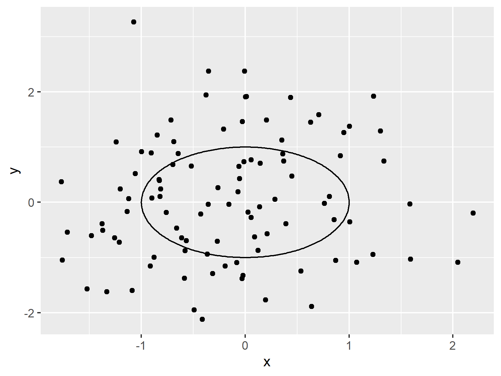
Note that we have specified the input data frame within the geom_point function and the circle data frame within the geom_circle function.
Example 3: Draw Plot with Multiple Circles Using ggplot2 & ggforce Packages
It is also possible to draw multiple circles to a ggplot2 plot using the ggforce package.
First, we have to create an extended version of our circle data:
data_circle2 <- data.frame(x0 = 1:5,    # Create data for multiple circles
                          y0 = 1:5,
                          r = 1:5)
data_circle2                            # Print data for multiple circles
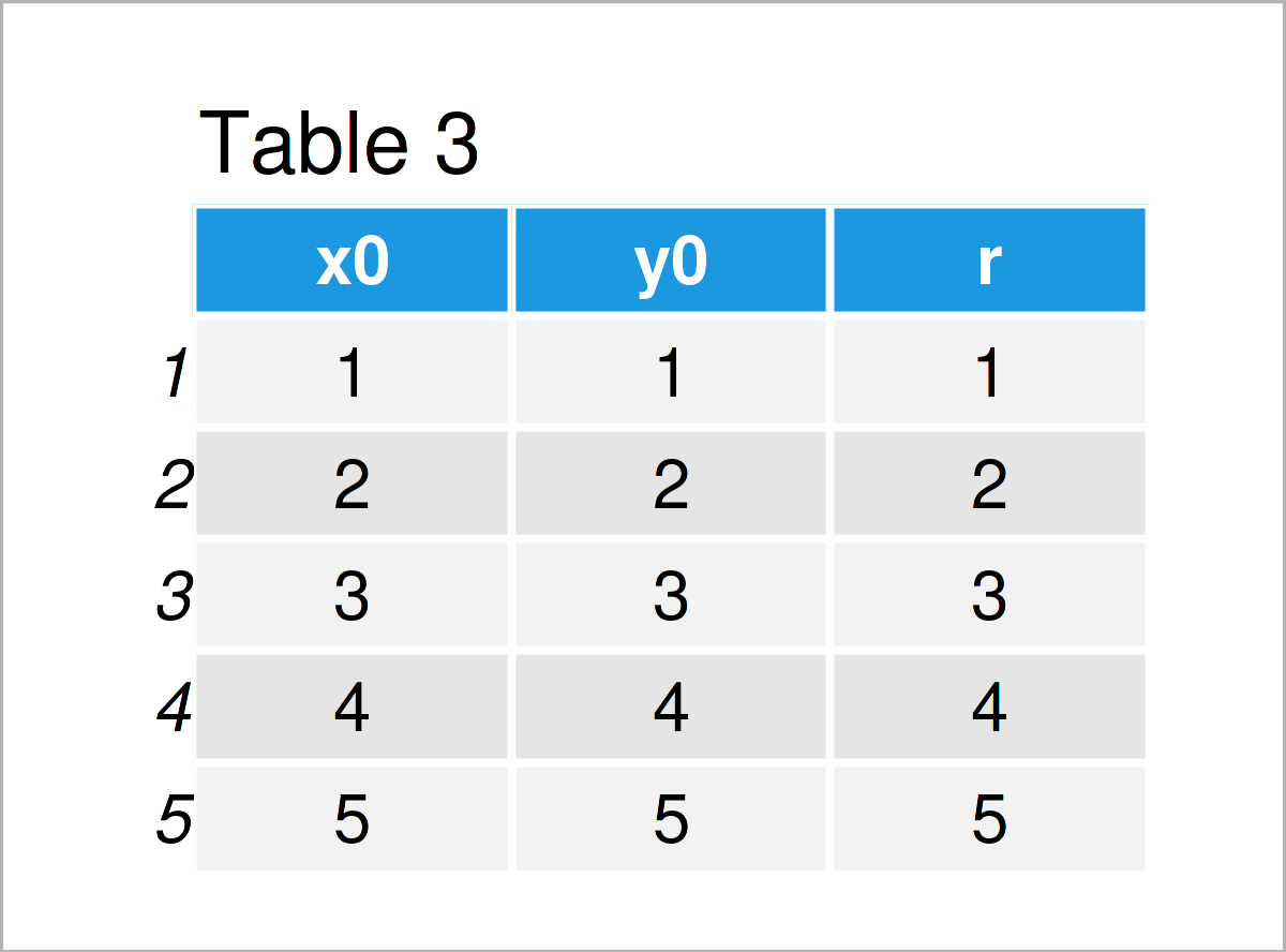
Table 3 shows the output of the previous syntax: Each row of the data frame corresponds to one circle.
In the next step, we can draw our data and our circles in a ggplot2 plot:
ggplot() +                              # Draw ggplot2 plot with multiple circles
  geom_point(data = data, aes(x, y)) +
  geom_circle(data = data_circle2, aes(x0 = x0, y0 = y0, r = r, col = r))
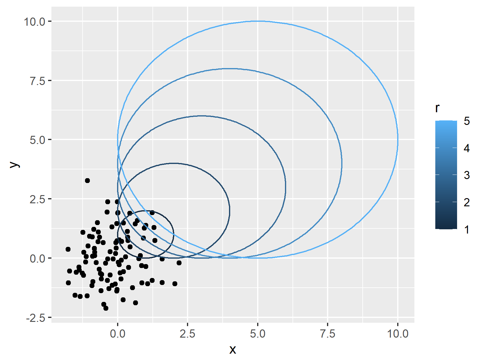
Note that we have also changed the color codes of the circles. You may use the typical ggplot2 syntax to modify further parameters of the circles as well.
Video, Further Resources & Summary
I have recently published a video on my YouTube channel, which shows the R programming codes of this post. Please find the video below.
In addition, you may want to read the other tutorials on this website:
- Add Regression Line to ggplot2 Plot
- Draw Plot with Confidence Intervals
- Draw Vertical Line to X-Axis of Class Date in ggplot2 Plot
- Draw Dates to X-Axis of Plot
- Graphics Gallery in R
- R Programming Tutorials
In this R programming article you have learned how to draw a plot with circles. If you have further questions, let me know in the comments section. In addition, don’t forget to subscribe to my email newsletter for updates on the newest tutorials.


