Overlay Density Plots in Base R (2 Examples)
In this article, I’ll show how to draw several Kernel densities in the same graphic in the R programming language.
The table of content is structured as follows:
So without further ado, let’s dive right in…
Creation of Example Data
As a first step, let’s create some example data:
set.seed(8723264)         # Create example data
x <- rnorm(1000, 0.5, 2)
y <- rnorm(1000)
z <- rnorm(1000, - 1)
As you can see based on the previous RStudio console output, our example data contains of three randomly distributed numeric vectors.
Example 1: Overlay Multiple Densities in R
This Example illustrates how to overlay multiple numeric distributions in the same graphic in the basic installation of the R programming language. For this task, we need to apply the plot, lines, and density functions as shown below. Note that the first density needs to be created using the plot function and all remaining densities need to be drawn with the lines function.
plot(density(x),          # Plot density of x
     xlim = c(- 6, 6),
     ylim = c(0, 0.4))
lines(density(y),         # Add density of y
      col = 2)
lines(density(z),         # Add density of z
      col = 3)

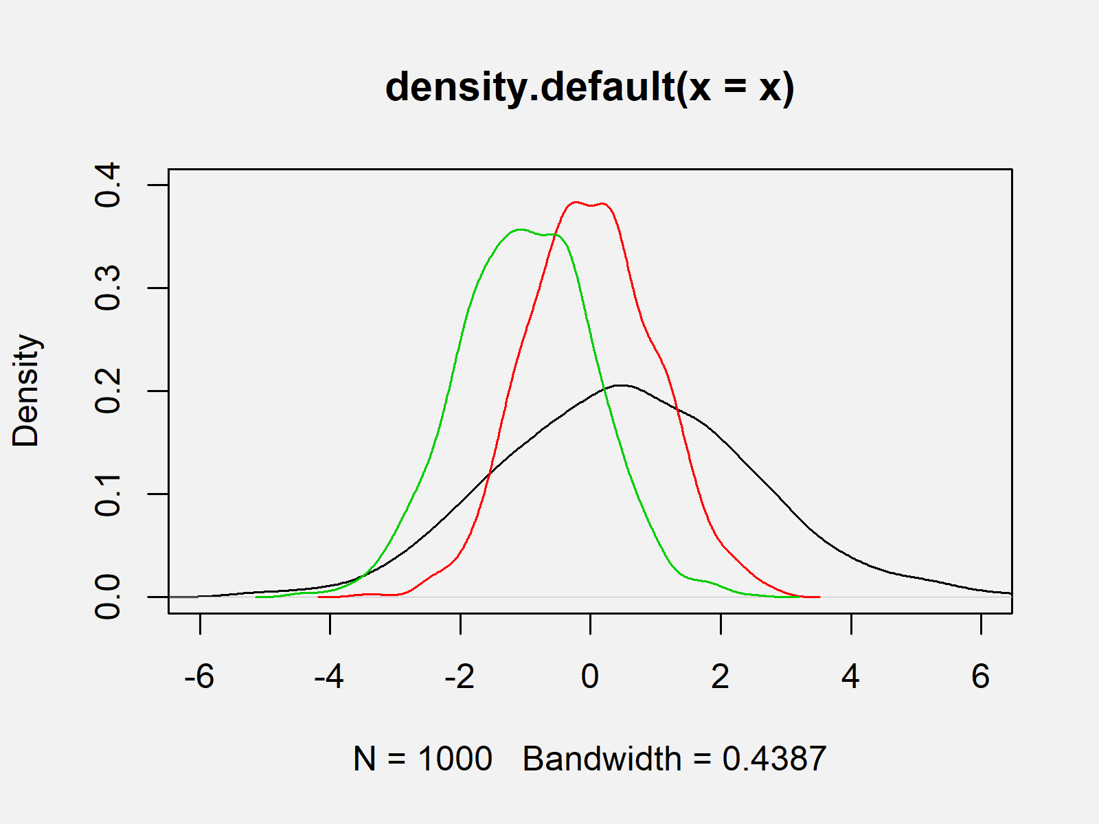
The output of the previous R programming code is visualized in Figure 1: It shows the Kernel density plots of our three numeric vectors.
Example 2: Add Legend to Plot with Multiple Densities
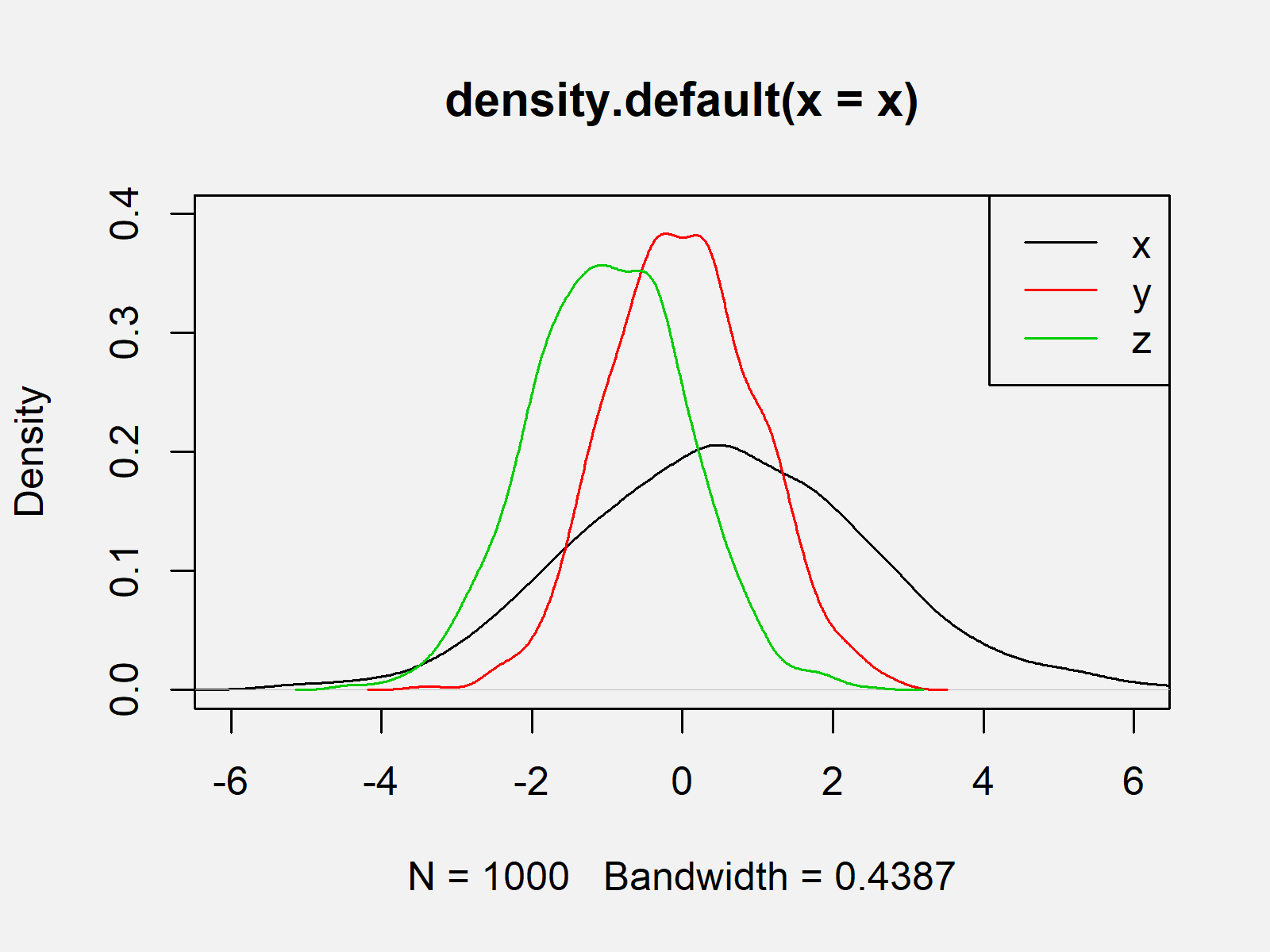
Based on Figure 1 you cannot know which of the lines correspond to which vector. Example 2 therefore illustrates how to add a legend to a graph showing multiple densities in R. If we want to draw a legend to a Base R plot, we can use the legend() function as follows:
legend("topright",        # Add legend to plot
       c("x", "y", "z"),
       col = 1:3,
       lty = 1)

As shown in Figure 2, we created the same plot again but this time showing a legend at the top right of our plot.
Video & Further Resources
Would you like to know more about graphics in R? Then you could watch the following video of my YouTube channel. I’m explaining the examples of this tutorial in the video.
Furthermore, I can recommend to read the related tutorials on my homepage. Some tutorials can be found here:
- plot() Function
- Create Kernel Density Plot in R
- Overlay Histogram with Fitted Density Curve in Base R & ggplot2 Package
- Add Color Between Two Points of Kernel Density Plot in R
- R Graphics Gallery
- The R Programming Language
In this article, I explained how to overlay multiple density plots in the R programming language. Let me know in the comments below, in case you have additional questions or comments.
Subscribe to the Statistics Globe Newsletter
Get regular updates on the latest tutorials, offers & news at Statistics Globe.
I hate spam & you may opt out anytime: Privacy Policy.
Thank you!
Welcome to the Statistics Globe newsletter. From now on, I’ll send you regular emails about statistics, data science, AI, and programming with R and Python.
I’m Joachim Schork. On this website, I provide statistics tutorials as well as code in Python and R programming.
Statistics Globe Newsletter
Get regular updates on the latest tutorials, offers & news at Statistics Globe. I hate spam & you may opt out anytime: Privacy Policy.
Thank you!
Please check your email inbox and click the confirmation link to complete your subscription. If you don’t see the email within a few minutes, please also check your spam/junk folder.


2 Comments. Leave new
Hi again Joachim,
I want to overlay 2 density plots (for treatment and control groups) in R.
I can do this using density function per your tutorial above, but I wish to differentiate the 2 plots using a solid and dashed line for treatment and control groups, respectively, and I can’t seem to reflect this in the legend (currently I can only format both groups as either solid or dashed in the legend using lty=1 or 2, respectively).
As an example, I include some code below (using the R dataset mpg):
data(mpg)
plot(density(mpg$displ[mpg$cyl==4],bw = “nrd”),
xlim=c(0.0,6),
lwd = 2,
col = ‘red’,
lty = 1,
main=”plot”,
xlab=”displ”)
lines(density(mpg$displ[mpg$cyl==6],bw = “nrd”),
xlim=c(0.0,6),
lwd = 2,
col = ‘purple’,
lty = 2,
main=”plot”,
xlab=”displ”)
legend(“topright”,legend=c(“cycl_4”, “cycl_5”),
col=c(“red”,”purple”),
lty=1, cex=0.8, lwd = c(1,2),text.font=4) #lty 1 = solid, 2=dashed
Thank you again for any help you can provide,
Hi again J 🙂
Have you considered using ggplot2 for this task? In my opinion, ggplot2 is the better choice when creating more advanced graphs like this.
Regards,
Joachim