Draw Plot with Multi-Row X-Axis Labels in R (2 Examples)
In this article, I’ll illustrate how to annotate several x-axis labels to a plot in the R programming language.
The content of the tutorial is structured as follows:
Here’s how to do it!
Creation of Example Data
The first step is to define some data that we can use in the examples below:
set.seed(526379)                    # Create example data
data <- data.frame(axis1 = paste0("Q", 1:4),
                   axis2 = rep(2021:2025, each = 4),
                   x = 1:20,
                   y = 1:20 + rnorm(20))
data$axis2[duplicated(data$axis2)] <- NA
head(data)                          # Print head of example data
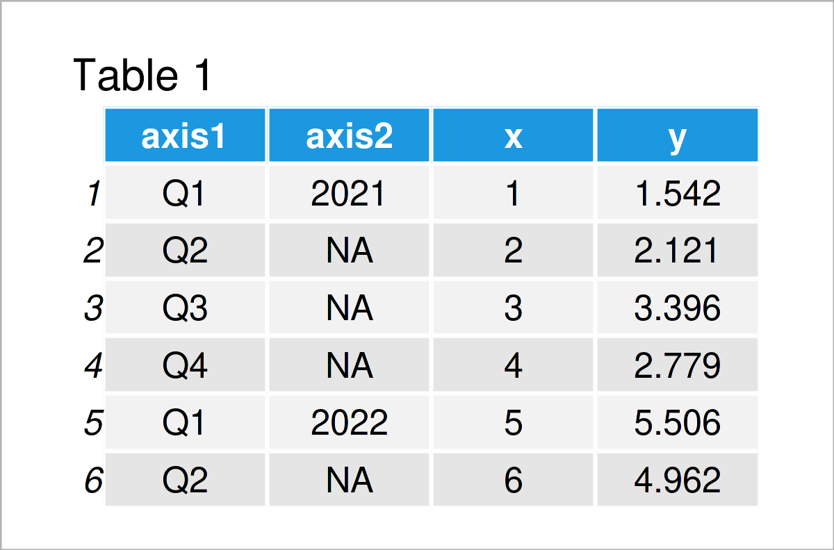
As you can see based on Table 1, our example data is a data frame consisting of four columns. The variables axis1 and axis2 contain the axis labels that we will draw to our plots (i.e. quarters and years), and the variables x and y contain the corresponding values.
Example 1: Draw Plot with Multiple Axes Using Base R
In this example, I’ll explain how to draw a Base R plot with multi-row x-axis labels.
Let’s first draw our data in a line and point plot with default specifications:
plot(data$x,                        # Draw Base R plot with one axis
     data$y,
     type = "o")
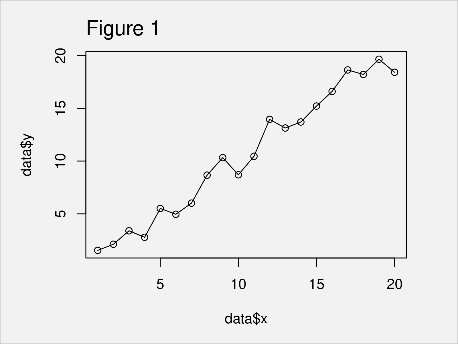
The output of the previous code is shown in Figure 1 – A graphic containing lines and points corresponding to the variables x and y in our example data. However, at this point our plot has only one x-axis.
If we want to change the x-axis labels in a Base R plot to multi-row text, we can use the R code below.
In this R code, we first draw a plot without any x-axis labels and ticks.
Furthermore, we use the axis function twice. In each call of the axis function, we add another x-axis row to our plot.
Note that we are specifying the line argument within the second call of the axis function to be equal to 2.5. This moves the axis labels to a vertically lower position and avoid overlap with the first axis row.
Let’s execute the code:
plot(data$x,                        # Draw Base R plot with multiple axes
     data$y,
     type = "o",
     xlab = "",
     xaxt = "n")
axis(1, 1:nrow(data), data$axis1)
axis(1, 1:nrow(data), data$axis2, line = 2.5)
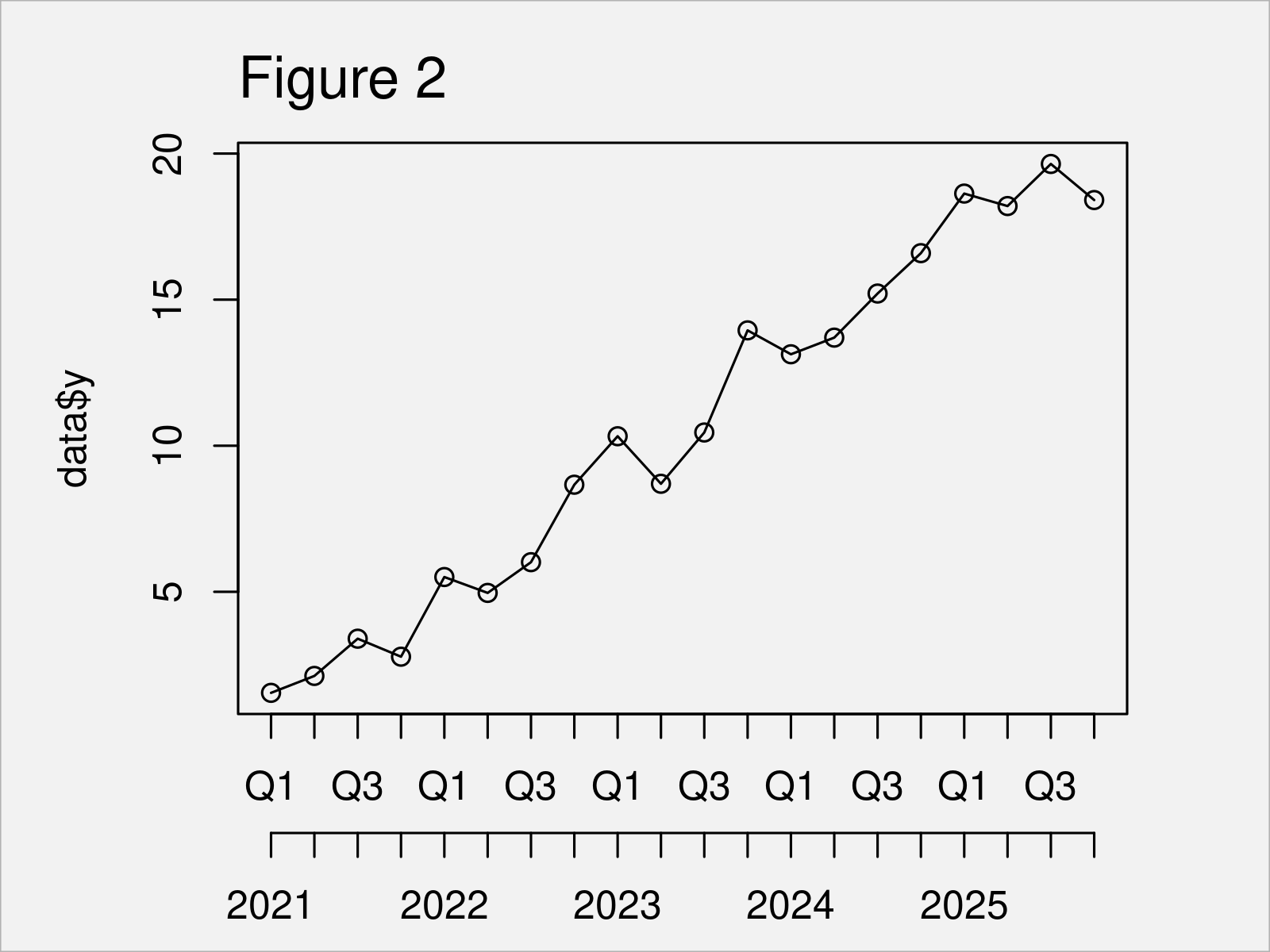
After running the previous R code the Base R plot with two x-axis labels shown in Figure 2 has been created.
Example 2: Draw Plot with Multiple Axes Using ggplot2 Package
This example illustrates how to use the ggplot2 package to draw a graph with multiple x-axis labels.
If we want to use the functions of the ggplot2 package, we first need to install and load ggplot2:
install.packages("ggplot2")         # Install ggplot2 package
library("ggplot2")                  # Load ggplot2
In the next step, we can use the ggplot and geom_line functions to draw a ggplot2 line plot of our data:
ggp <- ggplot(data, aes(x, y)) +    # Draw ggplot2 plot with one axis
  geom_line()
ggp
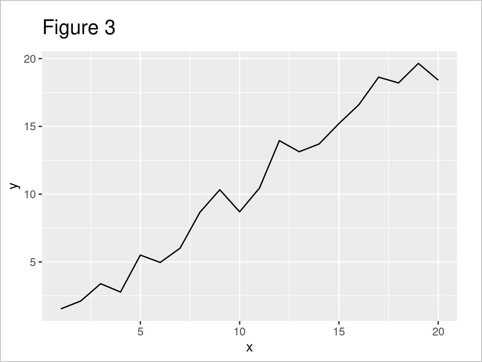
The output of the previous R programming syntax is shown in Figure 3: We have created a ggplot2 line plot with default axis limits and specifications.
Now, we can use this plot as basement for the following R code. In this code, we first remove the x-axis text and title.
Furthermore, we use the coord_cartesian function to make sure that the axis text is not clipped to the extent of the plot panel.
Finally, we use the annotate function twice to add two x-axis rows to our plot. Note that the vertical adjustment of the second call of the annotate function is higher than in the first call.
Let’s do this:
ggp +                               # Draw ggplot2 plot with multiple axes
  theme(plot.margin = unit(c(1, 1, 4, 1), "lines"),
        axis.title.x = element_blank(),
        axis.text.x = element_blank()) +
  coord_cartesian(clip = "off") +
  annotate(geom = "text",
           x = 1:nrow(data),
           y = min(data$y),
           label = data$axis1,
           vjust = 3.5) +
  annotate(geom = "text",
           x = 1:nrow(data),
           y = min(data$y),
           label = data$axis2,
           vjust = 5)
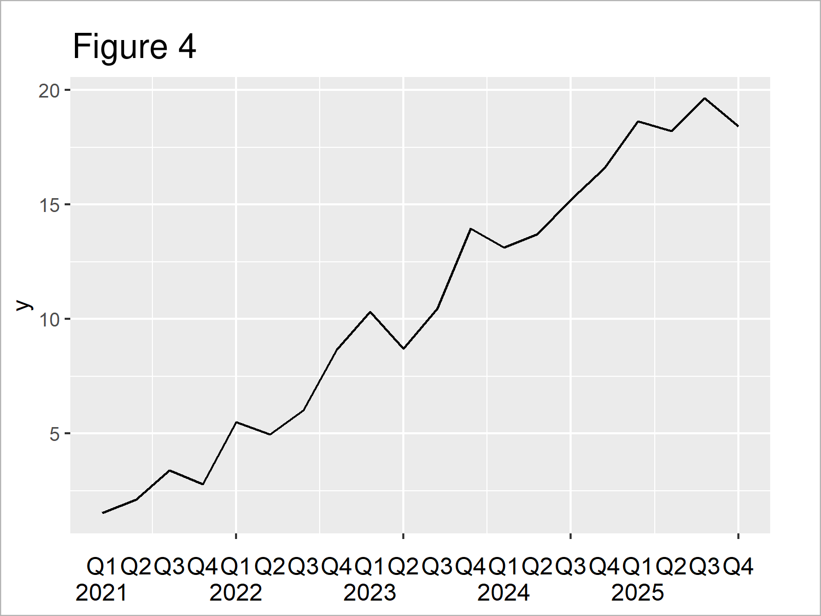
In Figure 4 you can see that we have plotted a ggplot2 line plot with two x-axis labels with the previous code.
Video & Further Resources
Do you need further info on the R codes of this article? Then you may watch the following video on my YouTube channel. I illustrate the R code of this tutorial in the video:
In addition, you may have a look at some other tutorials on this website. I have published several tutorials already:
- Draw Dates to X-Axis of Plot
- Draw Vertical Line to X-Axis of Class Date in ggplot2 Plot
- Draw Plot with Actual Values as Axis Ticks & Labels
- R Graphics Gallery
- All R Programming Examples
Summary: You have learned in this tutorial how to add multiple x-axis labels to a graphic in R. Kindly let me know in the comments, if you have further questions. Furthermore, please subscribe to my email newsletter for updates on the newest tutorials.


6 Comments. Leave new
Please, how do you add a second x axis to a gg2plot? To get something like the double x axis I get with
axis1 axis2 x y y1
2002 0 1 1.5 5
2003 1 2 2.1 4
2004 2 3 3.4 3
2005 3 4 2.8 2
2006 4 5 5.5 1
2007 5 6 5 0
plot(data2$x, data2$y1, type = “o”, xlab = “”, xaxt = “n”)
> axis(1, 1:nrow(data2), data2$axis1)
> axis(1, 1:nrow(data2), data2$axis2, line = 2.5)
Hey Ed,
I just took a few days off and therefore couldn’t respond earlier. Do you still need help with this problem?
Regards, Joachim
hello i need help with as to how to summarize multiple column into x-axis. I am trying to generate a temperature graph of certain year for all months of that year? how do i do that?
Hi Amina,
Are you looking for a grouped barplot?
Regards,
Joachim
Hi Joachim,
I followed your tutorial but i’m having issues. I think the labels might all be written on top of another for some reason as opposed to spread-out. Any ideas?
Hello Ondine,
I didn’t get your question well. Do you want to write the labels on top of each other or to avoid it? If you want to avoid overlapping, you can change the values for the arguments of line or vjust based on the package you use.
Regards,
Cansu