Move Axis Label Closer to Plot in Base R (2 Examples)
In this R tutorial you’ll learn how to decrease (or increase) the space between the axis label text and the axes.
The tutorial will consist of two examples for the modification of axis title positions. To be more specific, the article will contain the following topics:
Let’s dive right in…
Creating Exemplifying Data
Consider the following example data:
data <- data.frame(x_axis = 1:5,            # Create example data
                   y_axis = 1:5)
data                                        # Print example data

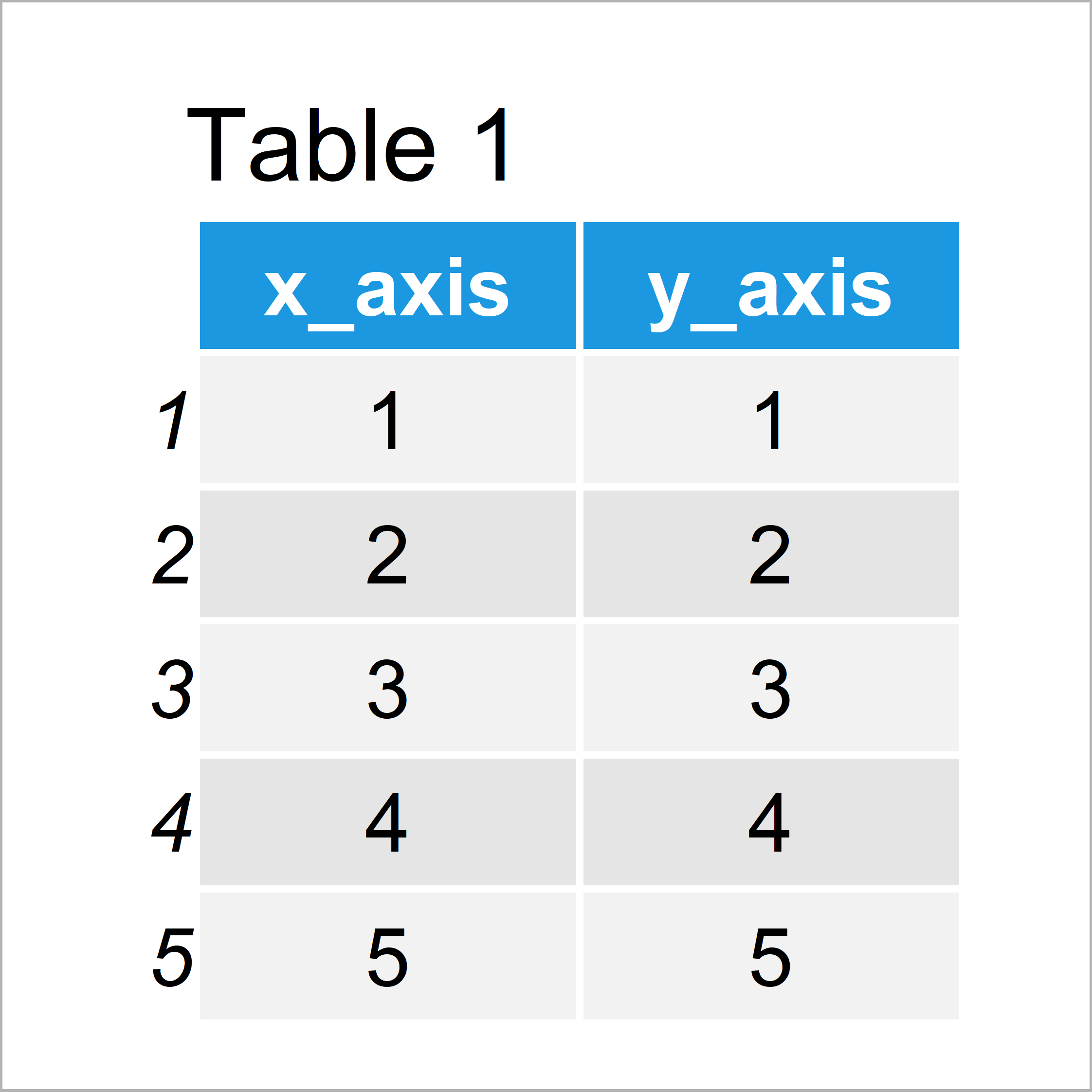
Have a look at the table that has been returned by the previous syntax. It shows that the example data consists of five rows and two columns.
Now, we can create a graphic of our data as follows:
plot(data,                                  # Create plot with default text
     xaxt = "n",
     yaxt = "n")

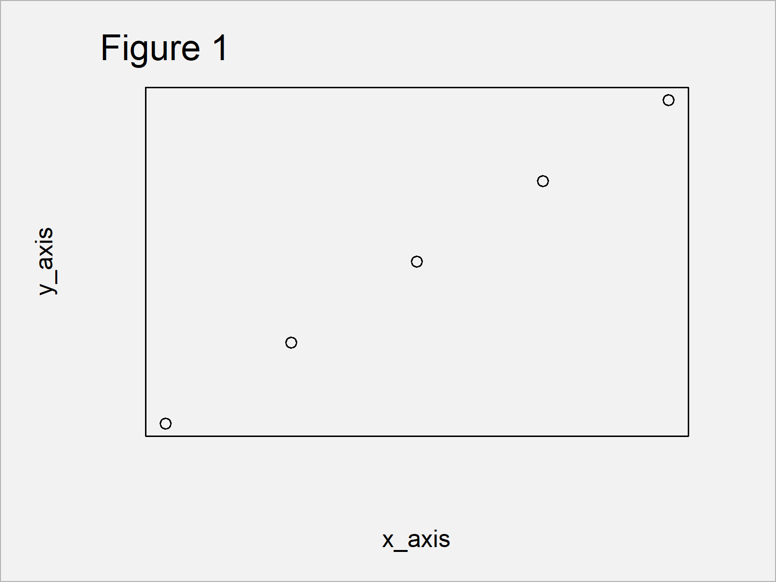
After running the previous R programming code the scatterplot shown in Figure 1 has been created. As you can see, the space between the axes and the axis titles is relatively large.
Example 1: Decrease Space Between Axis Text & Base R Plot Using line Argument
Example 1 shows how to print the axis text closer to the axes using the title function and the line argument.
Have a look at the following R code:
plot(data,                                  # Plot without axis text
     xaxt = "n",
     yaxt = "n",
     xlab = "",
     ylab = "")
title(xlab = "x_axis", line = 0)            # Add x-axis text
title(ylab = "y_axis", line = 0)            # Add y-axis text

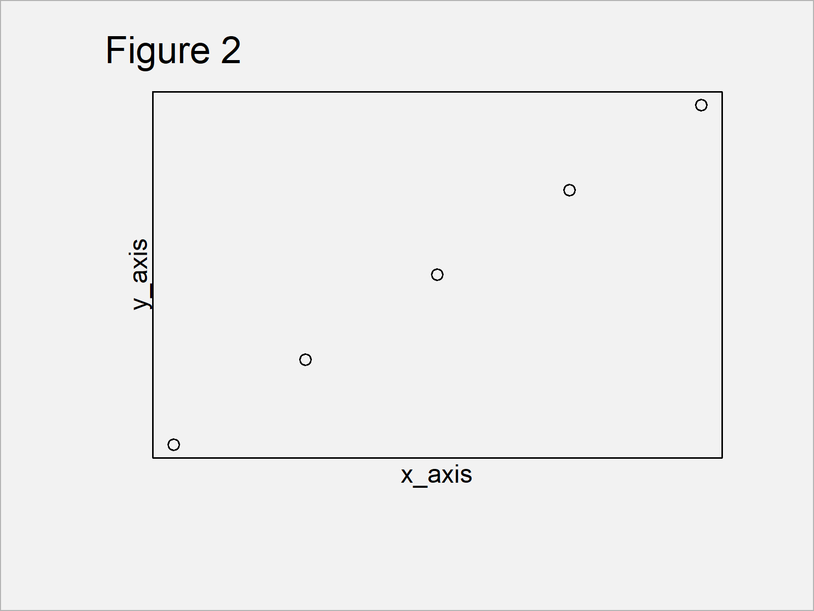
As shown in Figure 2, the previous R programming syntax has created an xy-plot with axis labels closer to the x- and y-axes.
Example 2: Decrease Space Between Axis Text & Base R Plot Using mgp Argument
Example 2 illustrates how to use the mpg argument provided by the title function to decrease the space between axis and axis title.
plot(data,                                  # Plot without axis text
     xaxt = "n",
     yaxt = "n",
     xlab = "",
     ylab = "")
title(xlab = "x_axis", mgp = c(1, 1, 0))    # Add x-axis text
title(ylab = "y_axis", mgp = c(1, 1, 0))    # Add y-axis text

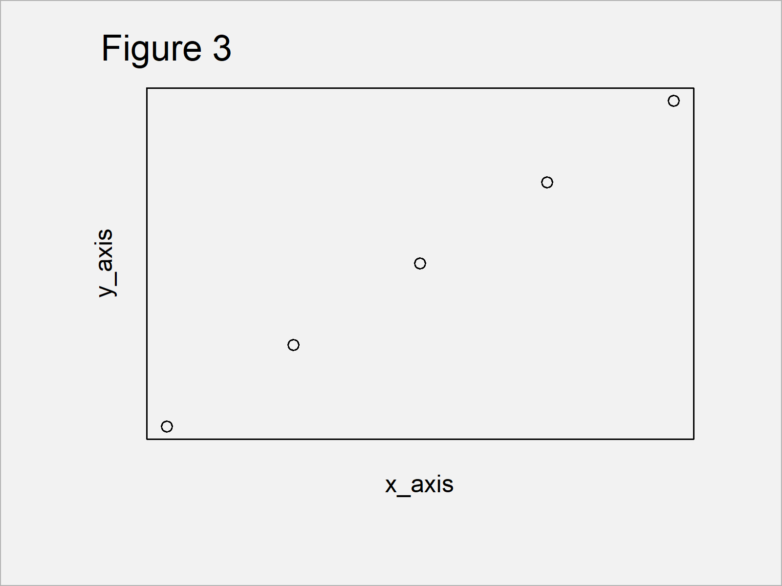
In Figure 3 it is shown that we have drawn another scatterplot with less space between axes and labels.
Video & Further Resources
Some time ago I have released a video on my YouTube channel, which explains the topics of this article. You can find the video below:
Furthermore, you could read the related tutorials of this website. I have released several articles about topics such as graphics in R and labels:
- Remove Axis Values of Plot in Base R
- Change Spacing of Axis Tick Marks in Base R Plot
- Change Colors of Axis Labels & Values of Base R Plot
- Rotate Axis Labels of Base R Plot
- Plots in R
- R Programming Overview
In summary: At this point you should have learned how to move axis text closer to the axes of a graphic in R programming. Let me know in the comments, in case you have additional questions.


