Draw Heatmap-Like Plot of Categorical Variables in R (Example)
In this article you’ll learn how to create a heatmap-like plot of categorical data in R programming.
The page will contain this information:
Here’s how to do it.
Example Data
In the first place, we have to create some data that we can use in the examples later on:
set.seed(6857323)                                # Set random seed for reproducibility
data <- data.frame(x1 = sample(letters[1:5], 10, replace = TRUE), # Create example data
                   x2 = sample(letters[1:5], 10, replace = TRUE),
                   x3 = sample(letters[1:5], 10, replace = TRUE))
data                                             # Print example data frame

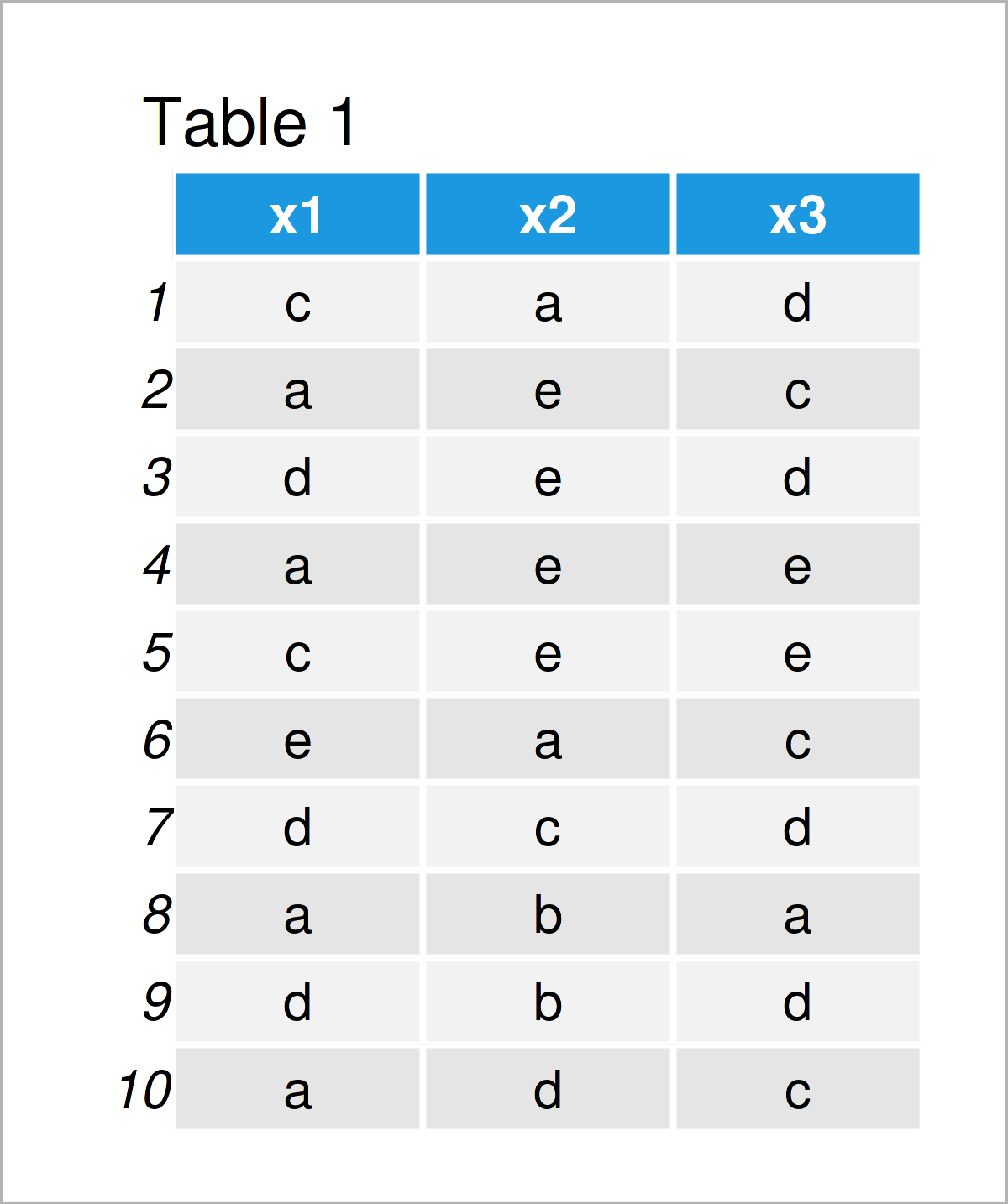
Table 1 shows that our example data consists of ten rows and three columns. Each of the columns contains the four categories a, b, c, and d, and each row of the data frame represents one observation.
Let’s draw these data!
Example: Draw Heatmap-Like Plot of Categorical Variables Using tidyr & ggplot2 Packages
In this example, I’ll show how to create a similar plot to a heatmap based on a data set containing categorical variables.
For this task, we first have to modify our data frame. For this, data manipulation process, I’m going to use the tidyr package.
If we want to use the functions of the tidyr package, we first need to install and load tidyr:
install.packages("tidyr")                        # Install & load tidyr
library("tidyr")
Next, we have to add an ID column to our data, and we have to reshape our data from wide to long format using the pivot_longer function:
data_long <- data                                # Duplicate data frame
data_long$id <- paste0("id", 1:nrow(data_long))  # Add ID column
data_long <- pivot_longer(data_long, colnames(data)) # Reshape to long format
head(data_long)                                  # Print head of long data

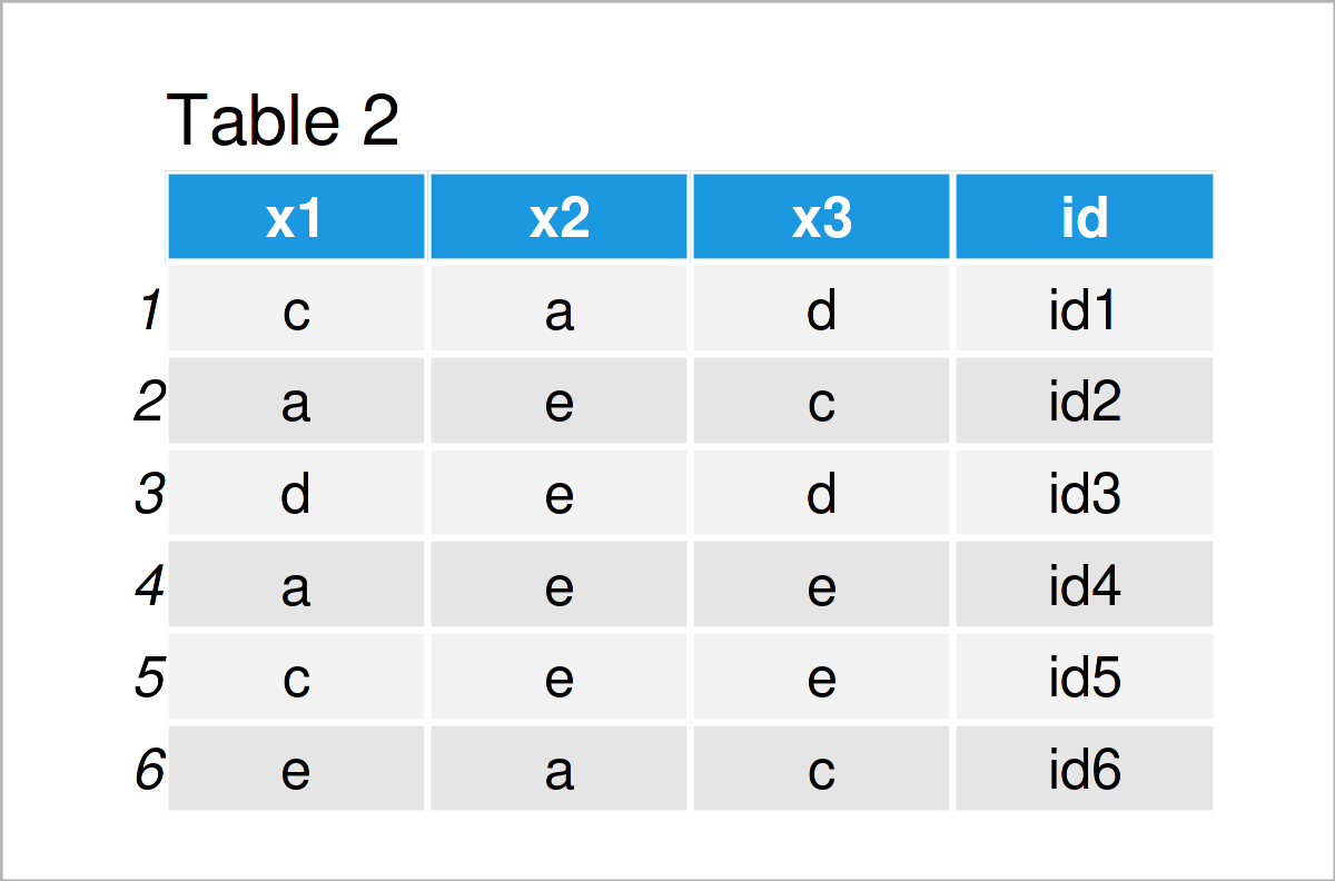
In Table 2 it is shown that we have created a new data frame based on the input data frame that is called pivot_longer.
In the next step, we can draw our data. For this, we’ll use the ggplot2 package. We first have to install and load the ggplot2 package:
install.packages("ggplot2")                      # Install & load ggplot2 package
library("ggplot2")
Next, we can draw a heatmap-like graph of our categorical data using the geom_tile function:
ggplot(data_long,                                # Draw heatmap-like plot
       aes(name, id, fill = value)) +
  geom_tile()

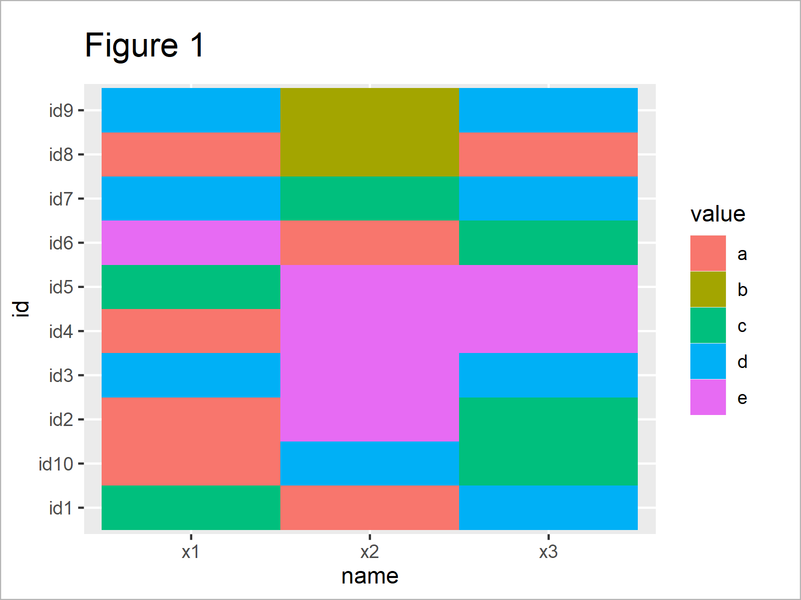
The output of the previous R syntax is shown in Figure 1 – A heatmap-like plot showing our categorical data.
Our categorical variables are represented on the x-axis, and the observations are represented on the y-axis.
The different categories of our variables are illustrated by the colors in the plot, as you also can see in the legend on the right side of the graphic.
Video, Further Resources & Summary
Do you need more information on the topics of this post? Then I can recommend having a look at the following video on my YouTube channel. In the video, I’m explaining the topics of the present post in a live session.
In addition, you may have a look at the other tutorials on my homepage. I have released numerous other tutorials about related topics such as factors, lines, and graphics in R:
- Draw ggplot2 Plot with Factor on X-Axis
- Draw Multiple Function Curves to Same Plot
- Draw ggplot2 Plot with Lines and Points
- Draw Vertical Line to X-Axis of Class Date in ggplot2 Plot
- Draw Multiple Variables as Lines to Same ggplot2 Plot
- Plots in R
- R Programming Language
In this R article you have learned how to draw a heatmap-like graphic of categorical variables. Don’t hesitate to kindly let me know in the comments section below, in case you have additional questions or comments.


