Draw ggplot2 Plot with Factor on X-Axis in R (Example)
This article shows how to create a ggplot2 graphic with a factor on the x-axis in R programming.
The tutorial consists of the following:
Let’s dive right in…
Example Data & Packages
The first step is to create some exemplifying data:
data <- data.frame(group = factor(letters[1:5]),  # Create example data
                   value = c(1, 4, 2, 5, 3))
data                                              # Print example data

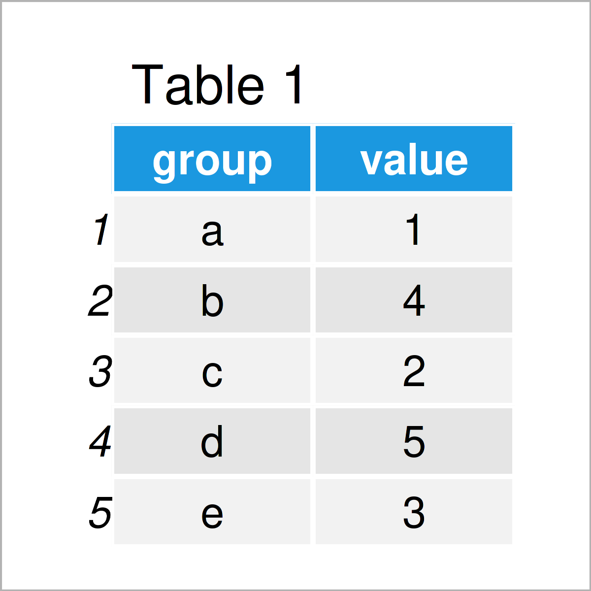
Have a look at the previous table. It shows that our example data consists of five rows and two columns. The column group has the factor class and the variable value has the numeric class.
If we want to use the functions of the ggplot2 package, we also need to install and load ggplot2:
install.packages("ggplot2")                       # Install & load ggplot2
library("ggplot2")
Let’s draw our data…
Example: Draw Line Plot with Factor on X-Axis Using geom_line() Function
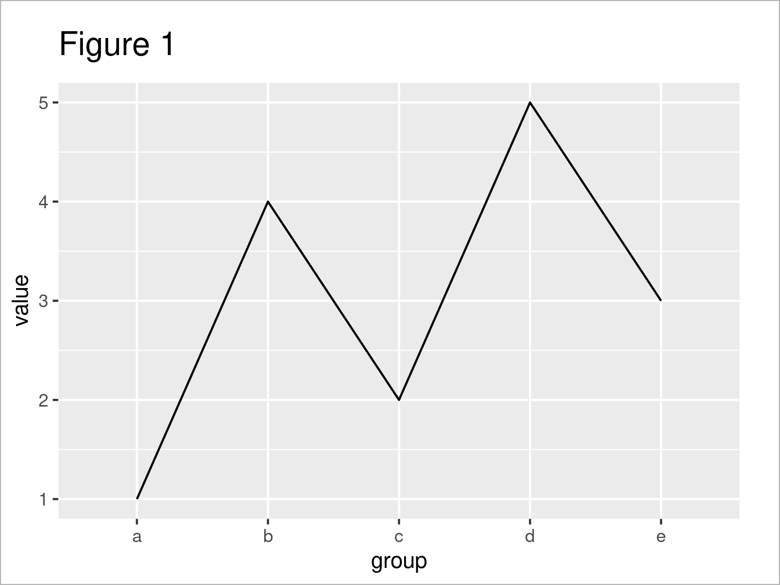
The following code explains how to create a ggplot2 line plot with factor levels on the x-axis using the geom_line function.
Consider the R code below:
ggplot(data,                                      # Draw line plot with factor on x-axis
       aes(x = group,
           y = value,
           group = 1)) +
  geom_line()

As shown in Figure 1, we have managed to create a ggplot2 line graph with factor levels on the x-axis.
Note that we have specified the group argument to be equal to 1. In case you want to draw multiple lines at once in the same ggplot2 plot, you would have to set the group argument to be equal to the variable which defines the lines.
Video, Further Resources & Summary
I have recently released a video on my YouTube channel, which explains the topics of this article. You can find the video instruction below.
In addition, you might have a look at the other articles on statisticsglobe.com. I have published several tutorials on similar topics such as graphics in R, ggplot2, and lines.
- Introduction to the ggplot2 Package
- Add Regression Line to ggplot2 Plot
- Draw ggplot2 Plot of Data Frame Subset
- Draw Vertical Line to X-Axis of Class Date in ggplot2 Plot
- Draw Dates to X-Axis of Plot in R
- Drawing Plots in R
- R Programming Overview
In this R programming tutorial you have learned how to draw a ggplot2 plot with a factor on the x-axis. In case you have any additional questions, tell me about it in the comments section below.


