Draw Multiple Variables as Lines to Same ggplot2 Plot in R (2 Examples)
In this tutorial you’ll learn how to plot two or more lines to only one ggplot2 graph in R programming.
The article is structured as follows:
You’re here for the answer, so let’s get straight to the exemplifying R syntax.
Example Data, Packages & Default Plot
The following data is used as basement for this R programming tutorial:
set.seed(6532465)                    # Create example data
data <- data.frame(x = 1:50,
                   y1 = sort(rnorm(50)),
                   y2 = sort(rnorm(50, 0.5)))
head(data)                           # Head of example data
#   x        y1         y2
# 1 1 -2.233737 -0.9549823
# 2 2 -1.836179 -0.9039053
# 3 3 -1.828040 -0.7433467
# 4 4 -1.691616 -0.6736192
# 5 5 -1.522380 -0.6325588
# 6 6 -1.437409 -0.6307781
Have a look at the previous output of the RStudio console. It shows that our example data consists of three columns. The variable x ranges from 1 to 50 and represents the x-axis values of our plot. The variables y1 and y2 represent the y-axis values of two different lines we will draw in this tutorial.
If we want to create a plot of our data with the ggplot2 package, we also have to install and load ggplot2:
install.packages("ggplot2")          # Install ggplot2 package
library("ggplot2")                   # Load ggplot2 package
Now, we can move on to the plotting of our data.
Example 1: Plotting Two Lines in Same ggplot2 Graph Using geom_line() Multiple Times
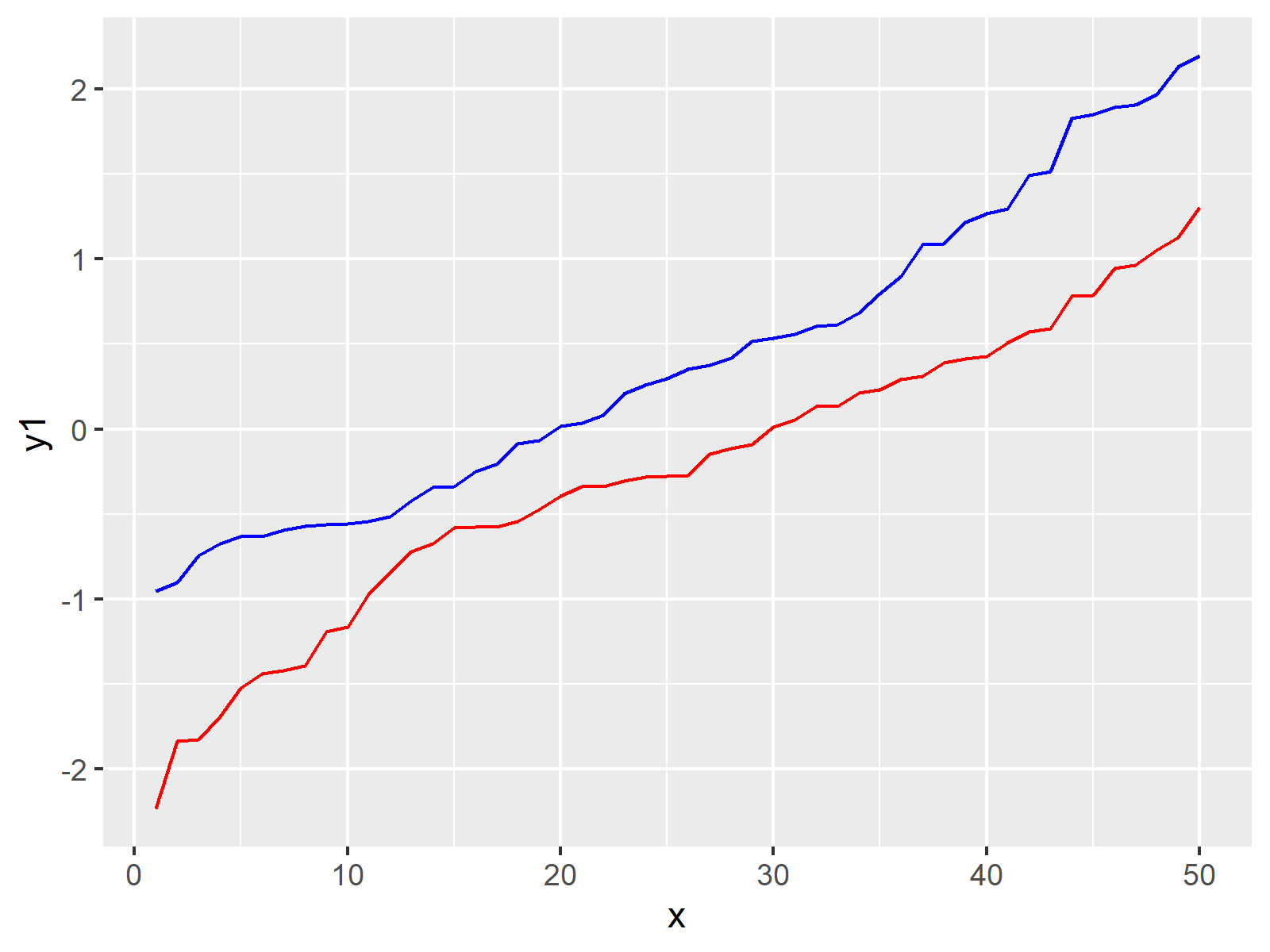
In this Example, I’ll illustrate how to draw two lines to a single ggplot2 plot using the geom_line function of the ggplot2 package. For this, we have to specify our x-axis values within the aes of the ggplot function. The values for the y-axis are specified within the two geom_line commands:
ggp1 <- ggplot(data, aes(x)) +       # Create ggplot2 plot
  geom_line(aes(y = y1), color = "red") +
  geom_line(aes(y = y2), color = "blue")
ggp1                                 # Draw ggplot2 plot

The output of the previous R programming syntax is shown in Figure 1: It’s a ggplot2 line graph showing multiple lines.
Example 2: Plotting Two Lines in Same ggplot2 Graph Using Data in Long Format
In Example 1 you have learned how to use the geom_line function several times for the same graphic. However, this methodology is not convenient for a large number of lines, since we would have to specify the geom_line function for each line we want to draw.
The following syntax shows a more general approach for the plotting of multiple lines for each group in a ggplot2 plot by reshaping our data frame from wide to long format.
We will use the functions of the reshape2 package to transform our data from wide to long format. Hence, we first have to install and load the reshape2 package:
install.packages("reshape2")         # Install & load reshape2 package
library("reshape2")
Now, we can convert our data from wide to long format as shown below:
data_long <- melt(data, id = "x")    # Convert data to long format
head(data_long)                      # Head of long data
#   x variable     value
# 1 1       y1 -2.233737
# 2 2       y1 -1.836179
# 3 3       y1 -1.828040
# 4 4       y1 -1.691616
# 5 5       y1 -1.522380
# 6 6       y1 -1.437409
Finally, we can use our long data to draw a ggplot2 graph containing multiple lines as shown below:
ggp2 <- ggplot(data_long,            # Create ggplot2 plot
               aes(x = x,
                   y = value,
                   color = variable)) +
  geom_line()
ggp2                                 # Draw ggplot2 plot

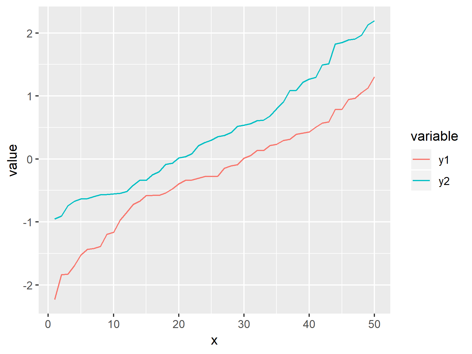
As shown in Figure 2, the previous R programming syntax created a similar ggplot2 plot as in Example 1. However, this time the R code is more general and can easily be applied to large data sets.
Video & Further Resources
In case you need further info on the R programming code of this article, you may have a look at the following video of my YouTube channel. In the video, I show the topics of this page.
Besides the video, you may want to read the related articles on this website. A selection of tutorials on related topics such as dates, graphics in r, regression models, and lines can be found below.
- Draw Multiple Graphs & Lines in Same Plot
- Add Regression Line to ggplot2 Plot
- Draw Time Series Plot with Events Using ggplot2 Package
- Draw Vertical Line to X-Axis of Class Date in ggplot2 Plot
- Draw Multiple Overlaid Histograms with ggplot2 Package
- Graphics Gallery in R
- R Programming Language
In this R tutorial you learned how to create a ggplot2 plot containing multiple lines with multiple groupings for the geom_line function. Don’t hesitate to let me know in the comments, in case you have further questions or comments. Besides that, please subscribe to my email newsletter for updates on new tutorials.


22 Comments. Leave new
I copied the procedure in your Example 1, and noticed my plots had color problems. I returned to your site, and see that your results have the same problems I did. Your seem to call for y1 to be red; however, the y1 line in the chart appears to be blue-green (not really even “blue”). Likewise, the other line appears switched and the legend appears to be mixed up as well. I am not sure yet what causes the problems.
Wow, thanks a lot for this! I didn’t notice this error in my code when I was creating the tutorial.
I have just adopted your code and have changed the graphic.
Thanks again!
Joachim
I think I found the correct program:
ggp1 <- ggplot(data, aes(x)) + # Create ggplot2 plot
geom_line(aes(y = y1), color = "red") +
geom_line(aes(y = y2), color = "blue")
ggp1 # Draw ggplot2 plot
Thanks a lot, I have just corrected my code (see comment above).
How do you deal with NA in your time series?
Hi,
You can either remove rows with missing data (see here: https://www.youtube.com/watch?v=q8eR2suCyGk), or you can impute your missing values (see here: https://statisticsglobe.com/missing-data-imputation-statistics/)
Regards,
Joachim
I want to determine structural breaks in mean and variance at the end of sample period that is outside the admissible region of (0.15T, 0.85T).
I want to determine the size of the breaks as well and estimate breaks size on forecasting as well. Any help?
Hey Sonwil,
Unfortunately, I’m not an expert on this topic. However, I have recently created a Facebook discussion group where people can ask questions about R programming and statistics. Could you post your question there? This way, others can contribute/read as well: https://www.facebook.com/groups/statisticsglobe
Regards
Joachim
This is a nice tutorial and has been very helpful. The only thing missing is how to plot a subsection of the y values. For example my long data set has six outcome variables which I want to look at in pairs rather than all at once. How would I specify only two rather than the whole data set?
Hey Daniel,
Thank you, glad you like the tutorial!
Regarding your question: One way to do this is to subset your data frame accordingly. For instance, you could extract all rows with the groups y1 and y2 from the long data set: data_long[data_long$variable %in% c(“y1” , “y2”), ]
Regards,
Joachim
Un excelente aporte, muchas gracias por brindar ayuda. Saludos
Thanks Walton, glad you like the tutorial!
I appreciate your help
I have a data set which contains 41 columns. First column is date and rest of the column represents places. I want to draw multiple lines(40 lines) using ggplt. I used the following code
library(reshape2) #
em <- melt(data, id = "date")
plot1 <- qplot(date, value, data = em, geom = "line", group = variable) +
facet_grid(variable ~ ., scale = "free_y")
ggsave("plot1.jpg",plot1, width = 6.5, height =6.5 )
But the resulting graph is too small. It does not give any information.
Can u give me some information how can I better my graph?
Hello Saima,
So does it mean that you get a graph that you want but the size is just too small?
Regards,
Cansu
Yes, the size of the graph is too small that I can’t get any information from it.
Hello Saima,
What about changing the width and height arguments in ggsave. As I can’t see the image here, I can’t help any further. If you can, please attach the image.
Regards,
Cansu
I can’t attach an image here. Can I send an image through joachim@statisticsglobe.com?
I don’t think so. If modifying ggsave does not help. See this solution.
Regards,
Cansu
Hallo. I have this data that I want to produce four graphs. That is a graph for every five timesteps. (This is just a sample. The data is very huge.) My problem is I can only produce the graphs if I change the data format and then change it to long data. Is there a way I can use loops and ggplot to do it?
Timestep Rate
0 -0.00061
1 -0.006777
2 -0.004195
3 -0.000712
4 0.003213
5 0.006641
6 0.009079
7 0.010617
8 0.011552
9 0.012175
10 0.012618
11 0.012815
12 0.012762
13 0.012649
14 0.012477
15 0.012268
16 0.012184
17 0.012238
18 0.012422
19 0.01265
20 0.012922
Hello,
Sorry for my late response. I was on vacation. Do you still need help?
Regards,
Cansu
Hi! I am currently trying to examine a dataset regarding which distribution fits it the best. Here I want to plot the histogram with the data, plot the density curve AND the fitted distribution. But when plotting the exponential distribution on top of the histogram and density curve it just lays in the bottom of the plot.. I guess it is because of the scale of the rate, but the rate is the one I get from using the fitdistr… However, I am not sure how to get around this problem.. do you have any suggestions?
Hello Mathilda,
It is strange. Can you share your code, please?
Regards,
Cansu