Draw ggplot2 Plot with Different Background Colors by Region in R (Example)
In this article, I’ll demonstrate how to create a ggplot2 graph with different background colors by region in the R programming language.
Table of contents:
Let’s dig in.
Example Data, Software Packages & Basic Graph
The following data will be used as basement for this R programming tutorial.
data <- data.frame(x = 1:10,                      # Create example data
                   y = 1:10)
data                                              # Print example data

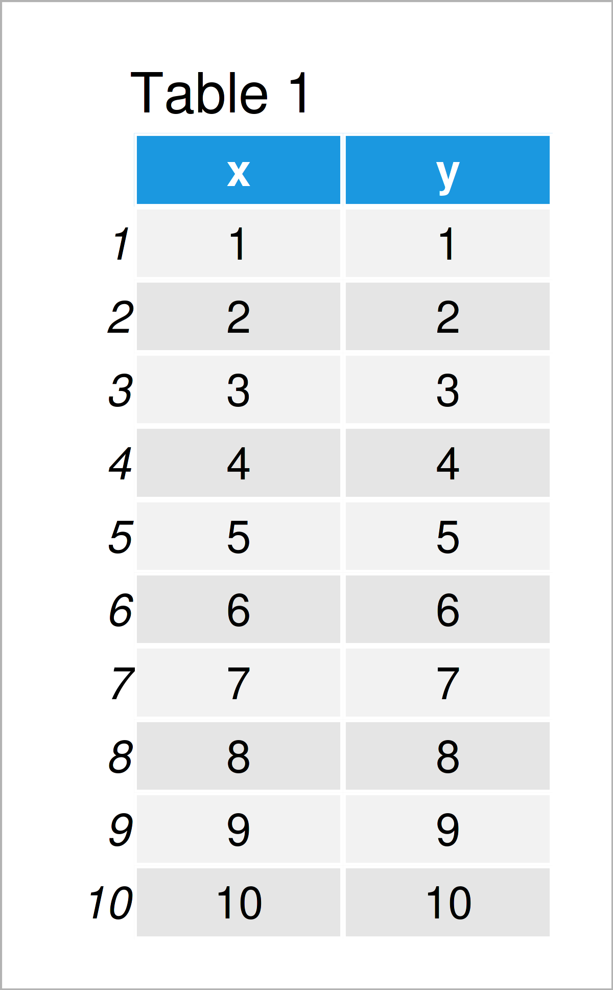
Table 1 shows the structure of the exemplifying data: It consists of ten rows and two integer columns that are called “x” and “y”.
We also have to install and load the ggplot2 package, to be able to use the corresponding functions:
install.packages("ggplot2")                       # Install & load ggplot2
library("ggplot2")
Next, we can draw our data:
ggplot(data, aes(x, y)) +                         # Draw default plot
  geom_point()

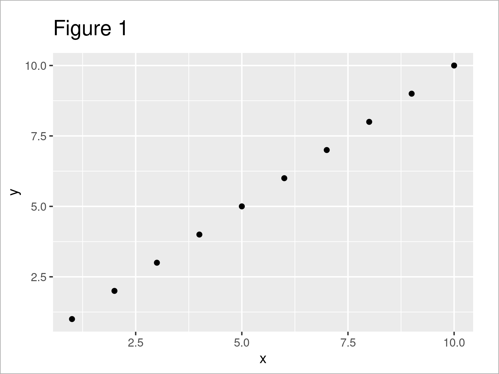
After executing the previous R syntax the scatterplot shown in Figure 1 has been created. As you can see, our plot does not have any additional background colors yet.
Let’s change this!
Example: Add Background Colors to ggplot2 Plot Using geom_rect() Function
The following R programming syntax shows how to assign certain background colors to particular areas in a ggplot2 plot.
For this, we first have to create a data frame containing the locations at which we want to switch from one color to another:
data_breaks <- data.frame(start = c(0, 2, 5, 9),  # Create data with breaks
                          end = c(2, 5, 9, 10),
                          colors = factor(1:4))
data_breaks                                       # Print data with breaks

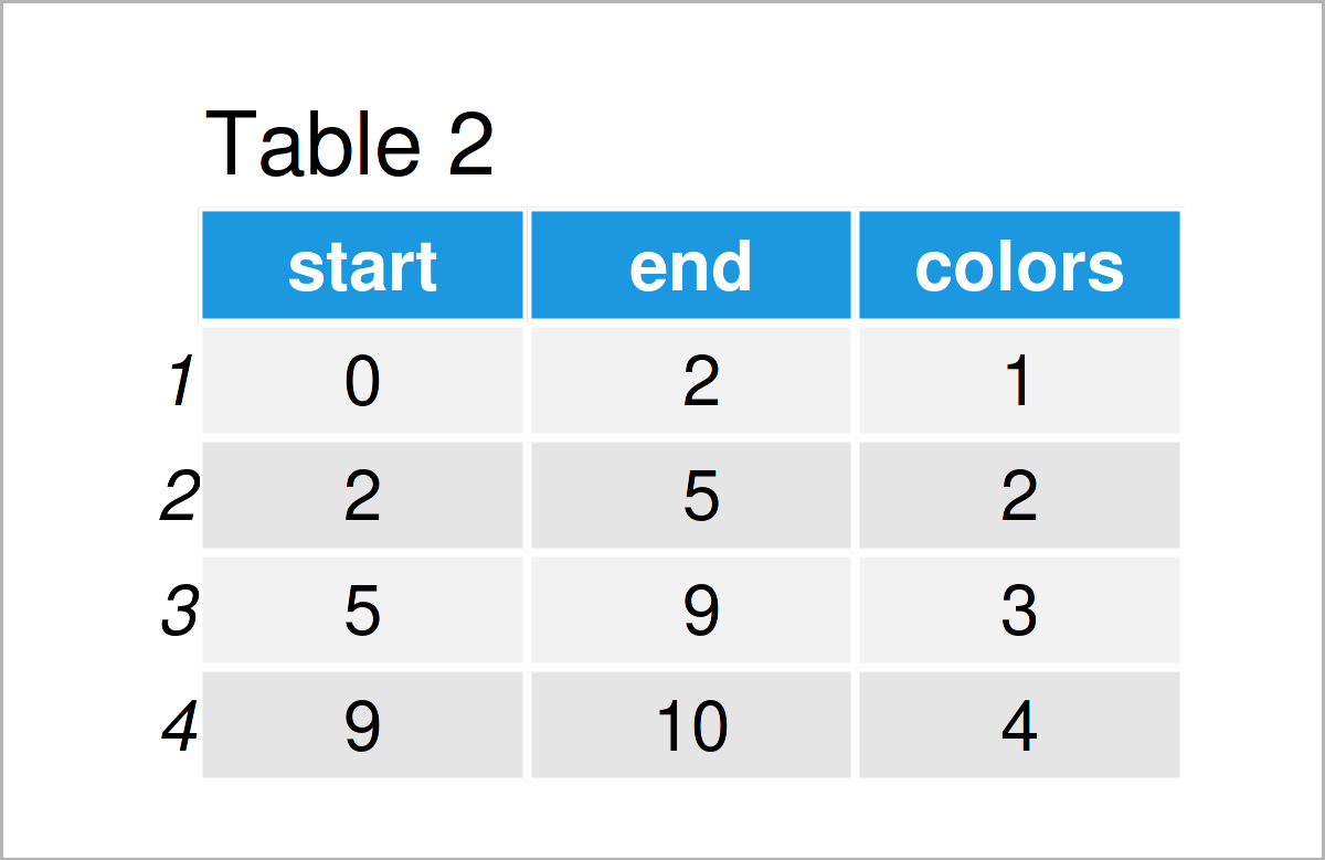
As shown in Table 2, the previous R code has created a data set with four color breaks.
Next, we can apply the geom_rect function to this data set to specify the background colors in our plot.
Have a look at the R syntax below:
ggplot() +                                        # Add background colors to plot
  geom_rect(data = data_breaks,
            aes(xmin = start,
                xmax = end,
                ymin = - Inf,
                ymax = Inf,
                fill = colors),
            alpha = 0.5) +
  geom_point(data = data, aes(x, y))

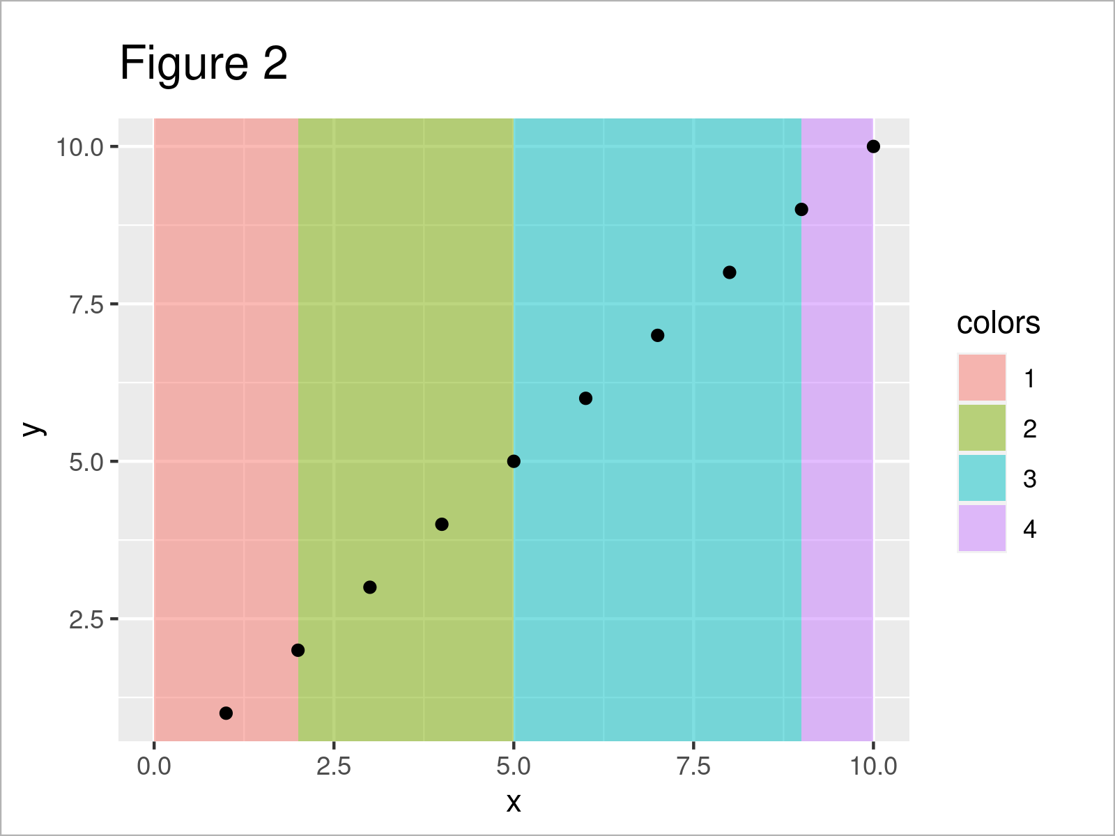
Figure 2 shows the output of the previous syntax: We have changed the background colors of four regions in our graphic.
Video, Further Resources & Summary
I have recently published a video on the Statistics Globe YouTube channel, which shows the R syntax of this article. You can find the video below.
Furthermore, you could have a look at some of the other tutorials on www.statisticsglobe.com. I have published several other articles about related topics such as ggplot2 and graphics in R.
- Change Background Color of ggplot2 Plot in R
- Add Image to Plot in R
- Draw ggplot2 Plot with Lines and Points
- ggplot2 Plot with Transparent Background
- Draw Dates to X-Axis of Plot
- Introduction – Create Graphics in R using the ggplot2 Package
- Draw Histogram with Different Colors
- Graphics Gallery in R
- R Programming Language
This page has shown how to draw a ggplot2 plot with multiple background colors for each portion of the plot in R.
Note that we have colored each plot region differently in the present tutorial. However, we could also use the shown R syntax to perform other tasks such as adding shade between two vertical lines.
In case you have any further questions, please let me know in the comments section.


19 Comments. Leave new
How can we manually choose the colors of each region?
Hey Chris,
You can accomplish that using the scale_fill_manual function. Have a look at the following example code:
Regards,
Joachim
Hi Joachim,
Thank you, this is very helpful!
How can we inverse the order of the colours only on the legend? So for the scale_fill_manual example in the previous comment, the graph background colours would stay the same but, in the legend, red would be first and blue last. I’ve tried using levels like in your ‘Change Display Order of ggplot2 Plot Legend’ video but I don’t seem to be using it right.
And another question: how do we plot a line on top? I’m trying to do so with the code: geom_smooth(formula = y ~ x, method = “lm”, color = “seagreen”, size = 1.7)
but it doesn’t appear. Any advice?
I can share pictures of my graphs and the line I’m trying to add if that’s helpful.
Thanks in advance!
Hey Flo,
You are very welcome, glad it was useful!
I just came back from vacation. Do you still need help with your question?
Regards,
Joachim
Hey Joachim!
I hope you had a nice vacation 🙂
The graph I made is actually part of my MSc thesis, which is due in three days. If you have the time, your help would still be much appreciated, but otherwise that’s no problem. The regression line on top of the colourful plot is a “nice to have.”
Kind regards,
Flo
Thanks, the vacation was very nice! 🙂
I assume the problem is that you have not specified the correct data within the geom_smooth function (note the difference between “data” and “data_breaks”). Please have a look at the modified example below:
I hope that helps, and I wish you the best for your MSc thesis!
Regards,
Joachim
I have just noticed that you also had a question regarding the display order of the legend. You can reverse the order of the background color legend as shown below:
Your question has also inspired me to create a new tutorial on how to reverse ggplot2 legends. You can find the tutorial here.
Regards,
Joachim
Thank you so much Joachim!
Well spotted for the missing geom_smooth function specification.
Your response and new tutorial on reversing ggplot2 legends are also appreciated.
I’ll be giving you and Statistics Globe a shout-out in my MSc thesis acknowledgments 🙂
All the best,
Flo
Wow thanks a lot, this is very kind! 🙂 What’s the topic of your thesis by the way?
My thesis is titled “Impacts on the Blue Carbon Potential of Macroalgae.” It essentially looks at how the carbon storage ability of coastal, shallow-water macroalgae is reduced when human impacts increase.
I’d be more than happy to share it with you so that you can see all the cool graphs you and your videos helped me make using ggplot in R 😉
Sounds interesting, I’d be happy to have a look, even though I’m coming from a completely different background (Survey Statistics).
It would be great if you could share a link or so once it’s finished! 🙂
Thanks for your interest and thanks again for your help!
You can access it at this link 🙂
Hey Flo,
Thanks a lot for sharing this link, and congratulations on finishing your Master thesis!
I agree, the graphics look amazing! 🙂 It’s really great to see that R can be applied to such different research fields.
Would you maybe be interested to share some of your work on Statistics Globe? I’ve send you an email regarding this.
Regards,
Joachim
Hi!
This is very intereseting and useful to an R newbie, thank you very much! 🙂
How would you color different background regions for a lollipop-plot where the y-axis holds categorical variables, and the x-axis continuous?
In my case I facet_wrap (‘freey’) the data in 3 main categories on the y-axis, and there is 12 sub categories within each main category. In other words there is 3 rows and 1 column with one main category per row.
I would like to have a light grey color for sub category 1-3 within each main category, and the same light grey color for sub category 7-9 as well.
I would also like to make another plot with 3 main categories and 6 sub categories within each main category. In that case it would be nice to only have a light grey background color for sub category 1-3 for each main category. I hope I managed to explain this well enough, and I would be thankful if you have any suggestions on this matter! 😉
Kind regards
John
Hey John,
Thank you very much for the kind comment!
Could you please share your code and illustrate the structure of your data in some more detail? What is returned when you execute head(your_data)? This would make it much easier for me to reproduce your situation. 🙂
Regards,
Joachim
Hi! Very good explanation on how to add a background. I have a trouble however in that my x-axis is discrete – I have 4 discrete strings of character on my x-axis and would like to colour from 0 to the middle between tick 2 and 3 and from the middle of tick 2 and 3 to the end of the plot (so two different colours, to be able to differentiate the conditions (it is a boxplot, I have colours in the boxplot already for male and female, so cannot colour the boxplots but was thinking of colouring the background to distinguish the two conditions). Do you think this is possible in that case, or does it not work for discrete string x-axis?
Hey Zoé,
Thank you very much for the kind words, glad you find the tutorial helpful!
Regarding your question, I think this thread on Stack Overflow shows a solution.
I hope that helps!
Joachim
Hi I might be coming a bit late to this, but is there away to color more than just different sections of the X axis. Could you make a certain box of the graph colored by specifying some Y coordinates as well for the color?
Hello Dan,
You can check this page to color your background given the x and y coordinates.
Regards,
Cansu