Change Legend Labels of ggplot2 Plot in R (2 Examples)
In this post, I’ll explain how to modify the text labels of a ggplot2 legend in R programming.
The tutorial will consist of these content blocks:
Let’s start right away!
Exemplifying Data, Add-On Packages & Basic Graphic
Consider the exemplifying data below.
data <- data.frame(x = 1:6,                            # Create example data
                   y = 1,
                   group = as.factor(letters[1:3]))
data                                                   # Print example data

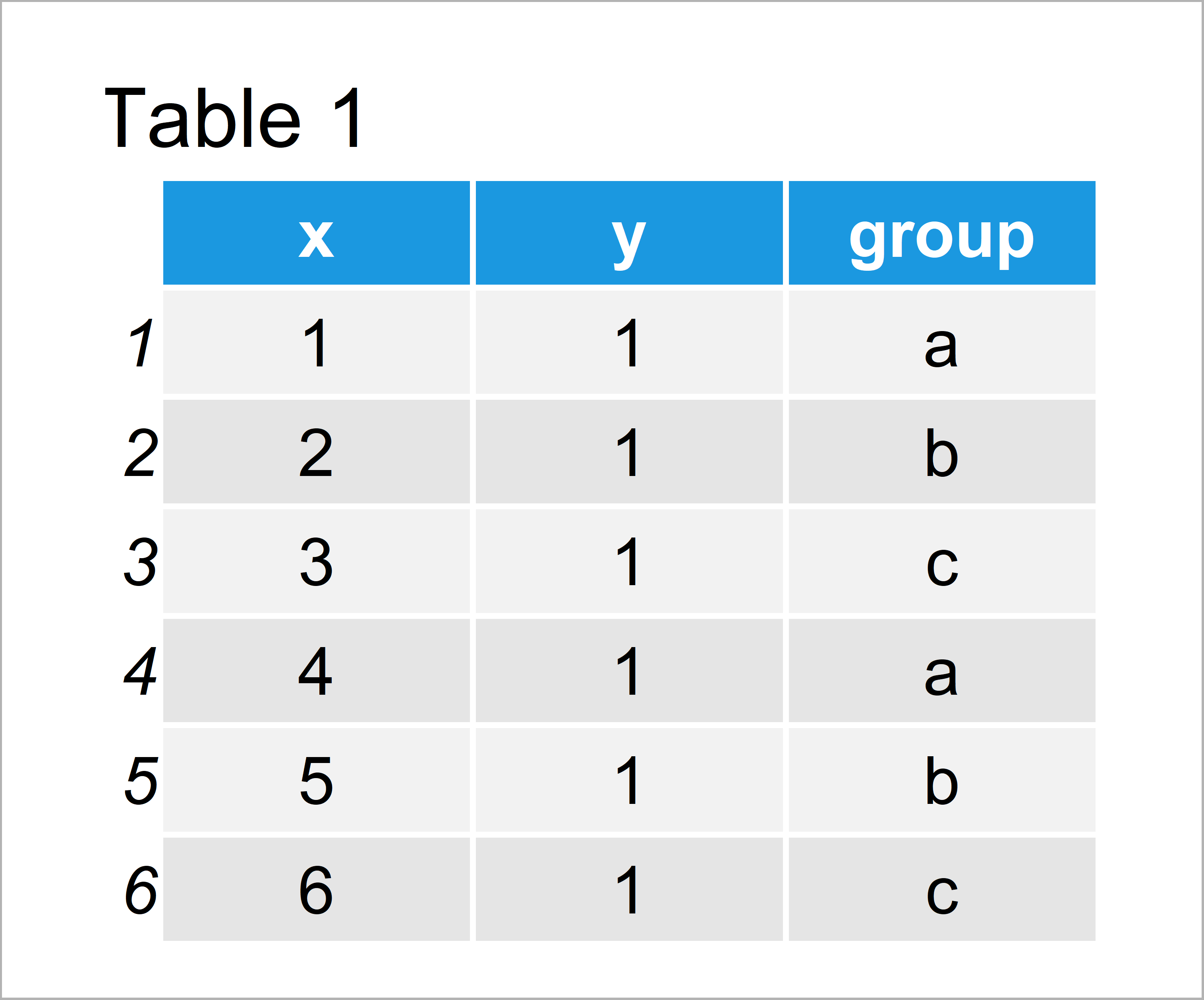
Table 1 illustrates that our example data comprises six rows and three variables. The variables x and y contain numeric values and the groups are defined by the group variable.
If we want to use the commands and functions of the ggplot2 package, we also need to install and load ggplot2:
install.packages("ggplot2")                            # Install ggplot2 package
library("ggplot2")                                     # Load ggplot2
Now, we can draw our data as follows:
ggp <- ggplot(data, aes(x, y, col = group)) +          # Create default ggplot2 plot
  geom_point()
ggp                                                    # Draw ggplot2 plot

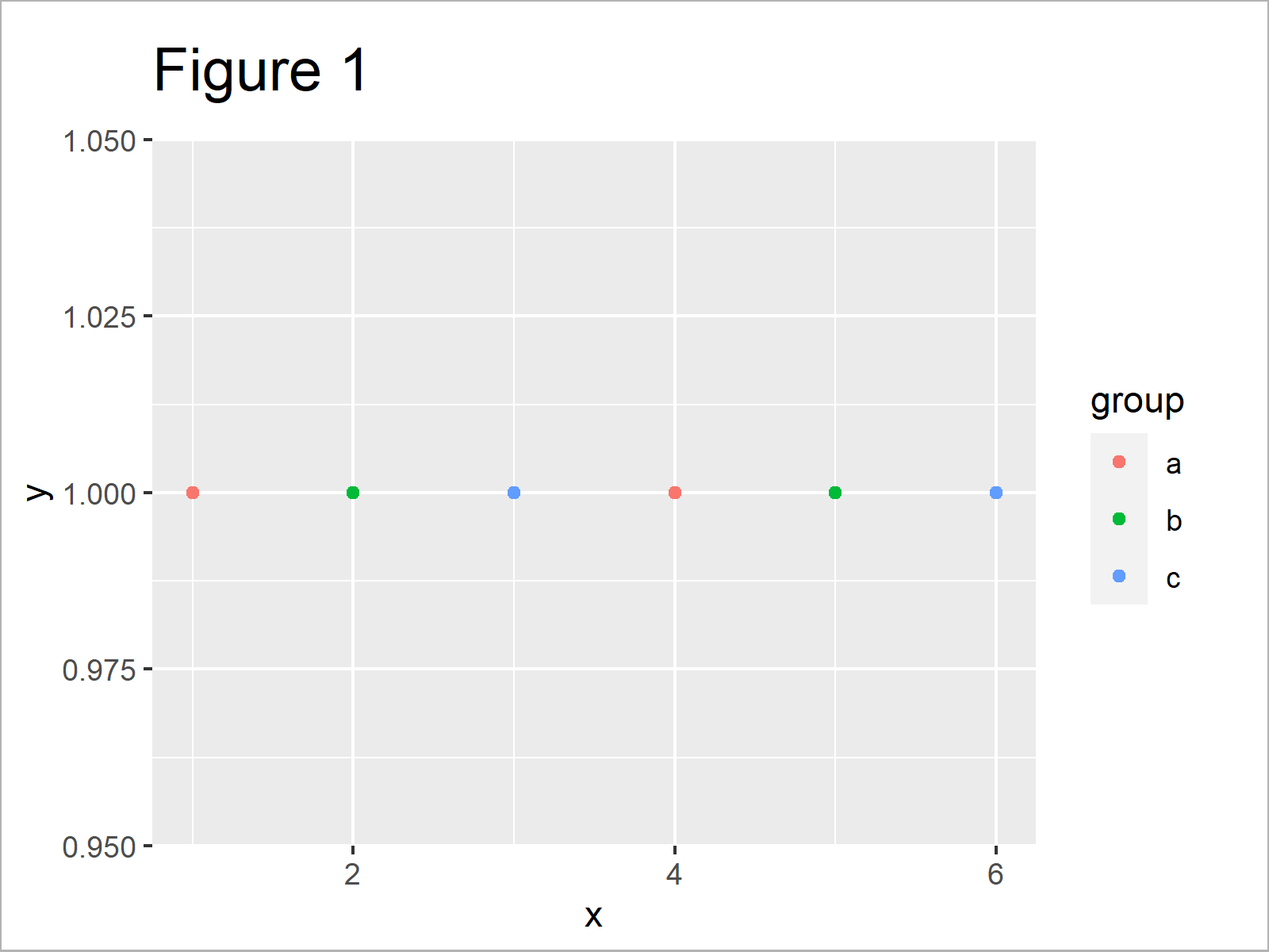
As shown in Figure 1, we have created a ggplot2 scatterplot with default legend items.
Example 1: Change Legend Labels of ggplot2 Plot Using scale_color_manual Function
Example 1 explains how to adjust the legend items using the scale_color_manual function of the ggplot2 package:
ggp +                                                  # Modify labels and colors
  scale_color_manual(labels = c("Group 1", "Group 2", "Group 3"),
                     values = c("red", "blue", "green"))

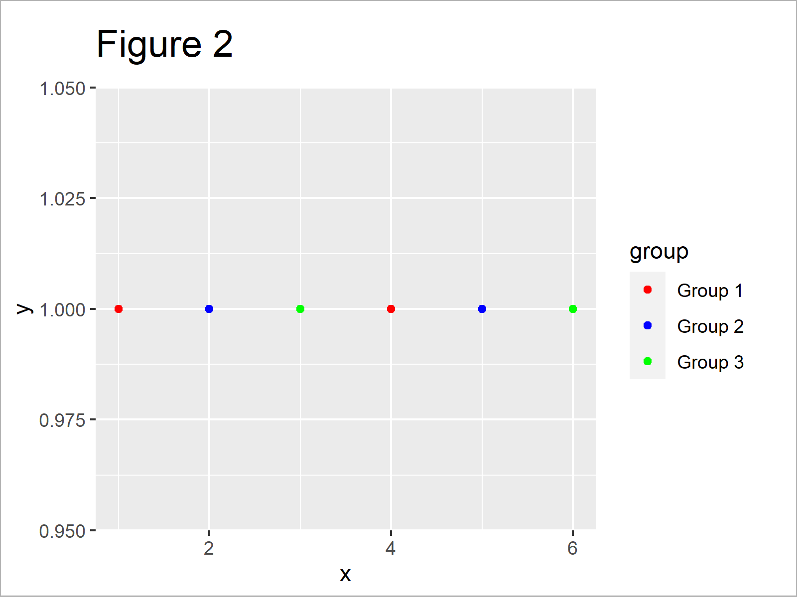
As shown in Figure 2, we have modified the text of the legend items with the previous R programming code. Note that the previous R code also change the color of the data points in our scatterplot.
Example 2: Rename Factor Levels to Change Legend Labels of ggplot2 Plot
In case we want to keep the default color palette of the ggplot2 package when changing the legend labels, we can manipulate our data frame in the forefront:
data_new <- data                                       # Duplicate data
levels(data_new$group) <- list("Group 1" = "a",        # Change factor levels
                               "Group 2" = "b",
                               "Group 3" = "c")
Now, we can use the new data frame as basement for our ggplot2 plot:
ggp_new <- ggplot(data_new, aes(x, y, col = group)) +  # Recreate ggplot2 plot
  geom_point()
ggp_new                                                # Draw updated ggplot2 plot

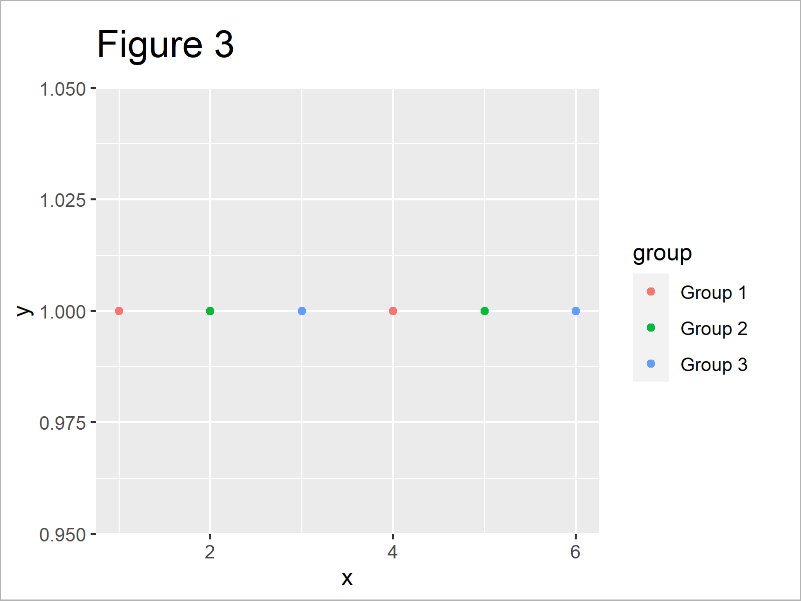
As shown in Figure 3, the previous syntax plotted our new data frame, i.e. the same data points with the same colors, but with different legend text.
Video & Further Resources
Do you need further explanations on the topics of this tutorial? Then you may want to watch the following video tutorial which I have published on my YouTube channel. I’m explaining the examples of this article in the video instruction:
In addition to the video, I can recommend reading some of the other articles on this website:
- Set Legend Alpha of ggplot2 Plot in R
- Change Background Color of ggplot2 Plot
- Change Colors in ggplot2 Line Plot in R
- Change Labels of ggplot2 Facet Plot in R
- Change Spacing Between Horizontal Legend Items of ggplot2 Plot
- Plotting Data in R
- The R Programming Language
To summarize: You learned in this tutorial how to change the item text of a ggplot2 legend in the R programming language. Let me know in the comments, in case you have any further comments and/or questions.
Subscribe to the Statistics Globe Newsletter
Get regular updates on the latest tutorials, offers & news at Statistics Globe.
I hate spam & you may opt out anytime: Privacy Policy.
Thank you!
Welcome to the Statistics Globe newsletter. From now on, I’ll send you regular emails about statistics, data science, AI, and programming with R and Python.
I’m Joachim Schork. On this website, I provide statistics tutorials as well as code in Python and R programming.
Statistics Globe Newsletter
Get regular updates on the latest tutorials, offers & news at Statistics Globe. I hate spam & you may opt out anytime: Privacy Policy.
Thank you!
Please check your email inbox and click the confirmation link to complete your subscription. If you don’t see the email within a few minutes, please also check your spam/junk folder.


