Draw Histogram with Different Colors in R (2 Examples)
In this article you’ll learn how to plot a histogram with multiple colors in the R programming language.
The article contains the following content:
Let’s get started!
Creation of Example Data
Have a look at the following example data:
set.seed(56390)                                      # Create example data
data <- data.frame(x = rnorm(100))
head(data)                                           # Print head of example data
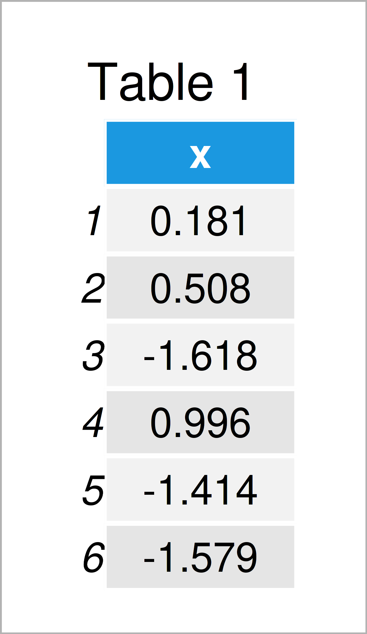
As you can see based on Table 1, our example data is a data frame comprising the column “x”.
Example 1: Draw Histogram with Different Colors Using Base R
The code below illustrates how to plot a histogram with multiple different colors using the basic installation of the R programming language.
Let’s start by drawing a histogram without colors:
hist(data$x) # Base R histogram without colors
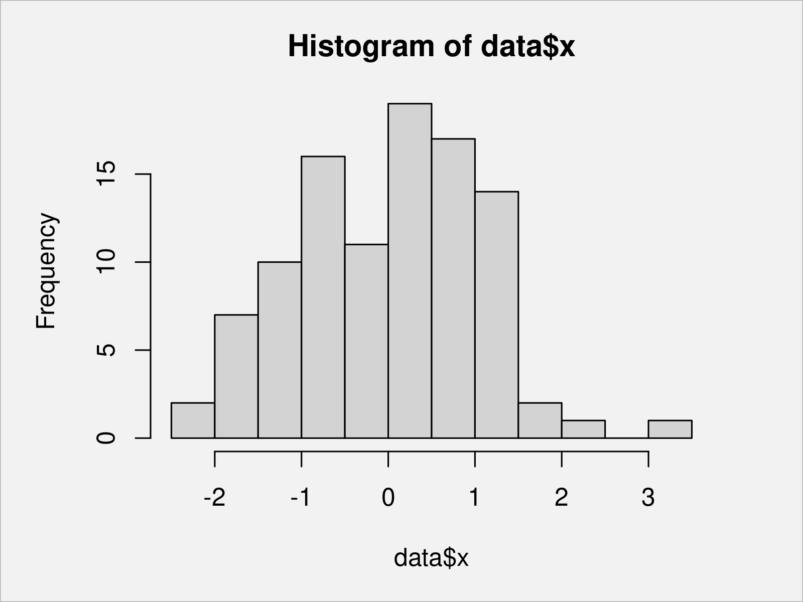
Figure 1 shows the output of the previous R code – We have used the hist function to draw a Base R histogram with default color specifications.
We can use the output of the hist function to extract the breaks of our histogram bars:
my_breaks <- hist(data$x)$breaks                     # Extract breaks
my_breaks                                            # Print breaks
#  [1] -2.5 -2.0 -1.5 -1.0 -0.5  0.0  0.5  1.0  1.5  2.0  2.5  3.0  3.5
Next, we can create a vector of hex color codes that specifies a color for each of our breaks:
my_colors <- rep("#1b98e0", length(my_breaks))       # Specify colors corresponding to breaks
my_colors[my_breaks > - 1 & my_breaks <= 0.5] <- "#f6f805"
my_colors[my_breaks > 0.5] <- "#353436"
my_colors                                            # Print colors corresponding to breaks
#  [1] "#1b98e0" "#1b98e0" "#1b98e0" "#1b98e0" "#f6f805" "#f6f805" "#f6f805" "#353436" "#353436" "#353436" "#353436" "#353436" "#353436"
The previous R code has created a vector of colors with the same length as our vector of breaks. Note that we could have specified fixed color names instead of hex color codes as well (e.g. “red”, “yellow”, blue”, “green”, and so on).
We can now use our breaks and colors to create a Base R histogram with different colors:
hist(data$x,                                         # Base R histogram with colors
     breaks = my_breaks,
     col = my_colors)

After running the previous R programming syntax, the histogram with several color sections shown in Figure 2 has been plotted.
Example 2: Draw Histogram with Different Colors Using ggplot2 Package
The R code below illustrates how to use the ggplot2 package to draw a histogram with different colors in R.
First, we have to install and load the ggplot2 package:
install.packages("ggplot2")                          # Install & load ggplot2 package
library("ggplot2")
Next, we have to create a group indicator for the value ranges corresponding to the different color sections:
my_groups <- rep("A", nrow(data))                    # Specify groups for different colors
my_groups[data$x > - 1 & data$x <= 0.5] <- "B"
my_groups[data$x > 0.5] <- "C"
In the next step, we have to create a data frame containing our values and the corresponding groups:
data_ggp <- data.frame(x = data$x,                   # Create data frame with values & groups
                       my_groups = my_groups)
head(data_ggp)                                       # Print head of new data frame
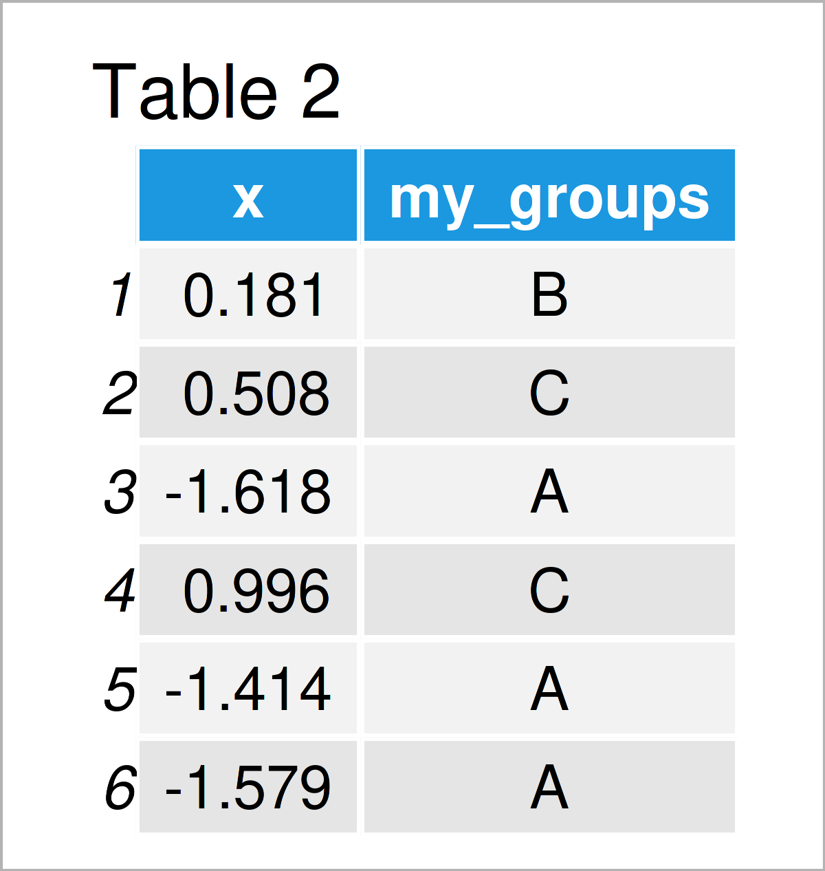
The output of the previous R syntax is shown in Table 2 – We have created a data frame with our values and our groups.
Now, we can use this data frame to draw a ggplot2 histogram with various colors:
ggp <- ggplot(data_ggp, aes(x, fill = my_groups)) +  # Create ggplot2 histogram with default colors
  geom_histogram()
ggp                                                  # Draw ggplot2 histogram with default colors
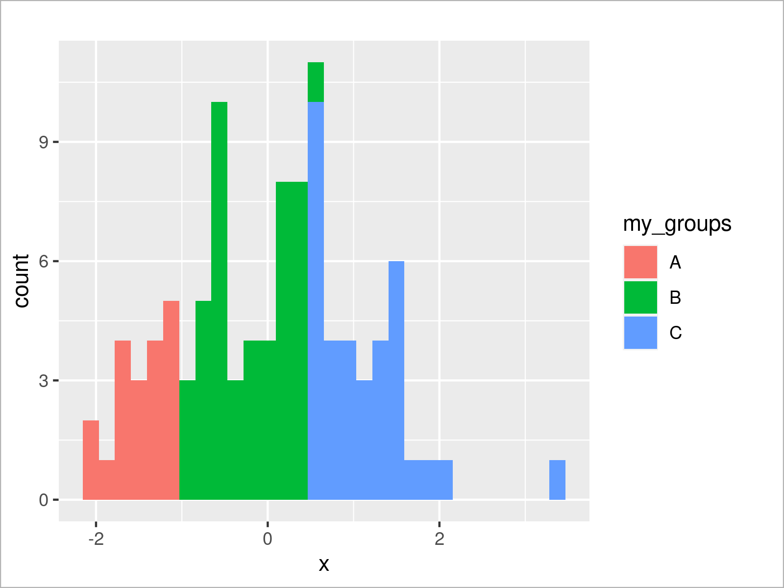
The output of the previously shown syntax is revealed in Figure 3: A ggplot2 histogram with three different color regions.
The colors of the previous graphic have been selected based on the default color palette of the ggplot2 package.
However, we can change the colors of our ggplot2 histogram using the scale_fill_manual function as shown below:
ggp +                                                # Draw ggplot2 histogram with manual colors
  scale_fill_manual(values = c("A" = "#1b98e0",
                               "B" = "#f6f805",
                               "C" = "#353436"))
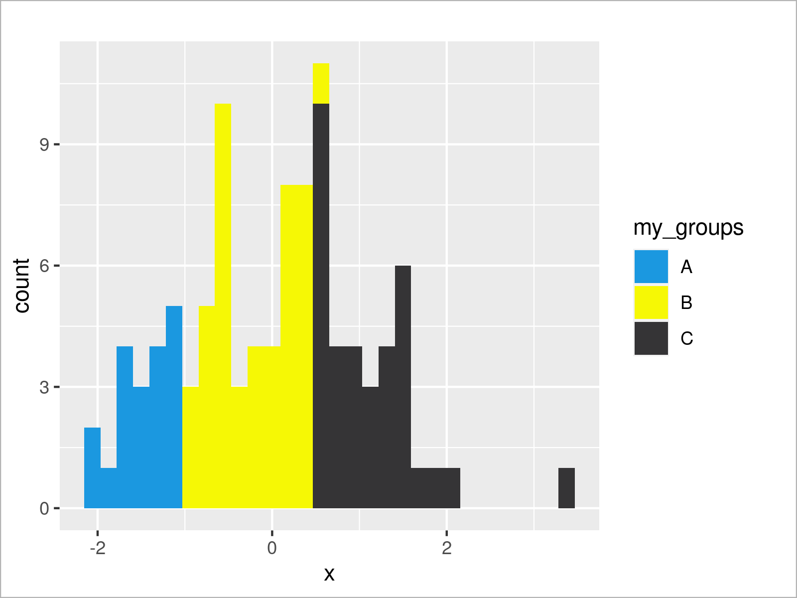
By running the previous R code we have plotted Figure 4, i.e. a ggplot2 histogram with different colors that have been manually specified.
Video & Further Resources
Have a look at the following video on my YouTube channel. I’m explaining the R syntax of this page in the video:
In addition, you could read some of the related posts on Statistics Globe:
- Draw Histogram with Percentages Instead of Frequency Counts in Base R
- Draw Histogram with Logarithmic Scale
- Different Colors of Points & Lines in Base R Plot Legend
- Graphics Overview in R
- R Programming Examples
This article has demonstrated how to draw a histogram with different colors in R programming. Don’t hesitate to let me know in the comments, in case you have additional questions. Besides that, don’t forget to subscribe to my email newsletter to get updates on the newest tutorials.
Subscribe to the Statistics Globe Newsletter
Get regular updates on the latest tutorials, offers & news at Statistics Globe.
I hate spam & you may opt out anytime: Privacy Policy.
Thank you!
Please check your email inbox and click the confirmation link to complete your subscription. If you don’t see the email within a few minutes, please also check your spam/junk folder.
I’m Joachim Schork. On this website, I provide statistics tutorials as well as code in Python and R programming.
Statistics Globe Newsletter
Get regular updates on the latest tutorials, offers & news at Statistics Globe. I hate spam & you may opt out anytime: Privacy Policy.
Thank you!
Please check your email inbox and click the confirmation link to complete your subscription. If you don’t see the email within a few minutes, please also check your spam/junk folder.


2 Comments. Leave new
Hey! Any chance you know how to plot the relative percentages? For example, the percent of the distribution where x > 0.5 (e.g., the black bars in the last plot)? I’ve tried a bunch of things, but can’t seem to get it right.
Hey Kirsten,
I’m not sure if I get your question correctly. Do you want to assign colors depending on the values on the x-axis? Please clarify 🙂
Regards,
Joachim