Combine Table & Plot in Same Graphic Layout in R (Example)
In this tutorial, I’ll illustrate how to arrange plots and tables in the same grid layout in the R programming language.
The tutorial is structured as follows:
Let’s get started…
Example Data, Software Packages & Default Plot
The first step is to define some data that we can use in the examples later on:
data <- data.frame(x = 1:9,                         # Create example data frame
                   y = c(1, 5, 2, 5, 5, 2, 1, 2, 1),
                   group = LETTERS[1:3])
data                                                # Print example data frame
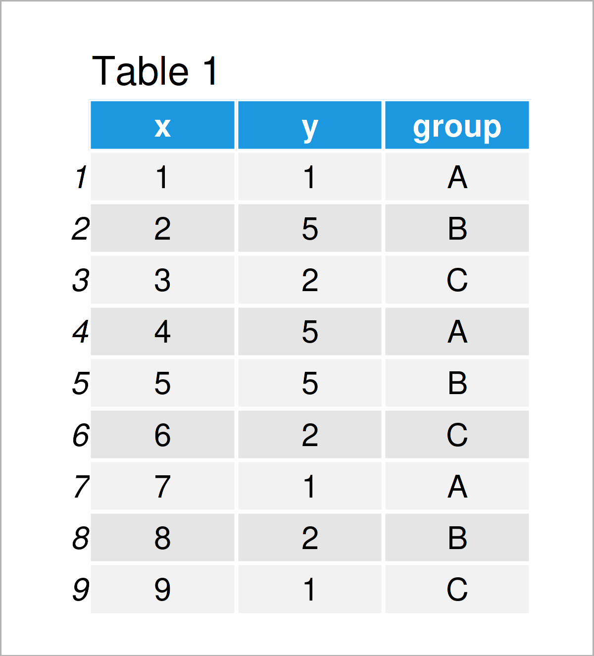
Have a look at the previous table. It shows that our example data consists of nine rows and three variables.
Next, I’ll explain how to draw a grid of plots and tables based on these data.
Example: Draw Plot & Table Using ggplot2, ggpmisc & patchwork Packages
In this example, I’ll demonstrate how to combine multiple plots and tables in the same graphical layout side-by.side.
For this example, we first need to install and load the ggplot2 package:
install.packages("ggplot2")                         # Install & load ggplot2
library("ggplot2")
Now, we can draw our data as shown below:
ggp <- ggplot(data,                                 # Create ggplot2 plot
              aes(x = x,
                  y = y,
                  color = group)) +
  geom_point(size = 3)
ggp                                                 # Draw ggplot2 plot
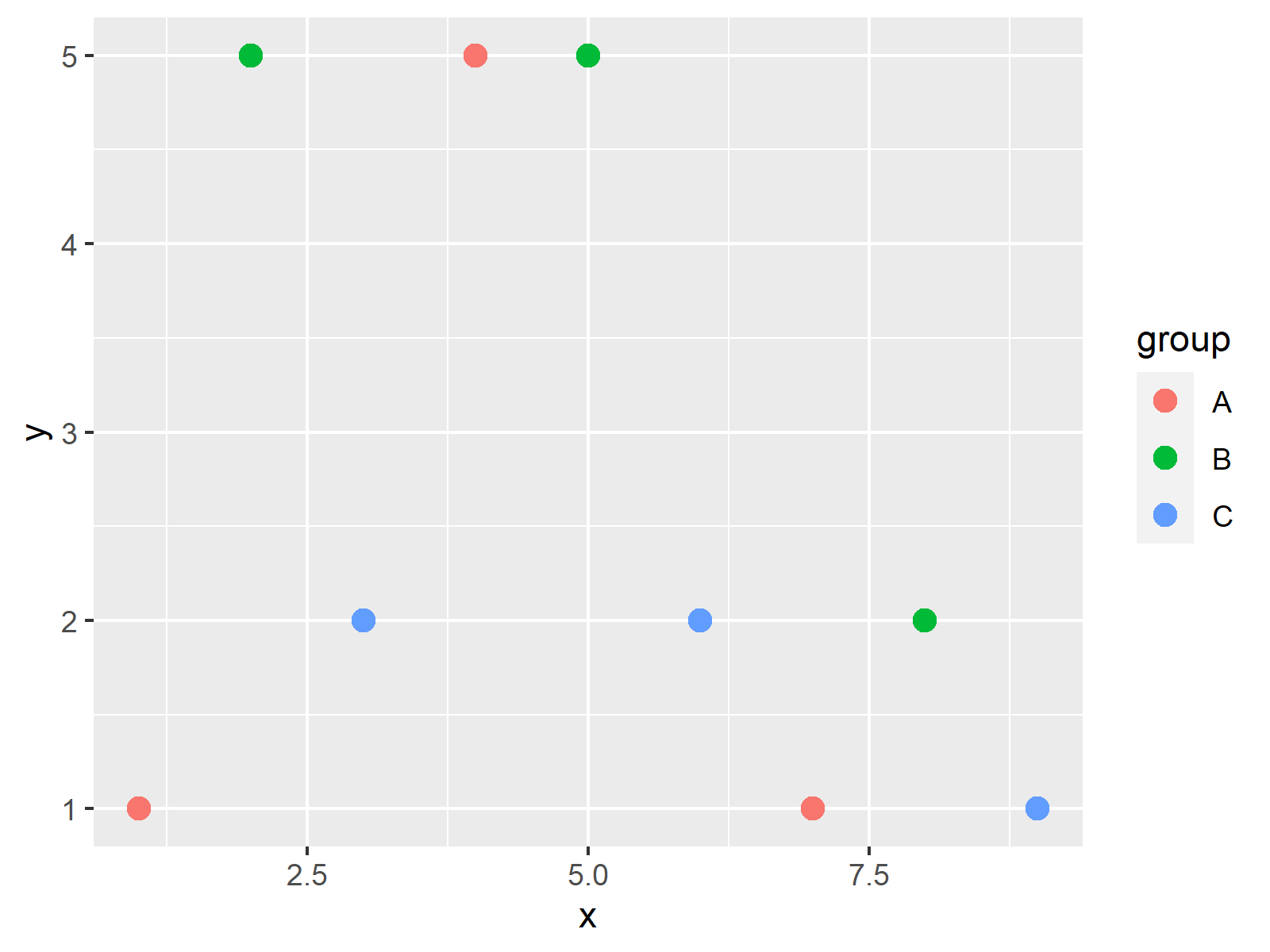
As shown in Figure 1, we have created a new ggplot2 scatterplot.
Next, let’s create a contingency table based on the columns y and group:
my_table <- as.data.frame(table(data[ , c(2, 3)]))  # Create example table
my_table                                            # Print example table
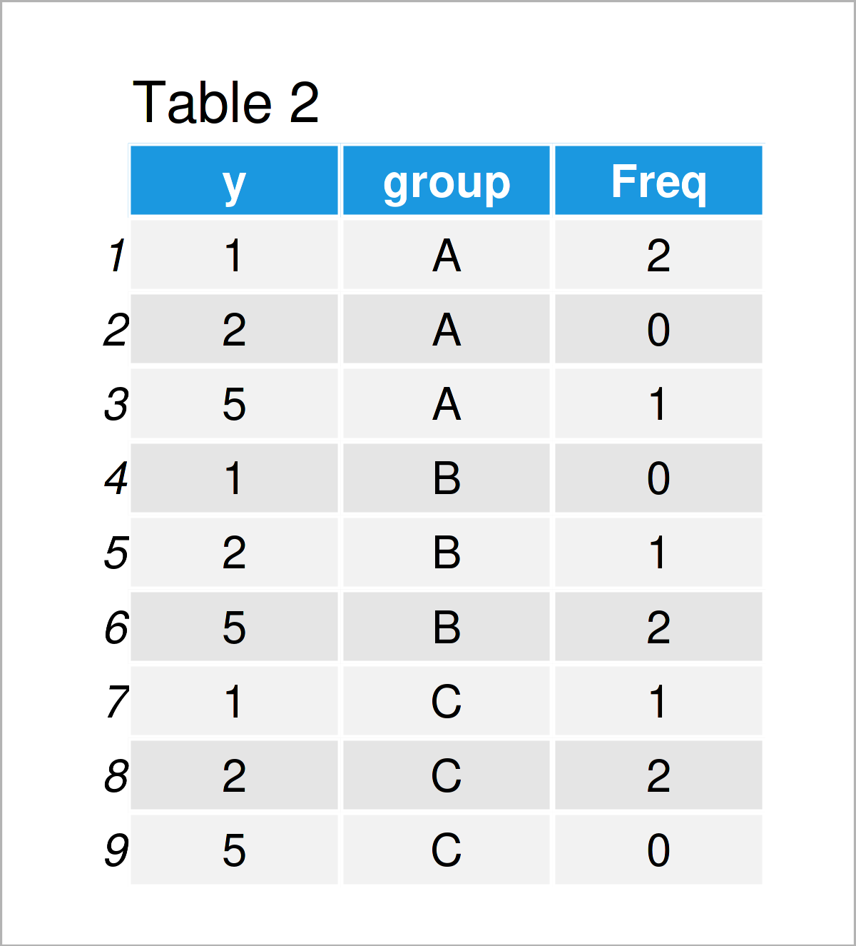
As shown in Table 2, we have created a new contingency table that shows the frequencies of the combinations of our variables y and group.
In the next step, we have to create a plot object that contains only this table.
For this, we need to install and load the ggpmisc package:
install.packages("ggpmisc")                         # Install & load ggpmisc package
library("ggpmisc")
Next, we can draw our table within an empty ggplot2 plot:
ggp_table <- ggplot() +                             # Create empty plot with table
  theme_void() +
  annotate(geom = "table",
           x = 1,
           y = 1,
           label = list(my_table))
ggp_table                                           # Draw empty plot with table
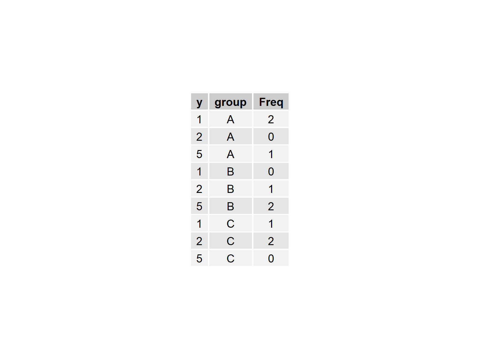
The previous figure shows our empty plot with our contingency table inside.
Now, we can combine our plot and table in a grid layout using the patchwork package.
First, we need to install and load the patchwork package:
install.packages("patchwork")                       # Install & load patchwork
library("patchwork")
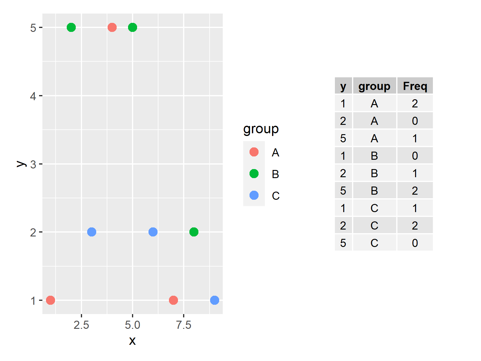
Next, we may draw our plot and table horizontally side-by-side to each other:
ggp + ggp_table # Plot and table side-by-side
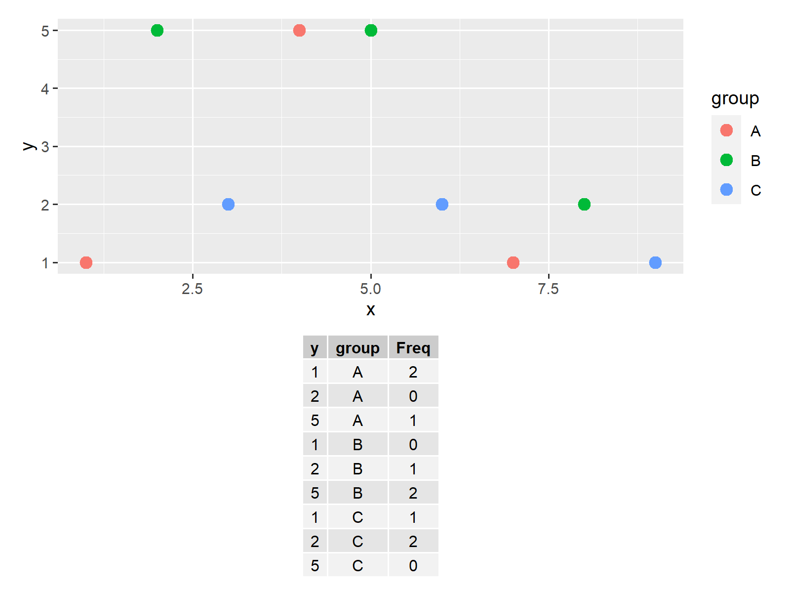
We may also combine our plot and table vertically:
ggp / ggp_table # Combine plot and table vertically
Note that we could add even more tables and graphics to this layout.
Video, Further Resources & Summary
In case you need more explanations on the R programming syntax of this article, I recommend having a look at the following video on my YouTube channel. In the video tutorial, I show the R syntax of this article in RStudio:
Furthermore, you could read some of the related tutorials on my website. Some tutorials about similar topics such as time objects, graphics in R, and plot legends are listed below.
- Draw Legend Outside of Plot Area in Base R Graphic
- Draw Table in Plot in R
- Draw Multiple Function Curves to Same Plot
- Draw Multiple Time Series in Same Plot
- Drawing Plots in R
- The R Programming Language
To summarize: In this tutorial you have learned how to combine plots and tables in the same grid layout in the R programming language. If you have further questions, let me know in the comments. Furthermore, don’t forget to subscribe to my email newsletter to receive updates on the newest tutorials.


