R ggplot2 Error: Continuous value supplied to discrete scale (2 Examples)
In this article, I’ll show how to handle the “Error: Continuous value supplied to discrete scale” in the R programming language.
The tutorial will consist of these topics:
Let’s dig in…
Exemplifying Data, Packages & Default Graph
In the first place, I’ll have to create some example data:
set.seed(834759)                                             # Create example data
data <- data.frame(x = rnorm(100),
                   group = 1:5)
head(data)                                                   # Head of example data

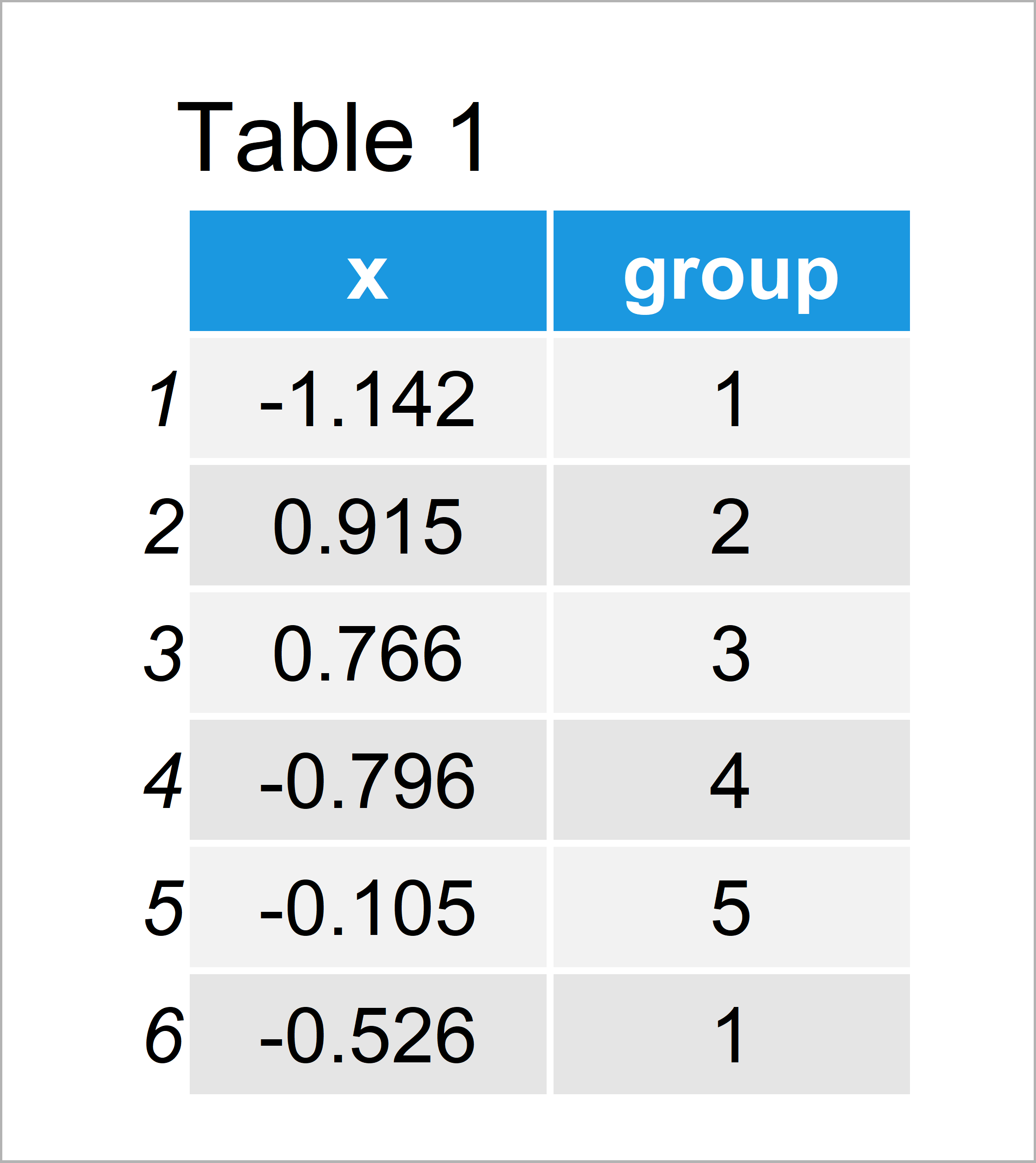
Table 1 shows the structure of our example data – It is constituted of 100 rows and two columns.
The variable x contains the values we want to display in a boxplot and the variable group defines the corresponding groups of our data.
We also need to install and load the ggplot2 package, in order to use the corresponding functions and commands:
install.packages("ggplot2")                                  # Install & load ggplot2 package
library("ggplot2")
Example 1: Reproduce the ggplot2 Error: Continuous value supplied to discrete scale
In this example, I’ll illustrate how to replicate the error message “Continuous value supplied to discrete scale” when drawing a graphic using the ggplot2 package in R.
Have a look at the following R code:
ggplot(data, aes(x, group = group, fill = group)) +          # Try to modify colors
  geom_boxplot() +
  scale_fill_manual(values = c("red", "yellow",
                               "blue", "orange",
                               "green"))
# Error: Continuous value supplied to discrete scale
As you can see, the RStudio console returns the “Error: Continuous value supplied to discrete scale” after executing the previous R syntax.
The reason for this is that our grouping variable has the numeric data class. However, to properly color the boxes of our groups, the grouping variable needs to be a factor.
So how can we solve this problem? Keep on reading!
Example 2: Fix the ggplot2 Error: Continuous value supplied to discrete scale
The following syntax shows how to avoid the “Error: Continuous value supplied to discrete scale”.
For this, we have to convert our grouping variable to the factor class using the factor() function.
Compare the last part of line one in the following code with the corresponding part in the previous example. As you can see, we are using the factor function to convert our grouping column from numeric to factor.
ggplot(data, aes(x, group = group, fill = factor(group))) +  # Properly adding colors
  geom_boxplot() +
  scale_fill_manual(values = c("red", "yellow",
                               "blue", "orange",
                               "green"))

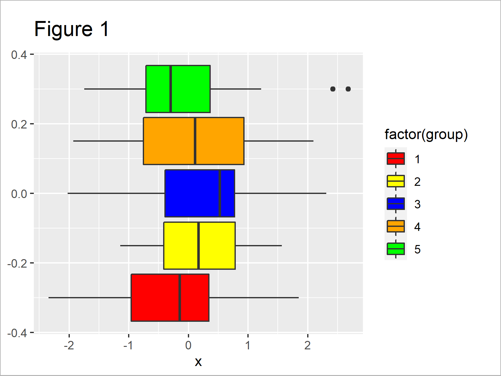
After executing the previous syntax the boxplot illustrated in Figure 1 has been created. As you can see, we have drawn each boxplot of our graphic in a different color.
Video & Further Resources
Do you need more information on the R programming syntax of this tutorial? Then I recommend having a look at the following video of my YouTube channel. I’m explaining the examples of this article in the video:
In addition, you might have a look at the other articles on this website. A selection of posts is shown below:
- ggplot2 Error: Discrete Value Supplied to Continuous Scale
- Error & Warning Messages in R
- R Programming Examples
In summary: You have learned in this article how to deal with the “Error: Continuous value supplied to discrete scale” in the R programming language. In case you have further questions, let me know in the comments. Furthermore, don’t forget to subscribe to my email newsletter for regular updates on the newest articles.


17 Comments. Leave new
Thank you for the great explanation! It immediatly worked with the added factor argument.
Hey Sarah,
Thanks a lot for the kind comment, this is great to hear! 🙂
Regards,
Joachim
Hello Jacob. Thank you very much for your good content.
I want to use discrete legend instead of continuous legend for raster maps. Can you guide me?
Hey,
Thank you for the kind words! Could you share your code and describe your data?
Regards,
Joachim
Hello, Joachim.
Yes, Sure. I have a raster data with TIFF format, which is a continuous data. Now I want to create a discrete legend with five classes for this data using ggplot. I tried to do it but failed.
the code:
# Load packages
library(ggplot2)
library(raster)
library(cowplot)
library(ggspatial)
library(RColorBrewer)
library(readr)
library(sf)
library(colorspace)
library(scales)
# Load data
sample= raster(“sample.tif”)
reclass <- c(0, 0.2, 1,
0.2, 0.4, 2,
0.4, 0.6, 3,
0.6, 0.7, 4,
0.8, 1, 5)
reclass_m <- matrix(reclass,
ncol = 3,
byrow = TRUE)
sample_classified <- reclassify(sample, reclass_m)
sample_classified[sample_classified == 0] <- NA
val <- getValues(sample_classified)
xy <- as.data.frame(xyFromCell(sample_classified,1:ncell(sample_classified)))
xy <- cbind(xy,val)
ggplot(na.omit(xy), aes(x=x, y=y, fill=val)) +
scale_fill_distiller(palette = "Set3", labels= c("Vl", "L", "M", "H","Vh"), name= "Class")+
annotation_scale(location ="br", width_hint= 0.5, pad_x = unit(1, "cm") )+
annotation_north_arrow (location="tl", which_north="true", pad_x= unit(0.4, "in"), pad_y= unit(0.3, "in"),
style= north_arrow_fancy_orienteering)+
theme(legend.title = element_text(colour="blue", size=10, face="bold"))+
theme(legend.text = element_text(colour="blue", size=10, face="bold"))+
theme(legend.background = element_rect(fill="lightblue",size=0.3, linetype="solid", colour ="darkblue"))+
theme(legend.position="right", legend.box = "horizontal")+
geom_raster()
Hey,
Could you please also share what your final data set looks like? What is returned when you execute this:
Regards,
Joachim
Great tutorial, thank you, Joachim! So simple. I am learning R and working through a tutorial importing data from spss, and was running into this issue with a Year variable. My workaround before reading this was to enter the data in manually using factor(), so this simple workaround was great.
Is there a way of making sure the label doesn’t add the prefix “(factor)…” to the variable on the ggplot graph when doing this though?
Hey Joe,
Thank you so much, glad you like my tutorials!
Please excuse the delayed response. I was on a long vacation, so unfortunately I wasn’t able to get back to you earlier. Do you still need help with your code?
Regards,
Joachim
Hi! I have the same question! How can i get rid of the prefix (factor) in the plot legend?
I’m sorry, i found the solution which was quite simple. Just make the variable in a factor in a separate line beforehand.
group<- as.factor(group)
Thx for your tutorials!! Great resource!
Hello Karlien,
Thank you for your kind words and for sharing the solution!
Have a good one!
Cansu
Hi Joachim,
thank you so much for the great tutorial!
There is one question i have to ask 🙂
Is the different order (graph and legend) intentionally?
I am asking because I have a problem with my own data regarding a discrepancy between the colors of the graph and the colors of the legend.
Thank you so much for your answer!
Best,
Jonas
Hi Jonas,
Thank you very much for the kind feedback, glad you like the tutorial!
Regarding your question, the ggplot2 package orders horizontal bars from the bottom to the top, that’s why the legend has the opposite order than the bars. You may reverse the order of your legend as shown here.
Regards,
Joachim
Hi Joachim, thanks a lot for your fast reply! I am sorry to bother you again.
Something is wrong with my script and I can not find a solution yet. I get either the wrong colors for the graph or for the legend. Attached you can find the code. I would be very thankful if you can go through it quickly.
The data frame is structured as follows:
x y value variable
1 -71.83764 -41.49597 80 getValues(y)
2 -71.82931 -41.49597 92 getValues(y)
3 -71.82097 -41.49597 92 getValues(y)
4 -71.81264 -41.49597 104 getValues(y)
5 -71.80431 -41.49597 104 getValues(y)
6 -71.79597 -41.49597 103 getValues(y)
…..
This line ***names(BIOcolors_1981_2010) <- as.character(BIOcodes_1981_2010) *** seems to be the problem. With that particular line I get wrong colors for the legend, without I get wrong colors for the graph.
library(raster)
library(rgdal)
library(RColorBrewer)
library(rasterVis)
library(ggplot2)
library(colorspace)
library(dplyr)
library(tidyr)
library(readr)
library(sf)
library(colorspace)
library(randomcoloR)
library(lattice)
BIO_1981_2010 <- raster("P:/Owncloud/GIS/CHELSA/BIO/Bio_1981_2010.tif")
transects <- st_read("P:/Owncloud/GIS/Shape_Transekte/transects_MANSO_BOLSON.shp")
Investigation_Area <- st_read("P:/Owncloud/GIS/Area_of_interest/Investigation_Area/Buffer/Investigation_Area.shp")
func <- function(x, aggregate = 1) {
resampleFactor <- aggregate
inputRaster <- x
inCols <- ncol(inputRaster)
inRows <- nrow(inputRaster)
# Compute numbers of columns and rows in the new raster for mapping
resampledRaster <- raster(ncol=(inCols / resampleFactor),
nrow=(inRows / resampleFactor))
# Match to the extent of the original raster
extent(resampledRaster) <- extent(inputRaster)
# Resample data on the new raster
y <- resample(inputRaster,resampledRaster,method='ngb')
# Extract cell coordinates
coords <- xyFromCell(y, seq_len(ncell(y)))
dat <- stack(as.data.frame(getValues(y)))
# Add names – 'value' for data, 'variable' to indicate different raster layers
# in a stack
names(dat) <- c('value', 'variable')
dat <- cbind(coords, dat)
dat
}
x y value variable
1 -71.83764 -41.49597 80 getValues(y)
2 -71.82931 -41.49597 92 getValues(y)
3 -71.82097 -41.49597 92 getValues(y)
4 -71.81264 -41.49597 104 getValues(y)
5 -71.80431 -41.49597 104 getValues(y)
6 -71.79597 -41.49597 103 getValues(y)
BIOcodes_1981_2010 <- c(52,53,54,64,65,66,67,68,76,77,78,79,80,81,88,89,90,91,92,93,101,102,103,104,105,106)
BIOnames_1981_2010 <-c(
"Upper-Arid – Lower-Supramediterranean",
"Lower-Semiarid – Lower-Supramediterranean",
"Upper-Semiarid – Lower-Supramediterranean",
"Upper-Arid – Upper-Supramediterranean",
"Lower-Semiarid – Upper-Supramediterranean",
"Upper-Semiarid – Upper-Supramediterranean",
"Lower-Dry – Upper-Supramediterranean",
"Upper-Dry – Upper-Supramediterranean",
"Upper-Arid – Lower-Oromediterranean",
"Lower-Semiarid – Lower-Oromediterranean",
"Upper-Semiarid – Lower-Oromediterranean",
"Lower-Dry – Lower-Oromediterranean",
"Upper-Dry – Lower-Oromediterranean",
"Lower-Subhumid – Lower-Oromediterranean",
"Upper-Arid – Upper-Oromediterranean",
"Lower-Semiarid – Upper-Oromediterranean",
"Upper-Semiarid – Upper-Oromediterranean",
"Lower-Dry – Upper-Oromediterranean",
"Upper-Dry – Upper-Oromediterranean",
"Lower-Subhumid – Upper-Oromediterranean",
"Lower-Semiarid – Lower-Crioromediterranean",
"Upper-Semiarid – Lower-Crioromediterranean",
"Lower-Dry – Lower-Crioromediterranean",
"Upper-Dry – Lower-Crioromediterranean",
"Lower-Subhumid – Lower-Crioromediterranean",
"Upper-Subhumid – Lower-Crioromediterranean"
)
BIOcolors_1981_2010 <- c(
"#f5b7b1",
"#f1948a",
"#ec7063",
"#fad7a0",
"#f8c471",
"#f5b041",
"#f39c12",
"#d68910",
"#abebc6",
"#82e0aa",
"#58d68d",
"#2ecc71",
"#28b463",
"#239b56",
"#aed6f1",
"#85c1e9",
"#5dade2",
"#3498db",
"#2e86c1",
"#2874a6",
"#d7dbdd",
"#cacfd2",
"#bdc3c7",
"#a6acaf",
"#909497",
"#797d7f"
)
names(BIOcolors_1981_2010) <- as.character(BIOcodes_1981_2010)
ggplot(data = BIO_1981_2010) +
geom_raster(aes(x = x, y = y, fill = as.character(value))) +
scale_fill_manual(name = "Bioclimates",
values = BIOcolors_1981_2010,
labels = BIOnames_1981_2010[-100],
na.translate = FALSE) +
geom_sf(data = transects, size = 1, linetype = "dashed") +
coord_sf(expand = F) +
theme(axis.title.x = element_blank(),
axis.title.y = element_blank(),
panel.border = element_rect(colour = "black", fill = NA, size = 1),
panel.background = element_rect(fill = "white", color = "black"))
Hi Jonas,
No problem at all, this is what the comment section is made for!
Is there a specific reason why you are specifying the name, labels, and na.translate arguments within the scale_fill_manual function?
I have just created some example code that changes the colors of a barchart and the corresponding legend. All I had to do was to assign a vector of colors to the values argument.
Have a look at the example code below:
I have developed this code based on this tutorial, so maybe you could also have a look at the other tutorial to learn more on how to manually specify colors of a ggplot2 barplot.
Regards,
Joachim
Hi Joachim,
Thanks again for the fast answer!
I think, I specified the name, labels, etc. because I want to use my own colour sheme. Not sure if this is the right way to do it.
However, I just used fill = factor(value) instead of fill = as.character(value) and it seems to work now.
Best regards and many thanks for your help,
Jonas
Hi Jonas,
This is great to hear, glad you found a solution!
Regards,
Joachim