Add Table to ggplot2 Plot in R (Example)
In this R article you’ll learn how to draw a data frame table to a ggplot2 plot.
The post is structured as follows:
Let’s just jump right in.
Example Data, Add-On Packages & Default Plot
The following data will be used as basement for this R tutorial:
my_data <- data.frame(group = letters[1:3],         # Create example data
                      x = 1:9,
                      y = c(1, 3, 2, 1, 3, 1, 2, 1, 1))
my_data                                             # Print example data
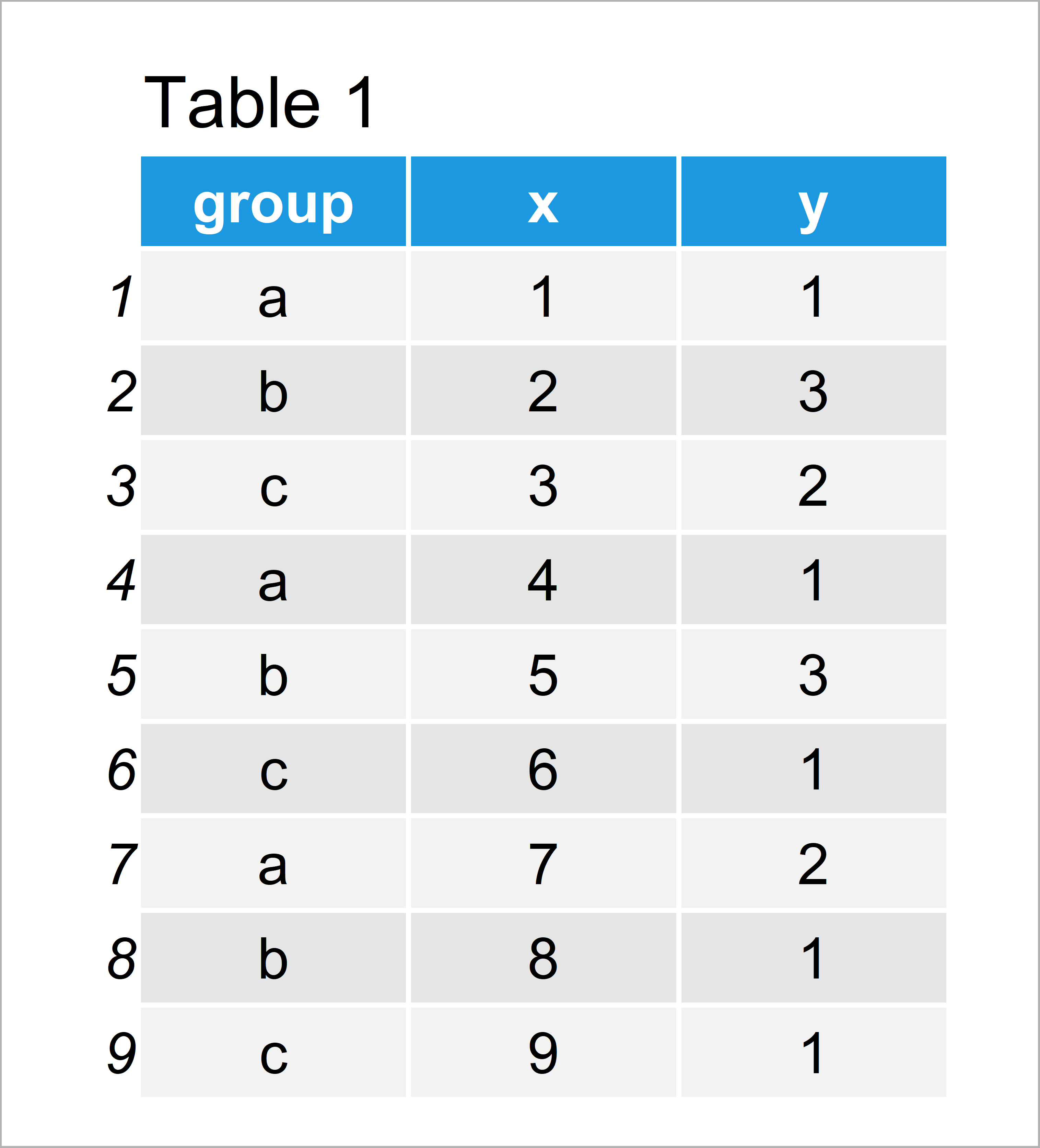
Table 1 visualizes the output of the RStudio console and reveals that our example data has nine data points and three columns.
To be able to use the functions of the ggplot2 package, we also need to install and load ggplot2:
install.packages("ggplot2")                         # Install ggplot2 package
library("ggplot2")                                  # Load ggplot2 package
As next step, we can create a plot of our data:
ggp <- ggplot(my_data, aes(x, y, color = group)) +  # Create ggplot2 plot without table
  geom_point(size = 3)
ggp                                                 # Draw plot
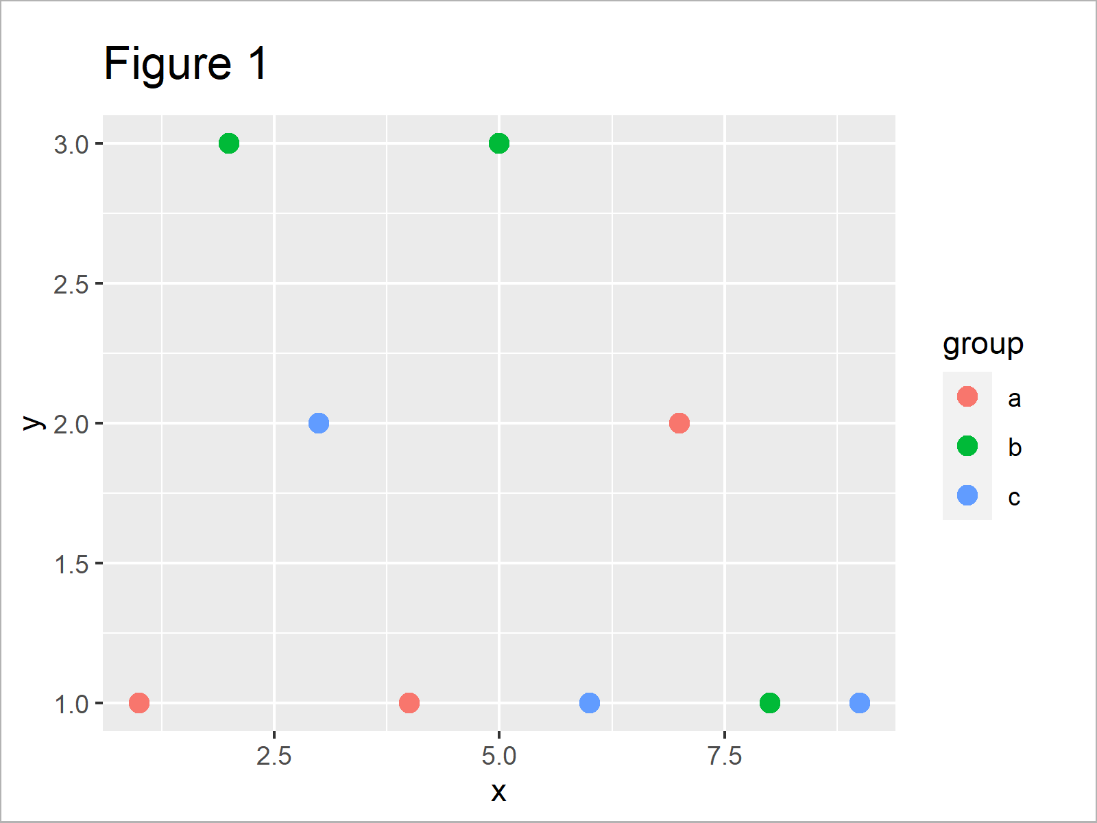
By running the previous R syntax we have created Figure 1, i.e. a ggplot2 scatterplot without any table in the plotting area.
Let’s create a data frame table in R:
my_table <- as.data.frame(table(my_data[ , c(1, 3)])) # Create example table
my_table                                            # Print example table
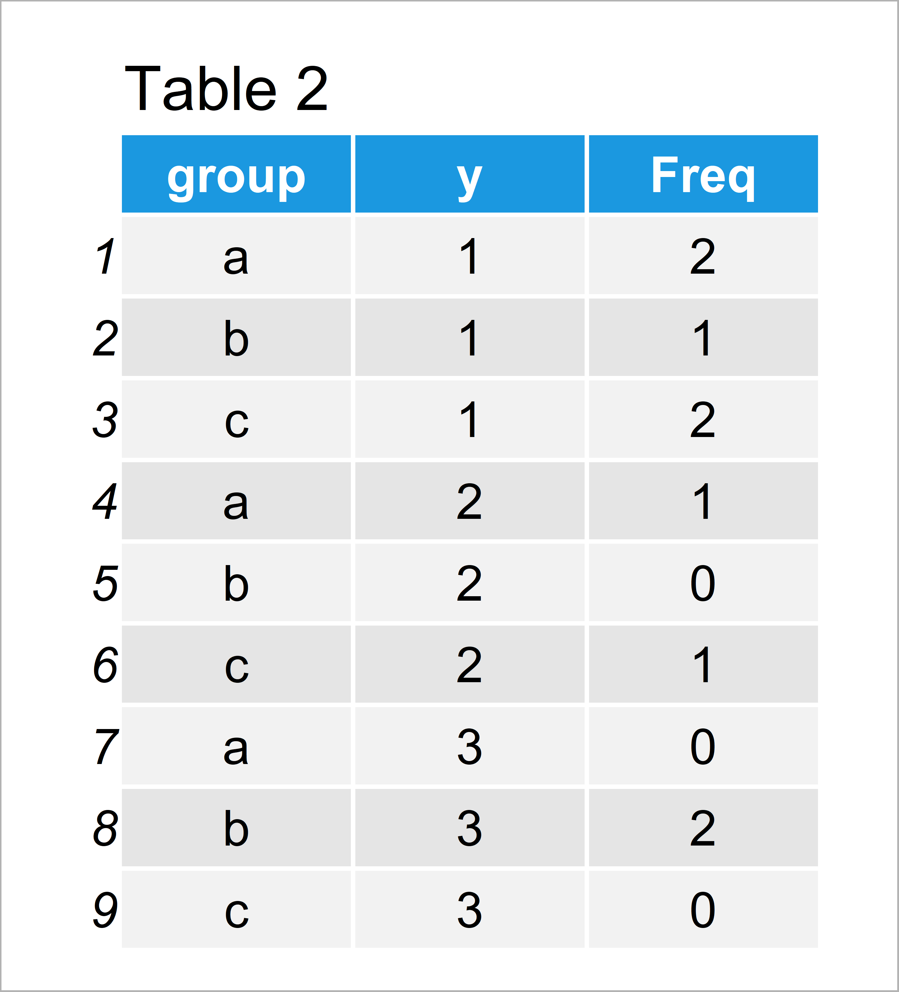
As shown in Table 2, the previous code has created a data frame with three columns.
In the following example, I’ll explain how to add this table to our graph using the ggplot2 and ggpmisc packages.
Example: Add Table to ggplot2 Plot Using ggpmisc Package
This example explains how to add a table to a ggplot2 plot in R.
First, we have to install and load the ggpmisc package:
install.packages("ggpmisc")                         # Install & load ggpmisc
library("ggpmisc")
Next, we can use the annotate function to add our table within the plot window of our graph:
ggp +                                               # Add table to ggplot2 plot
  annotate(geom = "table",
           x = 9,
           y = 3,
           label = list(my_table))
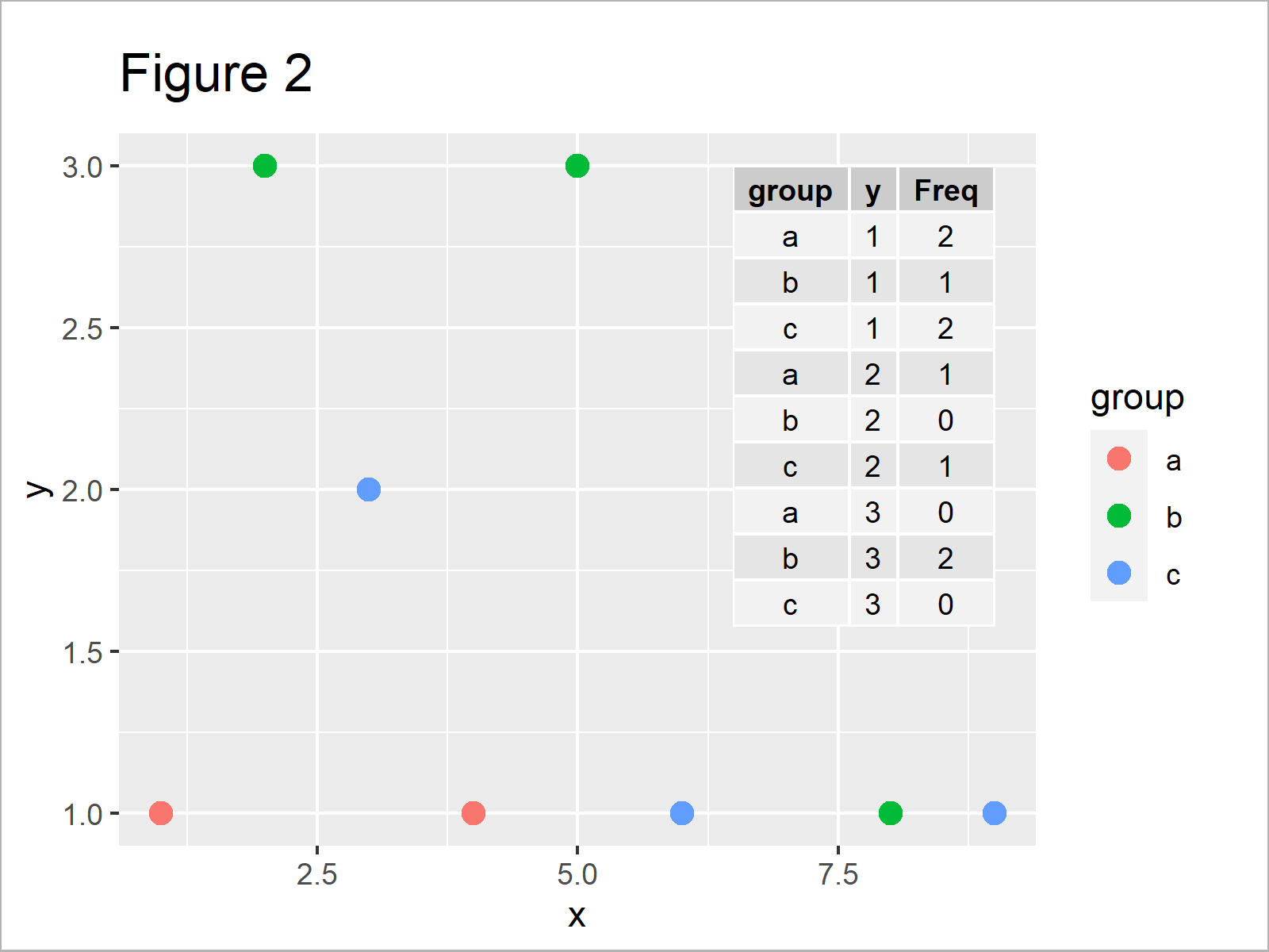
By executing the previous code we have drawn Figure 2, i.e. a ggplot2 scatterplot with a table in the plotting area.
Video & Further Resources
Would you like to know more about ggplot2 plots and tables? Then you could watch the following video of my YouTube channel. I’m illustrating the topics of this article in the video:
Besides the video, you could have a look at the other articles on Statistics Globe. I have released numerous other articles already.
- Add X & Y Axis Labels to ggplot2 Plot
- Add Confidence Band to ggplot2 Plot
- ggplot2 Package in R – Tutorial & Examples
- Add Bold & Italic Text to ggplot2 Plot
- Add Greek Symbols to ggplot2 Plot in R
- Graphics in R
- All R Programming Tutorials
This tutorial has illustrated how to add a table within the plotting area of a ggplot2 graphic in the R programming language. Don’t hesitate to let me know in the comments, in case you have additional questions.




8 Comments. Leave new
In the line where you create the table it is necessary to correct the data name from “data” to “my_data” .. so the code will work.
Thanks a lot for this hint Fernando! I just corrected the code.
Thanks
Joachim
how do you adjust the location of where the table is inserted on the graph?
Hey JT,
Please excuse the late response. I was on a long holiday so unfortunately I wasn’t able to reply sooner. Still need help with your code?
Regards,
Joachim
Hi! Is it possible to change the font size of the table?
Hello Carly,
Sorry for the late response. If you haven’t solved the problem yet, you can try the following code below. I have added the “size” argument in the annotate function.
Regards,
Cansu
can you assign different colours for each table column?
Hello Emmanuel,
To do best of my knowledge, The ggplot2 package does not support directly changing the color of each column in the table annotation. The geom_table() function is a very basic function that does not have arguments to control the appearance of individual columns or cells.
Best,
Cansu