Draw Multiple Time Series in Same Plot in R (2 Examples)
In this article you’ll learn how to create a plot showing multiple time series in the R programming language.
The post contains the following topics:
Let’s get started.
Creation of Example Data
First, we’ll have to construct some data that we can use in the examples below:
set.seed(1023172)                            # Create random example data
data <- round(data.frame(year = 2001:2025,
                         ts1 = 1:25 + rnorm(25),
                         ts2 = 30:6 + runif(25, 0, 10),
                         ts3 = rnorm(25, 5, 5)))
head(data)                                   # Head of example data
#   year ts1 ts2 ts3
# 1 2001   1  33   9
# 2 2002   1  31   0
# 3 2003   2  31  -9
# 4 2004   4  33   4
# 5 2005   6  33   4
# 6 2006   6  35   5
The previous output of the RStudio console shows that our example data has four columns. The variable year defines the time range and the variables ts1, ts2 and ts3 contain the corresponding values of three different time series.
Example 1: Drawing Multiple Time Series in Base R
In Example 1, I’ll illustrate how to draw a graph showing multiple time series using the basic installation of the R programming language.
More precisely, we have to use the plot, lines, and legend functions as follows:
plot(data$year,                              # Draw first time series
     data$ts1,
     type = "l",
     col = 2,
     ylim = c(- 15, 40),
     xlab = "Year",
     ylab = "Values")
lines(data$year,                             # Draw second time series
      data$ts2,
      type = "l",
      col = 3)
lines(data$year,                             # Draw third time series
      data$ts3,
      type = "l",
      col = 4)
legend("topright",                           # Add legend to plot
       c("ts1", "ts2", "ts3"),
       lty = 1,
       col = 2:4)

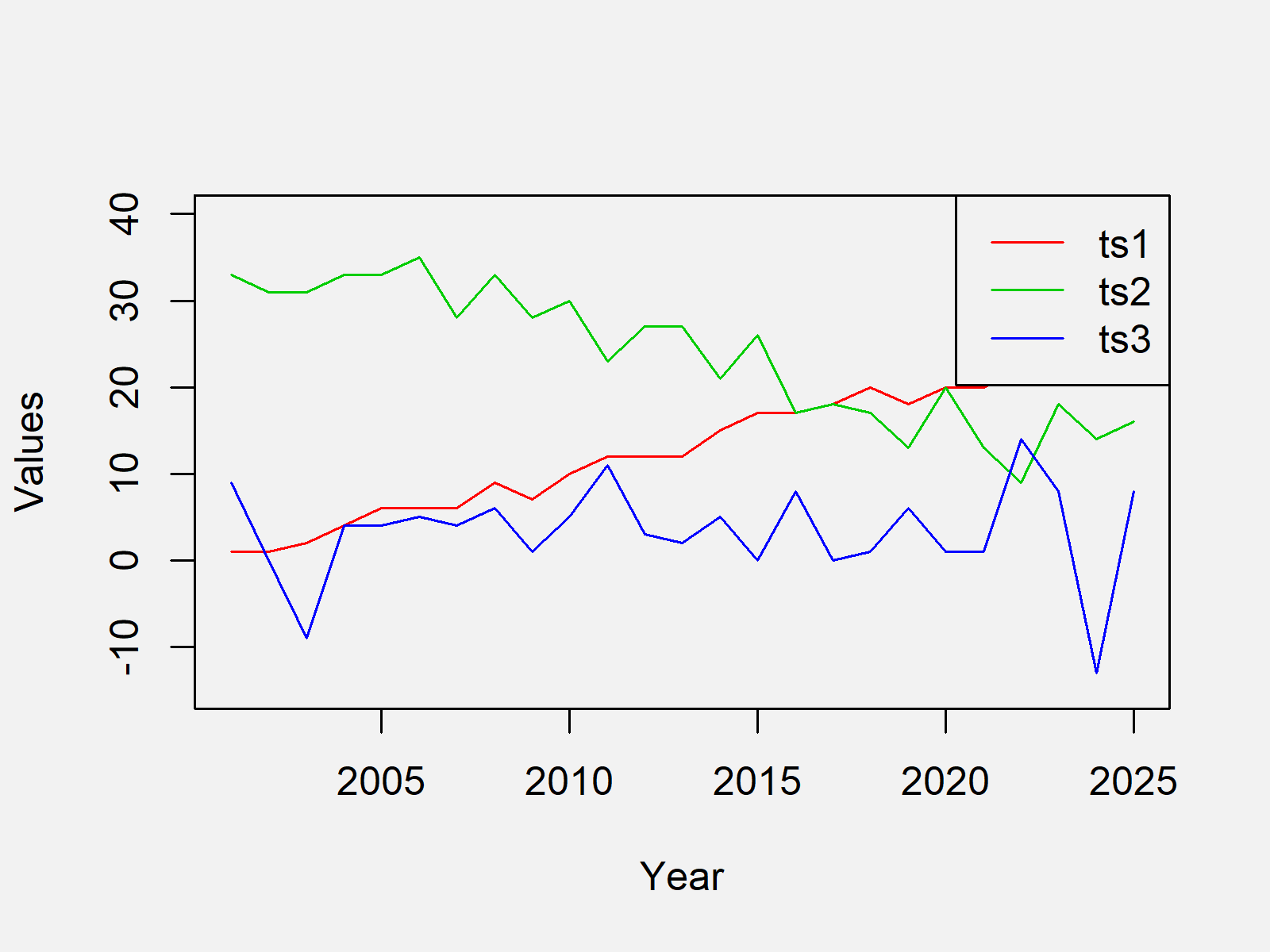
As shown in Figure 1, we created a time series graphic containing multiple lines with the previous syntax.
Example 2: Drawing Multiple Time Series Using ggplot2 Package
In Example 2, I’ll show how to plot multiple time series to a graph using the ggplot2 package in R.
The ggplot2 package typically takes long data as input. For that reason, we first have to use the reshape2 package to convert our data frame from wide to long format.
We first need to install and load the reshape2 package, if we want to use the functions that are included in the add-on package:
install.packages("reshape2")                 # Install reshape2 package
library("reshape2")                          # Load reshape2 package
Now, we can reshape our data from wide to long format using the melt function:
data_long <- melt(data, id.vars = "year")    # Reshaping data to long format
head(data_long)                              # Head of long data
#   year variable value
# 1 2001      ts1     1
# 2 2002      ts1     1
# 3 2003      ts1     2
# 4 2004      ts1     4
# 5 2005      ts1     6
# 6 2006      ts1     6
Furthermore, we need to install and load the ggplot2 package to draw our time series plot using ggplot2:
install.packages("ggplot2")                  # Install ggplot2 package
library("ggplot2")                           # Load ggplot2 package
Finally, we can apply the ggplot and geom_line commands to draw multiple time series to a plot:
ggplot(data_long,                            # Draw ggplot2 time series plot
       aes(x = year,
           y = value,
           col = variable)) +
  geom_line()

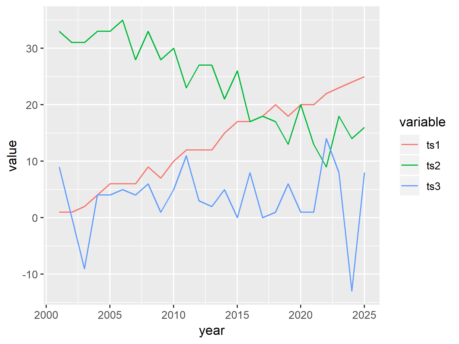
As shown in Figure 2, the previous syntax created a graphic showing multiple time series variables.
Video, Further Resources & Summary
In case you need further info on the R programming code of this article, you may have a look at the following video of my YouTube channel. In the video, I explain the R programming syntax of this article.
Furthermore, I can recommend reading the related tutorials of this homepage.
- Draw Multiple Graphs & Lines in Same Plot
- Draw Multiple Variables as Lines to Same ggplot2 Plot
- Draw Time Series Plot with Events Using ggplot2 Package
- Drawing Plots in R
- All R Programming Examples
In this article you learned how to print a graph with multiple overlaying time series and a legend in the R programming language. Don’t hesitate to let me know in the comments section below, in case you have additional questions. Furthermore, don’t forget to subscribe to my email newsletter in order to get updates on new tutorials.
Subscribe to the Statistics Globe Newsletter
Get regular updates on the latest tutorials, offers & news at Statistics Globe.
I hate spam & you may opt out anytime: Privacy Policy.
Thank you!
Please check your email inbox and click the confirmation link to complete your subscription. If you don’t see the email within a few minutes, please also check your spam/junk folder.
I’m Joachim Schork. On this website, I provide statistics tutorials as well as code in Python and R programming.
Statistics Globe Newsletter
Get regular updates on the latest tutorials, offers & news at Statistics Globe. I hate spam & you may opt out anytime: Privacy Policy.
Thank you!
Please check your email inbox and click the confirmation link to complete your subscription. If you don’t see the email within a few minutes, please also check your spam/junk folder.


8 Comments. Leave new
Dear Sir Joaquim
Greetings from Mozambique to you and your wonderful team. I am glad I have come across to your website and youtube with such great content and I have just subscribed.
Time series with geom_line does not work for me. After some search on web I got the reason – because I am working with grouped data. I wanted the line ploted and was not happy with the points (scatter). I come accross to your tutorial on summarise () with group_by() with the output on a new dataframe. Immediately I thought that could be the solution I was looking for and I was so excited to move on.
I created a subset using the selection () , grouped and computed the new variable to be plotted across the seasons.
Now when I bring the data into ggplot, I get so frustrated as ggplot cant access the data.
The data frame is there, I cant print the str(), head(), names, but as I run the code for plotting I get a message that the variables were not found.
“Error in ggplot.default(., ri_date, average_time, casual_member) :
object ‘ri_date’ not found”
This is my code
——
bsts1 %
group_by(ri_date,casual_member) %>%
summarise( average_time= mean(ri_time)) # creating a new dataset for plotting
head(bsts1) # view the top rows
sapply(bsts1, class) # checking data type
bsts1 %>%
ggplot(ri_date,average_time,casual_member)+
geom_point(size =0.5, alpha = 0.5)+
theme_grey() +
labs(title = Time Series bike sharing – Jan – jun)
Where am I getting lost or getting it wrong ?
Thank you in advance for all your support
Regards
Osorio
Hello Osorio,
Thank you very much for your kind words; they motivate us to create useful tutorials for lovely people like you. Your data is bsts1, am I correct? What are your x and y values? Or let me ask, what do you want to plot? Because ggplot(), one input is extra. It should be one for the x and one for the y values only.
Regards,
Cansu
Hi Cansu;
Thank you for your swift response.
yes, my dataset is bsts1. I have grouped and computed the average.
I have a categorical variable with two groups (levels) = casual_member.
My arguments for the ggplot are:
data = bsts1
x = date (1 year, from january to december)
y = numerical variable (trip_duration)
col = casual_member (the third and optional)
ggplot(data=bsts1, aes(x= date, y = trip_durantion, col=casual_member)
I know, the third argument is optional, but in this case becomes mandatory since I am comparing two series on the same plot.
Note: my numerical variable, trip_duration, is recorded on daily basis and has more than one observation per day. That is why I had to compute the average(mean) to get one data point for each day. And I guess, this grouping becoming the root of the problem for plotting a line across the time. The variables are not available to be used for plotting
I hope it is clear now.
My expected output would be two lines (casual and members) from January to December displaying the variation of y = average daily trip duration.
Thank you for all your support
Regards
Osorio
Hello Osorio,
Can you do this:
Then use the new data for plotting. It may be the issue as the new data is not stored in your case.
Regards,
Cansu
My statical knowledge is increasing because of you. Again, I have a question. I want to draw multiple Time series in the same plot. I use the following code:
x <- c("Jan", "Feb", "Mar", "Apr", "May", "Jun", "Jul", "Aug", "Sep", "Oct", "Nov", "Dec")
y1 <- c(4, 5, 6, 5, 6, 7, 7, 7, 5, 4, 4, 4)
y2 <- c(1:6, 1:6)
data <- data.frame(x, y1,y2)
View(data)
library("reshape2")
data_long <- melt(data, id.vars = "x") # Reshaping data to long format
View(data_long)
library(ggplot2)
ggplot(data_long, # Draw ggplot2 time series plot
aes(x = x,
y = value,
col = variable)) +
geom_line()
But I don't get my appropriate plot. There is no line of y1 and y2 and the value of X axis is from Apr to Sep.
I am looking forward to your helping hand.
Hello Saima,
Thank you for your kind words; please try the following.
Regards,
Cansu
Thanks. I couldn’t have done it without you.
Welcome 🙂
Regards,
Cansu