Draw Table in Plot in R (4 Examples) | Barplot, Histogram & Heatmap
This article shows several alternatives on how to plot a table object in R programming.
The article will consist of the following information:
Here’s how to do it!
Creating Example Data
Have a look at the example data below:
x <- c(letters[1:4], letters[2:4], "d")    # Create example vector
x                                          # Print example vector
# [1] "a" "b" "c" "d" "b" "c" "d" "d"
The previous output of the RStudio console shows the structure of our example data – We have created a character vector containing different letters.
In the next step, we can create a frequency table of these data using the table() function:
my_tab <- table(x)                         # Apply table function
my_tab                                     # Print table
# x
# a b c d
# 1 2 2 3
The previous output illustrates the frequency table that we have created with the table command.
In the following examples, I’ll show different ways on how to plot this table in a graphic.
Example 1: Draw Barplot of Table Using Base R
The most popular type of graph that is used to visualize tables are barplots.
This example demonstrates how to plot a table in a barchart using the basic installation of the R programming language.
For this, we can use the barplot() function as shown below:
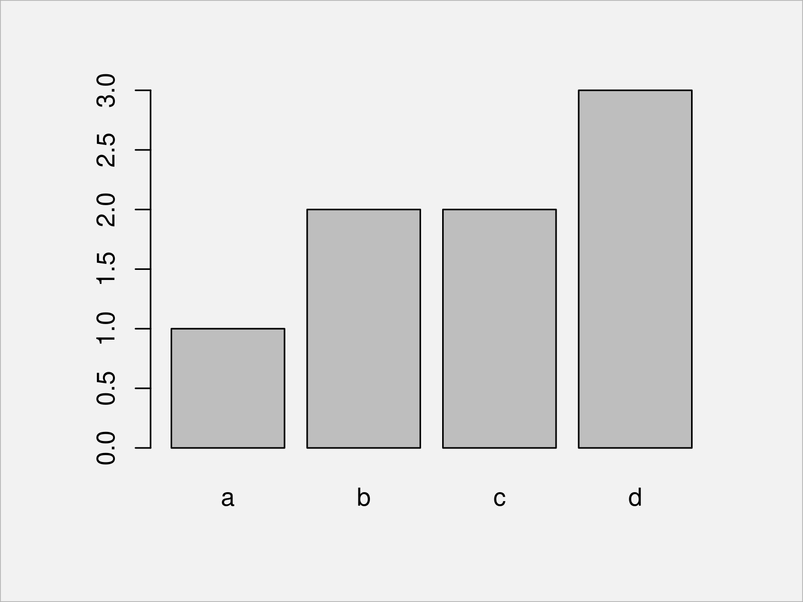
barplot(my_tab) # Create barplot of table

Figure 1 shows the output of the previous R programming syntax: A Base R barplot showing the counts of each group in our table.
Example 2: Draw Barplot of Table Using ggplot2 Package
Alternatively to Base R (as shown in Example 1), we can also use the ggplot2 package to create a barplot of a table.
If we want to use the functions of the ggplot2 package, we first need to install and load ggplot2:
install.packages("ggplot2")                # Install ggplot2 package
library("ggplot2")                         # Load ggplot2
In the next step, we can apply the ggplot, as.data.frame, and geom_bar functions to draw our table in a ggplot2 bargraph:
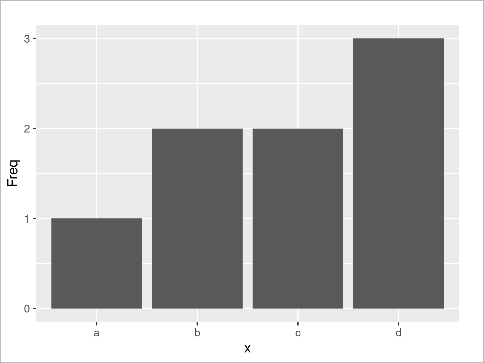
ggplot(as.data.frame(my_tab),              # Create ggplot2 barplot
       aes(x, Freq)) +
  geom_bar(stat = "identity")

After executing the previous R code the ggplot2 barplot shown in Figure 2 has been plotted.
Example 3: Draw Histogram of Table Using Base R
Sometimes people ask how to draw a table in a histogram. In my opinion, barplots should be preferred over histograms when plotting tables.
However, for the sake of completeness the following R code shows how to use the hist function to draw a histogram of a table object:
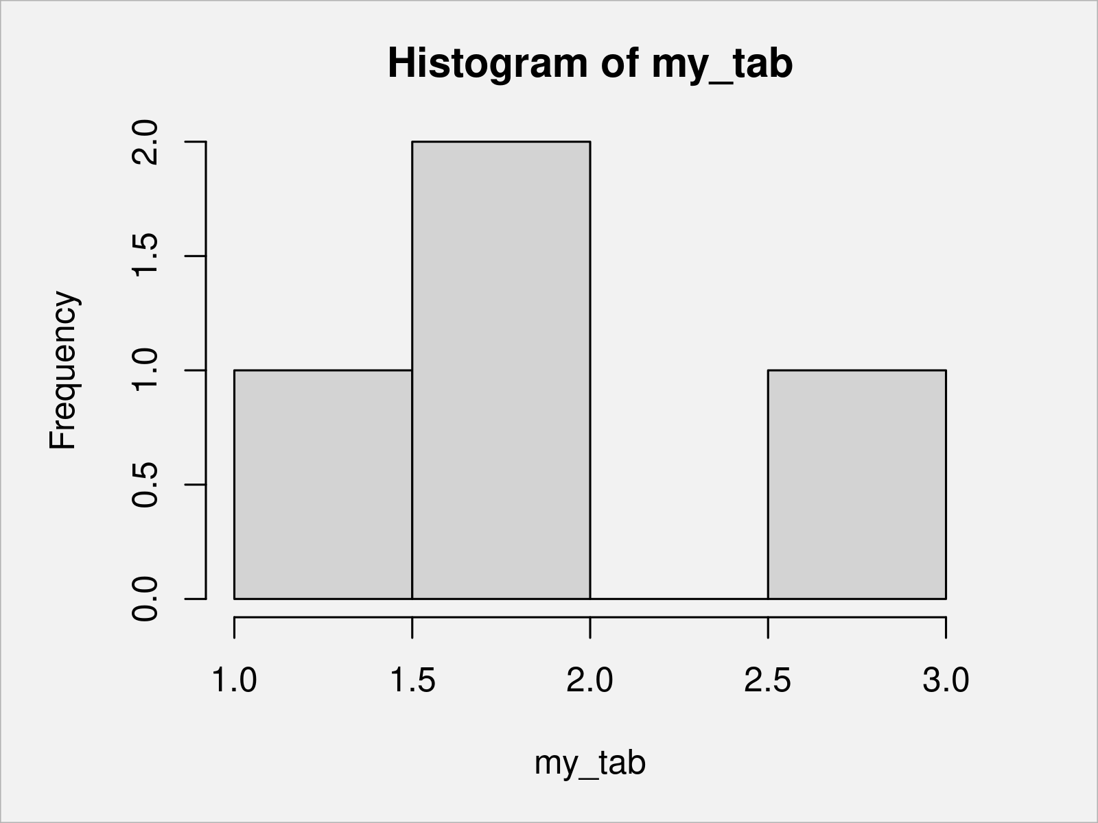
hist(my_tab) # Histogram of table

As shown in Figure 3, the previous syntax has plotted a Base R histogram of a table.
Example 4: Draw Heatmap of Table Using pheatmap Package
So far, we have visualized a frequency table in different types of plots. However, this section illustrates how to draw a correlation table in a plot.
First, we have to load some data into R:
data(iris)                                 # Load iris data frame
head(iris)                                 # Print head of iris data frame
#   Sepal.Length Sepal.Width Petal.Length Petal.Width Species
# 1          5.1         3.5          1.4         0.2  setosa
# 2          4.9         3.0          1.4         0.2  setosa
# 3          4.7         3.2          1.3         0.2  setosa
# 4          4.6         3.1          1.5         0.2  setosa
# 5          5.0         3.6          1.4         0.2  setosa
# 6          5.4         3.9          1.7         0.4  setosa
The previous output of the RStudio console shows the first six rows of the iris data set.
Next, we can calculate a correlation matrix of the numeric columns of the iris data frame:
iris_cor <- cor(iris[ , 1:4])              # Create correlation matrix of iris
iris_cor                                   # Print correlation matrix of iris
#              Sepal.Length Sepal.Width Petal.Length Petal.Width
# Sepal.Length    1.0000000  -0.1175698    0.8717538   0.8179411
# Sepal.Width    -0.1175698   1.0000000   -0.4284401  -0.3661259
# Petal.Length    0.8717538  -0.4284401    1.0000000   0.9628654
# Petal.Width     0.8179411  -0.3661259    0.9628654   1.0000000
As you can see, we have created a new correlation table called iris_cor.
To draw our correlation data in a heatmap, we have to install and load the pheatmap package to RStudio:
install.packages("pheatmap")               # Install pheatmap package
library("pheatmap")                        # Load pheatmap
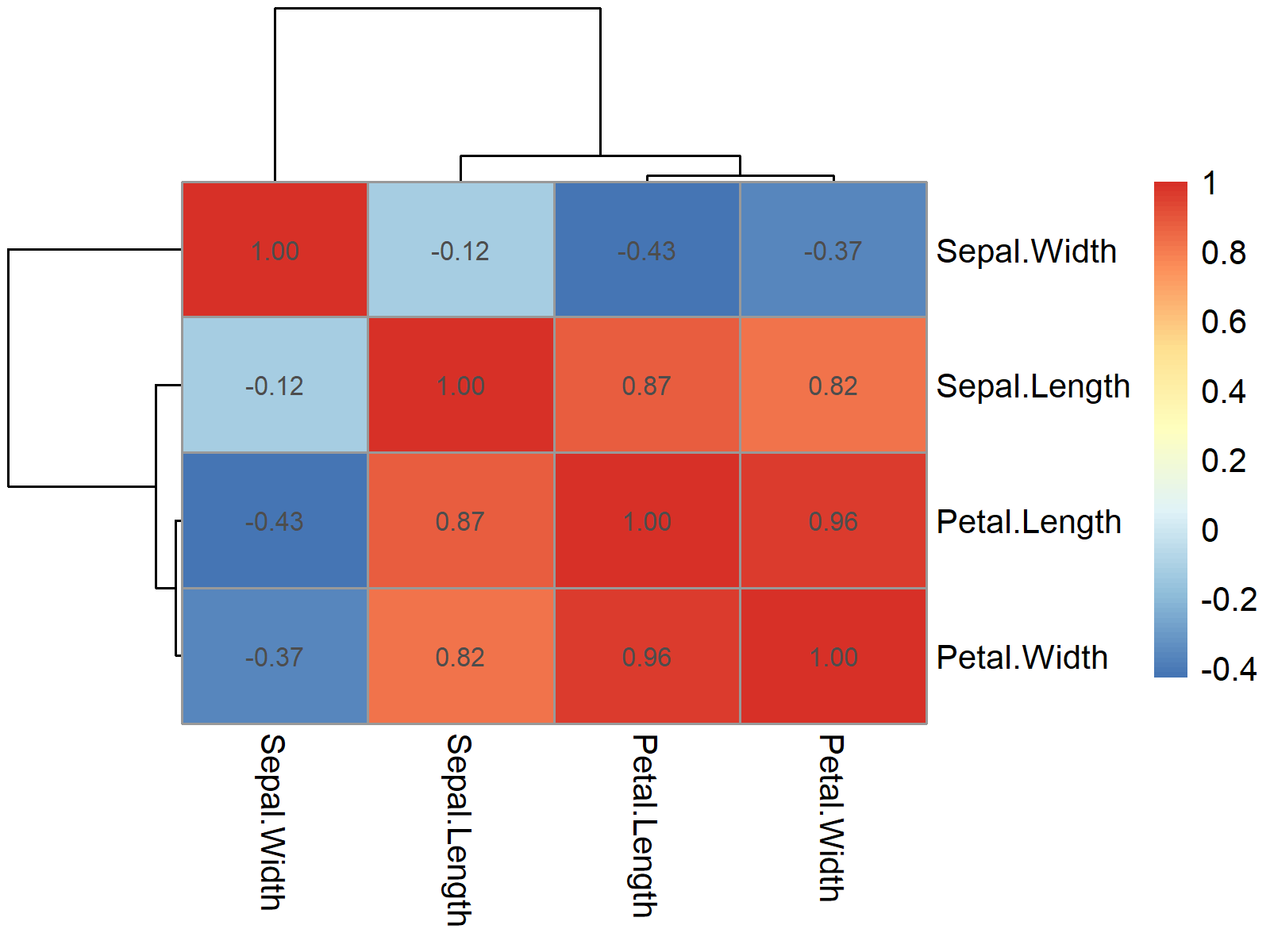
Now, we can use the pheatmap function to draw a heatmap of our correlation table. Note that we are specifying the display_numbers argument to be equal to TRUE to show the values of our table in the heatmap:
pheatmap(iris_cor,                         # Create heatmap with values
         display_numbers = TRUE)

The heatmap with added values of our correlation table is shown in Figure 4.
Video, Further Resources & Summary
Do you want to learn more about the creation of a plot based on a table object? Then you may have a look at the following video on my YouTube channel. I explain the R syntax of this tutorial in the video:
In addition, you may want to have a look at some related tutorials on my website:
- Print Table in R
- Draw Multiple Function Curves to Same Plot
- Draw ggplot2 Scatterplot with Lines
- Graphics Overview in R
- All R Programming Tutorials
In this article, you have learned how to draw a plot from a frequency, contingency, or correlation table in the R programming language.
In this tutorial, we have discussed graphics created by Base R, ggplot2, and the pheatmap package. Please note that other packages such as plotly or the lattice package would be capable of drawing such plots as well.
If you have additional questions, don’t hesitate to let me know in the comments section below.


