Loading Plot in Python (7 Examples)
This Python tutorial demonstrates how to draw a loading plot visualizing loadings in a principal component analysis (PCA).
Table of contents:
Let’s get started!
Libraries & Example Data
First, if the relevant libraries are not installed yet, you should first install them either by running the following commands in your Python environment (e.g., Jupyter notebook) or running them without exclamation marks ! in your command line interface.
!pip install pandas                                            # install libraries
!pip install matplotlib
!pip install scikit-learn
!pip install numpy
!pip install adjustText
If the libraries are installed, the next step is to import the relevant modules and functions as follows.
import pandas as pd                                            # import libraries
import matplotlib.pyplot as plt
from sklearn.decomposition import PCA
from sklearn.preprocessing import StandardScaler
from sklearn.datasets import load_iris
import numpy as np
from adjustText import adjust_text
from matplotlib.colors import Normalize
from matplotlib.cm import ScalarMappable
If the previous execution is successful, you can run the following code to load the sample data and create a DataFrame that will be used in this tutorial.
data = load_iris()                                             # load dataset
df = pd.DataFrame(data.data,                                   # convert to DataFrame
                  columns = data.feature_names)

df.head()                                                      # print df
#    sepal length (cm)  sepal width (cm)  petal length (cm)  petal width (cm)
# 0                5.1               3.5                1.4               0.2
# 1                4.9               3.0                1.4               0.2
# 2                4.7               3.2                1.3               0.2
# 3                4.6               3.1                1.5               0.2
# 4                5.0               3.6                1.4               0.2
As you see above, it is the well-known iris dataset that contains measurements of 150 iris flowers, including their sepal and petal sizes, categorized into three species. Normally, PCA is used with high-dimensional data, but this dataset was selected for the sake of its simplicity and familiarity.
Since all is set, we can jump into PCA!
Perform PCA
First of all, we need to standardize our dataset to obtain reliable results in PCA. We will use the StandardScaler function in tandem with the fit_transform method for this operation.
scaler = StandardScaler()                                      # create scaler
df_scaled = scaler.fit_transform(df)                           # transform data
Now, we can set our PCA model, which creates 2 principal components. Later, we can fit the model to our scaled dataset, df_scaled.
pca = PCA(n_components = 2)                                    # create PCA model for 2 components
pca.fit(df_scaled)                                             # fit model
In the next step, we will create a DataFrame, which contains the transformed data and the original variable names. This data will be utilized in drawing the loading plots.
Create Graph Data
In this section, we will create a DataFrame storing the principal component values in columns and original variable names as indices.
loadings = pd.DataFrame(data = pca.components_.T,              # create DataFrame with loadings
                        columns = ['PCA1', 'PCA2'],
                        index = data.feature_names)

print(loadings)                                                # print loadings
#                        PCA1      PCA2
# sepal length (cm)  0.521066  0.377418
# sepal width (cm)  -0.269347  0.923296
# petal length (cm)  0.580413  0.024492
# petal width (cm)   0.564857  0.066942
Each cell in the loadings DataFrame represents how much each original variable loads on or contributes to each principal component. For further details about the loading concept, see my theoretical tutorial What are Loadings in PCA?.
Now, we have well-organized data for plotting. Without further ado, let’s jump into the examples!
Example 1: Draw Basic Loading Plot
In this first example, we will create a basic loading plot including all fundamental elements with some default settings. To learn more about the visual elements in loading plots, visit my tutorial Loading Plot Explained.
In the implementation, first, we will create a unit circle and then draw the loading vectors, iterating through all original features stored in the indices. Finally, we will add the graph annotations like the plot title, axes titles, etc.
plt.figure(figsize = (5, 5))                                   # set figure and size
circle = plt.Circle((0, 0), 1, fill = False)                   # create unit circle
plt.gca().add_artist(circle)                                   # add circle

for i in loadings.index:                                       # loop through each feature
    plt.arrow(0, 0,                                            # plot arrows
              loadings.PCA1[i], loadings.PCA2[i],
              head_width = 0.05, head_length = 0.1)
    plt.text(loadings.PCA1[i]*1.15,                            # plot arrow labels
             loadings.PCA2[i]*1.15,
             i)

plt.xlabel('PCA 1')                                            # add graph annotations
plt.ylabel('PCA 2')
plt.title('PCA Loading Plot')
plt.grid(True)
plt.xlim(-1, 1)
plt.ylim(-1, 1)
plt.axhline(0, color = 'black', linewidth = 0.5)
plt.axvline(0, color = 'black', linewidth = 0.5)

plt.show()                                                     # show plot
The visual is printed below. You can see how the loadings are visualized by arrows for each corresponding variable.
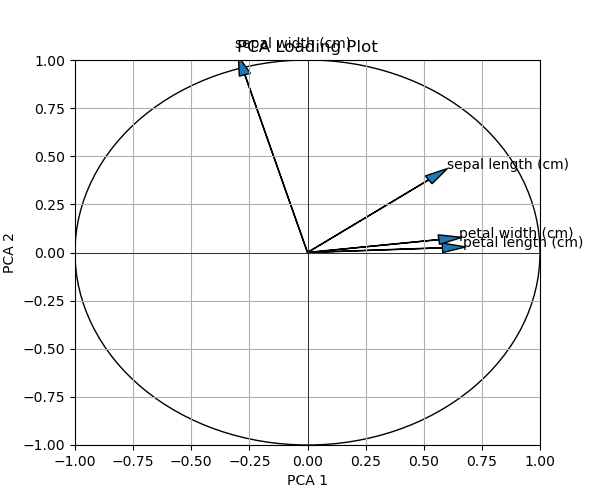
By default, the arrow shafts are printed black, and the heads are blue. If you would like to change this representation, the colors, and maybe the thickness of the arrows, see the next example.
Example 2: Draw Loading Plot with Adjusted Arrows
In this example, we will change the arrow width and head sizes. Besides, we will color them in red to have a highlighted view. All we need is to change the head_width and head_length arguments and add the width and color arguments to define the arrow shaft size and the color.
plt.figure(figsize = (5, 5))                                   # set figure and size
circle = plt.Circle((0, 0), 1, fill = False)                   # create unit circle
plt.gca().add_artist(circle)                                   # add circle

for i in loadings.index:                                       # loop through each feature
    plt.arrow(0, 0,                                            # plot arrows with new settings
              loadings.PCA1[i], loadings.PCA2[i],
              head_width = 0.025, head_length = 0.05,
              width = 0.01, color = "r")
    plt.text(loadings.PCA1[i]*1.15,                            # plot arrow labels
             loadings.PCA2[i]*1.15,
             i)

plt.xlabel('PCA 1')                                            # add graph annotations
plt.ylabel('PCA 2')
plt.title('PCA Loading Plot')
plt.grid(True)
plt.xlim(-1, 1)
plt.ylim(-1, 1)
plt.axhline(0, color = 'black',linewidth = 0.5)
plt.axvline(0, color = 'black',linewidth = 0.5)

plt.show()                                                     # show plot
As you can see above, the change happened in the plt.arrow function, where the arrow features are defined. Let’s print the graph!
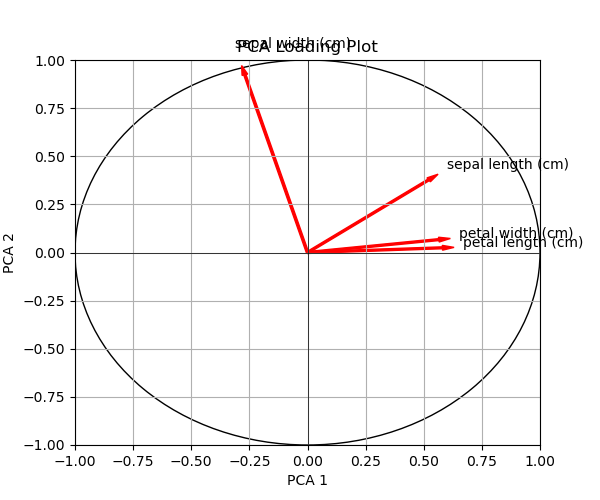
Alternatively, you can color each vector separately. In the next example, we will discover how to do it.
Example 3: Draw Loading Plot Colored by Selected Colors
Here, we will color each loading vector differently. To achieve that, we will create a color list first. Then, we will iterate through the zipped pairs of the color list and the indices of the loadings DataFrame, where the variable names are saved. During this process, each loading vector will be assigned a color from the color list.
colors = ['red', 'green', 'blue', 'purple', 'orange']          # define list of colors

plt.figure(figsize = (5, 5))                                   # set figure and size
circle = plt.Circle((0, 0), 1, fill = False)                   # create unit circle
plt.gca().add_artist(circle)                                   # add circle

for i, color in zip(loadings.index, colors):                   # loop through each feature and color
    plt.arrow(0, 0,                                            # plot arrows colored separately
              loadings.PCA1[i], loadings.PCA2[i],
              head_width = 0.05, head_length = 0.1,
              color = color)
    plt.text(loadings.PCA1[i]*1.15,                            # plot arrow labels
             loadings.PCA2[i]*1.15,
             i,
             color = color)

plt.xlabel('PCA 1')                                            # add graph annotations
plt.ylabel('PCA 2')
plt.title('PCA Loading Plot')
plt.grid(True)
plt.xlim(-1, 1)
plt.ylim(-1, 1)
plt.axhline(0, color = 'black', linewidth = 0.5)
plt.axvline(0, color = 'black', linewidth = 0.5)

plt.show()                                                     # show graph
Let’s see the visual below with colorful loading vectors!
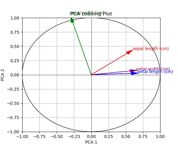
In the next example, we will take the coloring to the next level. The vectors will be colored based on the variables’ contributions. Let’s do it!
Example 4: Draw Loading Plot Colored by Contributions
The first step is to calculate the overall contribution of variables to the principal components.
contributions = np.sqrt(loadings.PCA1**2 + loadings.PCA2**2) # calculate contributions
The next step is to normalize the contribution values to make them more comparable and interpretable. We used min-max scaling in this instance.
max_contribution = contributions.max()                         # normalize contributions for coloring
normalized_contributions = contributions / max_contribution
Finally, we can write the plotting code.
cmap = plt.cm.viridis                                          # create color map

fig = plt.figure(figsize = (6.65, 5))                          # set figure and size
gs = fig.add_gridspec(1, 2, width_ratios = [20, 1], wspace = 0.5)  # specify grid measurements
ax = fig.add_subplot(gs[0])                                    # set first subplot location
circle = plt.Circle((0, 0), 1, fill = False)                   # create unit circle
ax.add_artist(circle)                                          # add circle

for i in loadings.index:                                       # loop through each feature
    color = cmap(normalized_contributions[i])                  # translate contributions to colors
    ax.arrow(0, 0,                                             # plot arrows colored by contribution
             loadings.PCA1[i], loadings.PCA2[i],
             head_width = 0.05, head_length = 0.1,
             color = color)
    ax.text(loadings.PCA1[i]*1.15,                             # plot arrow labels
            loadings.PCA2[i]*1.15,
            i)

ax.set_xlabel('PCA 1')                                         # add graph annotations
ax.set_ylabel('PCA 2')
ax.set_title('PCA Loading Plot')
ax.grid(True)
ax.set_xlim(-1, 1)
ax.set_ylim(-1, 1)
ax.axhline(0, color = 'black', linewidth = 0.5)
ax.axvline(0, color = 'black', linewidth = 0.5)

norm = Normalize(vmin = 0, vmax = 1)                           # match color map with data range
sm = ScalarMappable(norm = norm, cmap = cmap)                  # map contributions to colors
sm.set_array([])                                               # assign empty array to sm to use its color map
cbar_ax = fig.add_subplot(gs[1])                               # set sec subplot location
cbar = plt.colorbar(sm, cax = cbar_ax)                         # locate color bar
cbar.set_label('Contribution Level')                           # add sec subplot title

plt.show()                                                     # show plot
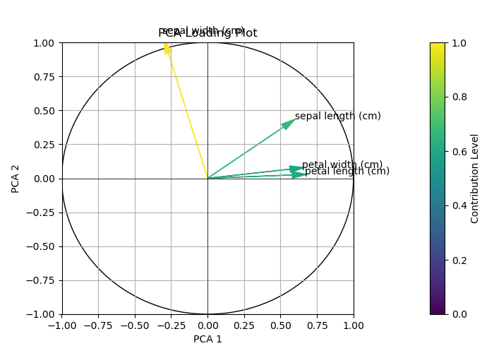
As shown above, first, we created a color map, which uses the viridis color scheme from Matplotlib’s color map module plt.cm.
Later, different from the previous code scripts, we created a grid layout for the main plot and its legend. This particular grid gs has 1 row and 2 columns, with the width ratio for columns set to 20:1 and a space wspace of 0.5 between them. Following this line, we added a subplot to the first cell of the grid. This is where the main plot will be drawn.
In the for loop, we used an additional line, color = cmap(normalized_contributions[i]), which translates to contributions to colors in the viridis scheme. Then, these obtained colors are used in the iteration to color each loading vector.
Furthermore, in this particular execution, a separate code block was devoted to forming the legend, which is the second subplot. There, we first defined that the range for the legend should span from 0 to 1, as specified by the norm object. Then, we created the ScalarMappable object sm matching the color map with contributions.
By using set_array([]), we ensured that the ScalarMappable object sm is linked to an array, which is a necessary step even though this array is empty. This setup enabled sm to use the previously defined normalization norm and color map cmap when creating the color bar.
The final three lines of the block are about creating and configuring the legend. The first line locates a new subplot in the second column of the grid layout. Then, the legend is drawn in that position via plt.colorbar(sm, cax = cbar_ax). Finally, the title "Contribution Level" is added.
See the final output below.
So far, we have customized the arrows in the loading plots. From the next example on, we will customize the arrow labels. Let’s dive into it!
Example 5: Draw Loading Plot with Adjusted Arrow Labels
In this example, we will alter the arrow label size and color using the color and fontsize parameters in the plt.text function.
plt.figure(figsize = (5, 5))                                   # set figure and size
circle = plt.Circle((0, 0), 1, fill = False)                   # create unit circle
plt.gca().add_artist(circle)                                   # add circle

for i in loadings.index:                                       # loop through features
    plt.arrow(0, 0,                                            # plot arrows with new settings
              loadings.PCA1[i], loadings.PCA2[i],
              head_width = 0.05, head_length = 0.1)
    plt.text(loadings.PCA1[i]*1.15,                            # plot arrow labels
             loadings.PCA2[i]*1.15,
             i,
             color = 'darkred', fontsize = 12)

plt.xlabel('PCA 1')                                            # add graph annotations
plt.ylabel('PCA 2')
plt.title('PCA Loading Plot')
plt.grid(True)
plt.xlim(-1, 1)
plt.ylim(-1, 1)
plt.axhline(0, color = 'black', linewidth = 0.5)
plt.axvline(0, color = 'black', linewidth = 0.5)

plt.show()                                                     # show graph
Now, let’s see how this attempt has changed the representation.
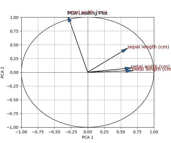
As seen, our intervention led to larger and dark-red-colored text. However, as you might notice, this also results in increased overlap in arrow labels. In the next example, we will explore how we can avoid overlapping in labeling.
Example 6: Draw Loading Plot with Repelled Arrow Labels
In order to repel the arrow labels to avoid overlapping, we will store each label in a list; then, we will parse it to the adjust_text function of the adjustText library to optimize the placement of text labels.
plt.figure(figsize = (5, 5))                                   # set figure and size
circle = plt.Circle((0, 0), 1, fill = False)                   # create unit circle
plt.gca().add_artist(circle)                                   # add circle

texts = []                                                     # create list to store arrow labels

for i in loadings.index:                                       # loop through features
    plt.arrow(0, 0,                                            # plot arrows
              loadings.PCA1[i], loadings.PCA2[i],
              head_width = 0.05, head_length = 0.1)
    text = plt.text(loadings.PCA1[i]*1.15,                     # plot arrow labels
                    loadings.PCA2[i]*1.15,
                    i)
    texts.append(text)                                         # append arrow labels

adjust_text(texts)                                             # adjust texts to avoid overlap

plt.xlabel('PCA 1')                                            # add graph annotations
plt.ylabel('PCA 2')
plt.title('PCA Loading Plot')
plt.grid(True)
plt.xlim(-1, 1)
plt.ylim(-1, 1)
plt.axhline(0, color = 'black', linewidth = 0.5)
plt.axvline(0, color = 'black', linewidth = 0.5)

plt.show()                                                     # show graph
You can observe that, first, an empty list has been created and called texts. Then, the labels have been appended to it in the for loop. Finally, adjust_text was employed to adjust the text allocations.
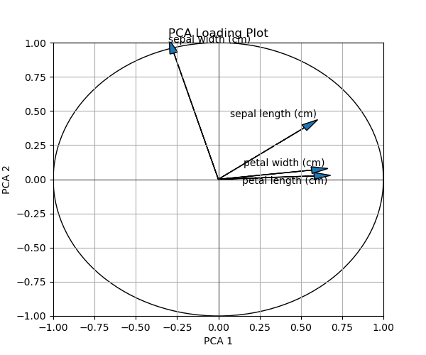
As seen, the labels are successfully repelled from each other. But you can always customize it further to get the best result for you, consulting the function’s documentation.
In the next example, we will discover one final loading plot customization, which is filtering out the variables with lower contributions.
Example 7: Draw Loading Plot with Filtered Arrows
In this example, we will filter out the variables, hence the loading vectors, that have contributions less than 0.7. Please see the if statement in the for loop below.
contributions = np.sqrt(loadings.PCA1**2 + loadings.PCA2**2)   # calculate contributions
max_contribution = contributions.max()                         # normalize contributions for coloring
normalized_contributions = contributions / max_contribution

plt.figure(figsize = (5, 5))                                   # set figure and size
circle = plt.Circle((0, 0), 1, fill = False)                   # create unit circle
plt.gca().add_artist(circle)                                   # add circle

for i in loadings.index:                                       # loop through features
    if contributions[i] > 0.7:                                 # set condition
        plt.arrow(0, 0,                                        # plot arrows
                  loadings.PCA1[i], loadings.PCA2[i],
                  head_width = 0.05, head_length = 0.1)
        plt.text(loadings.PCA1[i]*1.15,                        # plot arrow labels
                 loadings.PCA2[i]*1.15,
                 i)

plt.xlabel('PCA 1')                                            # add graph annotations
plt.ylabel('PCA 2')
plt.title('PCA Loading Plot')
plt.grid(True)
plt.xlim(-1, 1)
plt.ylim(-1, 1)
plt.axhline(0, color = 'black', linewidth = 0.5)
plt.axvline(0, color = 'black', linewidth = 0.5)

plt.show()                                                     # show graph
Let’s see which variables are omitted due to lower contribution!
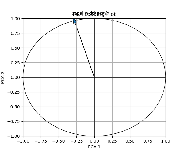
In this instance, based on the chosen arbitrary threshold number, only the sepal width remained in the plot. You can replace this threshold with one that is more convenient for your case.
Video, Further Resources & Summary
Do you want to know more about visualizing PCA loadings in Python? Then, you may watch the following video on my YouTube channel.
Furthermore, you may want to read the other articles on https://statisticsglobe.com/. Please find a selection of tutorials below:
- What is Principal Component Analysis (PCA)?
- Principal Component Analysis in Python
- PCA Using Correlation & Covariance Matrix
- What are Loadings in PCA?
- Loading Plot Explained
- Python Programming Tutorials
In summary: At this point, you should have learned how to plot a loading plot in Python. Don’t hesitate to let me know in the comments section in case you have any further questions.
This page was created in collaboration with Cansu Kebabci. Have a look at Cansu’s author page to get more information about her professional background, a list of all his tutorials, as well as an overview on her other tasks on Statistics Globe.
Subscribe to the Statistics Globe Newsletter
Get regular updates on the latest tutorials, offers & news at Statistics Globe.
I hate spam & you may opt out anytime: Privacy Policy.
Thank you!
Welcome to the Statistics Globe newsletter. From now on, I’ll send you regular emails about statistics, data science, AI, and programming with R and Python.
I’m Joachim Schork. On this website, I provide statistics tutorials as well as code in Python and R programming.
Statistics Globe Newsletter
Get regular updates on the latest tutorials, offers & news at Statistics Globe. I hate spam & you may opt out anytime: Privacy Policy.
Thank you!
Please check your email inbox and click the confirmation link to complete your subscription. If you don’t see the email within a few minutes, please also check your spam/junk folder.


