Visualize NA Gap in ggplot2 Line Plot in R (Example)
In this article you’ll learn how to draw data containing NA values as gaps in a ggplot2 line plot in the R programming language.
The tutorial will consist of this:
With that, here’s the step-by-step process.
Exemplifying Data
The first step is to construct some data that we can use in the following example code:
set.seed(675582)
data <- data.frame(x = 1:30,    # Create example data frame
                   y = c(rnorm(10), rep(NA, 10), runif(10)))
head(data)                      # Print head of example data frame

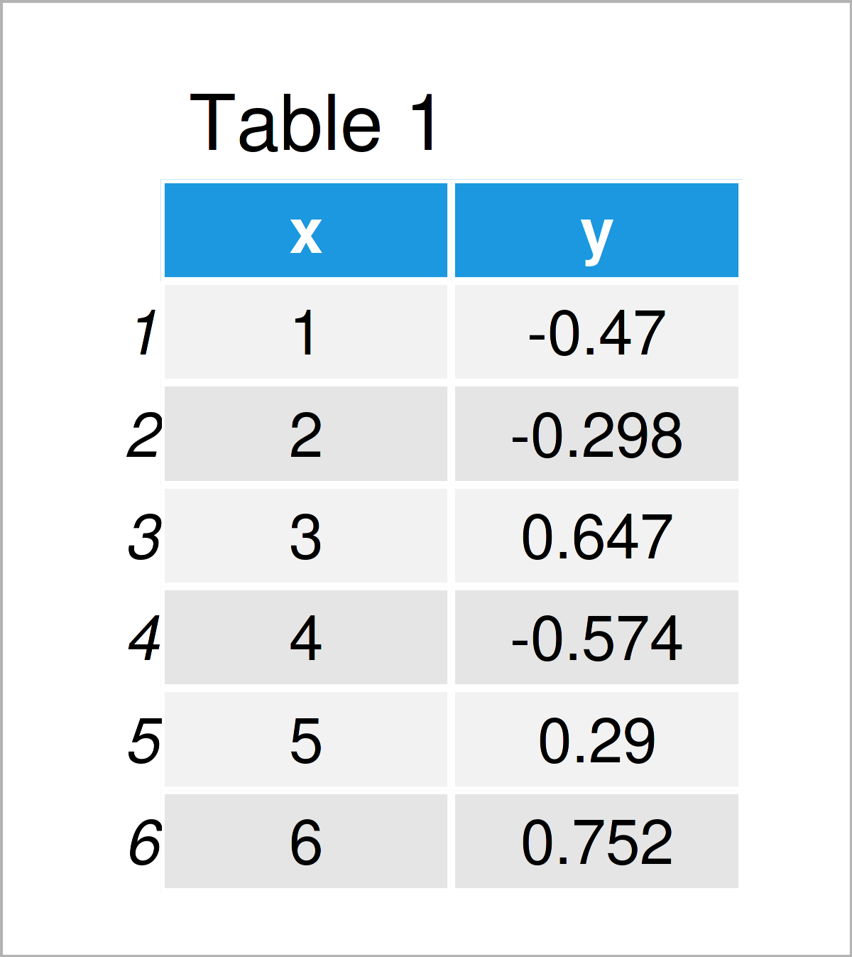
Table 1 shows the first six data points of our example data – as you can see, our data is made of two columns. The variable x has the integer class and the variable y has the numeric class.
Example: Draw ggplot2 Line Plot Containing Missing Values with Gap
This example illustrates how to draw a ggplot2 line graphic using the geom_line function where NA values are indicated by a gap.
First, we need to install and load the ggplot2 package:
install.packages("ggplot2")     # Install ggplot2 package
library("ggplot2")              # Load ggplot2
In the next step, we can draw our data using the geom_line function:
ggplot(data,                    # Visualize line with NA values in ggplot2
       aes(x = x,
           y = y)) +
  geom_line()

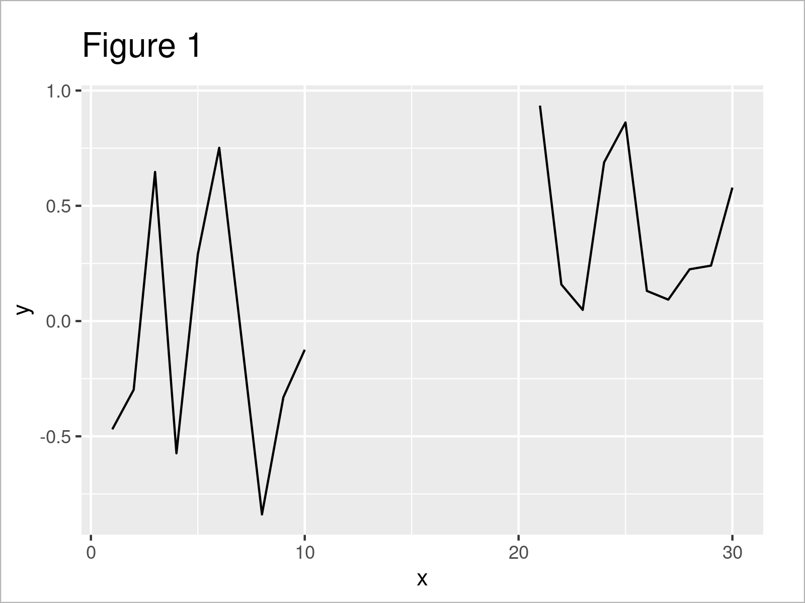
By running the previous R programming code, we have created Figure 1, i.e. a ggplot2 line graph.
As you can see, the missing data in the column y is shown as a gap in our ggplot2 line chart.
Note that there are ways to connect the lines across those gaps. In case you want to know more about that, please have a look here.
Video & Further Resources
I have recently released a video on my YouTube channel, which demonstrates the topics of this tutorial. You can find the video below.
Besides that, you could read the other tutorials on my website. Please find a selection of other posts below:
- Add Different Line to Each Facet of ggplot2 Plot
- Draw Vertical Line to X-Axis of Class Date in ggplot2 Plot
- Change Line Width in ggplot2 Plot
- Add Line Segment & Curve to ggplot2 Plot
- R Graphics Gallery
- R Programming Tutorials
In this tutorial, I have explained how to visualize data containing NA values as gaps in a ggplot2 geom_line plot in R programming. Don’t hesitate to let me know in the comments section below, in case you have further questions. Furthermore, please subscribe to my email newsletter in order to get updates on new posts.


