Add Line Segment & Curve to ggplot2 Plot in R (7 Examples)
In this article, I’ll show how to draw line segments and curves in ggplot2 plots in the R programming language.
The content of the page looks as follows:
Let’s dive into it:
Exemplifying Data, Add-On Packages & Basic Graphic
Let’s first create some example data.
data <- data.frame(x = 1:6,                      # Create example data frame
                   y = c(5, 3, 4, 8, 2, 3))
data                                             # Print example data frame
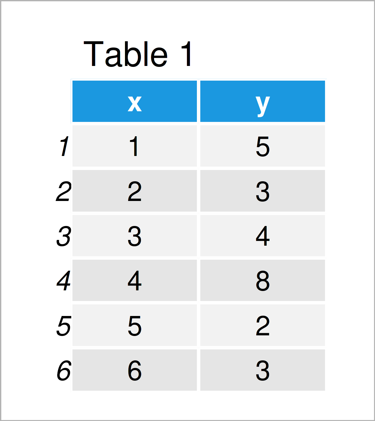
As you can see based on Table 1, our example data is a data frame made of six rows and two columns.
To be able to plot the data with the ggplot2 package, we also need to install and load ggplot2:
install.packages("ggplot2")                      # Install ggplot2 package
library("ggplot2")                               # Load ggplot2 package
As a next step, we can draw our data:
ggp <- ggplot(data, aes(x, y)) +                 # Create ggplot2 plot without lines & curves
  geom_point()
ggp                                              # Draw ggplot2 plot
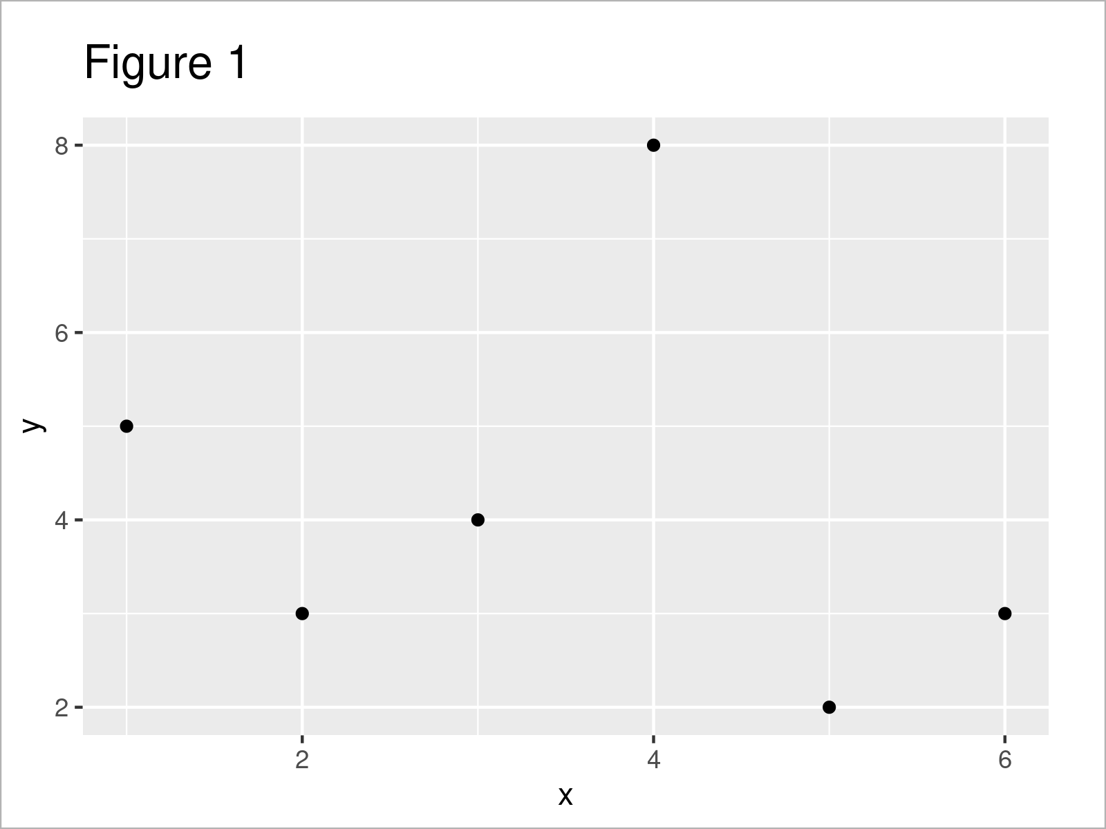
As shown in Figure 1, we have created a ggplot2 scatterplot without any line segments or curves yet.
Example 1: Add Single Line Segment to ggplot2 Plot
This example shows how to draw a single line segment to a ggplot2 plot.
For this task, we can apply the geom_segment function as shown below:
ggp +                                            # Draw line segment
  geom_segment(x = 2.5,
               y = 3,
               xend = 5,
               yend = 7)
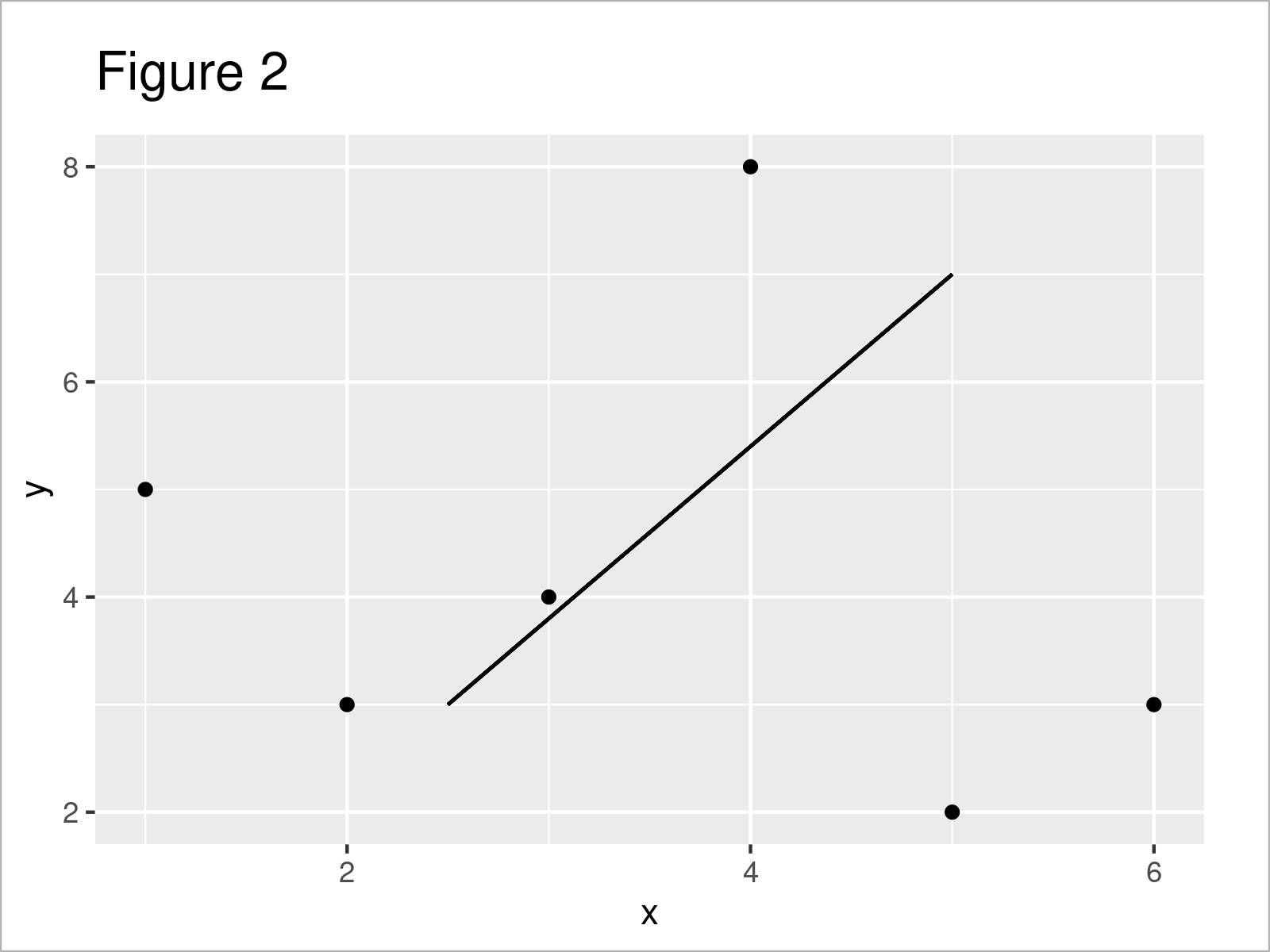
As shown in Figure 2, the previous syntax has created a single line segment with manually specified start and end points on the x- and y-axes.
Example 2: Adjust Color, Size & Linetype of Line Segment in ggplot2 Plot
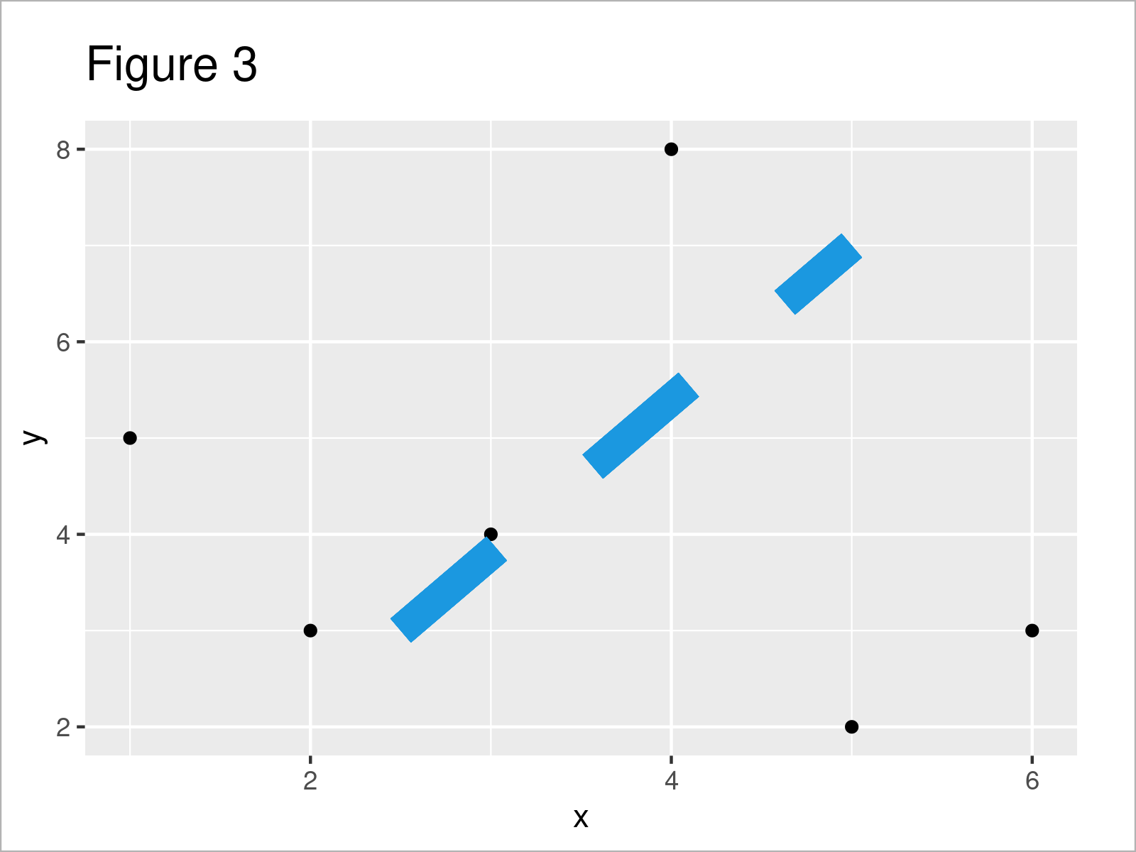
In this example, I’ll demonstrate how to change the color, size and linetype of our line segment.
Consider the R code below:
ggp +                                            # Modify color, size & linetype
  geom_segment(x = 2.5,
               y = 3,
               xend = 5,
               yend = 7,
               col = "#1b98e0",
               size = 5,
               linetype = "dashed")
Example 3: Add Multiple Line Segments to ggplot2 Plot
It is also possible to append multiple line segments to a ggplot2 plot.
For this, it makes sense to define all the parameters of our lines in a data frame object first:
data_lines <- data.frame(x = 2:4,                # Create data for multiple segments
                         y = c(4.5, 5, 2),
                         xend = c(6, 8, 5),
                         yend = c(7, 5, 6),
                         col = paste0("line_", letters[1:3]))
data_lines                                       # Print data for multiple segments
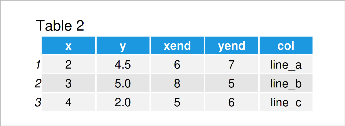
After running the previous code the data frame with all our line parameters shown in Table 2 has been created.
Next, we can use this data frame to add multiple line segments to our ggplot2 plot:
ggp +                                            # Draw multiple line segments
  geom_segment(data = data_lines,
               aes(x = x,
                   y = y,
                   xend = xend,
                   yend = yend,
                   col = col))
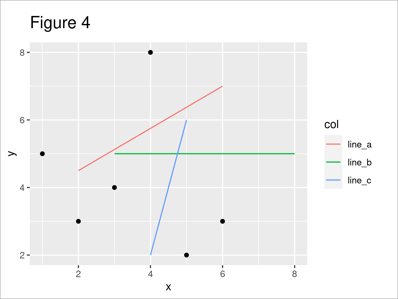
After running the previously shown R syntax the ggplot2 scatterplot shown in Figure 4 has been drawn. As you can see, we have added three lines with different colors and a legend on the right side of the plot.
Example 4: Add Curve to ggplot2 Plot
In this example, I’ll demonstrate how to draw a curve in a ggplot2 graphic.
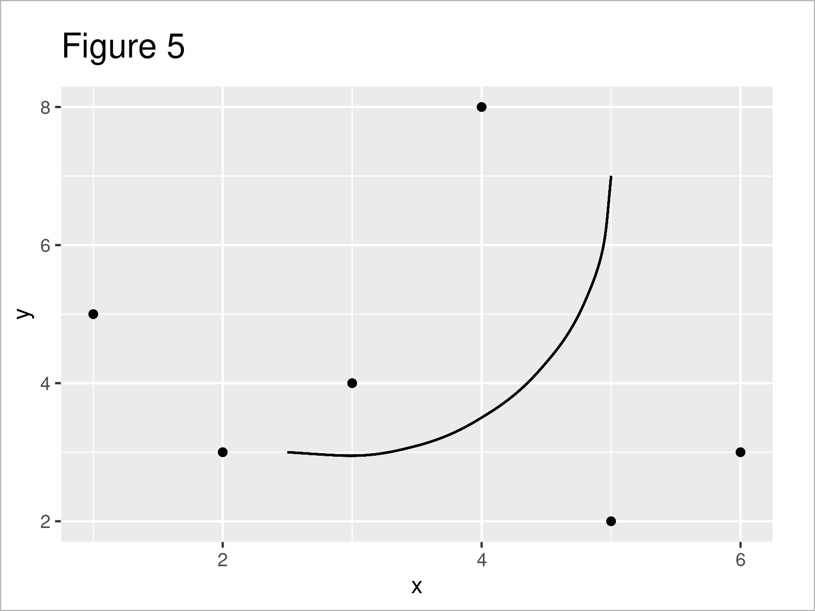
To achieve this, we simply have to exchange the geom_segment by the geom_curve function:
ggp +                                            # Draw curve
  geom_curve(x = 2.5,
             y = 3,
             xend = 5,
             yend = 7)
Example 5: Adjust Curvature, Angle & Control Points of Curve in ggplot2 Plot
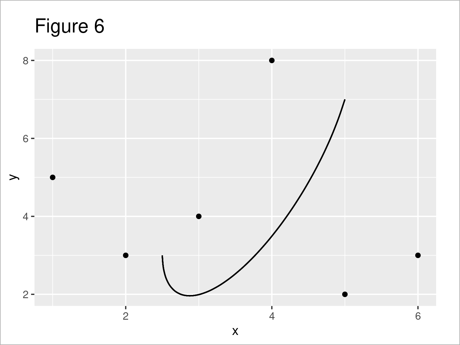
Besides the basic attributes of our curve (e.g. color and size), we can also modify the curvature, the angle, and the number of control points (i.e. ncp).
ggp +                                            # Modify curvature, angle & ncp
  geom_curve(x = 2.5,
             y = 3,
             xend = 5,
             yend = 7,
             curvature = 0.8,
             angle = 40,
             ncp = 20)
Example 6: Add Line Segment & Curve to ggplot2 Plot
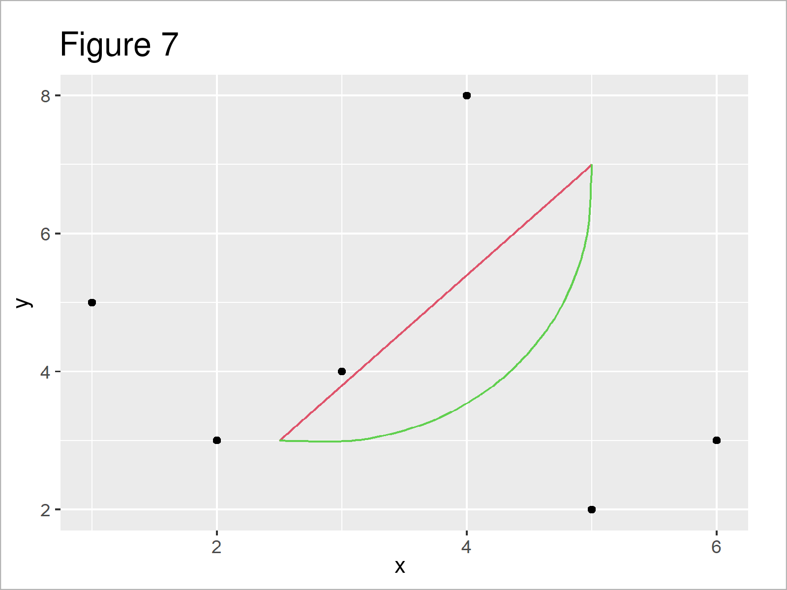
The following R code explains how to draw a line segment and a curve simultaneously to a ggplot2 plot.
For this, we have to add the geom_segment function as well as the geom_curve function to our ggp plot object:
ggp +                                            # Draw line segment & curve
  geom_segment(x = 2.5,
               y = 3,
               xend = 5,
               yend = 7,
               col = 2) +
  geom_curve(x = 2.5,
             y = 3,
             xend = 5,
             yend = 7,
             col = 3)
Example 7: Add Line Segments to Specific Facets in ggplot2 Facet Plot
Adding line segments and curves can be tricky when you are dealing with ggplot2 facet plots (i.e. facet_wrap & facet_grid).
This example explains how to draw line segments only to some of the facets in a facet plot.
In order to create a facet plot, we first have to modify our example data frame:
data_facet <- data                               # Create data with groups & subgroups
data_facet$group = LETTERS[1:3]
data_facet$subgroup = letters[1:2]
data_facet                                       # Print data with groups & subgroups
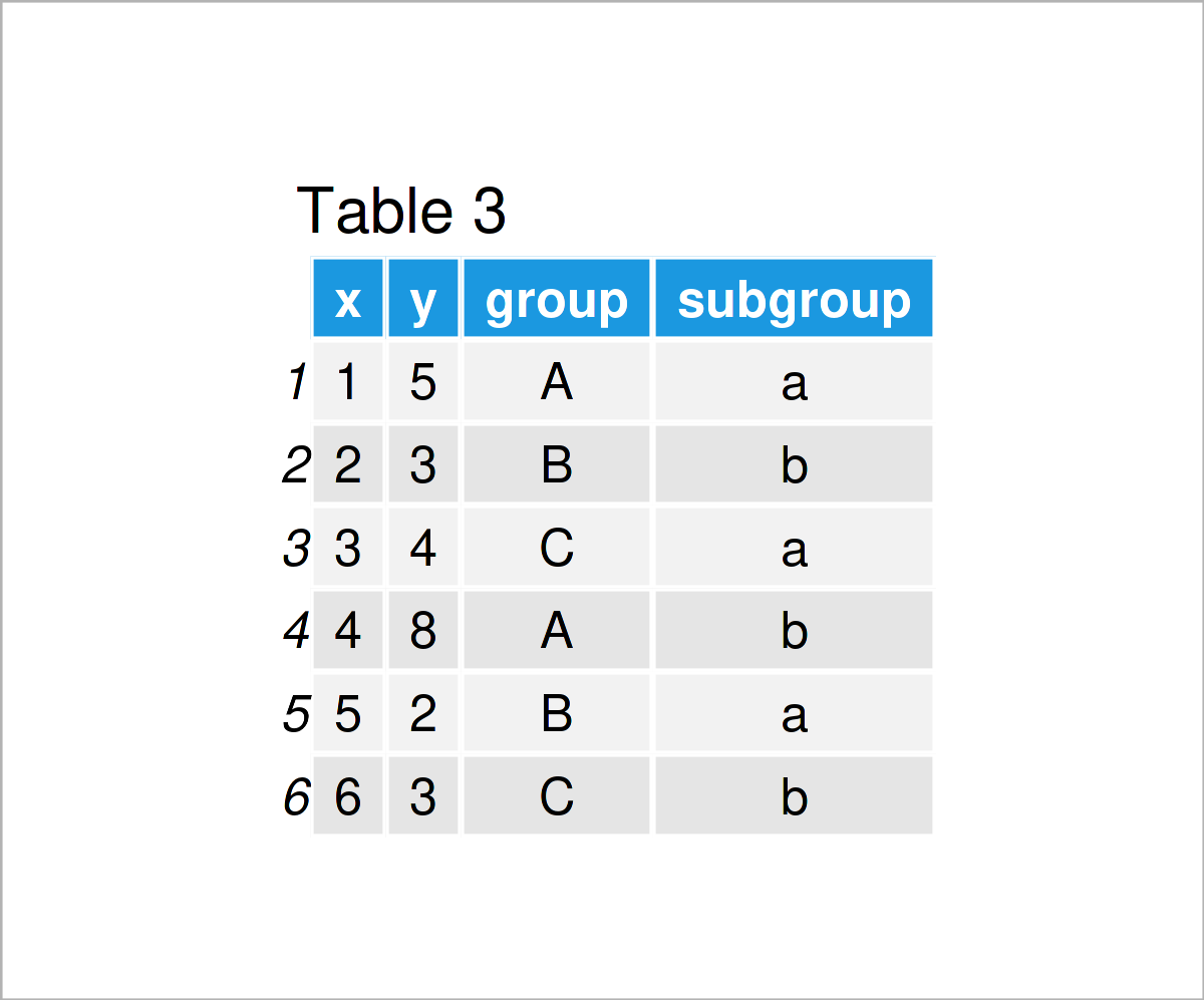
In Table 3 you can see that we have created a new data frame containing additional group and subgroup columns.
Now, we can use these data to draw a ggplot2 facet graphic:
ggp_facet <- ggplot(data_facet, aes(x, y)) +     # Create ggplot2 facet plot
  geom_point() +
  facet_grid(subgroup ~ group)
ggp_facet                                        # Draw ggplot2 facet plot
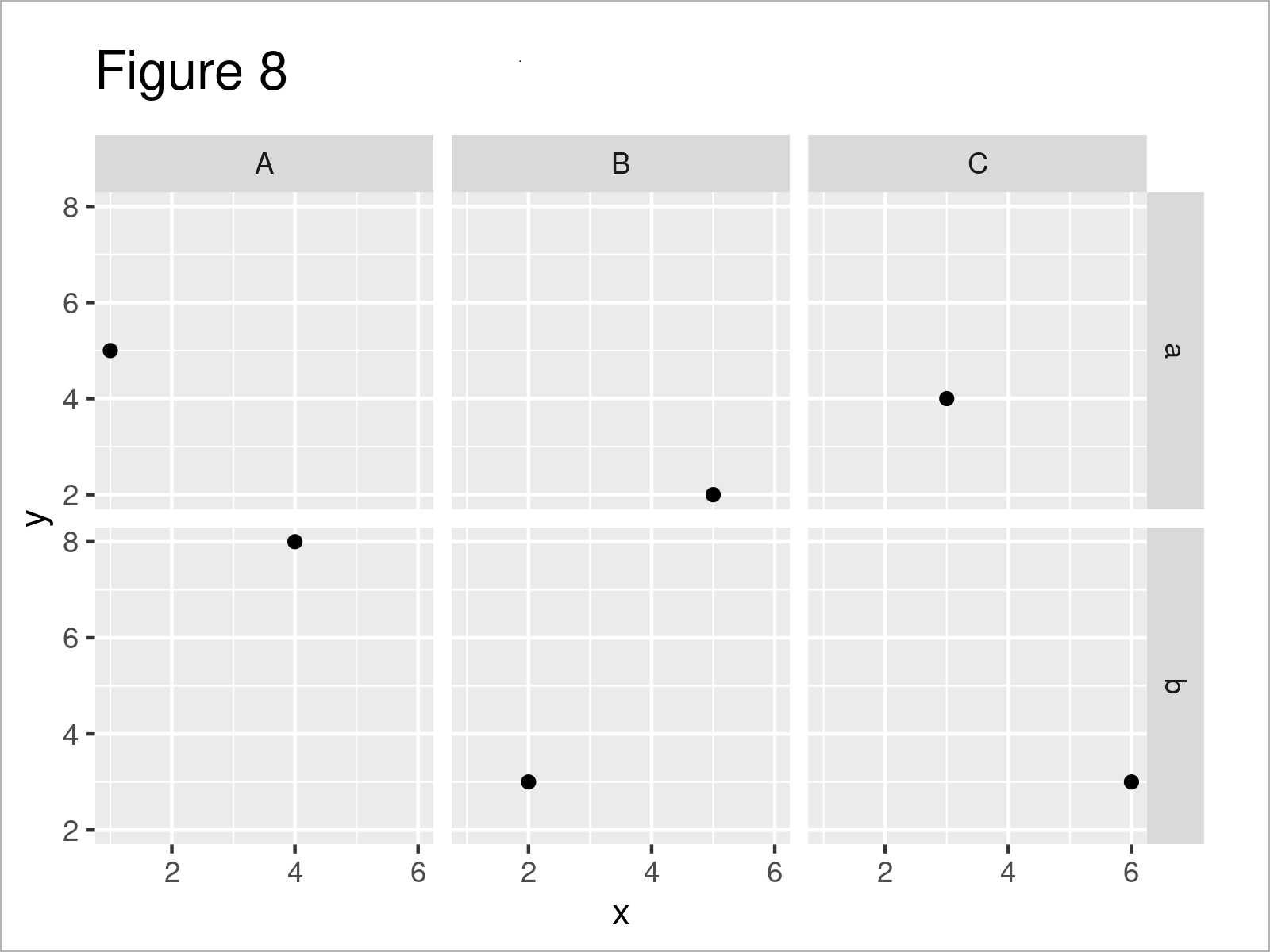
In the next step, we have to define a data set that contains all the parameters of our lines. Note that this data set also contains a group and subgroup column that specifies the facets to which we want to add the corresponding lines:
data_facet_lines <- data.frame(x = c(2.5, 2),    # Create data for lines in facets
                               y = 3:4,
                               xend = c(3, 5),
                               yend = 7:6,
                               group = c("A", "C"),
                               subgroup = c("a", "b"),
                               col = paste0("line_", 1:2))
data_facet_lines                                 # Print data for lines in facets

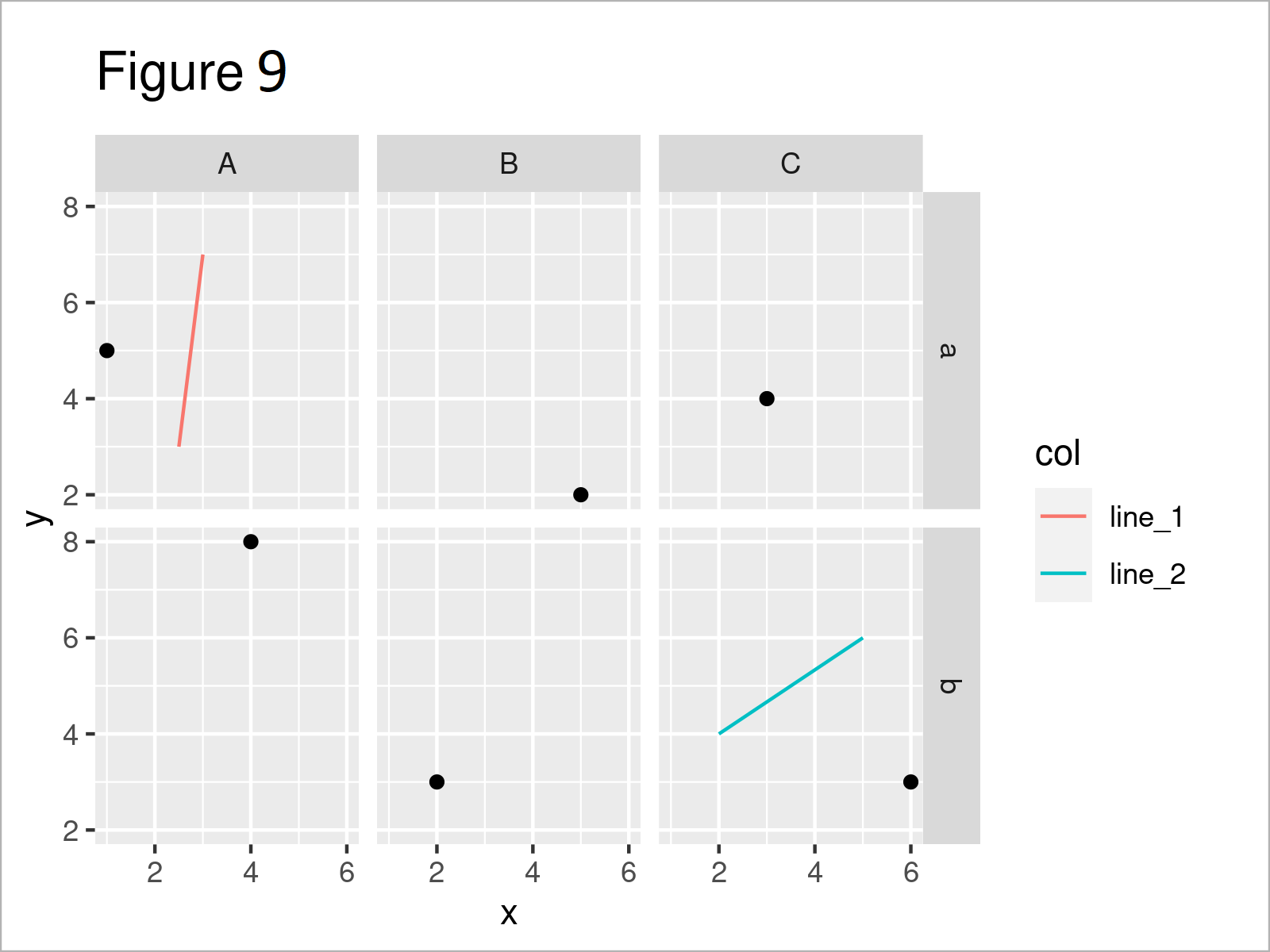
Finally, we can draw a ggplot2 facet plot with line segments in only some of the facets:
ggp_facet +                                      # Draw lines in certain facets
  geom_segment(data = data_facet_lines,
               aes(x = x,
                   y = y,
                   xend = xend,
                   yend = yend,
                   col = col),
               inherit.aes = FALSE)
Video & Further Resources
Have a look at the following video on my YouTube channel. In the video, I illustrate the R code of this tutorial in RStudio:
Furthermore, you might have a look at some of the related tutorials on this website.
- Extract stat_smooth Regression Line Fit from ggplot2 Plot
- Add Text to ggplot2 Plot in R
- Add Greek Symbols to ggplot2 Plot in R
- Add Grid Line Consistent with Ticks on Axis to Plot
- Add Marginal Plot to ggplot2 Scatterplot Using ggExtra Package
- Draw Vertical Line to X-Axis of Class Date in ggplot2 Plot
- Graphics Gallery in R
- R Programming Examples
At this point you should know how to add line segments and curves to ggplot2 graphs in the R programming language. Please let me know in the comments section below, in case you have further questions or comments. Furthermore, don’t forget to subscribe to my email newsletter to get updates on the newest articles.




2 Comments. Leave new
Lovely, thanks
Hi Frico,
thanks for the lovely feedback, hope the tutorial has been helpful!
Best,
Matthias