Transform ggplot2 Plot Axis to log10 Scale in R (Example)
This tutorial explains how to convert the axis of a ggplot2 graph to a logarithmic scale in the R programming language.
The content of the post is structured as follows:
Let’s jump right to the programming part:
Example Data, Packages & Basic Plot
As a first step, we’ll need to create some data that we can use in the following examples:
set.seed(293847)                    # Create example data
data <- data.frame(x = rnorm(100, 60, 5),
                   y = rnorm(100, 80, 7))
head(data)                          # Head of example data
#          x        y
# 1 57.34786 86.79776
# 2 60.15527 73.74097
# 3 63.63277 80.23659
# 4 68.15397 95.60626
# 5 60.26441 80.20467
# 6 57.86862 78.61634
As you can see based on the previous output of the RStudio console, our example data has two numeric columns.
We also have to install and load the ggplot2 package, if we want to use the corresponding functions:
install.packages("ggplot2")         # Install & load ggplot2
library("ggplot2")
Next, we can plot our data:
ggp <- ggplot(data, aes(x, y)) +    # Create default ggplot2 plot
  geom_point()
ggp                                 # Draw ggplot2 plot

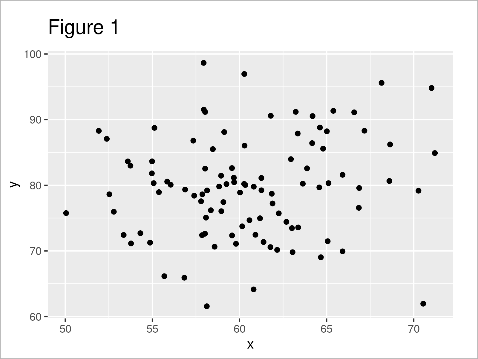
As illustrated in Figure 1, the previous code created a ggplot2 graphic with default axis values.
Example 1: Transform X-Axis Values of ggplot2 Plot to Logarithm with Base 10
In this example, I’ll show how to transform the values on the x-axis of our plot to a logarithmic scale with a base of 10.
For this, we have to use the scale_x_continuous function and the trans argument as shown below:
ggp +                               # Transform x-axis to log10
  scale_x_continuous(trans = "log10") +
  xlab("x-log10")

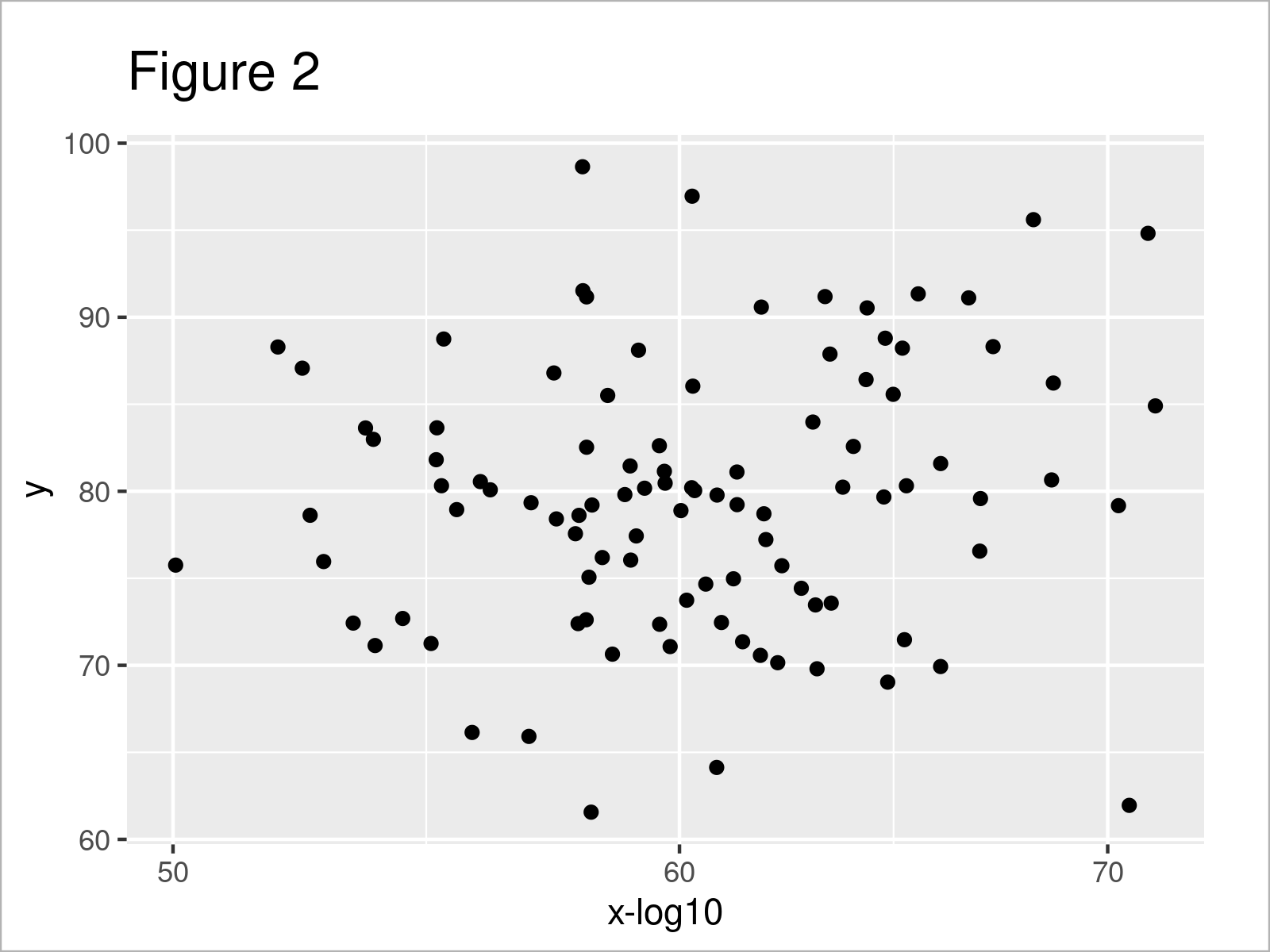
As shown in Figure 2, we created a scatterplot with log scale with the previous code.
Note that we have only changed the values in our ggplot2 scatterplot. The axis tick marks have not been transformed to a log10 scale.
Depending on how you want to illustrate your data, you may prefer to show the x-axis tick marks as log10 scale as well. In the next example, I’ll therefore explain how to change the axis tick marks as well. So keep on reading!
Example 2: Transform X-Axis Values & Axis Ticks of ggplot2 Plot to Logarithm with Base 10
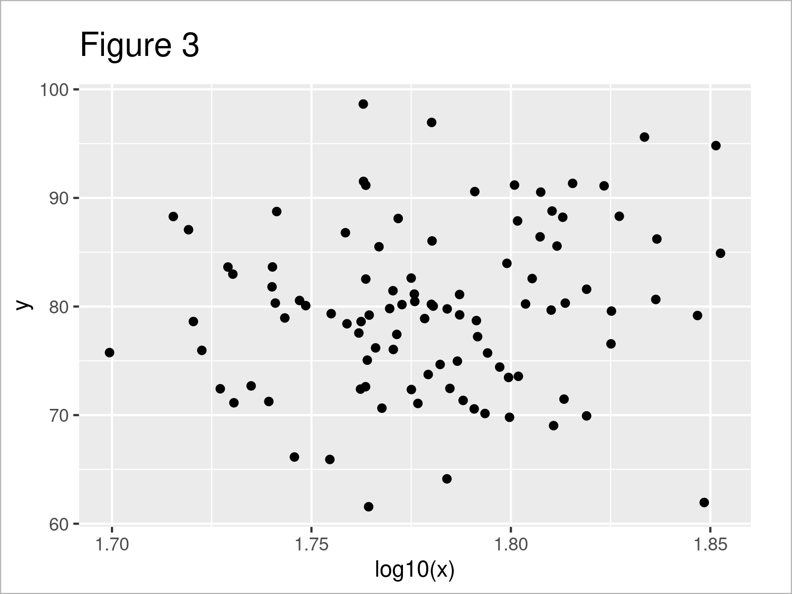
In this example, I’ll illustrate how to convert the values in our plot AND the x-axis tick marks to a log10 scale.
For this, we can use the log10 function as shown below:
ggplot(data, aes(log10(x), y)) +    # Transform x-axis to log10
  geom_point()

Video, Further Resources & Summary
I have recently published a video tutorial on my YouTube channel, which illustrates the content of this article. You can find the video below.
Furthermore, I can recommend having a look at the related tutorials on www.statisticsglobe.com.
- Graphics in R – Introduction to the ggplot2 Package
- Set Axis Limits of ggplot2 Facet Plot
- Add X & Y Axis Labels to ggplot2 Plot
- Change Formatting of Numbers of ggplot2 Plot Axis in R
- Remove Axis Labels & Ticks of ggplot2 Plot (R Example)
- Graphics in R
- The R Programming Language
In summary: On this page you learned how to transform axis values to log in R. If you have additional comments or questions, please tell me about it in the comments.


2 Comments. Leave new
You just showed the syntax. What does scaling do? Why may we need it? What kind of mathematic difference it makes? the tutorial is insufficient.
Hello Kurt,
I am sorry that you found the tutorial insufficient. In R tutorials on Statistics Globe, we solely focus on the implementation in R. In theoretical tutorials, we explain the details like why we need it, etc. But I am afraid that we don’t have a theoretical tutorial devoted to log scaling.
Best,
Cansu