Specify Different Colors for Points that are Connected by Lines in a ggplot2 Plot in R (Example)
In this tutorial, I’ll illustrate how to change the point colors for different lines in ggplot2 graphic in the R programming language.
The article will contain one example for the modification of the colors for points related to separate lines in ggplot2 graph. More precisely, the article contains the following content blocks:
Let’s start right away!
Example Data, Packages & Default Graphic
The following data will be used as a basis for this R programming language tutorial:
set.seed(86742)                     # Create example data frame
data <- data.frame(x = 1:10,
                   y = c(rnorm(10, 1, 2),
                         rnorm(10, 4, 1),
                         rnorm(10, 8, 3)),
                   line = rep(paste0("line_", LETTERS[1:3]), each = 10))
head(data)                          # Print head of example data frame

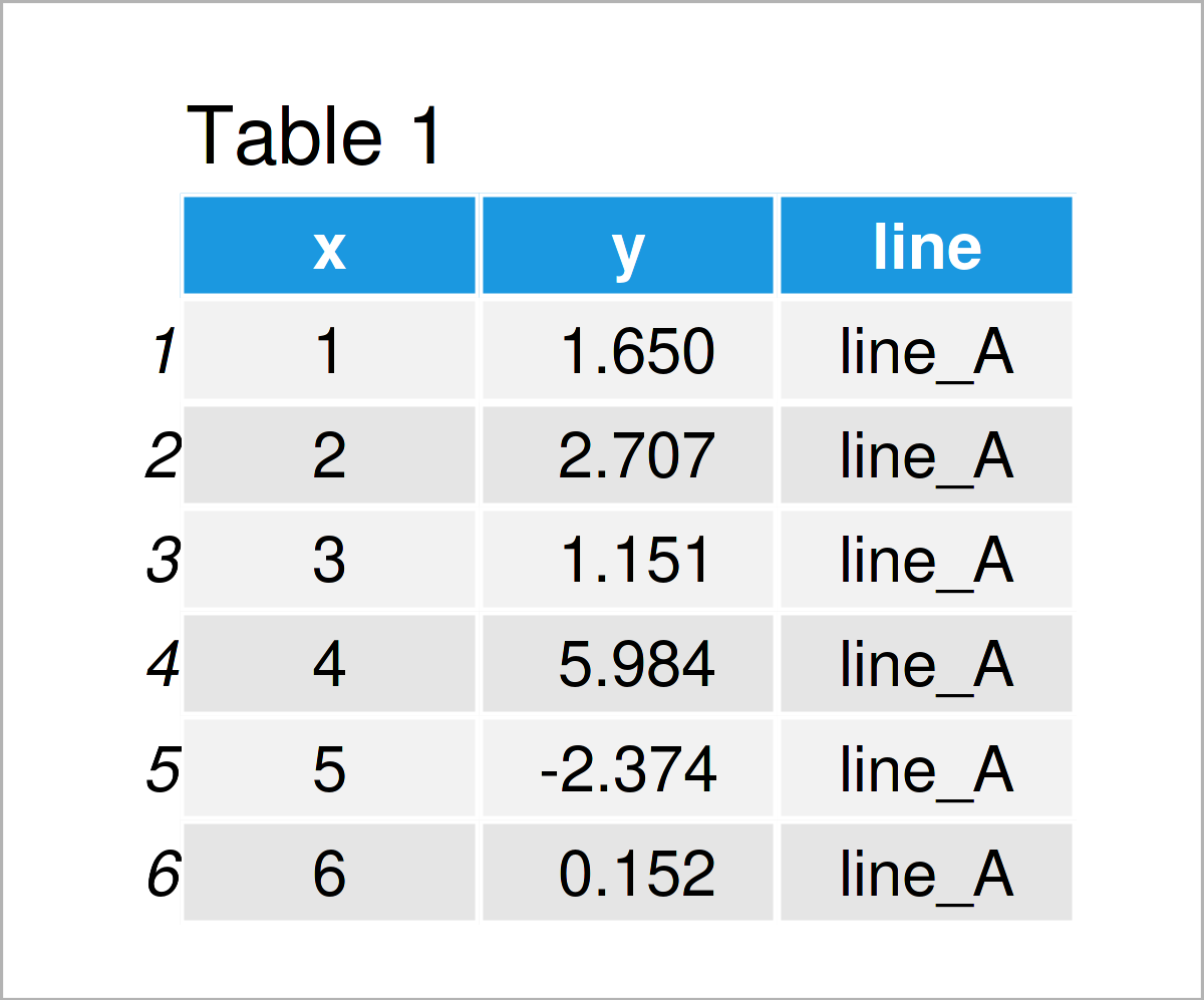
Have a look at the table that got returned after running the previous R programming syntax. It shows the upper lines of our exemplifying data, and that our data comprises three variables. The variable x is an integer, the variable y is numerical, and the variable line is a character.
In order to use the functions of the ggplot2 package, we also need to install and load ggplot2.
install.packages("ggplot2")         # Install & load ggplot2 package
library("ggplot2")
Next, we can create a plot of our data:
ggplot(data,                        # Draw ggplot2 line & point plot without colors
       aes(x = x,
           y = y,
           group = line)) +
  geom_line() +
  geom_point()

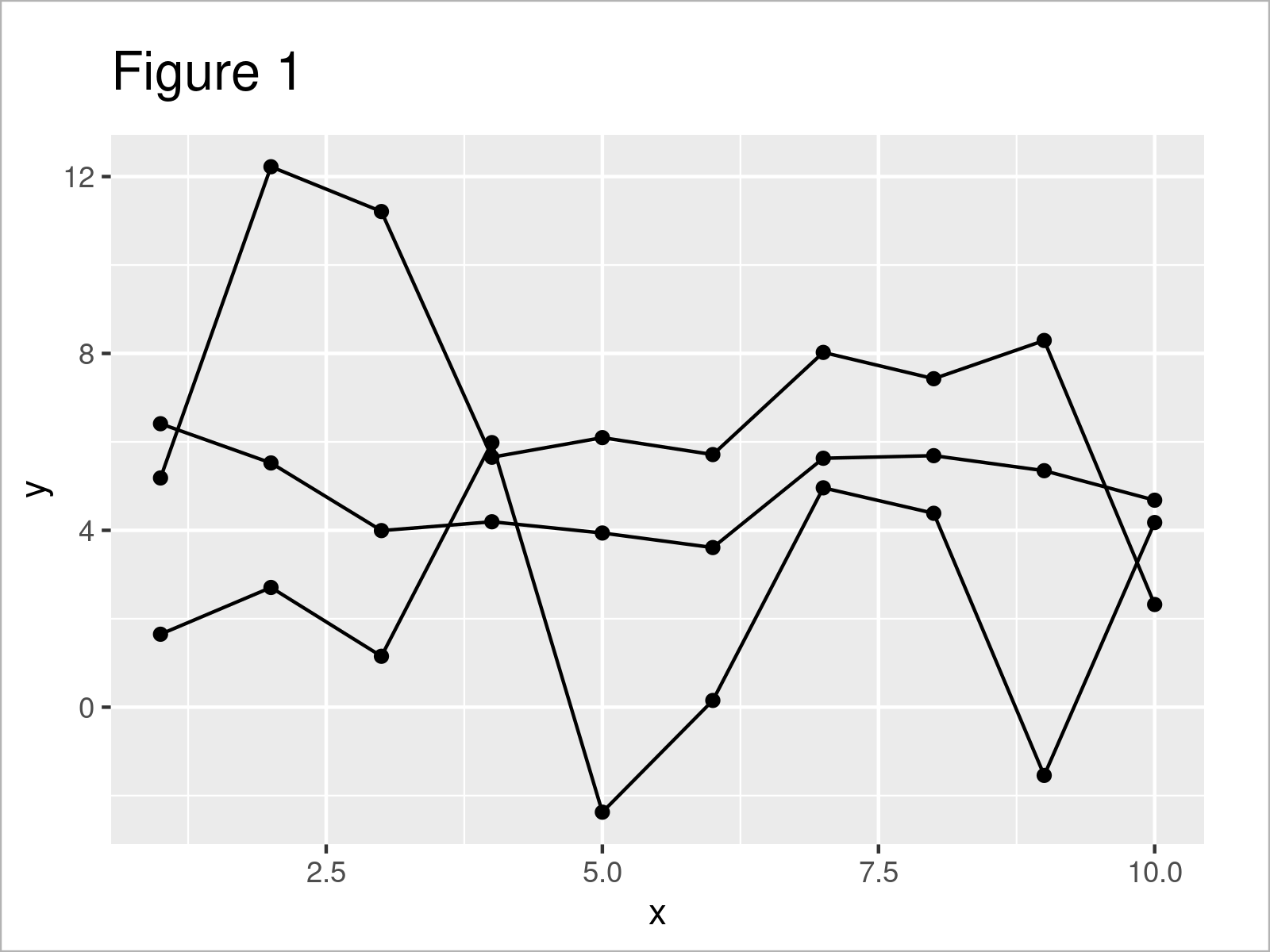
The output of the previous code is shown in Figure 1: We have drawn a ggplot2 line and point plot. At this point, our graphic does not contain any colors.
Example: Change Point Colors by Group by Specifying Aesthetics within geom_point() Function
The following code explains how to modify the color of points based on the different lines that are connecting those points.
For this task, we have to use the aes() function within the geom_point() function. Within the aesthetics, we have to set the col argument to be equal to the grouping column in our data set (i.e. the column line).
Consider the R syntax and its output below:
ggplot(data,                        # Change colors of points by group
       aes(x = x,
           y = y,
           group = line)) +
  geom_line() +
  geom_point(aes(col = line))

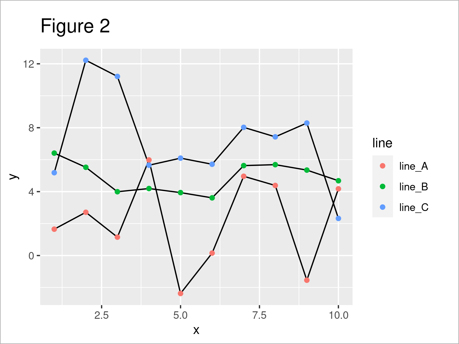
The output of the previous R programming syntax is shown in Figure 2 – We have changed the colors of our points according to the connecting lines of those points.
In addition to that, we have added a legend on the right side of the plot that identifies the group of each of the colors.
Looks great!
Note that we could use this kind of syntax to change other parameters such as the shape or style of the points as well.
Video, Further Resources & Summary
Have a look at the following video on my YouTube channel. In the video, I illustrate the content of this article.
Furthermore, you might want to have a look at the other articles on my homepage. Some tutorials on topics such as ggplot2, lines, variables, and graphics in R are shown below:
- Modify Major & Minor Grid Lines of ggplot2 Plot
- Change Colors in ggplot2 Line Plot in R
- Draw Multiple Variables as Lines to Same ggplot2 Plot
- Draw ggplot2 Plot with Two Y-Axes
- Draw ggplot2 Plot with Lines and Points
- Drawing Plots in R
- All R Programming Examples
In summary: You have learned in this tutorial how to adjust the point colors for different lines in ggplot2 line and point graph in the R programming language. In case you have additional questions, please let me know in the comments.
Subscribe to the Statistics Globe Newsletter
Get regular updates on the latest tutorials, offers & news at Statistics Globe.
I hate spam & you may opt out anytime: Privacy Policy.
Thank you!
Welcome to the Statistics Globe newsletter. From now on, I’ll send you regular emails about statistics, data science, AI, and programming with R and Python.
I’m Joachim Schork. On this website, I provide statistics tutorials as well as code in Python and R programming.
Statistics Globe Newsletter
Get regular updates on the latest tutorials, offers & news at Statistics Globe. I hate spam & you may opt out anytime: Privacy Policy.
Thank you!
Please check your email inbox and click the confirmation link to complete your subscription. If you don’t see the email within a few minutes, please also check your spam/junk folder.


