Modify Major & Minor Grid Lines of ggplot2 Plot in R (5 Examples)
This post shows how to control the grid lines of a ggplot2 graph in the R programming language.
Table of contents:
So now the part you have been waiting for – the examples.
Example Data, Packages & Default Plot
As the first step, I’ll have to create some data that we can use in the examples later on:
data <- data.frame(x = 1:5,         # Create example data
                   y = c(3, 1, 4, 2, 5))
data                                # Print example data

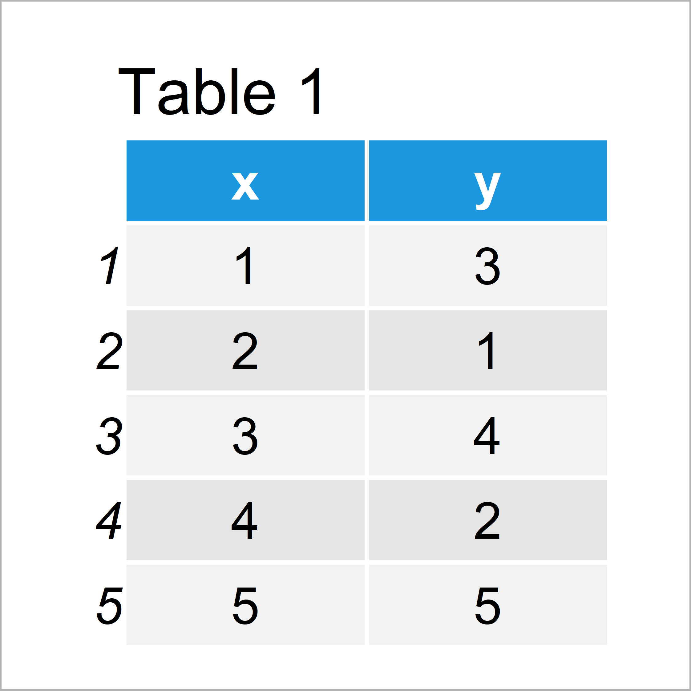
Table 1 shows the structure of our example data: It comprises five rows and two columns.
To be able to draw our data with the ggplot2 package, we also need to install and load ggplot2:
install.packages("ggplot2")         # Install & load ggplot2 package
library("ggplot2")
As next step, we can plot our data:
ggp <- ggplot(data, aes(x, y)) +    # ggplot2 plot with default grid
  geom_line()
ggp

By executing the previous syntax we have drawn Figure 1, i.e. a ggplot2 line plot with regular grid lines.
Example 1: Modify Minor Grid Lines on X-Axis of ggplot2 Plot
In this example, I’ll illustrate how to control the minor grid lines on the x-axis of a ggplot2 graphic.
For this, we can use the scale_x_continuous and the minor_breaks argument as shown below:
ggp +                               # X-axis minor breaks
  scale_x_continuous(minor_breaks = seq(0, 10, 0.1))

Example 2: Modify Minor Grid Lines on Y-Axis of ggplot2 Plot
In Example 2, I’ll show how to adjust the minor grid lines on the y-axis.
All we have to change compared to Example 1 is the function, i.e. scale_y_continuous instead of scale_x_continuous:
ggp +                               # Y-axis minor breaks
  scale_y_continuous(minor_breaks = seq(0, 10, 0.1))

Example 3: Modify Major Breaks & Grid Lines on Y-Axis of ggplot2 Plot
Example 3 explains how to modify the major breaks in a ggplot2 plot using the breaks argument within the scale_y_continuous function.
Note that the following R syntax also changes the axis ticks:
ggp +                               # Y-axis major breaks
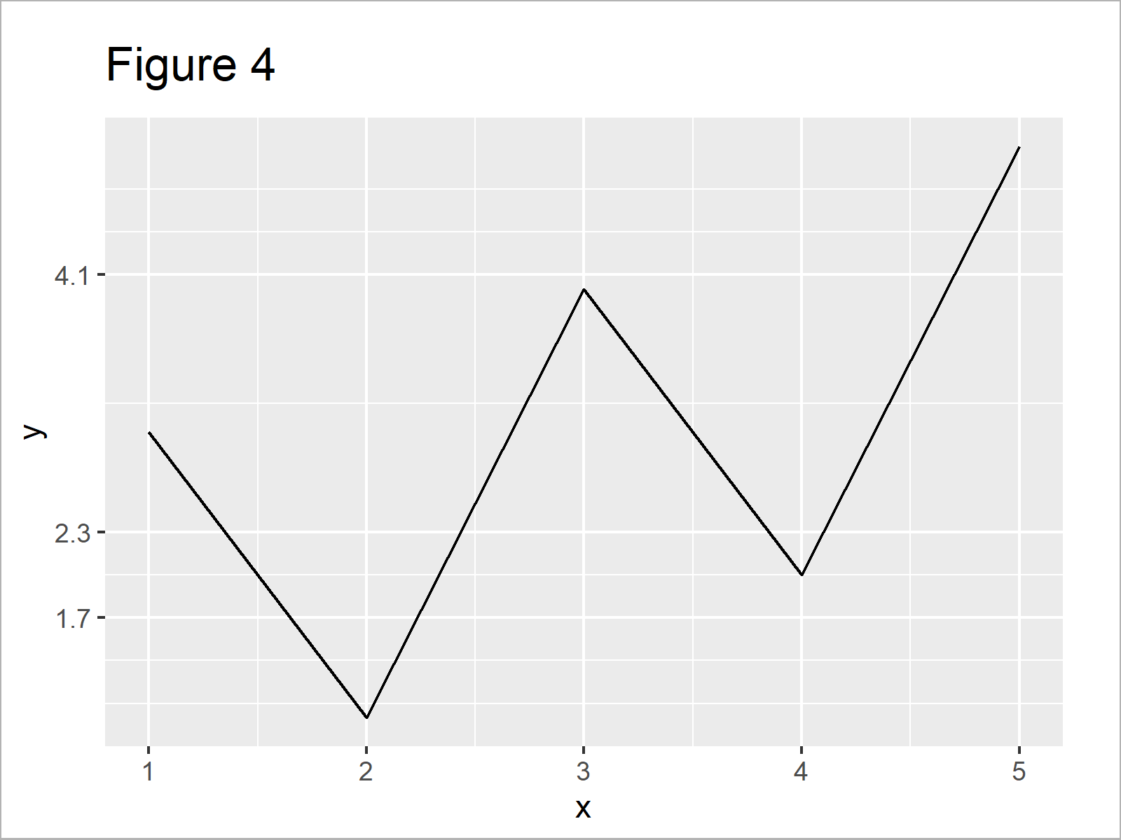
  scale_y_continuous(breaks = c(1.7, 2.3, 4.1))

Example 4: Remove Major & Minor Grid Lines on X-Axis of ggplot2 Plot
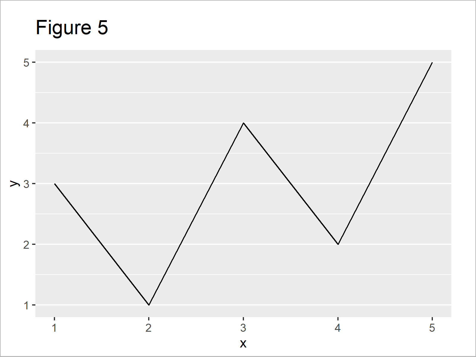
The following syntax shows how to delete all x-axis grid lines from our graphic using the theme function in combination with the panel.grid.major.x and panel.grid.minor.x arguments:
ggp +                               # Major & minor x-axis grid lines
  theme(panel.grid.major.x = element_blank(),
        panel.grid.minor.x = element_blank())

Example 5: Modify All Grid Lines on Both Axes of ggplot2 Plot
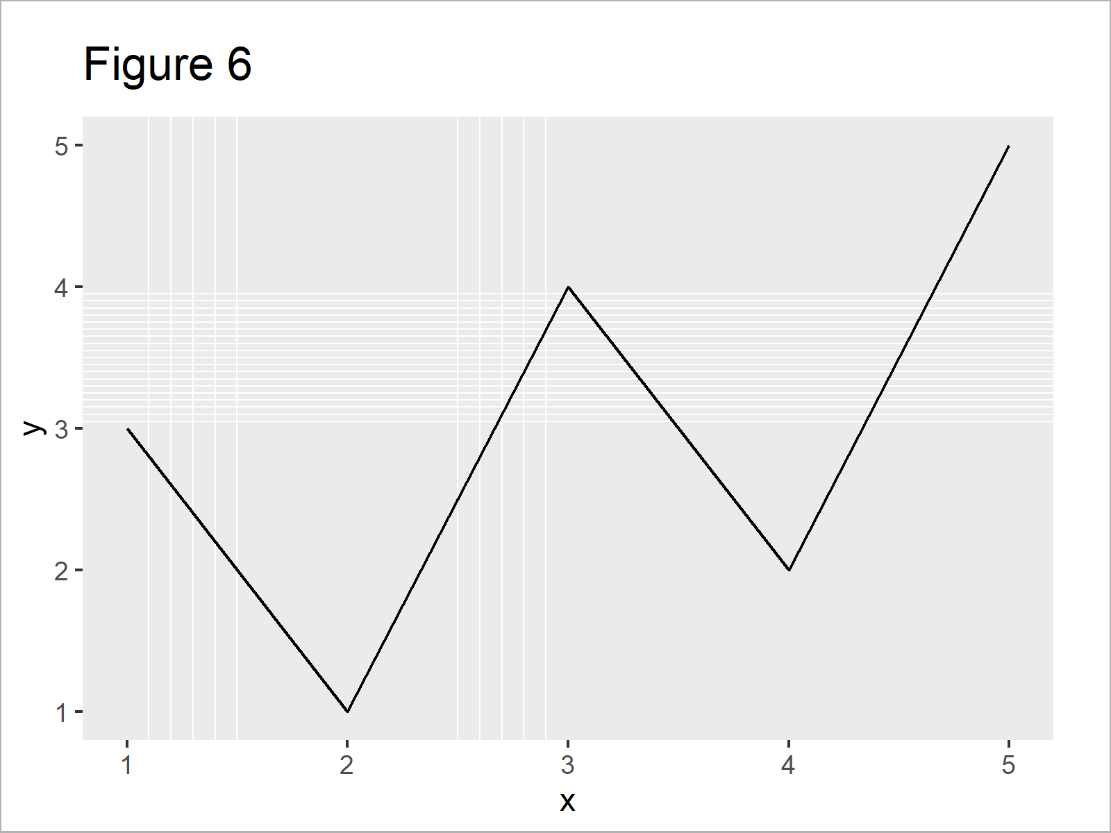
Example 5 shows how to control basically all grid lines in a single ggplot2 plot simultaneously:
ggp +                               # Major & minor breaks on both axes
  scale_x_continuous(minor_breaks = c(1.1, 1.2, 1.3, 1.4, 1.5,
                                      2.5, 2.6, 2.7, 2.8, 2.9)) +
  scale_y_continuous(minor_breaks = seq(3, 4, 0.05)) +
  theme(panel.grid.major.x = element_blank(),
        panel.grid.major.y = element_blank())

Video, Further Resources & Summary
As you have seen in the previous Examples, there are multiple alternatives when you want to control the grid lines of a ggplot2 plot in R.
Do you need more info on the topics of this article? Then you might want to have a look at the following video which I have published on my YouTube channel. I illustrate the R programming code of this tutorial in the video:
Additionally, you may have a look at some of the related articles of my website.
- Introduction – Create Graphics in R using the ggplot2 Package
- Remove Vertical or Horizontal Gridlines in ggplot2 Plot
- Remove Grid, Background Color, Top & Right Borders from ggplot2 Plot
- Add Vertical & Horizontal Line to gglot2 Plot
- Plotting Data in R
- R Programming Tutorials
To summarize: You have learned in this tutorial how to change or suppress grid lines in ggplot2 plots in R programming.
In this tutorial, we have modified the number of both major and minor grid lines of a ggplot2 line plot. However, please note that we could use the same R syntax to control grids of other types of graphics such as density plots, boxplots, histograms, scatterplots, and heatmaps.
If you have additional questions, let me know in the comments section.
Subscribe to the Statistics Globe Newsletter
Get regular updates on the latest tutorials, offers & news at Statistics Globe.
I hate spam & you may opt out anytime: Privacy Policy.
Thank you!
Welcome to the Statistics Globe newsletter. From now on, I’ll send you regular emails about statistics, data science, AI, and programming with R and Python.
I’m Joachim Schork. On this website, I provide statistics tutorials as well as code in Python and R programming.
Statistics Globe Newsletter
Get regular updates on the latest tutorials, offers & news at Statistics Globe. I hate spam & you may opt out anytime: Privacy Policy.
Thank you!
Please check your email inbox and click the confirmation link to complete your subscription. If you don’t see the email within a few minutes, please also check your spam/junk folder.


2 Comments. Leave new
Hello Joachim,
Can you give us an example with a 3d graphic? Possibly with a 3D histogram?
Thank you in advance,
Vlad M
Hey Vlad,
That’s actually a very interesting question. Unfortunately, I’m not an expert for 3D graphics, so I don’t know how to do that. Please let me know in case you find an answer to your question.
Thanks!
Joachim