Set ggplot2 Axis Limits by Date Range in R (Example)
In this tutorial, I’ll explain how to use dates as axis limits in a ggplot2 plot in R.
Table of contents:
Let’s dive right into the example.
Example Data, Packages & Basic Graph
To start with, I have to create some example data:
data <- data.frame(x = seq(as.Date("2022-01-01"),  # Create example data
                           by = "day",
                           length.out = 10),
                   y = 1:10)
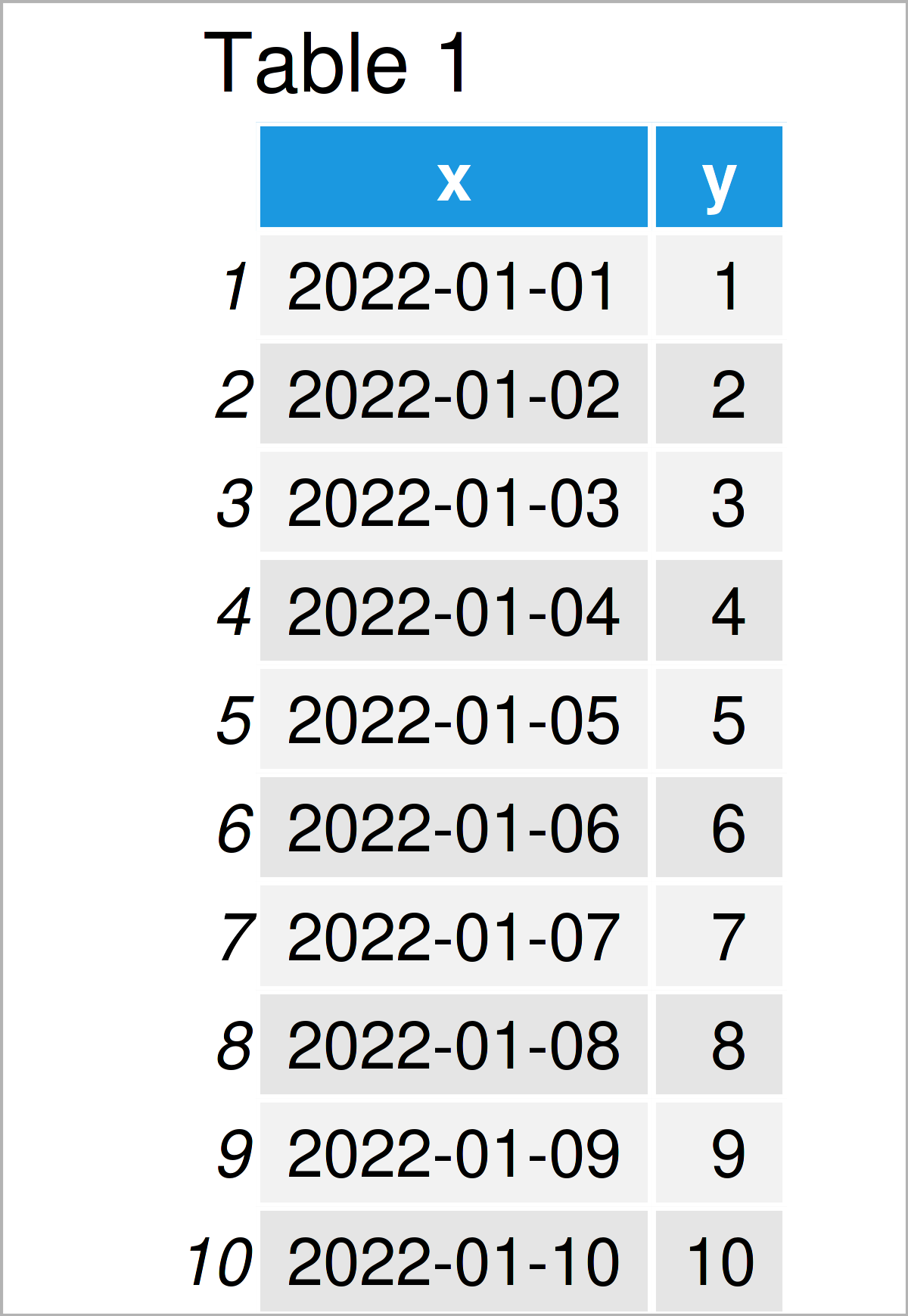
data                                               # Print example data

Have a look at the previously shown table. It visualizes that our example data contains ten rows and two columns.
In order to use the functions of the ggplot2 package, we also have to install and load ggplot2:
install.packages("ggplot2")                        # Install & load ggplot2 package
library("ggplot2")
Next, we can draw our data:
ggp <- ggplot(data, aes(x, y)) +                   # ggplot2 plot with default axis limits
  geom_point()
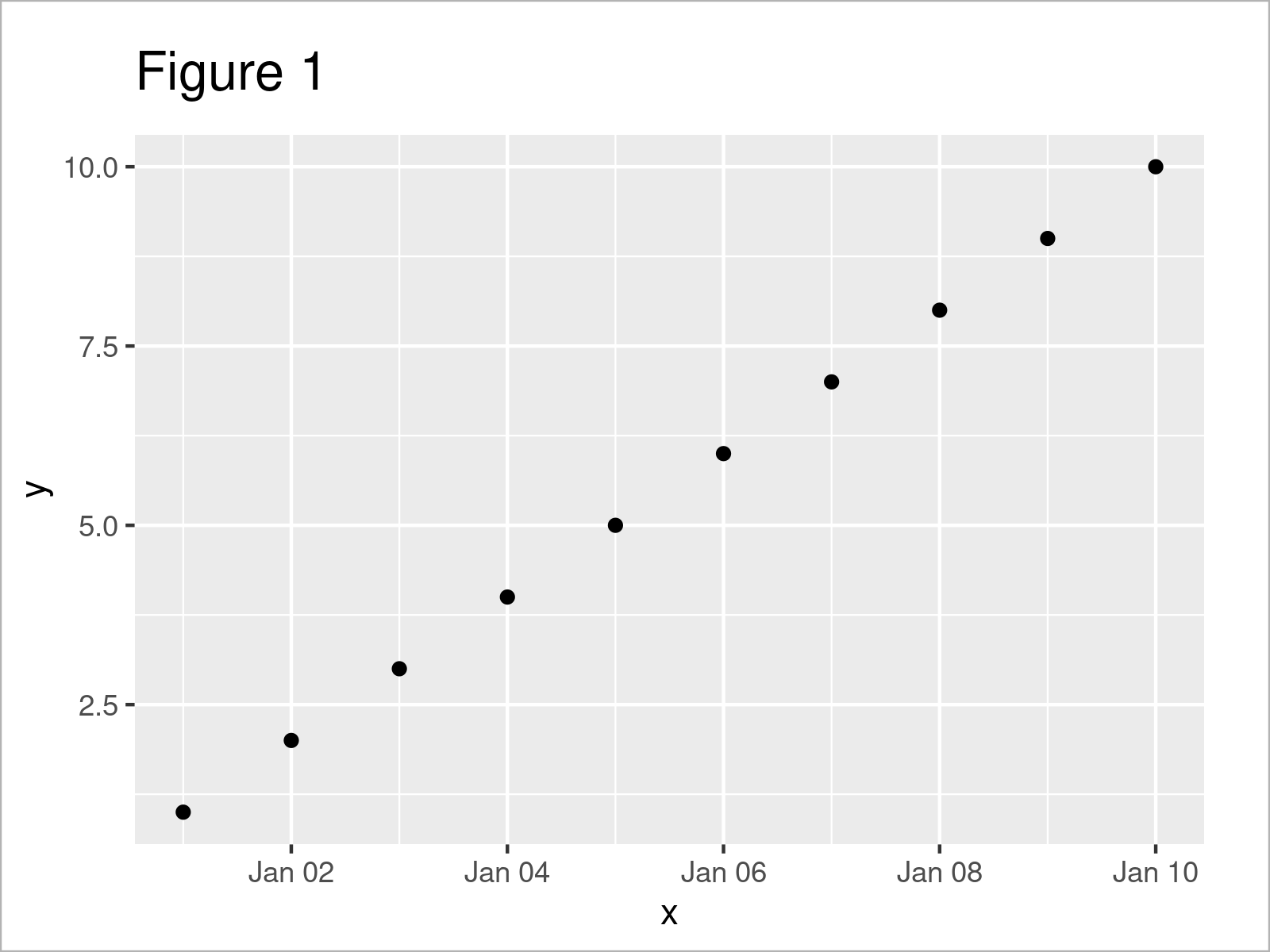
ggp

As shown in Figure 1, the previous R code has created a ggplot scatterplot containing all data points of our example data.
Example: Set ggplot2 Axis Limits Based On Dates Using scale_x_date() Function of scales Package
The syntax below explains how to change the axis limits of a ggplot2 graphic using a date range.
We first have to install and load the scales package:
install.packages("scales")                         # Install & load scales
library("scales")
As a next step, we can use the scale_x_date function provided by the scales package and the as.Date function to define the limits of our plot x-axis:
ggp +                                              # Set date range as limits
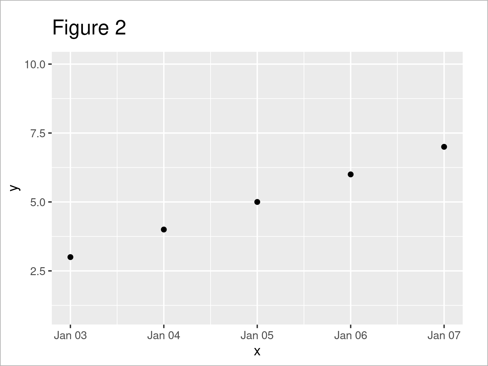
  scale_x_date(limits = as.Date(c("2022-01-03", "2022-01-07")))

After executing the previous syntax the ggplot2 graph with smaller axis limits shown in Figure 2 has been plotted.
Video, Further Resources & Summary
Would you like to learn more about the usage of dates as axis limits in a ggplot2 plot? Then I recommend watching the following video on my YouTube channel. In the video, I illustrate the contents of this tutorial:
In addition, you could have a look at some of the related tutorials that I have published on this website:
- Set Axis Breaks of ggplot2 Plot
- Set ggplot2 Axis Limit Only on One Side
- Set Axis Limits of Plot
- Set Axis Limits of ggplot2 Facet Plot
- Set Axis Limits in ggplot2 R Plot
- Plots in R
- R Programming Examples
To summarize: In this article, I have shown how to use a date range to modify axis limits in a ggplot2 plot in the R programming language. In case you have additional comments and/or questions, let me know in the comments section.
Subscribe to the Statistics Globe Newsletter
Get regular updates on the latest tutorials, offers & news at Statistics Globe.
I hate spam & you may opt out anytime: Privacy Policy.
Thank you!
Welcome to the Statistics Globe newsletter. From now on, I’ll send you regular emails about statistics, data science, AI, and programming with R and Python.
I’m Joachim Schork. On this website, I provide statistics tutorials as well as code in Python and R programming.
Statistics Globe Newsletter
Get regular updates on the latest tutorials, offers & news at Statistics Globe. I hate spam & you may opt out anytime: Privacy Policy.
Thank you!
Please check your email inbox and click the confirmation link to complete your subscription. If you don’t see the email within a few minutes, please also check your spam/junk folder.


2 Comments. Leave new
Hi again!
it’s me, Israel Lopez.
Summing up! I was working with the function:
as.POSIXct(paste(df$Date, df$Time), format=”%Y-%m-%d %H:%M”)
because I want to make a Datetime variable that gives me 2021-02-22-00-10. However, today I ran this and it gives me a bunch of NA this time. I don’t know what’s wrong! Would you mind give me a hint on this matter, please? I’m just a newbie in R and sometimes it makes me feel so frustrated….
Hey Israel,
I have just responded to your comment on YouTube. Does this help?
Regards
Joachim