Set Axis Limits of Plot in R (3 Examples)
In this tutorial, I’ll explain how to change x-axis and y-axis limits in the R programming language.
The article is structured as follows:
With that, let’s do this!
Creation of Example Data
As the first step, I’ll need to construct some data that we can use in the example syntax later on:
set.seed(259687)                     # Create example data
x <- rnorm(300)
y <- rnorm(300) + x
The previously shown R code has created two randomly distributed numeric vectors.
Now, we can create a graph of our data as follows:
plot(x, y) # Draw example data with default axes

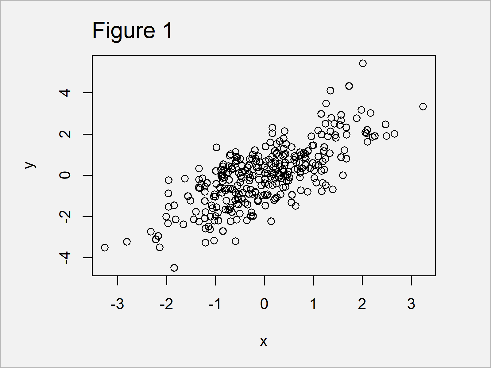
As shown in Figure 1, the previous R programming code has managed to create a scatterplot by applying the plot() function to our two numeric vectors.
The x- and y-axis limits have been chosen automatically based on the minimum and maximum values in our data.
In the following examples, I’ll explain how to adjust the axis limits of our graphic manually.
Example 1: Set X-Axis Limits Using xlim Argument
Example 1 shows how to change the x-axis limits of our graph using the xlim argument.
As you can see in the following R code, we have to assign a vector consisting of two numeric values to the xlim argument.
The first value specifies the lower axis limit and the second value specifies the upper axis limit.
Let’s run the following R code:
plot(x, y,                           # Apply xlim argument
     xlim = c(- 1, 5))

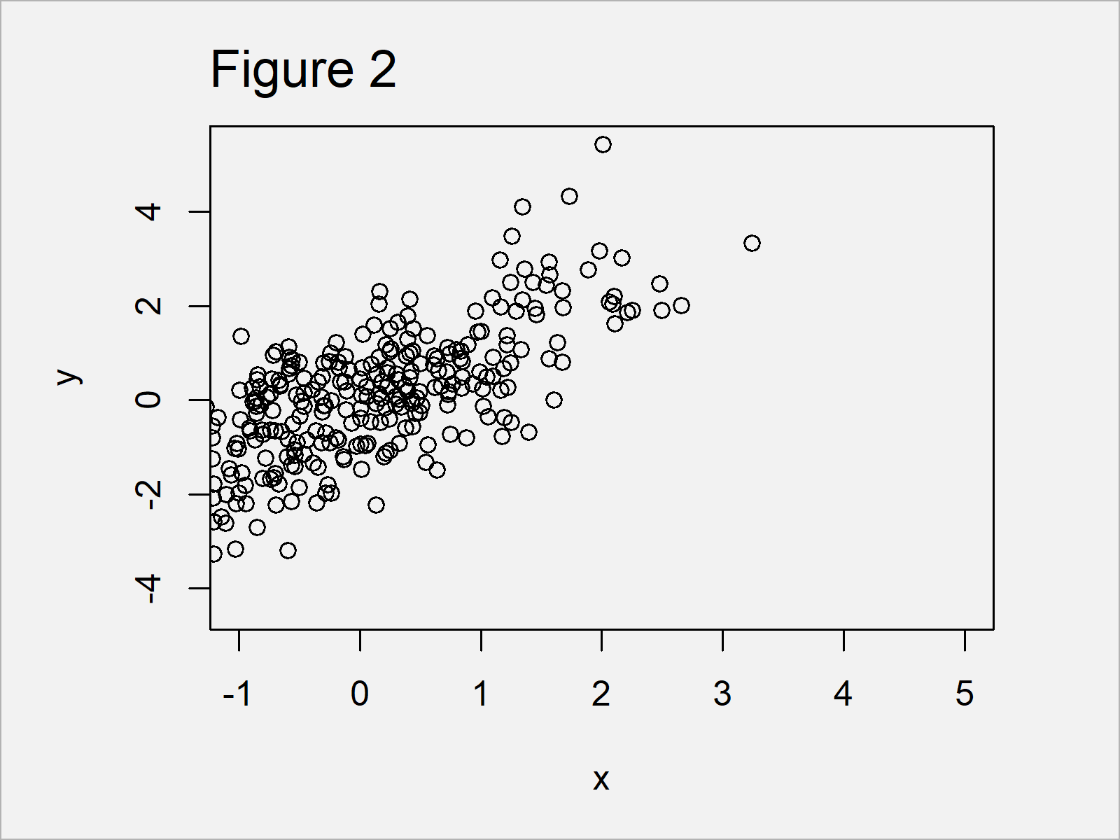
By running the previous syntax we have created Figure 2, i.e. a scatterplot with a manually specified x-axis range.
The y-axis range, however, has still been selected automatically by the R programming language.
Example 2: Set Y-Axis Limits Using ylim Argument
The following R programming syntax explains how to use the ylim argument to set the y-axis limits in R.
Similar as in case of the xlim option (shown in Example 1), we have to assign a vector with a length of two to the ylim argument.
Consider the following R syntax:
plot(x, y,                           # Apply ylim argument
     ylim = c(0, 3))

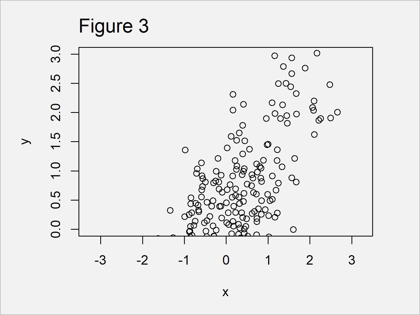
As shown in Figure 3, we have drawn another xy-plot with the previous R code. However, this time the y-axis limits were set by the user and the x-axis were set to the default values.
Example 3: Set X-Axis & Y-Axis Limits Using xlim & ylim Arguments Simultaneously
The following R code explains how to change the x-axis and y-axis limits of our plot at the same time.
For this task, we have to specify both the xlim and ylim arguments:
plot(x, y,                           # Apply xlim & ylim arguments
     xlim = c(- 1, 5),
     ylim = c(0, 3))

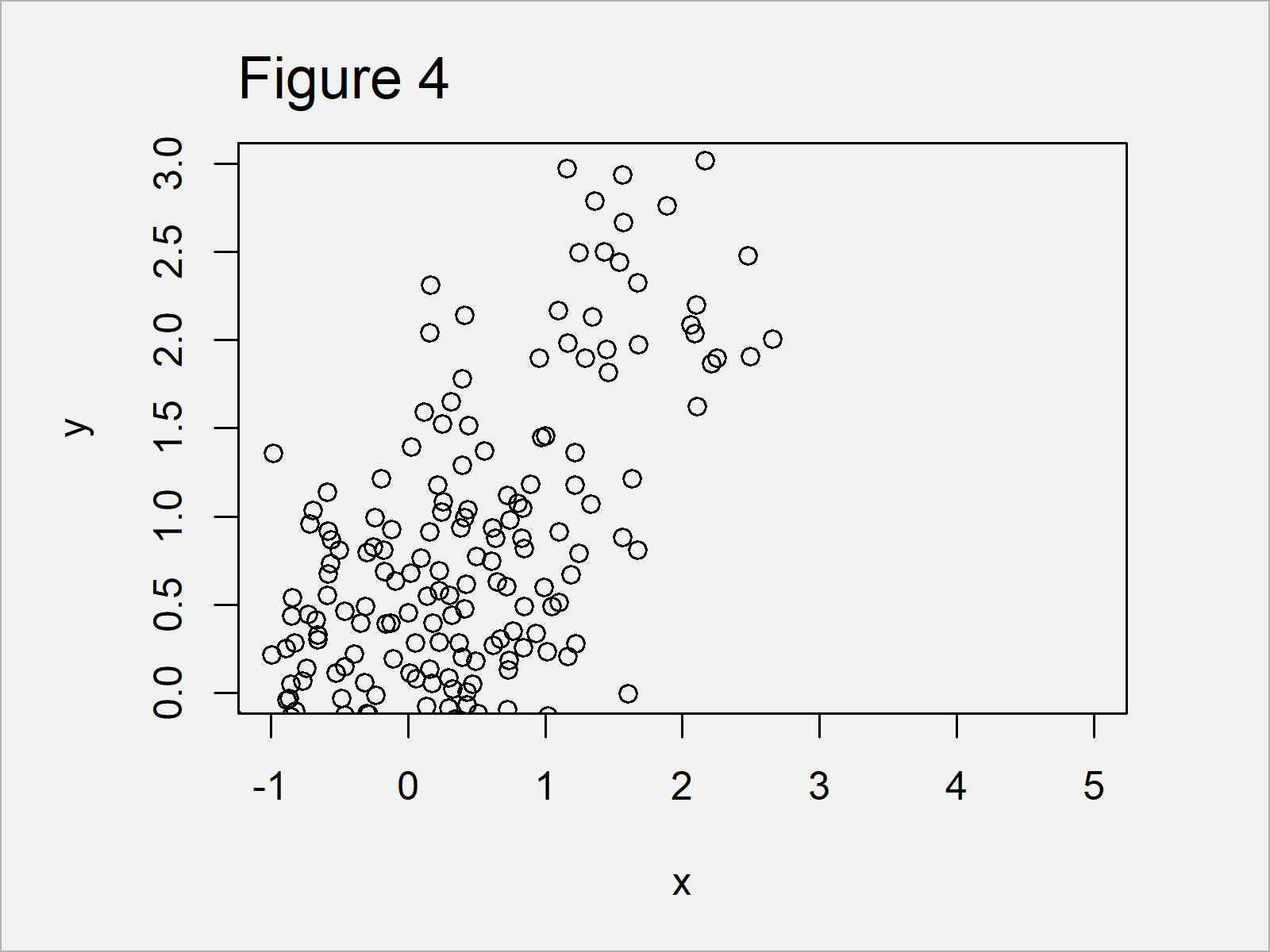
In Figure 4 it is shown that we have drawn a dotplot where all axes have been defined manually.
Video, Further Resources & Summary
Have a look at the following video which I have published on my YouTube channel. In the video, I illustrate the R programming syntax of this article.
In addition, you might read the other tutorials on this website:
At this point you should know how to manually adjust axis limits using xlim and ylim in R.
In the present tutorial, we have changed the axis limits of a scatterplot. However, please note that we could apply the same type of code to change the axes of other graphs such as barcharts, boxplots, and line plots as well.
If you have further questions, let me know in the comments section below.
Subscribe to the Statistics Globe Newsletter
Get regular updates on the latest tutorials, offers & news at Statistics Globe.
I hate spam & you may opt out anytime: Privacy Policy.
Thank you!
Welcome to the Statistics Globe newsletter. From now on, I’ll send you regular emails about statistics, data science, AI, and programming with R and Python.
I’m Joachim Schork. On this website, I provide statistics tutorials as well as code in Python and R programming.
Statistics Globe Newsletter
Get regular updates on the latest tutorials, offers & news at Statistics Globe. I hate spam & you may opt out anytime: Privacy Policy.
Thank you!
Please check your email inbox and click the confirmation link to complete your subscription. If you don’t see the email within a few minutes, please also check your spam/junk folder.


2 Comments. Leave new
Very helpful. Is it the same for scatterplots? And what about R? Scatterplot, boxplot?
Hello James,
The examples show how to do it for a scatterplot. So, yes, you can use the method for the scatterplot. Also, it is possible to boxplot, see Change y-Axis Limits of Boxplot.
Regards,
Cansu