Set Axis Breaks of ggplot2 Plot in R (3 Examples)
In this R programming tutorial you’ll learn how to change the axis tick marks of a ggplot2 graphic.
The tutorial will consist of the following content:
It’s time to dive into the examples:
Exemplifying Data, Add-On Packages & Basic Graphic
The first step is to create some example data:
data <- data.frame(x = 1:6,         # Create example data
                   y = c(4, 6, 8, 1, 5, 3))
data                                # Print example data

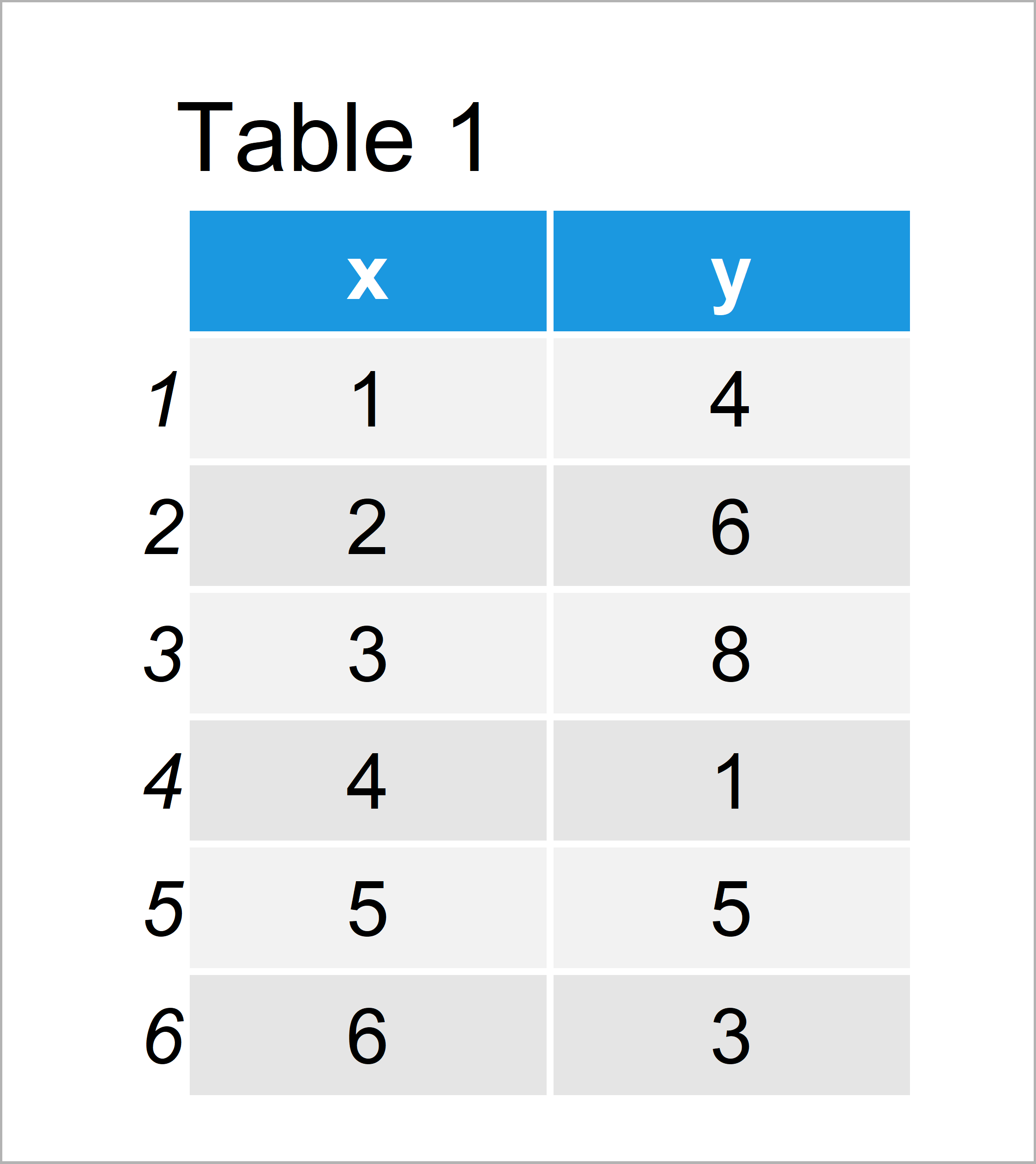
Have a look at the table that got returned by the previous syntax. It illustrates that our example data is made of six rows and two columns.
In this R code, we also have to install and load the ggplot2 package:
install.packages("ggplot2")         # Install & load ggplot2 package
library("ggplot2")
As next step, we can draw a graph of our data:
ggp <- ggplot(data, aes(x, y)) +    # Create default ggplot2 plot
  geom_line()
ggp                                 # Draw default ggplot2 plot

Figure 1 shows the output of the previous code – A ggplot2 line plot with default axis ticks.
Example 1: Manually Specify X-Axis Ticks in ggplot2 Plot
The following syntax illustrates how to adjust the axis tick positions of a ggplot2 plot using the scale_x_continuous function and the breaks argument.
Have a look at the following R code:
ggp +                               # Manually specify x-axis ticks
  scale_x_continuous(breaks = c(2, 3, 5))

The output of the previous R syntax is shown in Figure 2: A ggplot2 line chart with manual axis ticks on the x-axis.
Example 2: Manually Specify Y-Axis Ticks in ggplot2 Plot
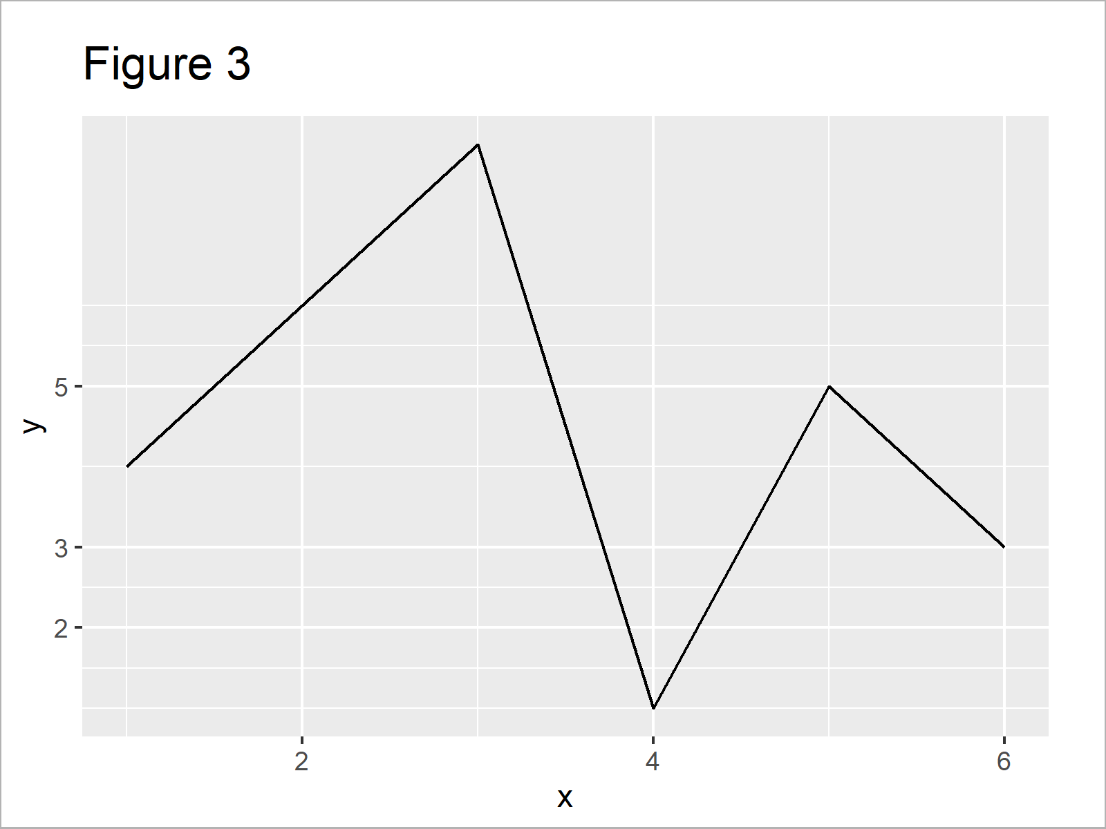
The following code illustrates how to set the axis breaks of a ggplot2 plot on the y-axis.
For this, we can basically use the same code as in Example 1. We simply need to replace the scale_x_continuous function by the scale_y_continuous function:
ggp +                               # Manually specify y-axis ticks
  scale_y_continuous(breaks = c(2, 3, 5))

Figure 3 shows the output of the previous R code – A ggplot2 graphic with user-defined axis values on the y-axis.
Example 3: Manually Specify Sequence of Axis Ticks in ggplot2 Plot
In Example 3, I’ll illustrate how to create a user-defined sequence of axis breaks.
For this task, we can apply the seq function within the scale_x_continuous function as shown below:
ggp +                               # Manually specify sequence of x-axis ticks
  scale_x_continuous(breaks = seq(1, 6, 0.33))

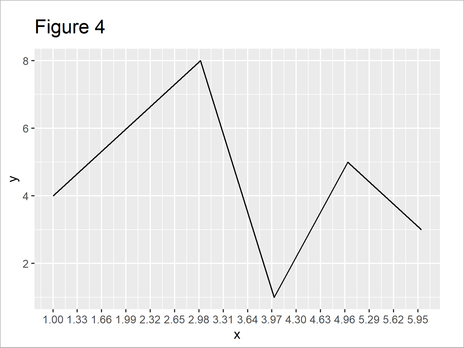
The output of the previous R code is shown in Figure 4 – A ggplot2 graph with a manually specified sequence of x-axis breaks.
Video & Further Resources
Have a look at the following video of my YouTube channel. In the video, I illustrate the examples of this article in RStudio:
In addition, you might want to have a look at the related tutorials of my website:
- ggplot2 Package in R – Tutorial & Examples
- Set Origin of ggplot2 Plot Axes to Zero
- Remove Axis Labels & Ticks of ggplot2 Plot (R Example)
- Set ggplot2 Axis Limit Only on One Side
- Transform ggplot2 Plot Axis to log10 Scale
- R Graphics Gallery
- Introduction to R Programming
To summarize: At this point you should know how to modify ggplot2 axis breaks in the R programming language.
In this tutorial, I have illustrated how to set axis ticks of a line plot. Please note that it would be possible to apply the same type of R syntax to other kinds of plots such as scatterplots, barcharts, boxplots, density plots, heatmaps, and so on.
Let me know in the comments, if you have further questions.


2 Comments. Leave new
Very helpful and easy to absorb. Thank you!
Thanks a lot Patrick, glad you liked the tutorial and its style.
Regards,
Joachim