Draw Time Series Plot with Events Using ggplot2 Package in R (Example)
This post shows how to create a time series graph containing specific events in the R programming language.
Table of contents:
So without further ado, let’s dive right into the example!
Example Data
First, we have to create a data frame containing some example values for a time series:
set.seed(98213674)                                     # Example data for time series
data_values <- data.frame(year = 1901:2000,
                          values = 100:1 + rnorm(100, 0, 10))
head(data_values)                                      # Print head
#   year    values
# 1 1901 110.18375
# 2 1902 105.93849
# 3 1903 106.02063
# 4 1904  89.64547
# 5 1905  96.89598
# 6 1906  92.29945
Have a look at the previous output of the RStudio console. It visualizes that our example data consists of two columns. One variable contains the time line of our time series in years and the other variable contains the corresponding values.
We also have to create a second data frame consisting of the events and the corresponding years. Note that the following R code is also creating two variables defining the starting and ending points of segment lines that we will add later to the plot.
data_events <- data.frame(year = c(1905, 1925, 1945),  # Example data for events
                          name = c("Event1", "Event2", "Event3"))
data_events$yend <- data_values$values[data_values$year %in% data_events$year] * 0.9
data_events$ystart <- data_events$yend * 0.5
data_events                                            # Print events
#   year   name     yend   ystart
# 1 1905 Event1 87.20639 43.60319
# 2 1925 Event2 78.75749 39.37874
# 3 1945 Event3 47.71781 23.85891
Example: Creating Time Series Plot with Events
This Example shows how to use the ggplot2 package to create a time series plot with events. We first need to install and load the ggplot2 package, if we want to use the functions that are included in the package:
install.packages("ggplot2")                            # Install ggplot2 package
library("ggplot2")                                     # Load ggplot2
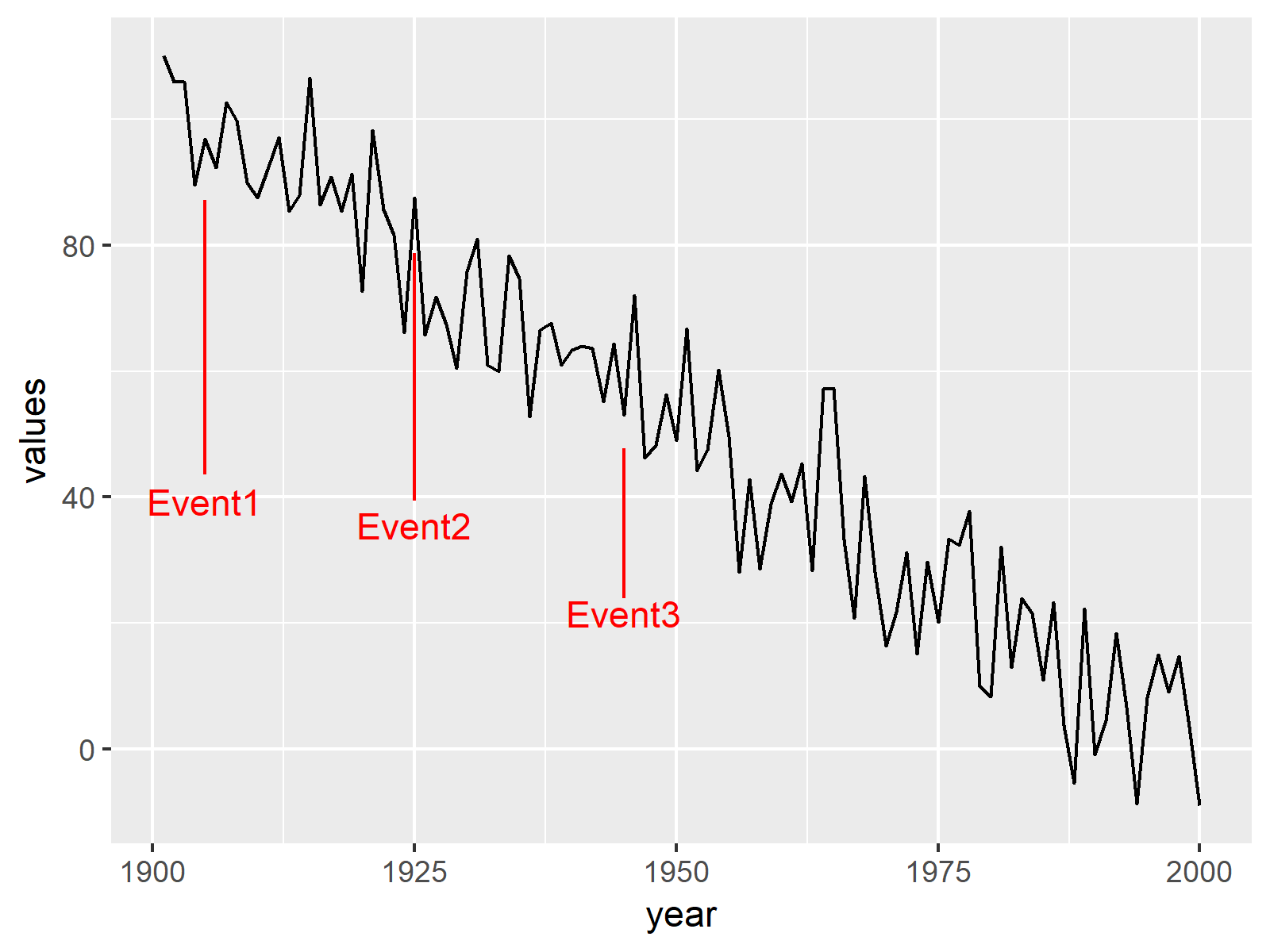
Now, we can use the ggplot, geom_line, geom_segment, and geom_text functions to create our time series graphic. Note that we are specifying NULL within the ggplot function, since we are creating the ggplot2 plot based on two data frames.
ggp <- ggplot(NULL) +                                  # Create ggplot2 time series graph
  geom_line(data = data_values, aes(x = year, y = values)) +
  geom_segment(data = data_events, aes(x = year, y = ystart, xend = year, yend = yend), color = "red") +
  geom_text(data = data_events, aes(x = year, y = ystart * 0.9, label = name), color = "red")
ggp                                                    # Draw plot

The output of the previous R programming syntax is shown in Figure 1 – As expected, we created a time series plot with certain events.
Video, Further Resources & Summary
In case you want to learn more about the ggplot2 package and data visualization in R, please have a look at the following video tutorial, where I give a detailed introduction with different examples:
In addition, you could have a look at the related tutorials on my website.
- Combine Two ggplot2 Plots from Different Data Frames
- Merge Time Series in R
- lead & lag R Functions of dplyr Package
- R Graphics Gallery
- The R Programming Language
You learned in this post how to plot a time series with events in the R programming language. In case you have additional questions, let me know in the comments section.
Subscribe to the Statistics Globe Newsletter
Get regular updates on the latest tutorials, offers & news at Statistics Globe.
I hate spam & you may opt out anytime: Privacy Policy.
Thank you!
Welcome to the Statistics Globe newsletter. From now on, I’ll send you regular emails about statistics, data science, AI, and programming with R and Python.
I’m Joachim Schork. On this website, I provide statistics tutorials as well as code in Python and R programming.
Statistics Globe Newsletter
Get regular updates on the latest tutorials, offers & news at Statistics Globe. I hate spam & you may opt out anytime: Privacy Policy.
Thank you!
Please check your email inbox and click the confirmation link to complete your subscription. If you don’t see the email within a few minutes, please also check your spam/junk folder.


2 Comments. Leave new
Thank you.
It does not work if you use autoplot and define data frame as a time series
Hey Fran,
Please excuse the delayed response. I was on a long vacation, so unfortunately I wasn’t able to get back to you earlier. Do you still need help with your question?
Regards,
Joachim