Change Colors of Bars in ggplot2 Barchart in R (2 Examples)
In this tutorial you’ll learn how to modify the color of a ggplot2 barchart in the R programming language.
Table of contents:
Let’s take a look at some R codes in action!
Example Data, Packages & Basic Plot
The following data will be used as basement for this R tutorial:
data <- data.frame(x = LETTERS[1:5],    # Create example data
                   y = c(4, 2, 7, 3, 5))
data                                    # Print example data
#   x y
# 1 A 4
# 2 B 2
# 3 C 7
# 4 D 3
# 5 E 5
The previous output of the RStudio console shows the structure of our example data: It’s a data frame consisting of five rows and two columns. The variable x identifies the barchart groups and the variable y shows the corresponding values.
In case we want to use the functions of the ggplot2 package, we also have to install and load ggplot2:
install.packages("ggplot2")             # Install ggplot2 package
library("ggplot2")                      # Load ggplot2 package
Next, we can create a graph of our data.
ggplot(data, aes(x, y)) +               # ggplot2 barplot with single color
  geom_bar(stat = "identity")

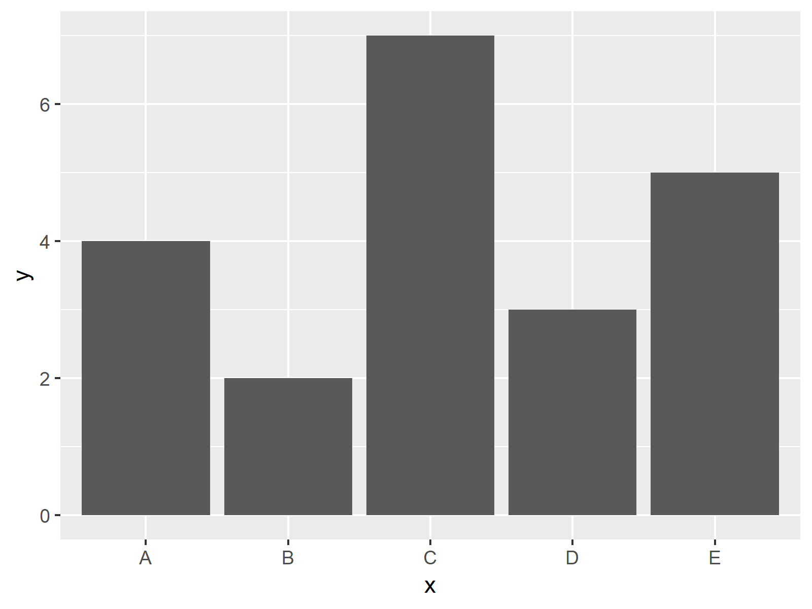
The output of the previous R syntax is shown in Figure 1 – A barplot with only one color.
Example 1: Drawing ggplot2 Barplot with Default Colors
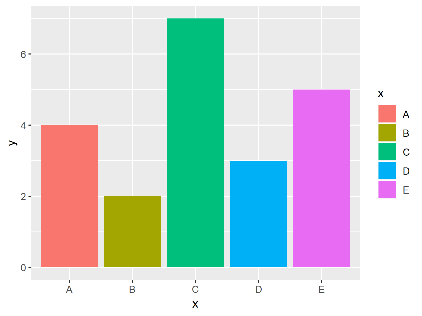
The following syntax shows how to create a barchart with a different color for each of the bars using the default ggplot2 color palette.
For this, we have to specify the fill argument within the aes function to be equal to the grouping variable of our data (i.e. x):
ggplot(data, aes(x, y, fill = x)) +     # Using default colors
  geom_bar(stat = "identity")

The output of the previous R programming code is shown in Figure 2 – Each of the bars of our barchart has a different color and the graphic is also showing a legend in these colors.
Example 2: Drawing ggplot2 Barplot with Manually Specified Colors
The previous example explained how to draw bars in different colors using the default color specifications of the ggplot2 package. The following syntax shows how to choose the color of each bar manually.
To do this, we have to use the scale_fill_manual function of the ggplot2 package. Within this function, we need to specify a color for each of the bars as shown below:
ggplot(data, aes(x, y, fill = x)) +     # Manually specifying colors
  geom_bar(stat = "identity") +
  scale_fill_manual(values = c("A" = "#353436",
                               "B" = "#1b98e0",
                               "C" = "red",
                               "D" = "red",
                               "E" = "green"))

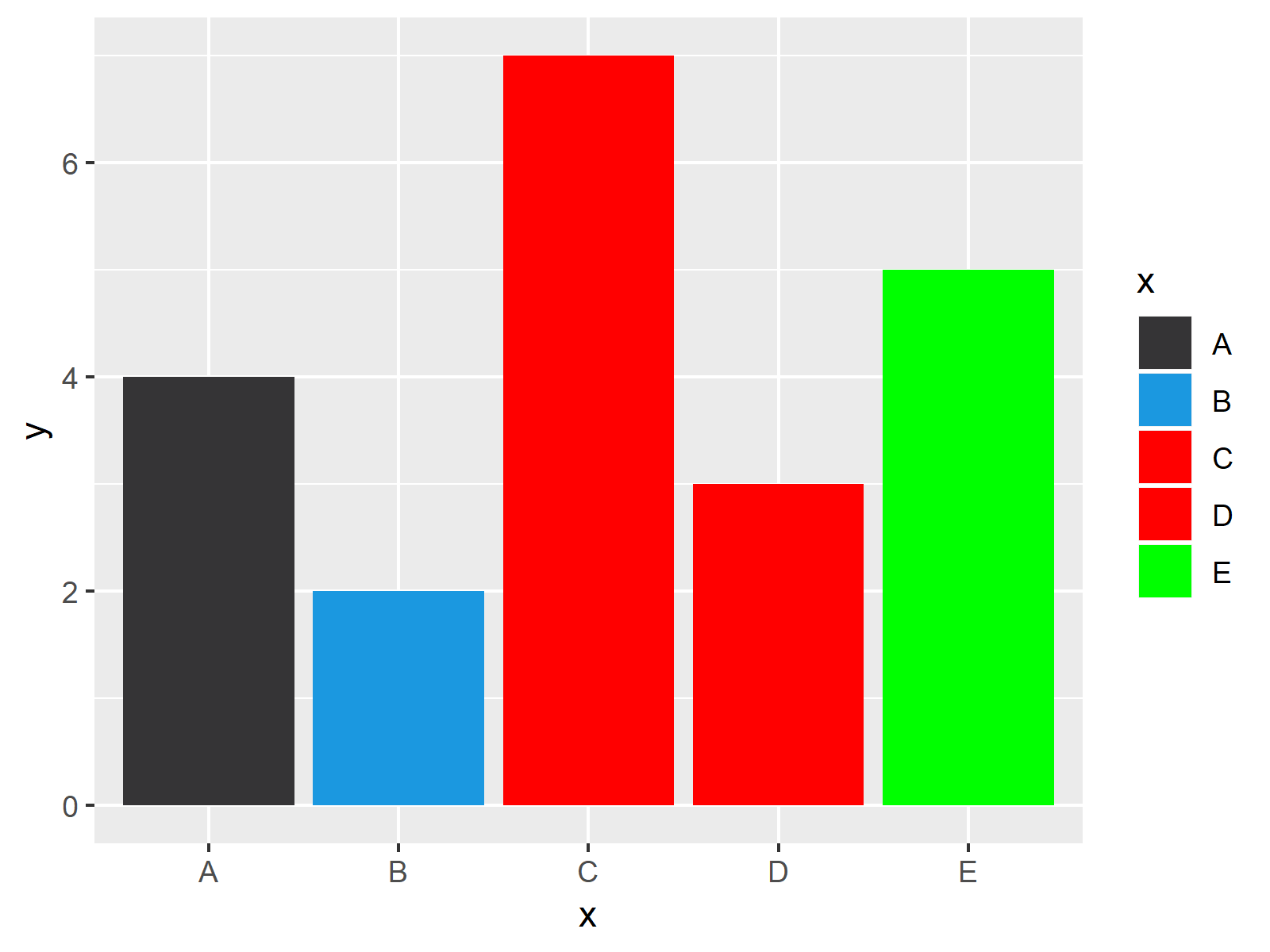
As shown in Figure 3, the previously shown R programming code plotted a barchart with user-defined colors.
Note that we have specified the same color for two of the bars (i.e. C and D). Furthermore, we have used hex color codes for some of the bars (i.e. A and B) and predefined R colors for the other bars (i.e. C, D, and E).
Video & Further Resources
I have recently released a video on my YouTube channel, which shows the content of this tutorial. Please find the video below:
Besides the video, you could have a look at some of the other articles that I have published on my website:
- Order Bars of ggplot2 Barchart in R
- Change Colors in ggplot2 Line Plot in R
- Graphics Gallery in R
- R Programming Language
In this article, I illustrated how to switch the color palette of ggplot2 barplots in R. If you have further questions, tell me about it in the comments section below.


