Insert PNG Image Between Certain ggplot2 Axis Positions in R (3 Examples)
In this R tutorial you’ll learn how to add an image at a certain axis location.
The tutorial contains these topics:
If you want to learn more about these topics, keep reading.
Example Data, Add-On Packages & Basic Graph
Before all else, let’s create some example data:
set.seed(769534)                              # Create example data
data <- data.frame(x = rnorm(100),
                   y = rnorm(100))
head(data)                                    # Print head of example data
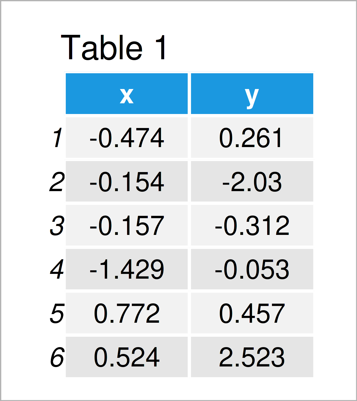
Table 1 shows that our example data contains the two variables “x” and “y”.
For the examples of this R syntax, we’ll also have to install and load the ggplot2 add-on package:
install.packages("ggplot2")                   # Install ggplot2 package
library("ggplot2")                            # Load ggplot2 package
Now, we can draw our data as shown below:
my_plot <- ggplot(data, aes(x, y)) +          # Create example ggplot2 plot
  geom_point() +
  xlim(- 5, 5) +
  ylim(- 5, 5)
my_plot                                       # Draw example ggplot2 plot
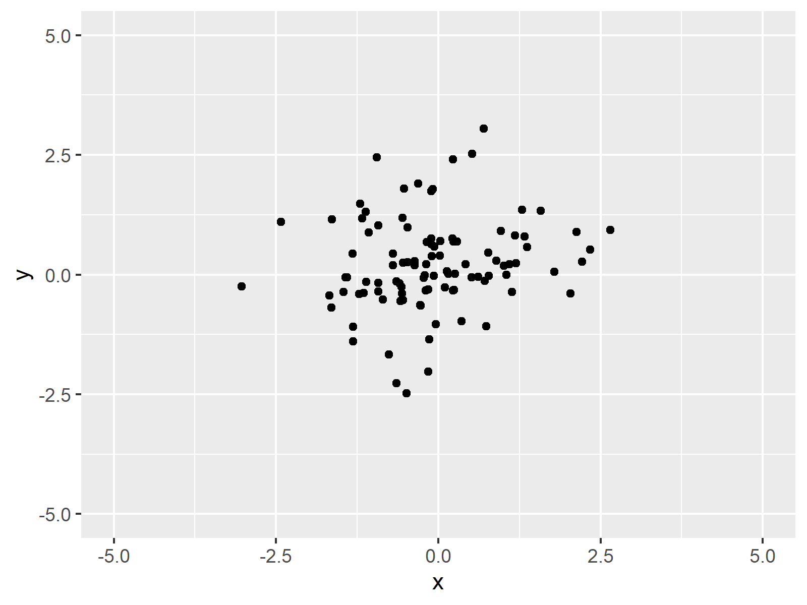
As shown in Figure 1, the previous code has created a ggplot2 scatterplot of our example data. Note that we have set the axis limits manually using the xlim and ylim functions.
For this tutorial, we also have to download an exemplifying PNG image. Let’s download the flag of Switzerland as PNG:
download.file("https://upload.wikimedia.org/wikipedia/commons/thumb/f/f3/Flag_of_Switzerland.svg/1280px-Flag_of_Switzerland.svg.png",
              "Switzerland.png",
              mode = "wb")
We also have to install and load the png package to load our downloaded PNG file into R:
install.packages("png")                       # Install & load png
library("png")
After loading the png package, we can import our example PNG using the readPNG function:
my_image1 <- readPNG("Switzerland.png") # Read image file as PNG
The previous R code has created a new data object called my_image1, which contains an image of the flag of Switzerland.
So far so good – let’s move on to the examples!
Example 1: Draw PNG Image & ggplot2 Plot Side-by-Side
Example 1 demonstrates how to plot a PNG image and a ggplot2 side-by-side.
Hereby, it is important that the PNG image should be shown over exactly the same y-axis range as the ggplot2 graphic.
For this, we first have to modify our PNG image using the grid package. In order to use the functions of the grid package, we first need to install and load grid.
install.packages("grid")                      # Install grid package
library("grid")                               # Load grid
In the next step, we transform our PNG image to a ggplot2 object with the same axis ranges as our ggplot2 plot:
my_image_mod1 <- ggplot(data, aes(x, y)) +    # Modify image file
  geom_point(col = "white") +
  xlim(- 5, 5) +
  ylim(- 5, 5) +
  theme(axis.line = element_line(),
        axis.line.x = element_line(color = "white"),
        axis.title.x = element_text(color = "white"),
        axis.text.x = element_text(color = "white"),
        axis.ticks.x = element_line(color = "white"),
        panel.grid.major = element_blank(),
        panel.grid.minor = element_blank(),
        panel.border = element_blank(),
        panel.background = element_blank()) +
  annotation_custom(rasterGrob(my_image1, width = 1, height = 1),
                    xmin = - 4.5, xmax = Inf,
                    ymin = - Inf, ymax = Inf)
The previous R syntax has created a new ggplot2 plot object called my_image_mod1. This plot object contains our example PNG image and the y-axis on the left side of the example image.
Since our PNG now contains the y-axis of our plot, we can remove it from the example ggplot2 plot:
my_plot_mod <- my_plot +                      # Modify ggplot2 plot
  theme(axis.title.y = element_blank(),
        axis.text.y = element_blank(),
        axis.ticks.y = element_blank())
The prevous syntax has created a ggplot2 plot without y-axis values.
In the next step, we can combine our modified PNG image and our modified ggplo2 plot in a single graph. For this, we can use the patchwork package:
install.packages("patchwork")                 # Install & load patchwork package
library("patchwork")
After installing and loading the patchwork package, we can simply add our two modified plots together:
my_image_mod1 + my_plot_mod # Draw image and plot side-by-side
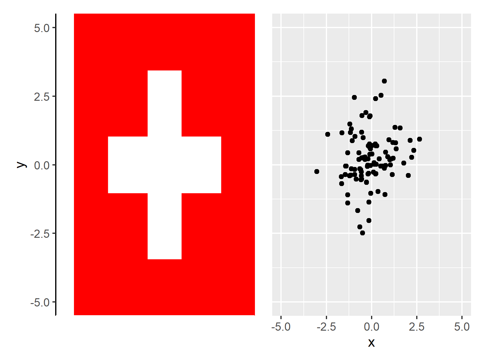
Figure 2 shows the final output of Example 1, i.e. a combination of our PNG image and our ggplot2 scatterplot.
Example 2: Add PNG Image Between Certain Y-Axis Range of ggplot2 Plot
In Example 2, I’ll show how to limit a PNG to a certain range on the y-axis of our ggplot2 plot.
For this, we have to modify our example PNG image once again:
my_image_mod2 <- ggplot(data, aes(x, y)) +    # Modify y-axis positions of image
  geom_point(col = "white") +
  xlim(- 5, 5) +
  ylim(- 5, 5) +
  theme(axis.line = element_line(),
        axis.line.x = element_line(color = "white"),
        axis.title.x = element_text(color = "white"),
        axis.text.x = element_text(color = "white"),
        axis.ticks.x = element_line(color = "white"),
        panel.grid.major = element_blank(),
        panel.grid.minor = element_blank(),
        panel.border = element_blank(),
        panel.background = element_blank()) +
  annotation_custom(rasterGrob(my_image1, width = 1, height = 1),
                    xmin = - 4.5, xmax = Inf,
                    ymin = - 2.5, ymax = 4)
Note the different ymin and ymax specifications in the previous syntax (i.e. the last line of code).
Next, we can use the patchwork package to create our final graphic:
my_image_mod2 + my_plot_mod # Draw image and plot side-by-side
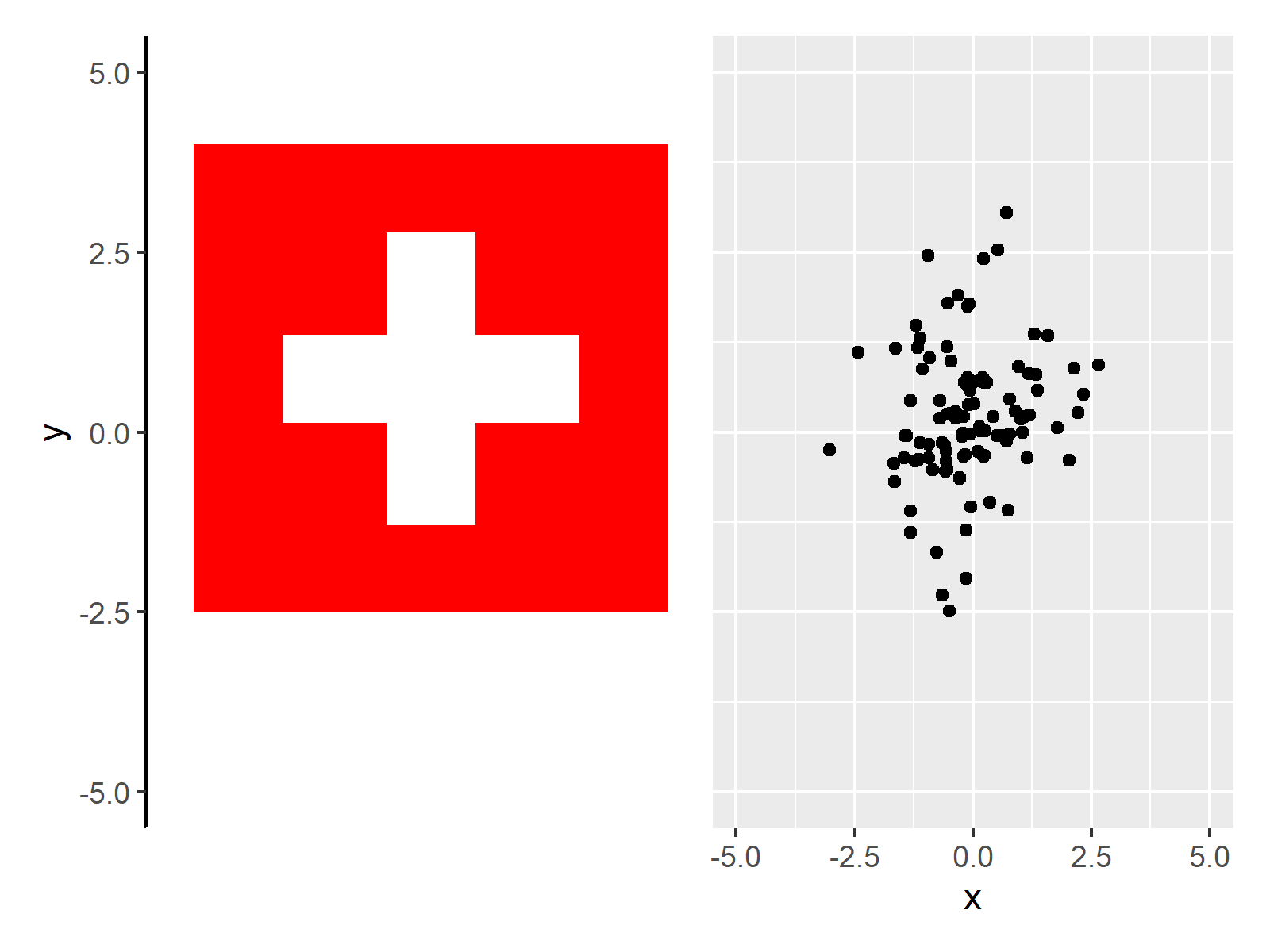
As you can see, we have created a plot composition with a PNG at a specific range on the y-axis of our ggplot2 plot.
Example 3: Add Multiple PNG Images Between Certain Y-Axis Ranges of ggplot2 Plot
This example illustrates how to add multiple PNG images at different y-axis ranges of our ggplot2 plot.
For this, we first have to download and import another PNG image to R. We’ll use the German flag for this:
download.file("https://upload.wikimedia.org/wikipedia/en/thumb/b/ba/Flag_of_Germany.svg/1280px-Flag_of_Germany.svg.png",
              "Germany.png",
              mode = "wb")
my_image2 <-  readPNG("Germany.png")          # Read image file as PNG
Next, we have to create another modified version of our PNG images. Note that we annotate both PNG images to the following plot object:
my_image_mod3 <- ggplot(data, aes(x, y)) +    # Modify y-axis positions of image
  geom_point(col = "white") +
  xlim(- 5, 5) +
  ylim(- 5, 5) +
  theme(axis.line = element_line(),
        axis.line.x = element_line(color = "white"),
        axis.title.x = element_text(color = "white"),
        axis.text.x = element_text(color = "white"),
        axis.ticks.x = element_line(color = "white"),
        panel.grid.major = element_blank(),
        panel.grid.minor = element_blank(),
        panel.border = element_blank(),
        panel.background = element_blank()) +
  annotation_custom(rasterGrob(my_image1, width = 1, height = 1),
                    xmin = - 4.5, xmax = Inf,
                    ymin = - 2.5, ymax = 4) +
  annotation_custom(rasterGrob(my_image2, width = 1, height = 1),
                    xmin = - 4.5, xmax = Inf,
                    ymin = - 4.5, ymax = - 3)
As next step, we can draw our PNG images and our ggplot2 plot side-by-side:
my_image_mod3 + my_plot_mod # Draw image and plot side-by-side
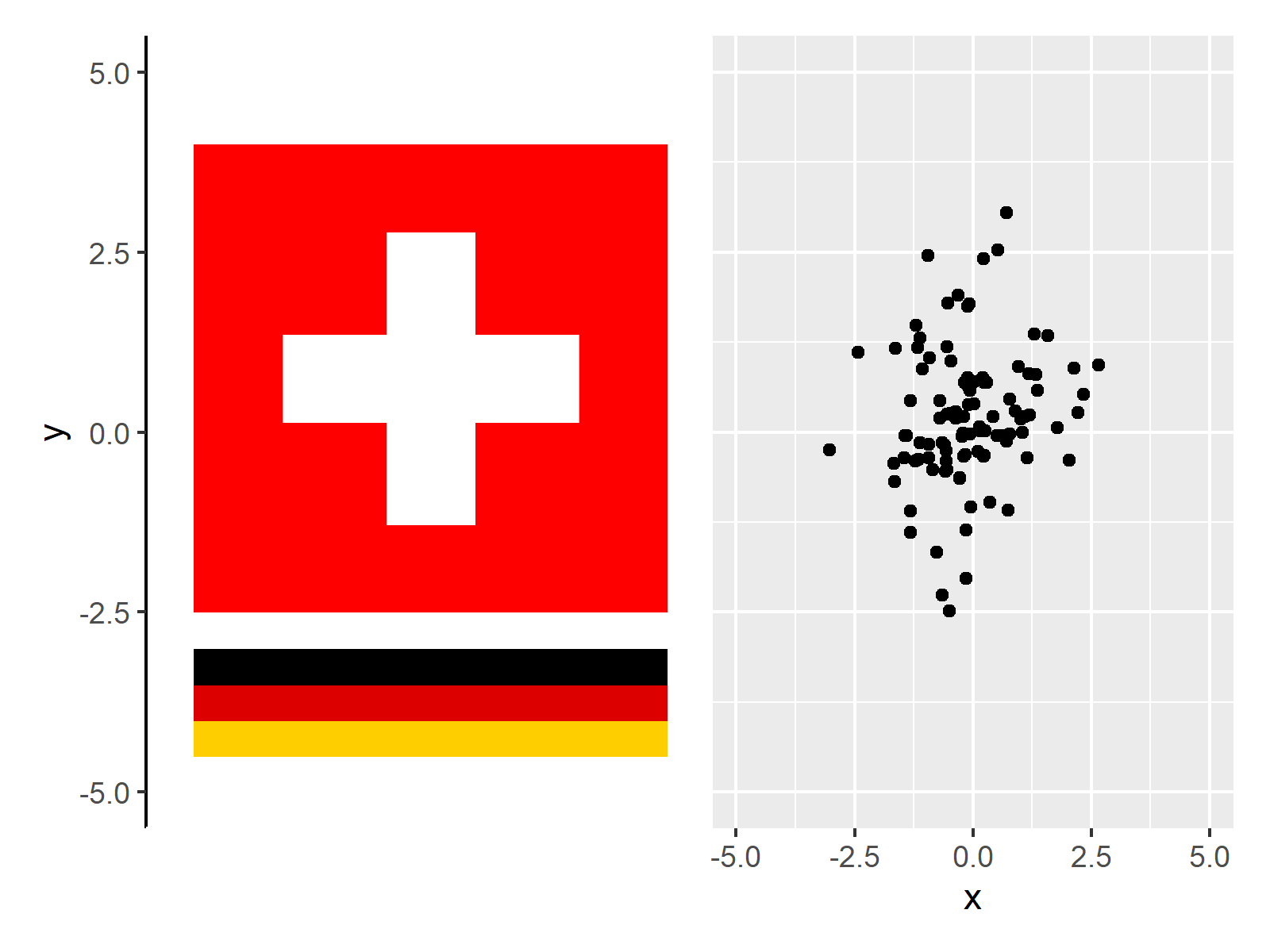
In Figure 4 you can see that we have created a plot composition of two PNG images and a ggplot2 scatterplot using the previous R programming syntax.
Video & Further Resources
Do you want to know more about the addition of PNG images to ggplot2 plots? Then I can recommend watching the following video on my YouTube channel. I’m demonstrating the R syntax of this page in the video.
In addition to the video, you might read some of the other tutorials on this homepage.
- Common Main Title for Multiple Plots in Base R & ggplot2
- Add Image to Plot in R
- Draw Composition of Plots Using the patchwork Package
- Draw Multiple ggplot2 Plots Side-by-Side
- Add Common Legend to Combined ggplot2 Plots
- Set ggplot2 Axis Limit Only on One Side in R
- Adjust Space Between ggplot2 Axis Labels and Plot Area
- Graphics in R
- Introduction to R
To summarize: In this article, I have shown how to insert a PNG image between particular axis values in the R programming language. Please let me know in the comments section, if you have additional questions. Furthermore, don’t forget to subscribe to my email newsletter in order to receive updates on the newest tutorials.


