If Else Condition to Add Extra Layer to ggplot2 Plot in R (2 Examples)
In this article, I’ll explain how to add a ggplot2 layer via if-else statement in the R programming language.
Table of contents:
So without further ado, let’s do this!
Example Data, Software Packages & Default Graph
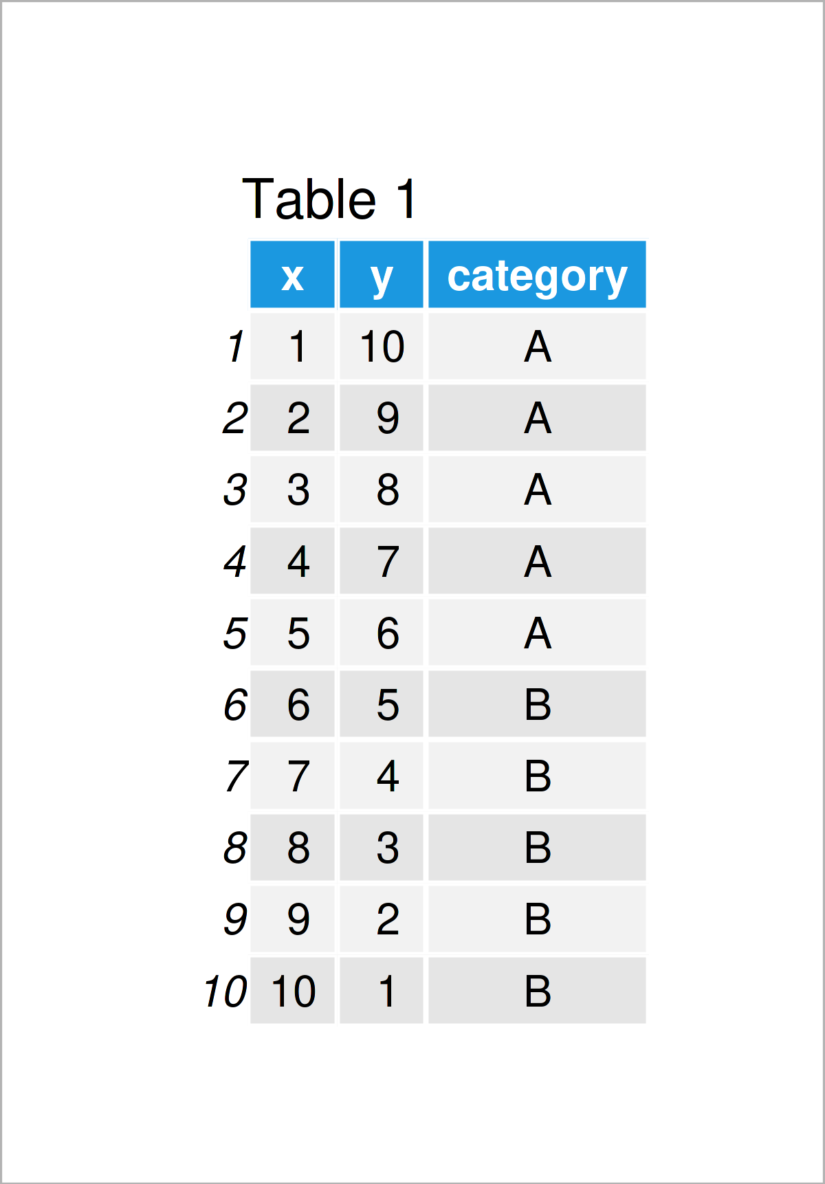
The first step is to define the sample data. I created a dataset with two numerical variables, x and y, and one categorical variable called category.
data <- data.frame(                         # Create example data
  x = 1:10,
  y = c(10:1),
  category = c(rep("A", 5), rep("B", 5))
)
You can see the exact values of each variable below.
To be able to use the functions of the ggplot2 package, we also need to install and load ggplot2.
install.packages("ggplot2")                 # Install ggplot2 package
library("ggplot2")                          # Load ggplot2
After all is set, we can plot our base plot for the demonstration. The ggplot2 layers will be added to this plot conditionally in the following examples.
ggp <- ggplot(data, aes(x = x, y = y)) +    # Create a base plot
  geom_point(aes(color = category)) +
  theme_minimal()
ggp                                         # Print the plot
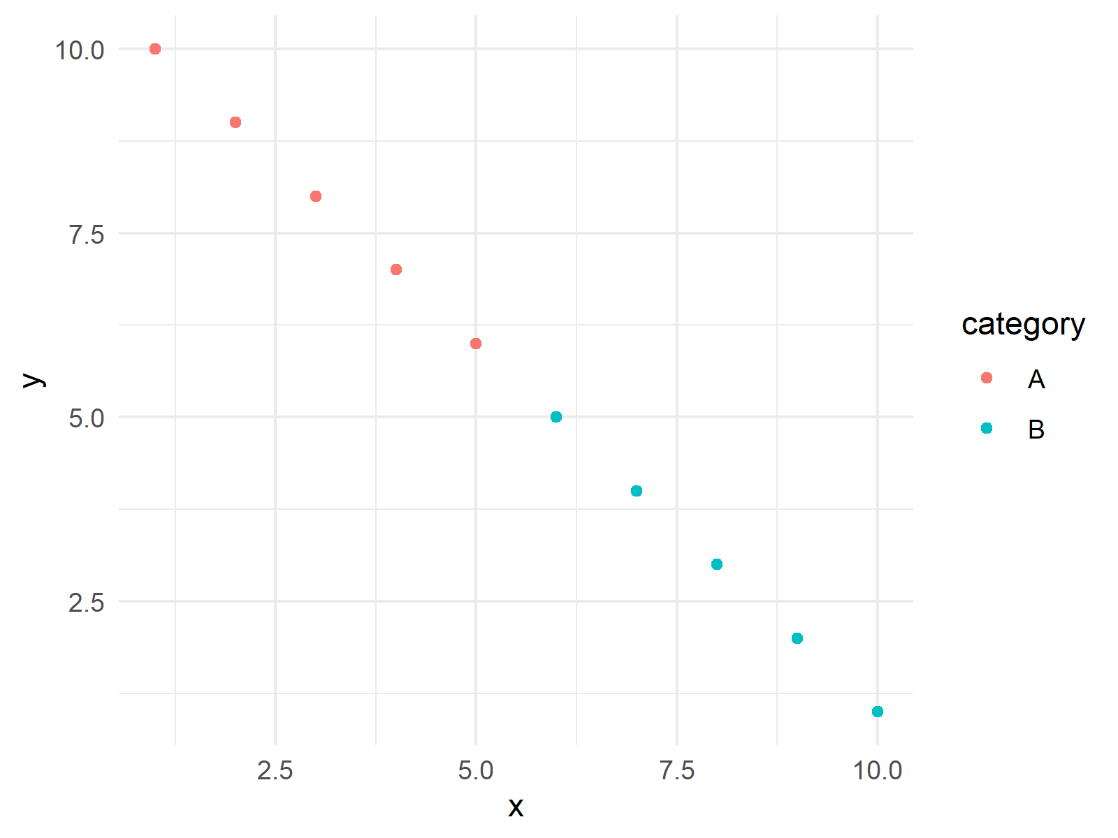
As seen in Figure 1, our plot is a scatterplot showing the relation between the x and y variables for each category, A and B. Let’s draw the first conditional layer on our scatter plot!
Example 1: Add geom_hline Layer based on Condition
In this example, I will show how to add a horizontal line layer to my plot using the geom_hline() function. In order to indicate the intersection point on the y-axis, I will define a variable called threshold. Then I will set the condition “if the maximum y value is bigger than the threshold, set a horizontal line intersecting the y-axis at the threshold”. The respective code is as follows.
threshold <- 8                                       # Set a threshold for the condition

ggp_new <- if (max(data$y) > threshold) {            # Add an extra layer based on the condition
   ggp +
   geom_hline(yintercept = threshold,
              linetype = "dashed",
              color = "red")
  } else {
    ggp
  }

ggp_new                                               # Print the plot
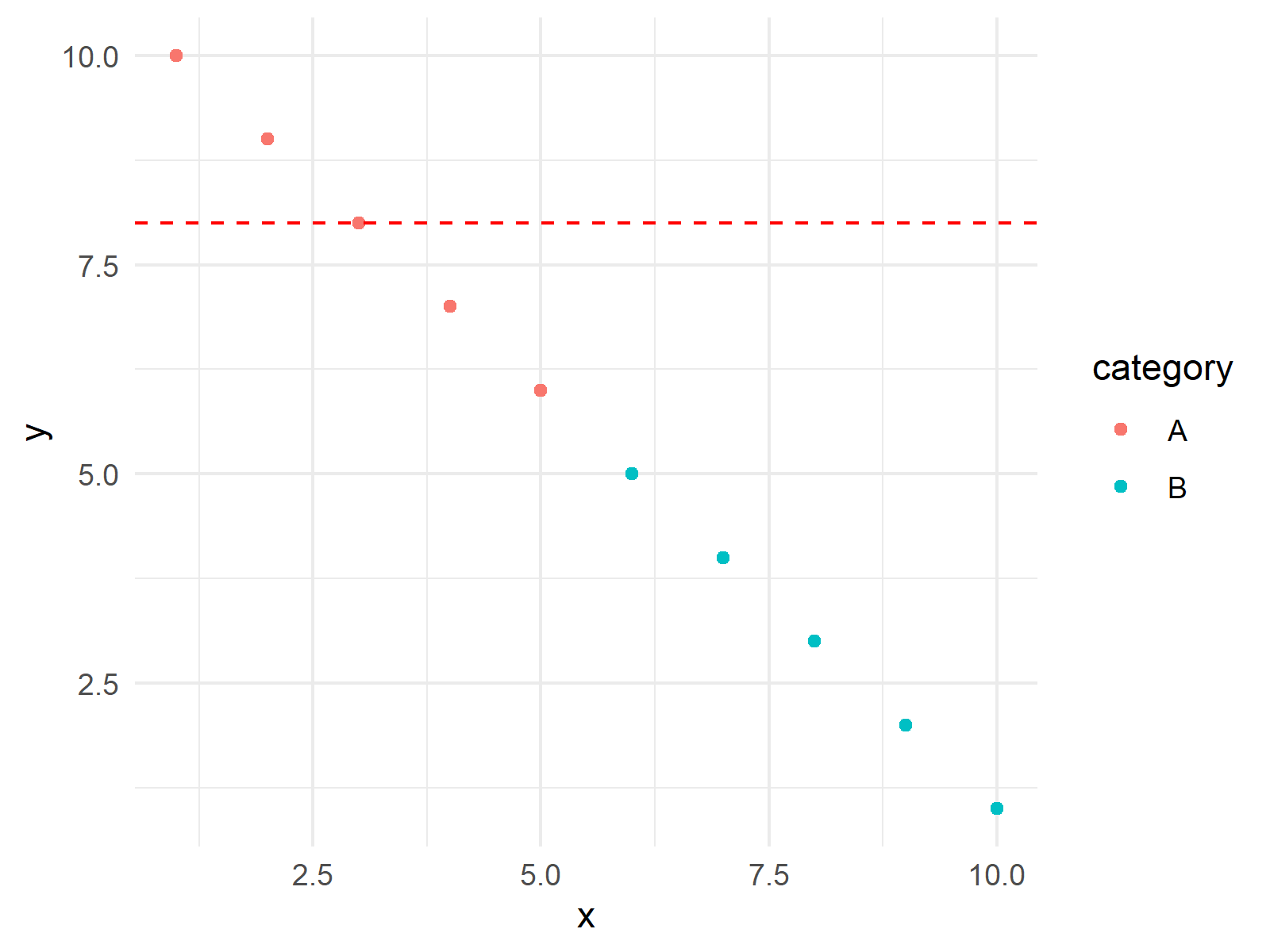
Thanks to this additional layer, we can inspect the points above the threshold if some y-values exceed the threshold; if not, there will be no horizontal line shown. See Figure 2 below.
This is just one example of how to add a layer to a ggplot2 plot. Next, we will add an extra text layer to our plot.
Example 2: Add geom_text Layer based on Condition
In this example, I’ll explain how to use the geom_text() function to add an extra text layer to show the coordinates of points. To set a condition, I will use another threshold; see data_points_threshold below. This time, the condition is to add texts if the number of data points exceeds 15.
data_points_threshold <- 15                                # Set a threshold for the condition

ggp_new_text <- if (nrow(data) <= data_points_threshold) { # Add an extra layer based on the condition
    ggp_new +
    geom_text(aes(label = paste("(", x, ",", y, ")", sep = "")),
              position = position_nudge(x = 0.3, y = 0.3),
              size = 3,
              color = "blue")
  } else {
    ggp_new
  }

ggp_new_text                                                # Print the plot
You see above how the color, size, position, and label have been specified in geom_text(). The paste() function has been used for showing the x and y coordinates in parentheses and position_nudge() ensures that the texts do not overlap.
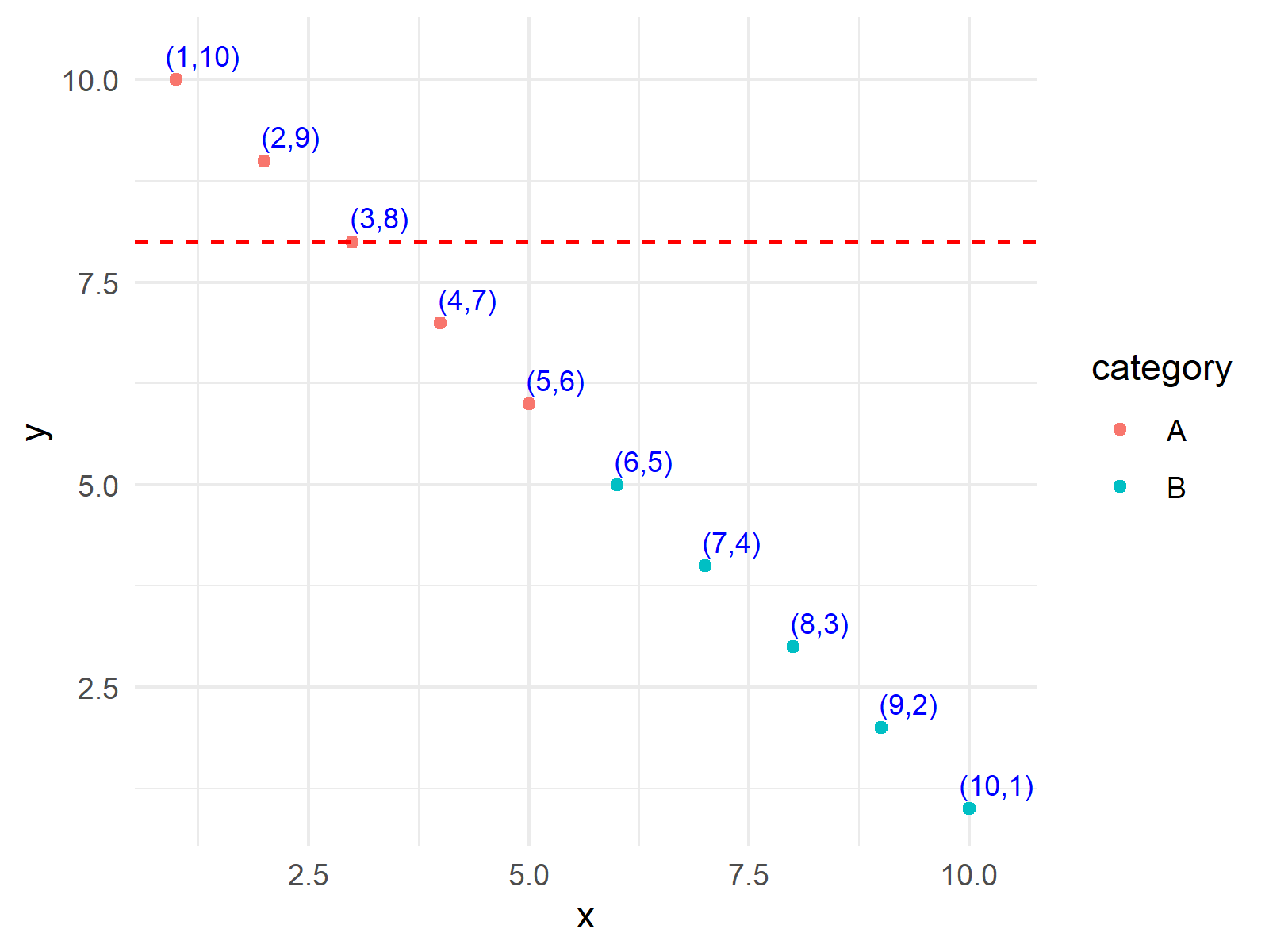
Thanks to this additional layer, we can see the coordinates of points if there are fewer than 15 data points. Otherwise, the graph could be too messy with all points labeled. In this case, all points are labeled as there are 15 points in total anyways.
Finally, we got a fancy scatter plot with some added ggplot2 layers. I hope these examples can help you visualize your data in a more advanced way!
Video & Further Resources
In case you want to learn more about the ggplot2 package and data visualization in R, please have a look at the following video tutorial, where I give a detailed introduction with different examples:
Furthermore, you may want to read the other tutorials on this homepage:
- Add Bold & Italic Text to ggplot2 Plot
- Add Greek Symbols to ggplot2 Plot in R
- Add Different Line to Each Facet of ggplot2 Plot
- Add Image to Plot in R
- Graphics Overview in R
- Introduction to R Programming
In summary: In this R tutorial, you have learned how to include an extra layer in ggplot2 conditionally. Let me know in the comments below if you have further questions.
This page was created in collaboration with Cansu Kebabci. Have a look at Cansu’s author page to get more information about her professional background, a list of all his tutorials, as well as an overview of her other tasks on Statistics Globe.


