Add Values to Heatmap in R (Example)
In this tutorial, I’ll illustrate how to draw a heatmap with values in the R programming language.
Table of contents:
So now the part you have been waiting for – the R code.
Example Data, Software Packages & Basic Graphic
Consider the following example data:
set.seed(328576)                              # Create example data
data <- data.frame(group1 = rep(LETTERS[1:4], each = 10),
                   group2 = letters[1:10],
                   values = round(rnorm(40), 2))
head(data)                                    # Print head of example data
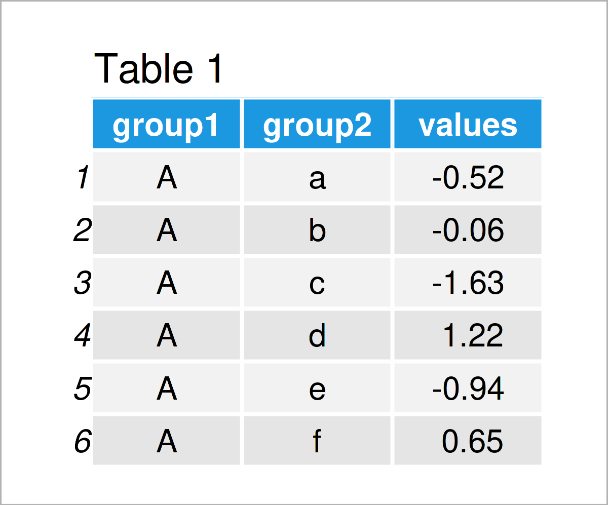
Have a look at the table that has been returned after executing the previously shown R programming syntax. It shows the first six lines of our example data, and that our data is made of the three columns “group1”, “group2”, and “values”. The variables group1 and group2 have the character class and the variable values is numerical.
We also need to install and load the ggplot2 package to RStudio, in order to use the corresponding functions:
install.packages("ggplot2")                   # Install & load ggplot2
library("ggplot2")
As a next step, we can draw our data.
ggp <- ggplot(data, aes(group1, group2)) +    # Create default ggplot2 heatmap
  geom_tile(aes(fill = values))
ggp                                           # Draw default ggplot2 heatmap
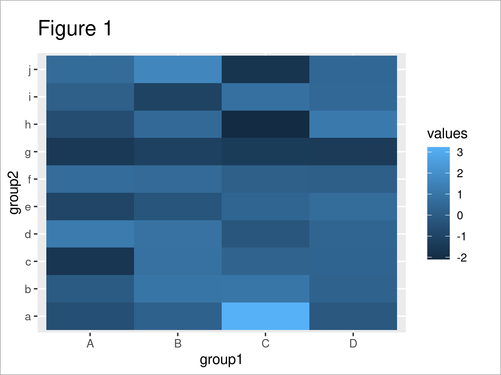
By running the previous code we have plotted Figure 1, i.e. a heatmap without values.
Example: Add Values to ggplot2 Heatmap Using geom_text() Function
This example illustrates how to create a heatmap with values using the R programming language.
For this task, we can use the geom_text function as shown below:
ggp +                                         # Add values to heatmap
  geom_text(aes(label = values))
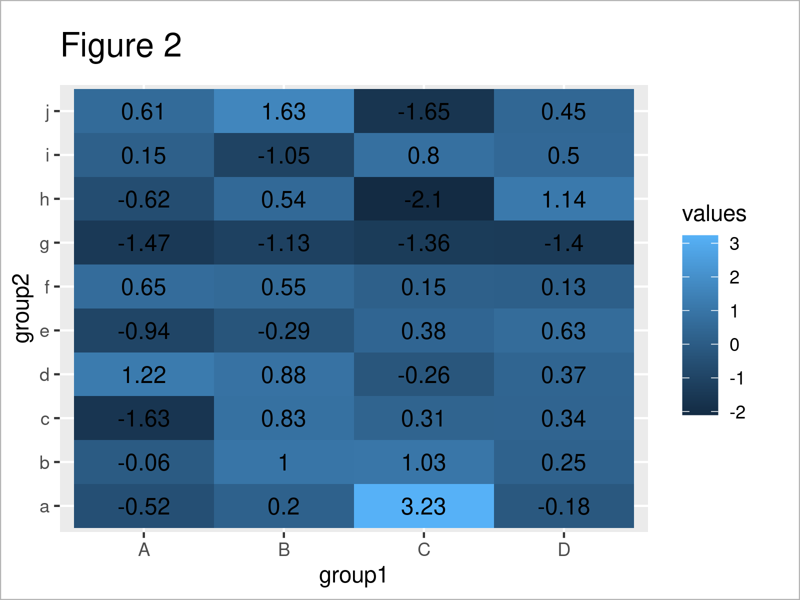
As shown in Figure 2, the previous R syntax has managed to create a heatmap with values.
However, as you can see some of the values cannot be read, since the color of the heatmap cells is similar to the text color.
For that reason, we can modify the heatmap color using the scale_fill_gradient function:
ggp +                                         # Add values & modify color
  geom_text(aes(label = values)) +
  scale_fill_gradient(low = "white", high = "#1b98e0")
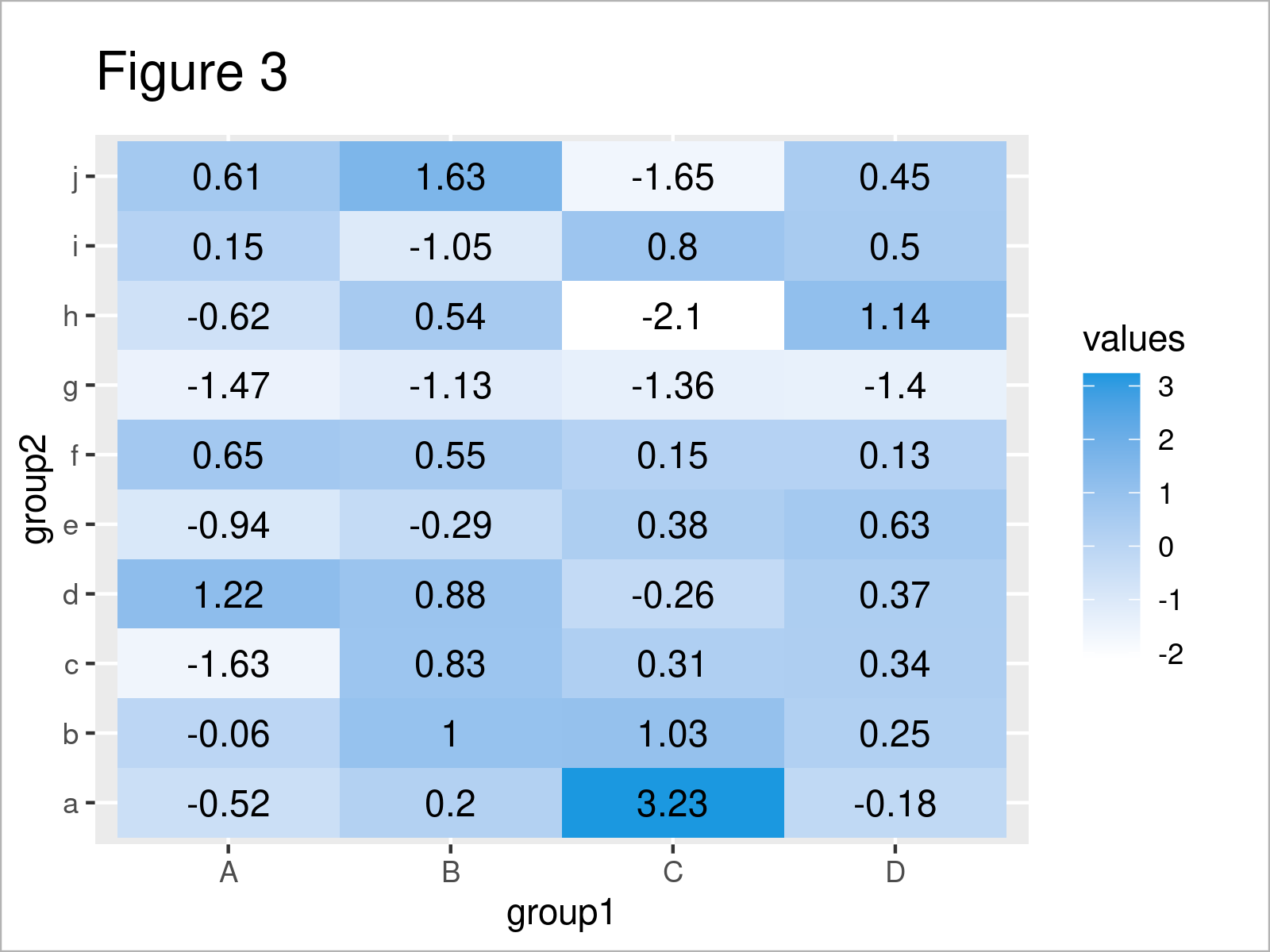
By executing the previous R syntax we have created Figure 3, i.e. a heatmap with values and modified colors.
Video & Further Resources
In case you need more information on the examples of this page, you might want to watch the following video on my YouTube channel. I explain the topics of this article in the video:
In addition, you may want to read some of the related articles on this website.
To summarize: In this R post you have learned how to create a heatmap graphic with values. Don’t hesitate to tell me about it in the comments section, if you have any additional comments or questions.
Subscribe to the Statistics Globe Newsletter
Get regular updates on the latest tutorials, offers & news at Statistics Globe.
I hate spam & you may opt out anytime: Privacy Policy.
Thank you!
Welcome to the Statistics Globe newsletter. From now on, I’ll send you regular emails about statistics, data science, AI, and programming with R and Python.
I’m Joachim Schork. On this website, I provide statistics tutorials as well as code in Python and R programming.
Statistics Globe Newsletter
Get regular updates on the latest tutorials, offers & news at Statistics Globe. I hate spam & you may opt out anytime: Privacy Policy.
Thank you!
Please check your email inbox and click the confirmation link to complete your subscription. If you don’t see the email within a few minutes, please also check your spam/junk folder.


