Draw Histogram with Logarithmic Scale in R (3 Examples)
This article illustrates how to convert the x-axis of a graph to log scale in R.
The article is structured as follows:
It’s time to dive into the examples:
Creation of Example Data
Have a look at the following example data:
set.seed(120653)                              # Set random seed
x <- c(rnorm(1000, 6), rnorm(1000, 13, 4))    # Create example data
head(x)                                       # Head of example data
# [1] 6.717975 5.000511 5.836833 5.255884 5.894466 5.847968
The previous output of the RStudio console shows the structure of our example data – It’s a numeric vector containing randomly drawn numbers.
Example 1: Draw Histogram with Logarithmic Scale Using Base R
Example 1 shows how to create a Base R histogram with logarithmic scale.
Let’s first draw a histogram with regular values on the x-axis:
hist(x, breaks = 100) # Histogram without logarithmic axis

As shown in Figure 1, the previous R programming code created a histogram without logarithmic scale.
If we want to convert the x-axis values of our histogram to logarithmic scale, we can use the log function as shown below:
hist(log(x), breaks = 100) # Histogram with logarithmic axis

As shown in Figure 2, the previous syntax created a Base R histogram with logarithmic scale.
Example 2: Draw Histogram with Logarithmic Scale Using ggplot2 Package
In this example, I’ll explain how to draw a ggplot2 histogram with logarithmic scale.
If we want to use the functions of the ggplot2 package, we first need to install and load ggplot2:
install.packages("ggplot2")                   # Install & load ggplot2 package
library("ggplot2")
Next, we can draw a ggplot2 histogram without log scale:
ggplot(data.frame(x), aes(x)) +               # Histogram without logarithmic axis
  geom_histogram(bins = 100)

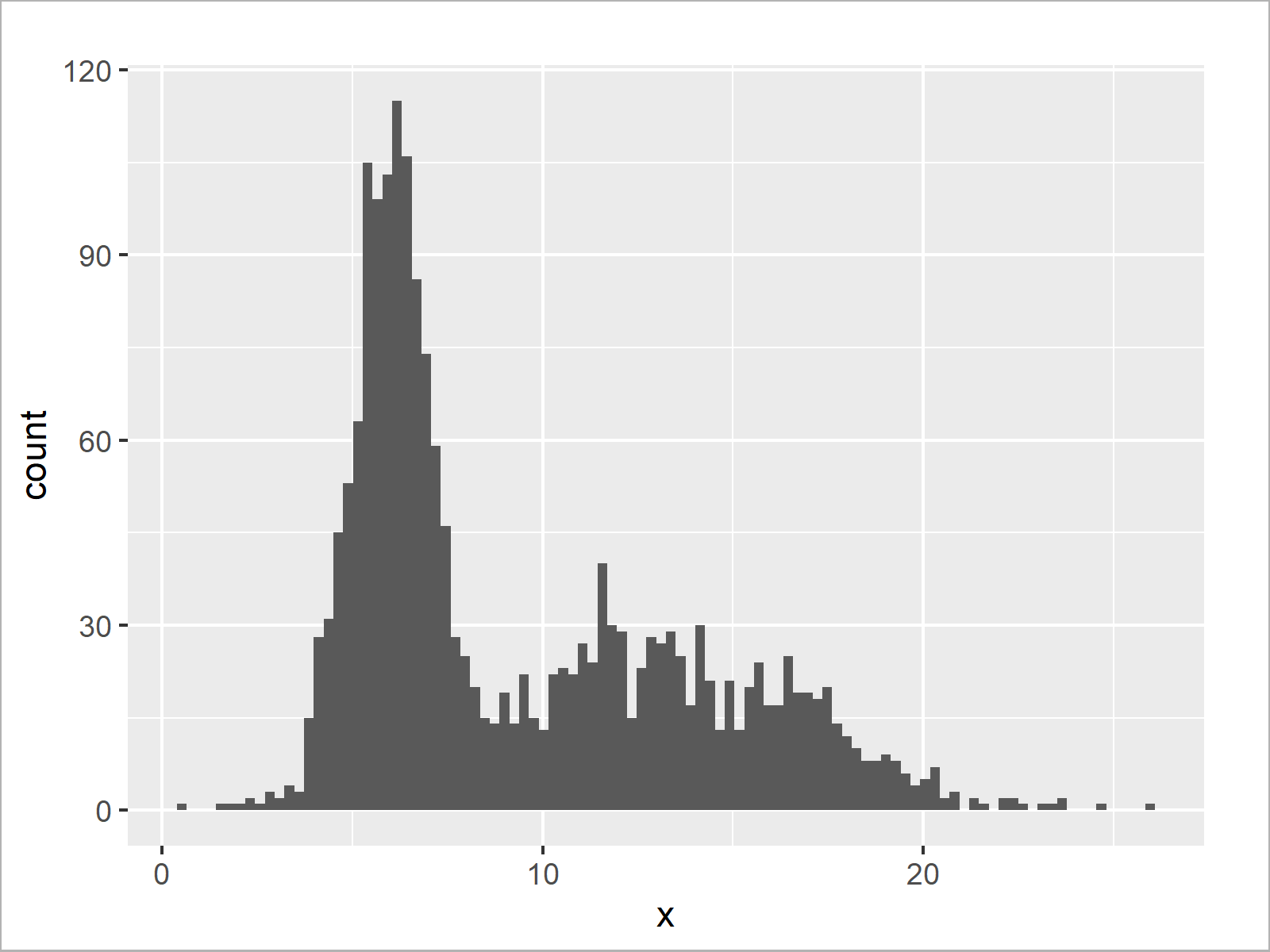
The output of the previous R code is shown in Figure 3 – A ggplot2 histogram with default x-axis values.
Let’s transform our x-axis to logarithmic scale:
ggplot(data.frame(log(x)), aes(log(x))) +     # Histogram with logarithmic axis
  geom_histogram(bins = 100)

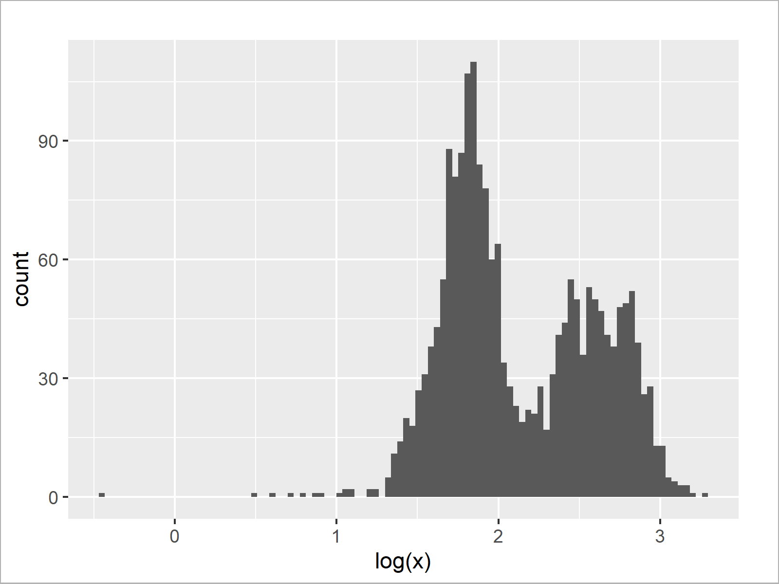
As shown in Figure 4, the previous code created a ggplot2 histogram with logarithmic scale using the log and geom_histogram functions.
Example 3: Draw Histogram with Logarithmic Scale Using scale_x_log10 Function of ggplot2 Package
In case we want to draw a ggplot2 histogram with log10 scale, we can use the scale_x_log10 function instead of the log function.
ggplot(data.frame(x), aes(x)) +               # Histogram with log10 axis
  geom_histogram(bins = 100) +
  scale_x_log10()

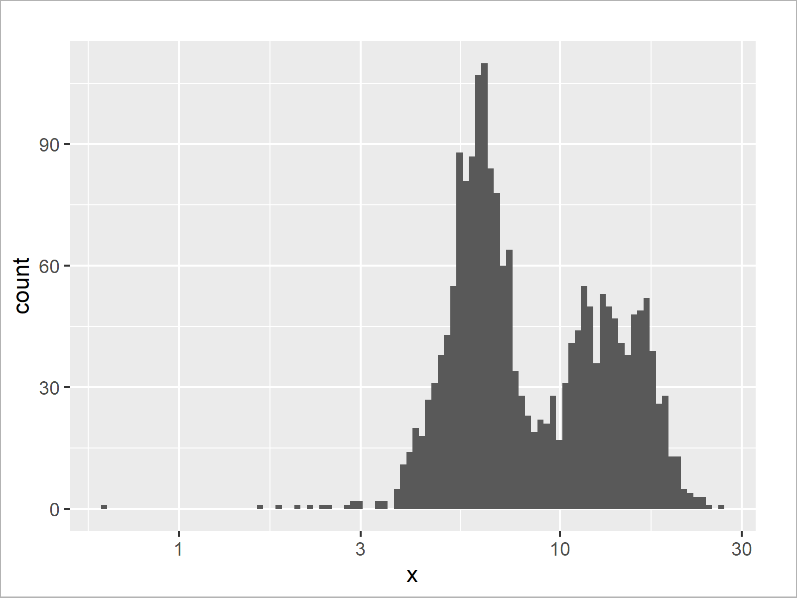
The output of the previous R programming code is shown in Figure 5 – A ggplot2 plot with log10 x-axis scale.
Video & Further Resources
Do you need more explanations on the R programming codes of this tutorial? Then you might have a look at the following video of my YouTube channel. In the video, I’m explaining the R programming code of this article:
In addition, you might want to have a look at the other articles on my website.
- Transform ggplot2 Plot Axis to log10 Scale
- Natural, Binary & Common Logarithm Using log() Function
- R Graphics Gallery
- R Programming Examples
In this post you learned how to display the x-axis of a graphic in logarithmic scale in the R programming language. In case you have any further questions, let me know in the comments section below.
Subscribe to the Statistics Globe Newsletter
Get regular updates on the latest tutorials, offers & news at Statistics Globe.
I hate spam & you may opt out anytime: Privacy Policy.
Thank you!
Welcome to the Statistics Globe newsletter. From now on, I’ll send you regular emails about statistics, data science, AI, and programming with R and Python.
I’m Joachim Schork. On this website, I provide statistics tutorials as well as code in Python and R programming.
Statistics Globe Newsletter
Get regular updates on the latest tutorials, offers & news at Statistics Globe. I hate spam & you may opt out anytime: Privacy Policy.
Thank you!
Please check your email inbox and click the confirmation link to complete your subscription. If you don’t see the email within a few minutes, please also check your spam/junk folder.


2 Comments. Leave new
Hello there, could you help me with changing x-axis values for a log scaled histogram?
I have used hist(log(mydata$data, 10)) which gives me the histogram I want but now I want to change the x-axis values from log base exponents to the actual value they represent i.e., instead of 1, 2, 3, 4, 5 I’d like 10, 100, 1000, 10000, 100000.
Hello Jack,
I understand that you want to plot a histogram for the transformed data but use the actual values as labels on the x-axis. Then I suggest you run the code below.
Be aware that I also changed the x-axis label from log(x) to x.
Regards,
Cansu