Draw Histogram with Percentages Instead of Frequency Counts in Base R
In this article, I’ll explain how to use the hist() function to draw a histogram with percent in the R programming language.
The content of the article looks as follows:
It’s time to dive into the example…
Creation of Example Data
Consider the exemplifying data below:
set.seed(2956923)                          # Create random example data
x <- rnorm(300)
head(x)                                    # Head of example data
# [1] -1.3758433  0.7445425  0.2984749 -1.5253859  1.4278683 -1.2988354
The previous output of the RStudio console shows that our exemplifying data is a numeric vector containing random values.
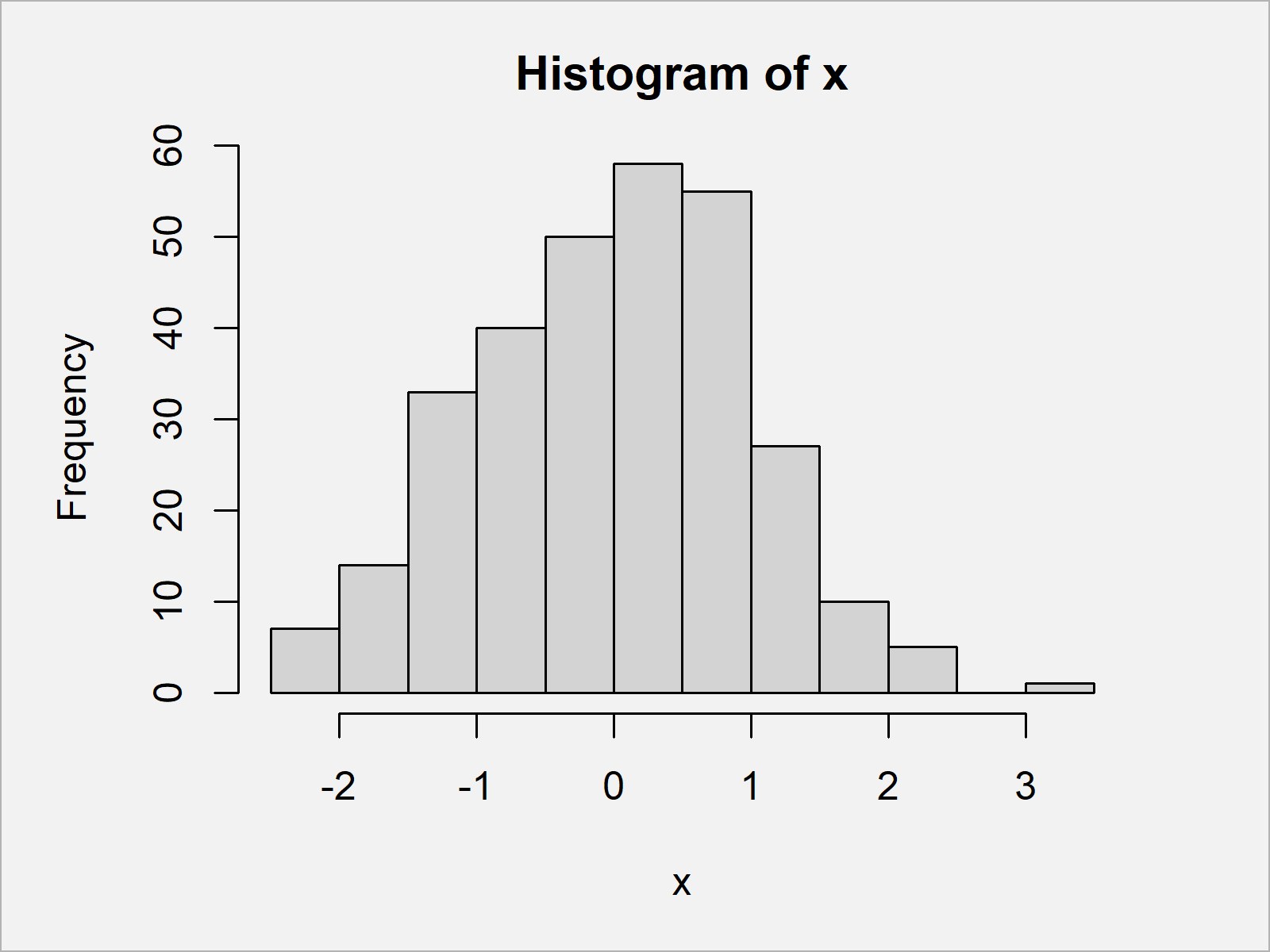
As next step, we can draw our data in a Base R histogram using the hist function:
hist(x) # Draw histogram with default specification

The output of the previously shown code is shown in Figure 1: A Base R histogram with frequencies on the y-axis.
Example: Draw Histogram with Percentages Using hist() & plot() Functions
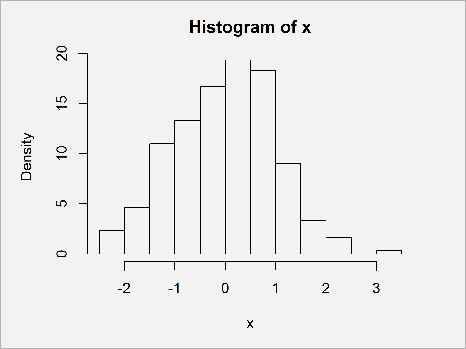
The following syntax illustrates how to show percentages instead of frequency counts on the y-axis of our histogram.
Have a look at the following R code:
hist_info <- hist(x, plot = FALSE)         # Store output of hist function
hist_info$density <- hist_info$counts /    # Compute density values
  sum(hist_info$counts) * 100
plot(hist_info, freq = FALSE)              # Plot histogram with percentages

By running the previous code we have created Figure 2, i.e. a Base R histogram with percentages on the y-axis.
Video, Further Resources & Summary
Do you need further information on the topics of this article? Then I recommend watching the following video of my YouTube channel. In the video instruction, I illustrate the R programming code of this article in the R programming language:
Furthermore, you may want to have a look at the related tutorials at https://www.statisticsglobe.com/. A selection of articles on topics such as graphics in R, distributions, plot legends, and ggplot2 can be found below:
- Draw Legend Outside of Plot Area in Base R Graphic
- Draw Dates to X-Axis of Plot
- Create a Histogram in Base R
- Overlay Histogram with Fitted Density Curve in Base R & ggplot2 Package
- Graphics in R
- R Programming Examples
Summary: In this post you have learned how to create a histogram with percentage points on the y-axis in the R programming language. Let me know in the comments section, in case you have any further comments or questions.


