Draw ggplot2 Plot with Two Different Continuous Color Scales in R (Example)
In this article you’ll learn how to use two different color ranges in a ggplot2 plot in R.
The table of content is structured as follows:
Let’s start right away:
Creation of Example Data
The first step is to construct some data that we can use in the examples later on:
data1 <- data.frame(x1 = rnorm(500),    # Create first example data frame
                    y1 = rnorm(500))
head(data1)                             # Print head of first example data frame

data2 <- data.frame(x2 = runif(500),    # Create second example data frame
                    y2 = runif(500))
head(data2)                             # Print head of second example data frame

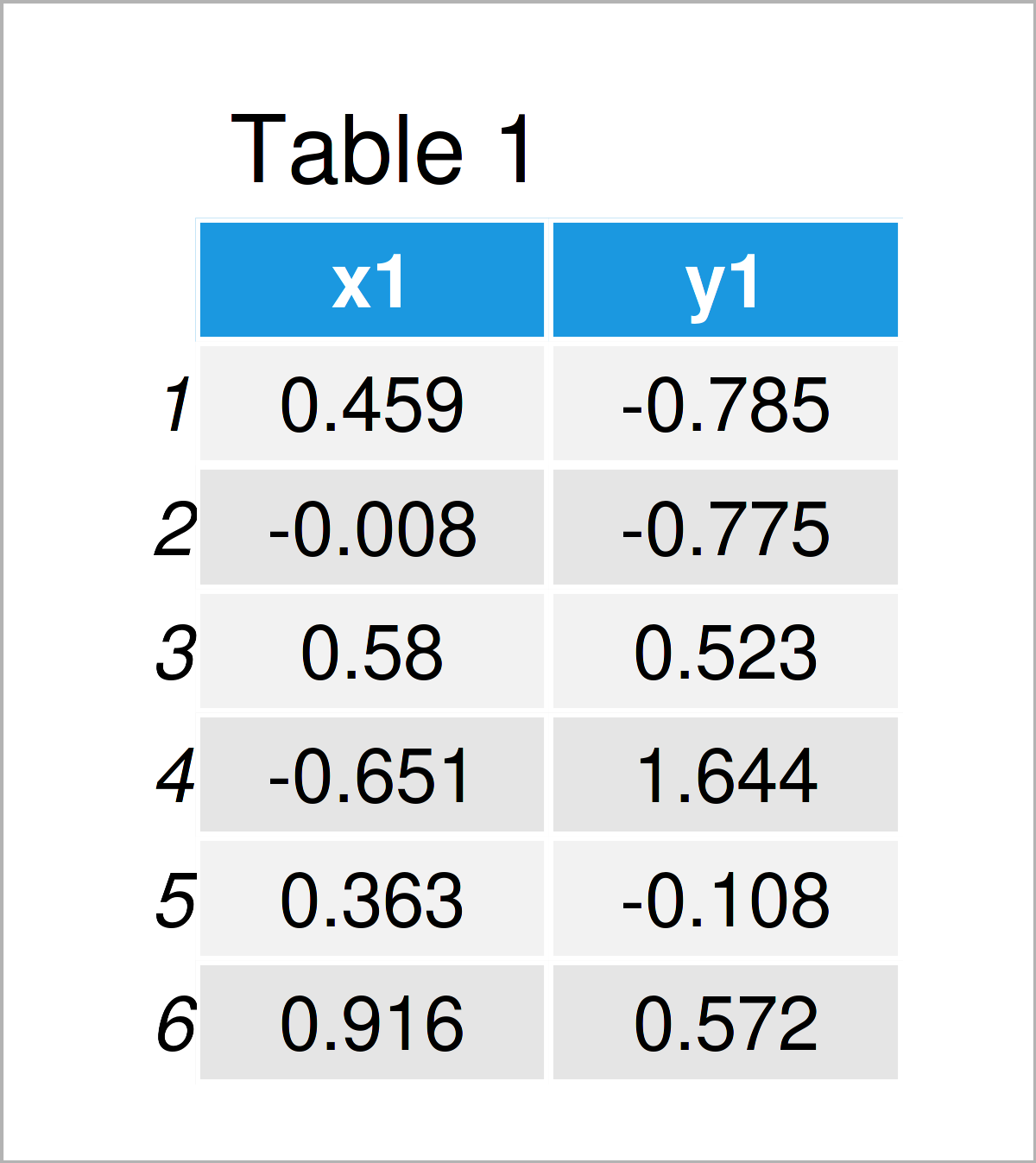
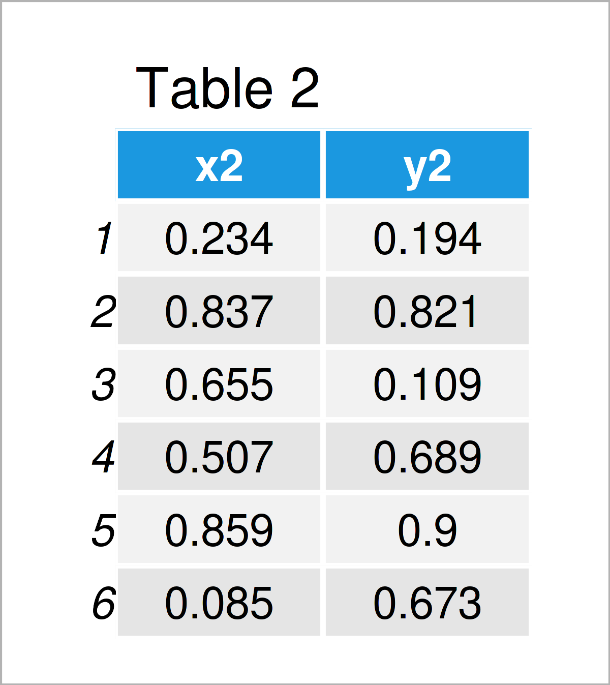
The output of the previous R programming syntax is shown in Tables 1 and 2: As you can see, we have created two different data frames, each consisting of two randomly distributed numeric variables.
Let’s draw these data!
Example: Draw ggplot2 Plot with Two Different Color Scales Using ggnewscale Package
This example explains how to create a ggplot2 plot of two data sets where each data set has its own continuous color range.
As a first step, we have to install and load the ggplot2 package:
install.packages("ggplot2")             # Install ggplot2 package
library("ggplot2")                      # Load ggplot2 package
Next, we also have to install and load the ggnewscale package:
install.packages("ggnewscale")          # Install ggnewscale package
library("ggnewscale")                   # Load ggnewscale
The ggnewscale package provides the new_scale_color function. This function can be used to create a new color scale.
Consider the R programming syntax below:
ggplot() +                              # Draw ggplot2 plot with two color scales
  geom_point(data = data1, aes(x = x1, y = y1, color = y1)) +
  scale_color_gradient(low = "green", high = "blue") +
  new_scale_color() +
  geom_point(data = data2, aes(x = x2, y = y2, color = y2)) +
  scale_color_gradient(low = "yellow", high = "red")

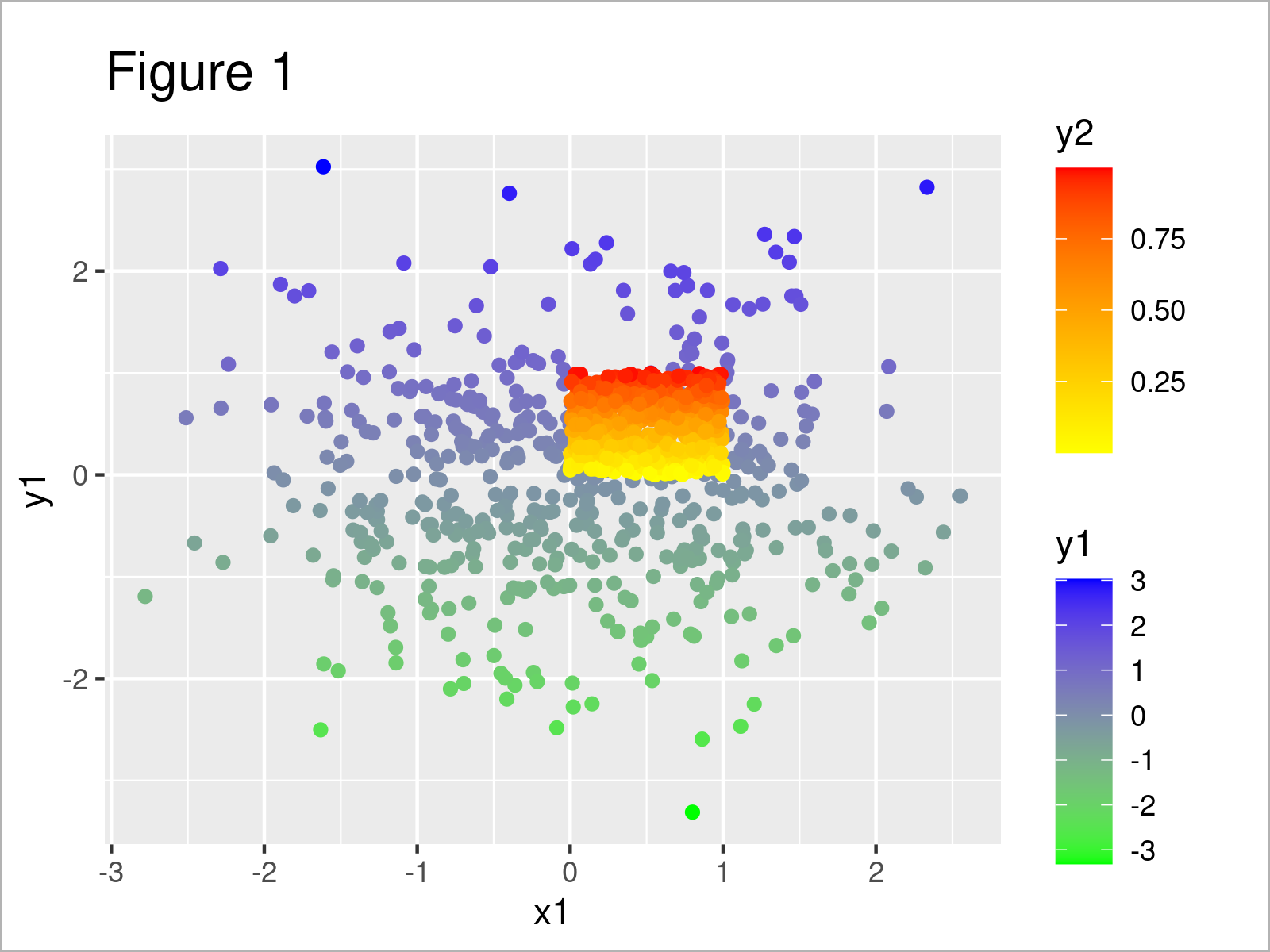
In Figure 1 you can see that we have managed to create a ggplot2 scatterplot by running the previous R programming code.
The data of the first data set has a color scale ranging from green to blue, and the data of the second data set has a color scale ranging from yellow to red.
The two color ranges have been specified by the scale_color_gradient function, and the new_scale_color function has been used to tell R that we wanted to start a new color scale.
Looks great! 🙂
Video & Further Resources
I have recently published a video on my YouTube channel, which illustrates the R syntax of this tutorial. You can find the video below.
Furthermore, you may want to read the related tutorials which I have published on Statistics Globe. I have published numerous articles on topics such as ggplot2, groups, and lines:
- Draw Plot with Two Y-Axes
- Add Different Line to Each Facet of ggplot2 Plot
- Draw Two ggplot2 Boxplots on Same X-Axis Position
- Set Color by Group in ggplot2 Plot
- Draw ggplot2 Plot with Two Y-Axes in R
- R Graphics Gallery
- Introduction to R
Summary: At this point you should have learned how to use separate color scales in a continuous ggplot2 plot in the R programming language. In case you have any further questions, let me know in the comments section.
Subscribe to the Statistics Globe Newsletter
Get regular updates on the latest tutorials, offers & news at Statistics Globe.
I hate spam & you may opt out anytime: Privacy Policy.
Thank you!
Welcome to the Statistics Globe newsletter. From now on, I’ll send you regular emails about statistics, data science, AI, and programming with R and Python.
I’m Joachim Schork. On this website, I provide statistics tutorials as well as code in Python and R programming.
Statistics Globe Newsletter
Get regular updates on the latest tutorials, offers & news at Statistics Globe. I hate spam & you may opt out anytime: Privacy Policy.
Thank you!
Please check your email inbox and click the confirmation link to complete your subscription. If you don’t see the email within a few minutes, please also check your spam/junk folder.


