Coloring Plot by Factor in R (2 Examples)
This tutorial shows how to specify graphic colors according to a factor in the R programming language.
The content of the page is structured as follows:
Let’s dive right in!
Creation of Exemplifying Data
The following data will be used as basement for this R tutorial:
data <- data.frame(x = 1:100,             # Creating example data
                   y = 1:100,
                   group = LETTERS[1:5],
                   stringsAsFactors = TRUE)
head(data)                                # Printing example data
#   x y group
# 1 1 1     A
# 2 2 2     B
# 3 3 3     C
# 4 4 4     D
# 5 5 5     E
# 6 6 6     A
Have a look at the previous output of the RStudio console. It shows that our example data has two numeric columns and a factor column that specifies the groups of our data.
Example 1: Draw Base R Plot with Colors According to Factor
This Example shows how to use the basic installation of the R programming language to color a plot according to the levels of a factor.
For this, we have to specify the col argument within the plot function to be equal to our grouping factor.
Furthermore, we specify filled points within the plot function by setting the pch argument to be equal to 16 (this is optional).
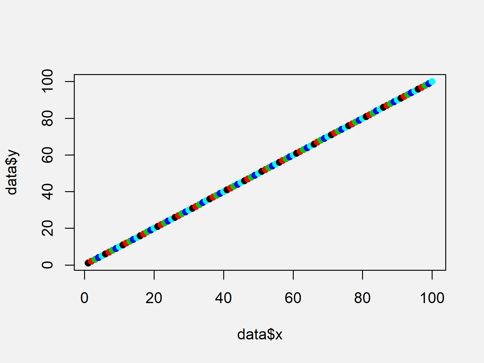
plot(data$x, data$y,                      # Plotting in Base R
     col = data$group,
     pch = 16)

As visualized in Figure 1, the previous code created a scatterplot in Base R with colors according to the factor variable of our data frame.
Example 2: Draw ggplot2 Plot with Colors According to Factor
The following R syntax shows how to draw a ggplot2 graphic with different colors for each factor level.
First, we have to install and load the ggplot2 package:
install.packages("ggplot2")               # Install ggplot2 package
library("ggplot2")                        # Load ggplot2 package
Now, we can draw a ggplot2 xyplot with different colors and a legend as shown below:
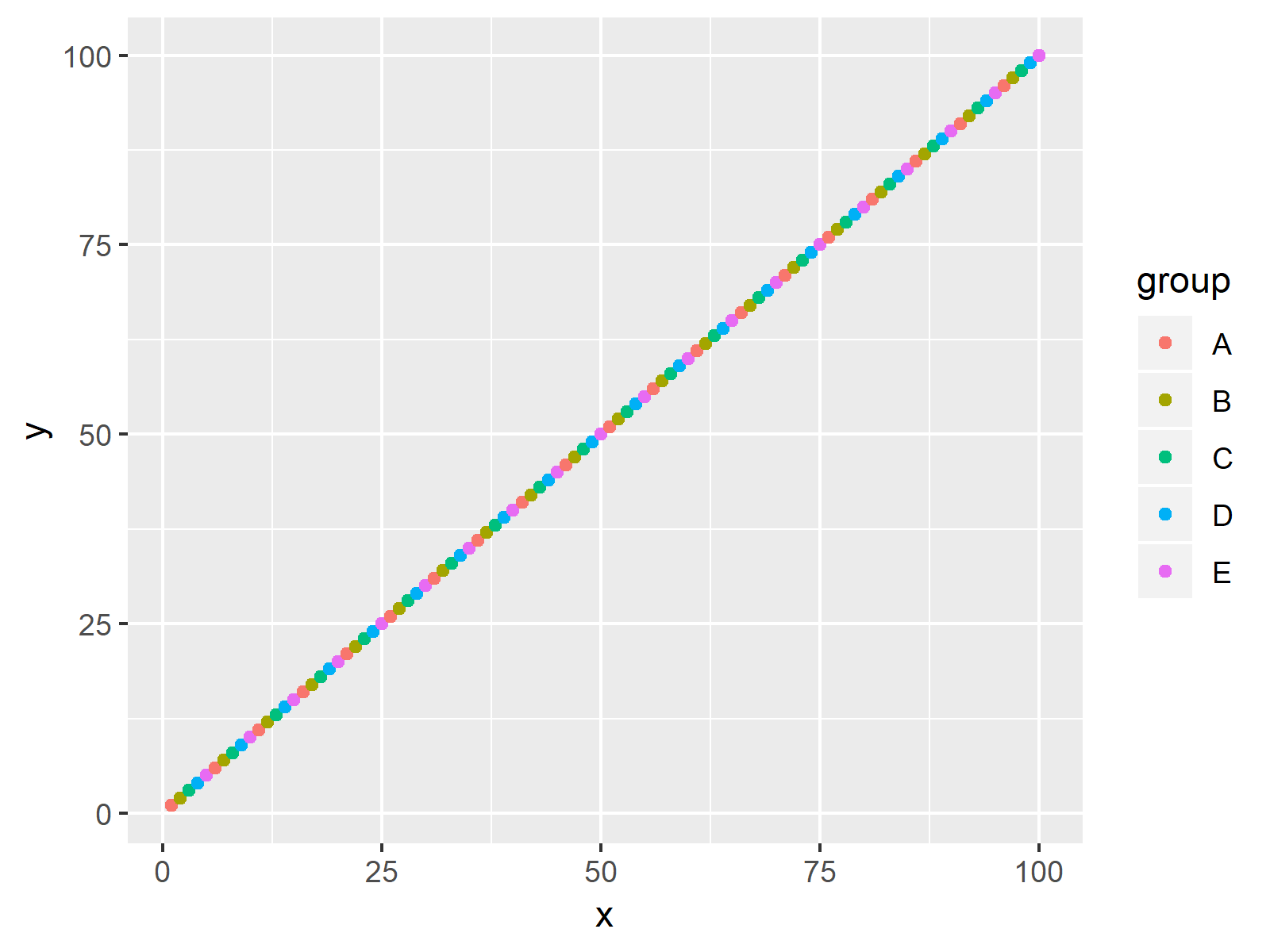
ggplot(data, aes(x, y, col = group)) +    # Plotting with ggplot2 package
  geom_point()

As shown in Figure 2, we created a colored ggplot2 graphic with the previous code.
Note that we have drawn scatterplots in the two examples of this tutorial. However, we could apply similar R codes in case we want to draw a histogram, boxplot, line chart, and so on…
Video, Further Resources & Summary
Would you like to learn more about graphics in R? Then you might want to watch the following video of my YouTube channel. In the video, I illustrate the R code of this tutorial:
In addition, you might read the related tutorials on this website. A selection of articles about plots in R is shown below:
- Control Line Color & Type in ggplot2 Plot Legend
- Change Colors in ggplot2 Line Plot
- Create Color Range Between Two Colors
- Extract Default Color Palette of ggplot2 R Package
- Drawing Plots in R
- R Programming Tutorials
In this R tutorial you learned how to change the colors of a graph based on a factor column. Tell me about it in the comments section below, if you have any additional questions.
Subscribe to the Statistics Globe Newsletter
Get regular updates on the latest tutorials, offers & news at Statistics Globe.
I hate spam & you may opt out anytime: Privacy Policy.
Thank you!
Welcome to the Statistics Globe newsletter. From now on, I’ll send you regular emails about statistics, data science, AI, and programming with R and Python.
I’m Joachim Schork. On this website, I provide statistics tutorials as well as code in Python and R programming.
Statistics Globe Newsletter
Get regular updates on the latest tutorials, offers & news at Statistics Globe. I hate spam & you may opt out anytime: Privacy Policy.
Thank you!
Please check your email inbox and click the confirmation link to complete your subscription. If you don’t see the email within a few minutes, please also check your spam/junk folder.


2 Comments. Leave new
Hello! When the command is executed:
plot(data$x, data$y, # Plotting in Base R
col = data$group,
pch = 16)
an error appears:
Error in plot.xy(xy, type, …) : wrong color name ‘A’
When I perform using ggplot2 (Example 2), then everything works correctly.
I can’t understand why this is happening.
Hey Sergey,
Thank you for the hint!
The reason for this is that this tutorial was created using an older R version. In new R versions, character string columns are not converted to factors automatically.
Please try to re-create the example data frame as shown below, then it should work:
Regards,
Joachim