Adjust binwidth of ggplot2 Histogram in R (2 Examples)
In this tutorial you’ll learn how to change the binwidth of the bars in a ggplot2 histogram in R programming.
The content of the post looks like this:
So now the part you have been waiting for – the examples!
Example Data, Software Packages & Default Plot
Have a look at the exemplifying data below:
set.seed(26453832)            # Create example data frame
data <- data.frame(x = rnorm(1000))
head(data)                    # Head of example data frame

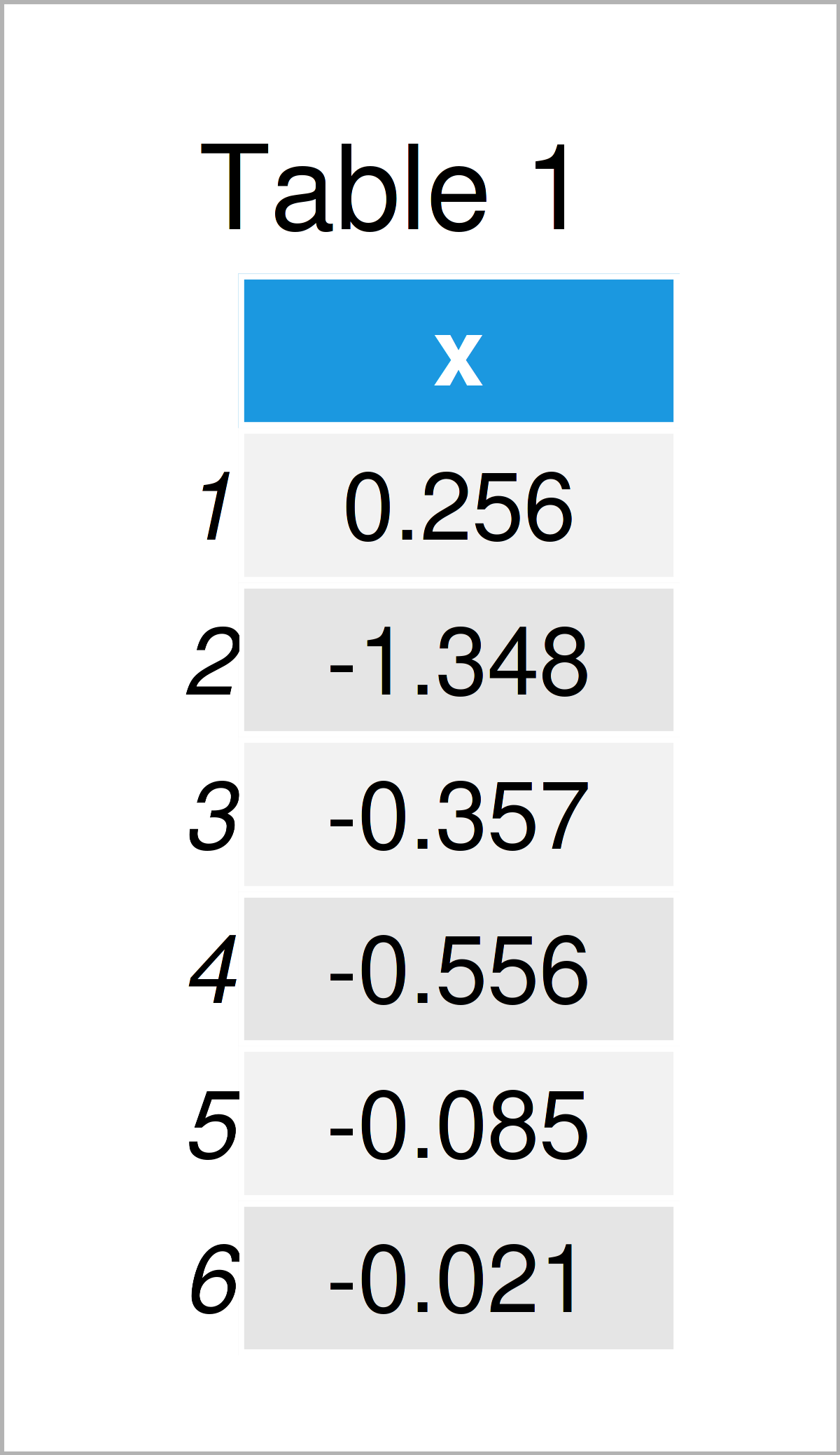
Have a look at the previous table. It illustrates the first six observations of our exemplifying data, and that our data is made of one column.
We also have to install and load the ggplot2 package to RStudio, in order to use the functions that are included in the package:
install.packages("ggplot2")   # Install & load ggplot2
library("ggplot2")
As a next step, we can draw our data:
ggplot(data, aes(x)) +        # Draw ggplot2 histogram with default bins
  geom_histogram(col = "#1b98e0")

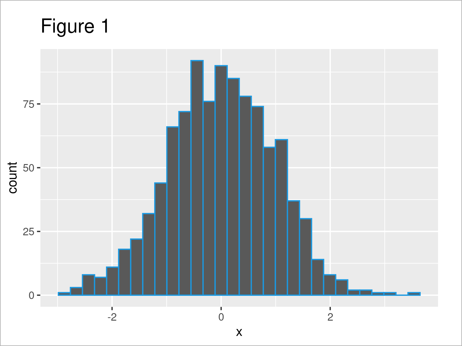
In Figure 1 it is shown that we have plotted a ggplot2 histogram with default width settings of the histogram bins.
After running the previous R code, the warning message “`stat_bin()` using `bins = 30`. Pick better value with `binwidth`.” is returned to the RStudio console. This is because we have not set a binwidth manually.
Next, I’ll show you how to do that, and how to avoid this warning message!
Example 1: Increase binwidth of ggplot2 Histogram
The following R programming syntax shows how to increase the binwidth of the bars in a ggplot2 histogram.
For this task, we can apply the binwidth argument of the geom_histogram function as shown below:
ggplot(data, aes(x)) +        # Increase binwidth
  geom_histogram(col = "#1b98e0",
                 binwidth = 1)

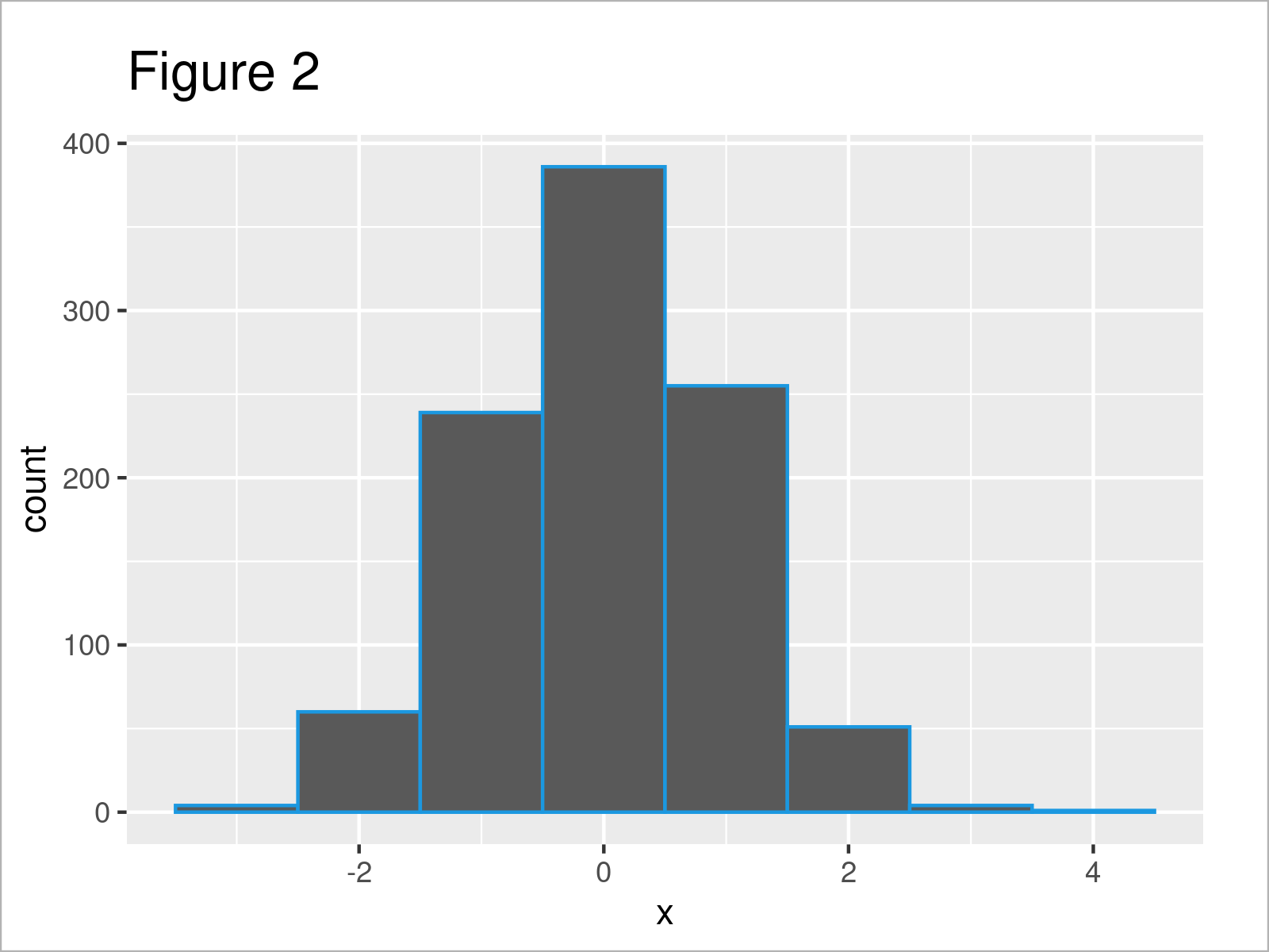
As shown in Figure 2, we have plotted a new histogram with a smaller number of bins.
You may also have noticed that the warning message “`stat_bin()` using `bins = 30`. Pick better value with `binwidth`.” has disappeared, since we have specified the binwidth argument manually.
Example 2: Decrease binwidth of ggplot2 Histogram
We may also decrease the binwidth to show a larger number of bars in our histogram.
For this, we have to decrease the value that we assign to the binwidth argument:
ggplot(data, aes(x)) +        # Decrease binwidth
  geom_histogram(col = "#1b98e0",
                 binwidth = 0.1)

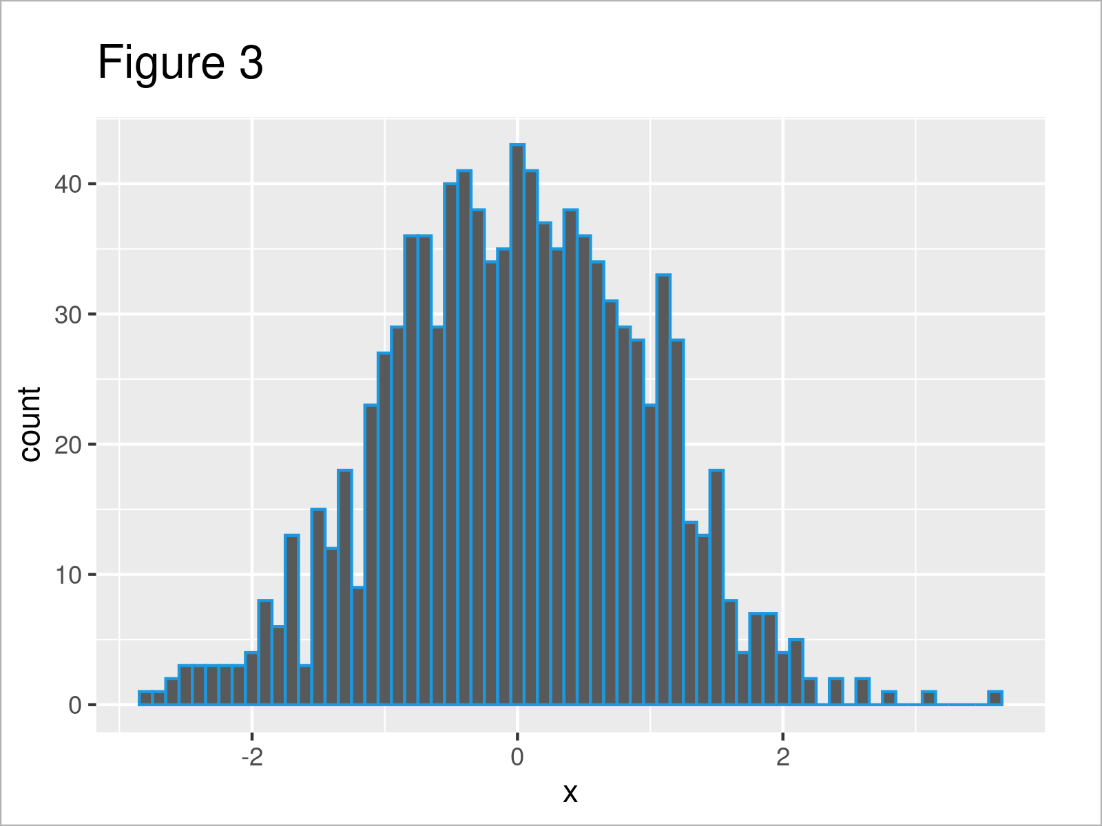
After executing the previous R code the ggplot2 histogram visualized in Figure 3 has been drawn.
Video, Further Resources & Summary
Some time ago, I have published a video on my YouTube channel, which shows the R codes of this article. You can find the video below:
Furthermore, you might have a look at the related articles on https://statisticsglobe.com/. Some tutorials are listed below:
- Create ggplot2 Histogram in R
- Overlay Normal Density Curve on Top of ggplot2 Histogram
- Control Size of ggplot2 Legend Items
- Draw Cumulative Histogram in R
- Creating Plots in R
- R Programming Tutorials
Summary: In this R programming post you have learned how to modify the binwidth of the bars in a ggplot2 histogram plot. Kindly let me know in the comments, if you have additional questions.
Subscribe to the Statistics Globe Newsletter
Get regular updates on the latest tutorials, offers & news at Statistics Globe.
I hate spam & you may opt out anytime: Privacy Policy.
Thank you!
Welcome to the Statistics Globe newsletter. From now on, I’ll send you regular emails about statistics, data science, AI, and programming with R and Python.
I’m Joachim Schork. On this website, I provide statistics tutorials as well as code in Python and R programming.
Statistics Globe Newsletter
Get regular updates on the latest tutorials, offers & news at Statistics Globe. I hate spam & you may opt out anytime: Privacy Policy.
Thank you!
Please check your email inbox and click the confirmation link to complete your subscription. If you don’t see the email within a few minutes, please also check your spam/junk folder.


