Plotting Categorical Variable with Percentage Points Instead of Counts on Y-Axis in R (2 Examples)
In this R article you’ll learn how to draw categories of a variable with percentage points on the y-axis.
The post consists of two examples for the plotting of data in R. To be more precise, the page looks as follows:
Here’s the step-by-step process!
Creating Example Data
We’ll use the data below as basement for this R programming tutorial:
set.seed(927456)                                   # Creating example data
data <- data.frame(x = sample(LETTERS[1:5],
                              200,
                              replace = TRUE))
head(data)                                         # Printing head of example data
#   x
# 1 A
# 2 C
# 3 D
# 4 C
# 5 E
# 6 C
As you can see based on the previous output of the RStudio console, our example data has only one column consisting of categorical values.
Example 1: Barchart with Percentage on Y-Axis Using barplot() Function of Base R
The following R programming code explains how to show percentage points of the y-axis of a barplot created with the basic installation of the R programming language.
For this task, we first have to convert our data frame to a matrix consisting of the percentages of each category:
data_perc <- t(prop.table(table(data$x))) * 100 # Convert data to probability table
Now, we can draw our barchart with percentage points on the y-axis as shown below:
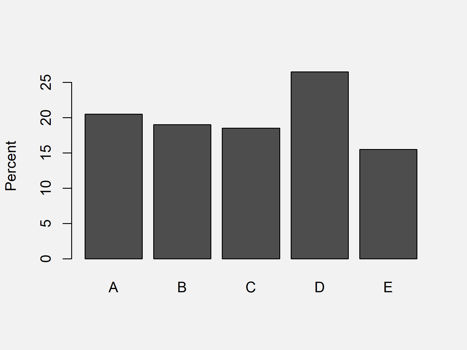
barplot(data_perc, ylab = "Percent") # Draw barchart with Base R

As shown in Figure 1, the previous code created a Base R barchart with %-points on the y-axis.
Example 2: Barchart with Percentage on Y-Axis Using ggplot2 Package
This section illustrates how to plot a ggplot2 graph with percentage points instead of counts on the y-axis.
We first need to install and load the ggplot2 package:
install.packages("ggplot2")                        # Install & load ggplot2 package
library("ggplot2")
Furthermore, we have to install and load the scales package:
install.packages("scales")                         # Install & load scales package
library("scales")
Now, we can draw our graphic as follows:
ggplot(data, aes(x)) +                             # Draw barchart with ggplot2 package
  geom_bar(aes(y = (..count..)/sum(..count..))) +
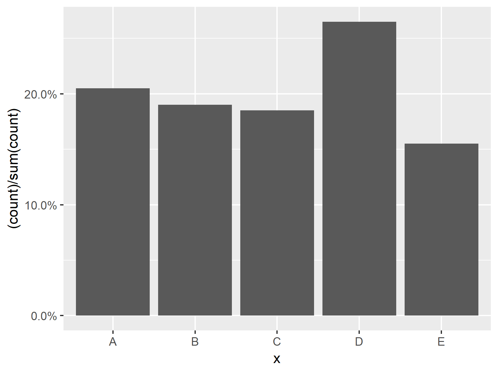
  scale_y_continuous(labels = percent)

The output of the previous R programming code is shown in Figure 2 – A ggplot2 barplot with % on the y-axis instead on counting numbers.
Video, Further Resources & Summary
In case you need further explanations on the examples of this tutorial, you could have a look at the following video of my YouTube channel. In the video, I explain the R programming codes of the present article:
Furthermore, you could have a look at the other articles of this homepage:
- Change Y-Axis to Percentage Points in ggplot2 Barplot
- Keep Unused Factor Levels in ggplot2 Barplot
- Barplot in Base R
- Assign Fixed Colors to Categorical Variable in ggplot2 Plot
- Graphics in R
- The R Programming Language
Summary: You learned on this page how to plot categories instead of counts in a barchart in the R programming language. If you have any additional questions, let me know in the comments. Furthermore, please subscribe to my email newsletter in order to receive updates on the newest articles.
Subscribe to the Statistics Globe Newsletter
Get regular updates on the latest tutorials, offers & news at Statistics Globe.
I hate spam & you may opt out anytime: Privacy Policy.
Thank you!
Welcome to the Statistics Globe newsletter. From now on, I’ll send you regular emails about statistics, data science, AI, and programming with R and Python.
I’m Joachim Schork. On this website, I provide statistics tutorials as well as code in Python and R programming.
Statistics Globe Newsletter
Get regular updates on the latest tutorials, offers & news at Statistics Globe. I hate spam & you may opt out anytime: Privacy Policy.
Thank you!
Please check your email inbox and click the confirmation link to complete your subscription. If you don’t see the email within a few minutes, please also check your spam/junk folder.


