Change Size of Plot when Drawing Multiple Plots in R (2 Examples)
In this R tutorial you’ll learn how to draw an unbalanced grid of plots.
The content of the post looks as follows:
So without further ado, let’s get started!
Creation of Example Data
Consider the following example data.
set.seed(67428)                              # Create example data frame
data <- data.frame(x = rnorm(100),
                   y = rnorm(100))
head(data)                                   # Print head of example data frame
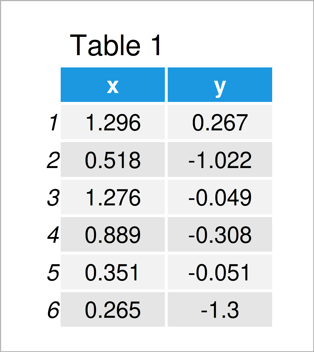
Have a look at the previous table. It shows the first six data points of our example data, and that our data consists of two randomly distributed numerical columns.
Example 1: Change Size of Plots in Base R Grid Layout
In Example 1, I’ll explain how to create a grid of plots with different sizes using the basic installation of the R programming language.
We can specify a grid of multiple graphics with the same size side-by-side using the par function and the mfrow argument:
par(mfrow = c(2, 2)) # Specify grid of plots
Next, we simply have to draw a few graphs to appear in our grid of plots:
plot(data$x, data$y)                         # Draw plots
plot(data$y, type = "l")
hist(data$x)
boxplot(data$x)
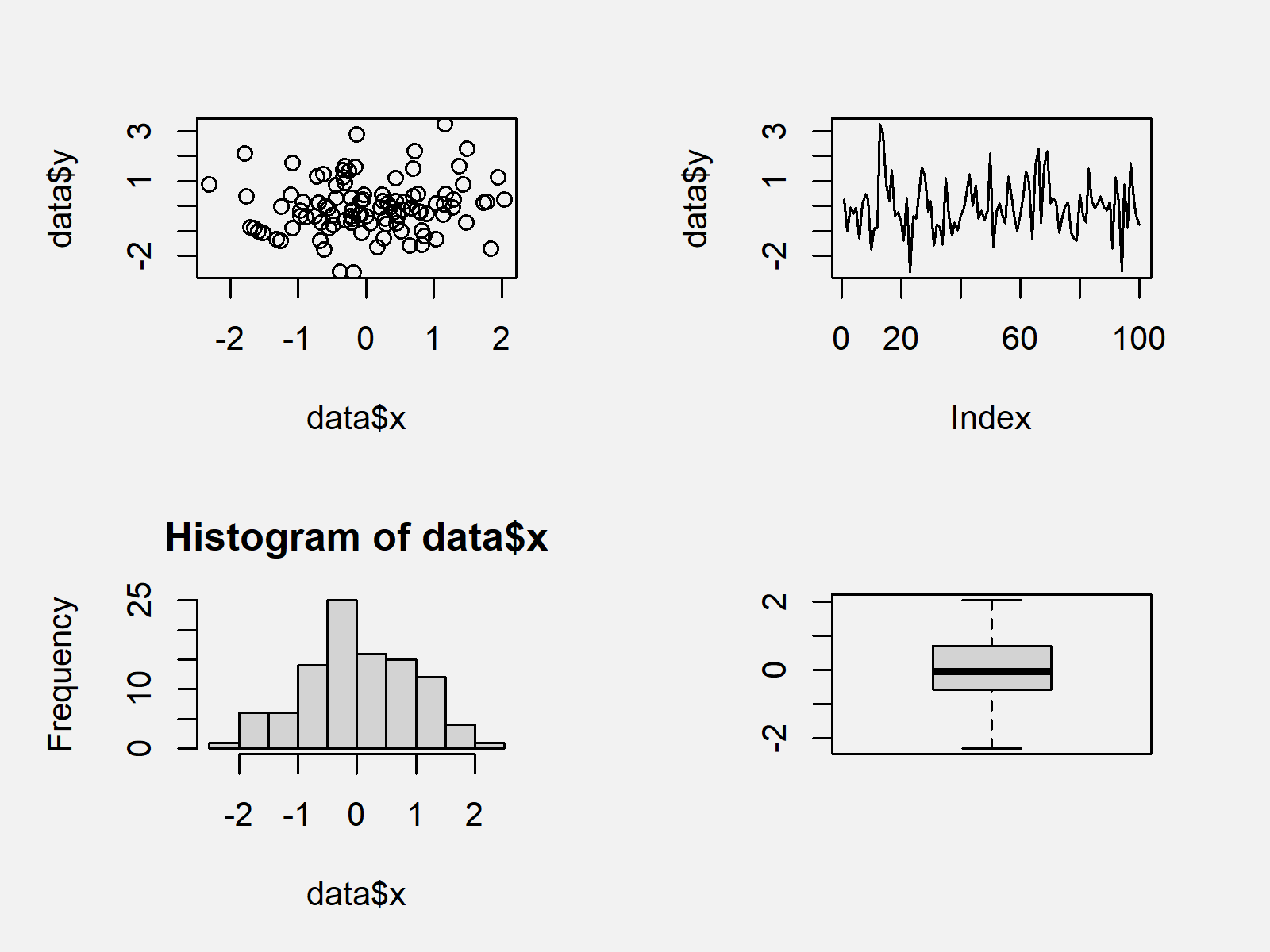
The output of the previously shown R syntax is shown in Figure 1: We have drawn four different graphics in two rows and two columns. All graphs have the same size.
If we want to change the size of graphics in a grid of Base R plots, we first have to specify a matrix corresponding to the positions of each plot:
mat_layout <- matrix(c(1, 1, 2, 3, 4, 4),    # Specify layout matrix
                     nrow = 2,
                     byrow = TRUE)
mat_layout                                   # Print layout matrix
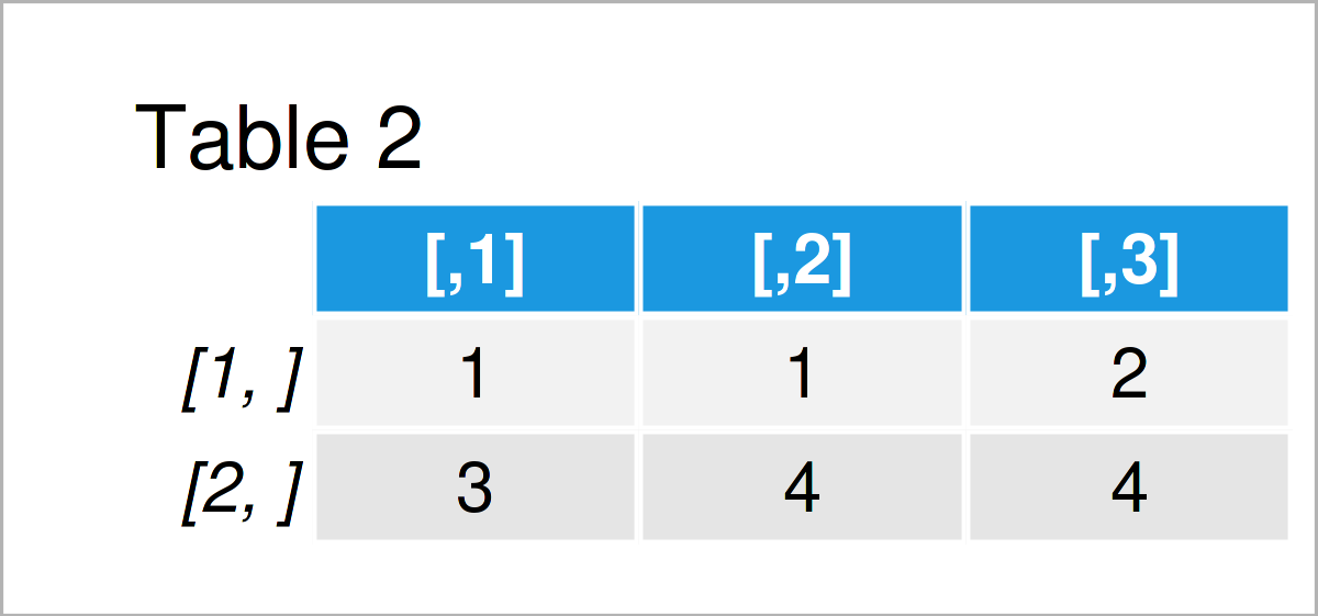
The output of the previous R programming syntax is shown in Table 2 – We have specified the positions where our plots should appear. Note that the plots No. 1 and No. 4 appear at two locations.
Next, we have to apply the layout function to our matrix to arrange the grid of plots according to this matrix:
layout(mat_layout) # Apply layout function
Finally, we can create our grid of plots with unbalanced sizes:
plot(data$x, data$y)                         # Draw plots with different sizes
plot(data$y, type = "l")
hist(data$x)
boxplot(data$x)
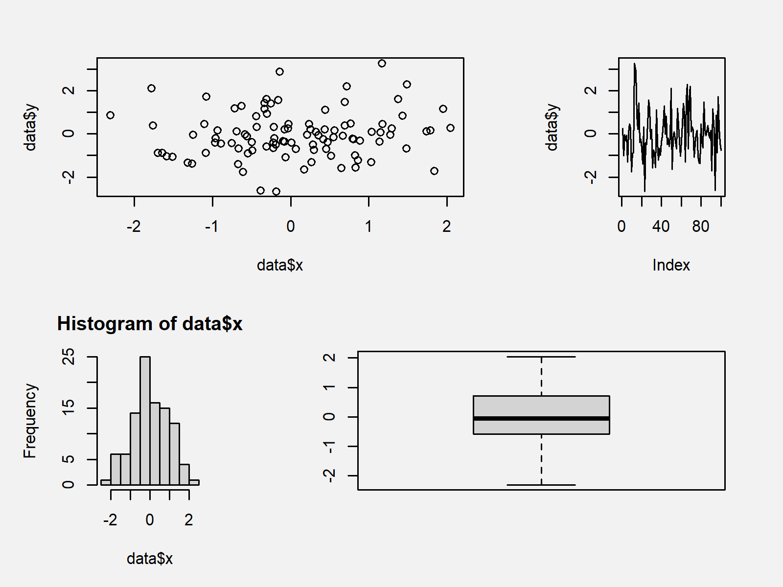
Figure 2 shows the output of the previous code: A grid layout of Base R plots with different sizes.
Example 2: Change Size of Plots in ggplot2 Grid Layout
This example explains how to draw a grid of ggplot2 plots with different sizes.
In order to use the functions of the ggplot2 package, we first need to install and load ggplot2:
install.packages("ggplot2")                  # Install ggplot2 package
library("ggplot2")                           # Load ggplot2
Next, we have to create multiple ggplot2 plot objects that contain the graphs we want to illustrate in our plot layout:
ggp1 <- ggplot(data, aes(x, y)) +            # Create ggplot2 plot objects
  geom_point()
ggp2 <- ggplot(data, aes(x = 1:nrow(data), y)) +
  geom_line()
ggp3 <- ggplot(data, aes(x)) +
  geom_histogram()
ggp4 <- ggplot(data, aes(x)) +
  geom_boxplot()
In order to draw our ggplot2 plots side-by-side, we first have to install and load the patchwork software package:
install.packages("patchwork")                # Install patchwork package
library("patchwork")                         # Load patchwork
Next, we can arrange our ggplot2 plots in a plot layout with equal sizes as shown below:
(ggp1 + ggp2) /                              # Draw grid of ggplot2 plots
  (ggp3 + ggp4)
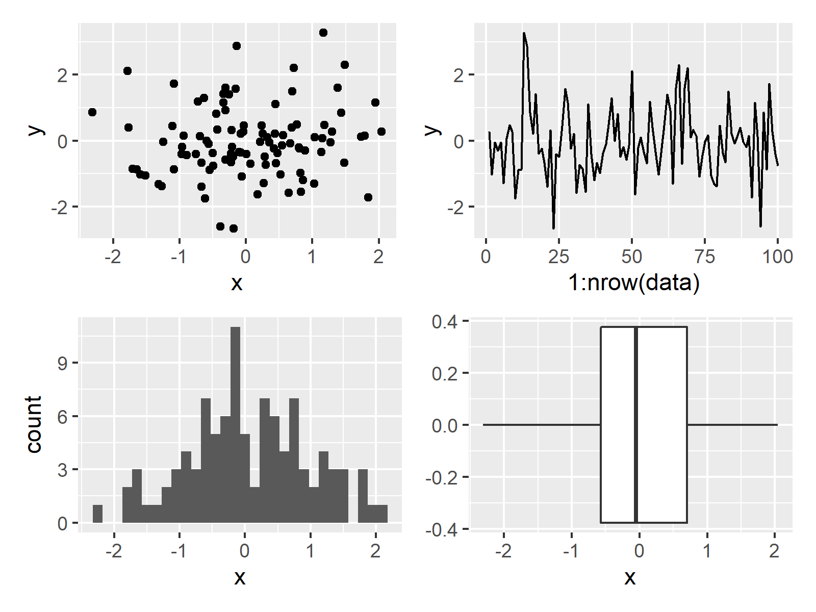
In Figure 3 you can see that we have drawn all the ggplot2 plots side-by-side by running the previous R programming code.
In case we want to draw ggplot2 plots with different sizes, we have to define the grid design first:
patch_design <- c(area(1, 1, 1, 2),          # Specify design of grid
                  area(1, 3, 1, 3),
                  area(2, 1, 2, 1),
                  area(2, 2, 2, 3))
patch_design                                 # Print design of grid
# 4 patch areas, spanning 3 columns and 2 rows
#
#     t l b r
# 1:  1 1 1 2
# 2:  1 3 1 3
# 3:  2 1 2 1
# 4:  2 2 2 3
The previous output shows the top, left, bottom, and right positions of our four ggplot2 graphs.
Next, we can draw our grid of ggplot2 graphics according to this design:
ggp1 + ggp2 + ggp3 + ggp4 +                  # Grid of ggplot2 plots with manual design
  plot_layout(design = patch_design)
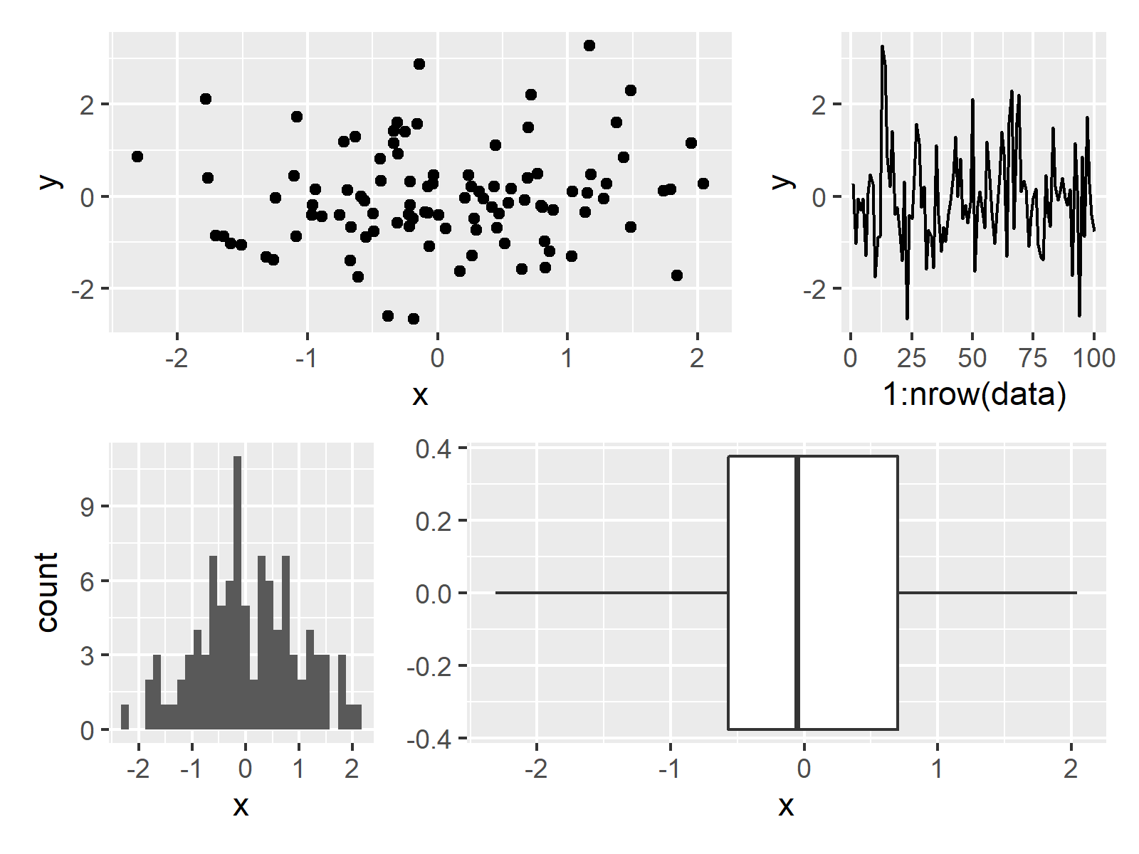
The output of the previously shown R programming code is shown in Figure 4: A grid of ggplot2 plots with different sizes.
Video & Further Resources
Some time ago I have released a video on my YouTube channel, which shows the topics of this tutorial. You can find the video below.
In addition, you could have a look at the other posts on my website. I have released numerous tutorials about similar topics such as graphics in R, plot legends, and ggplot2 already.
- Change Font Size of ggplot2 Plot
- Change Font & Item Size in Base R Plot Legend
- Change Legend Size in Base R Plot
- Change Drawing Order of Points in ggplot2 Plot
- Change Color, Shape & Size of One Data Point in Plot (Base R & ggplot2)
- Drawing Plots in R
- R Programming Examples
In summary: This tutorial has shown how to draw plots with different sizes side-by-side in the R programming language. In case you have additional questions and/or comments, please let me know in the comments below.
Subscribe to the Statistics Globe Newsletter
Get regular updates on the latest tutorials, offers & news at Statistics Globe.
I hate spam & you may opt out anytime: Privacy Policy.
Thank you!
Welcome to the Statistics Globe newsletter. From now on, I’ll send you regular emails about statistics, data science, AI, and programming with R and Python.
I’m Joachim Schork. On this website, I provide statistics tutorials as well as code in Python and R programming.
Statistics Globe Newsletter
Get regular updates on the latest tutorials, offers & news at Statistics Globe. I hate spam & you may opt out anytime: Privacy Policy.
Thank you!
Please check your email inbox and click the confirmation link to complete your subscription. If you don’t see the email within a few minutes, please also check your spam/junk folder.


