Change Color, Shape & Size of One Data Point in Plot (Base R & ggplot2)
On this page you’ll learn how to set color, shape, and size of a single data point in the R programming language.
The tutorial contains these contents:
Let’s take a look at some R codes in action.
Example Data & Default Plot
The following data is used as basement for this R programming tutorial:
data <- data.frame(x1 = 1:6,    # Create example data
                   x2 = 6:1)
data                            # Print example data
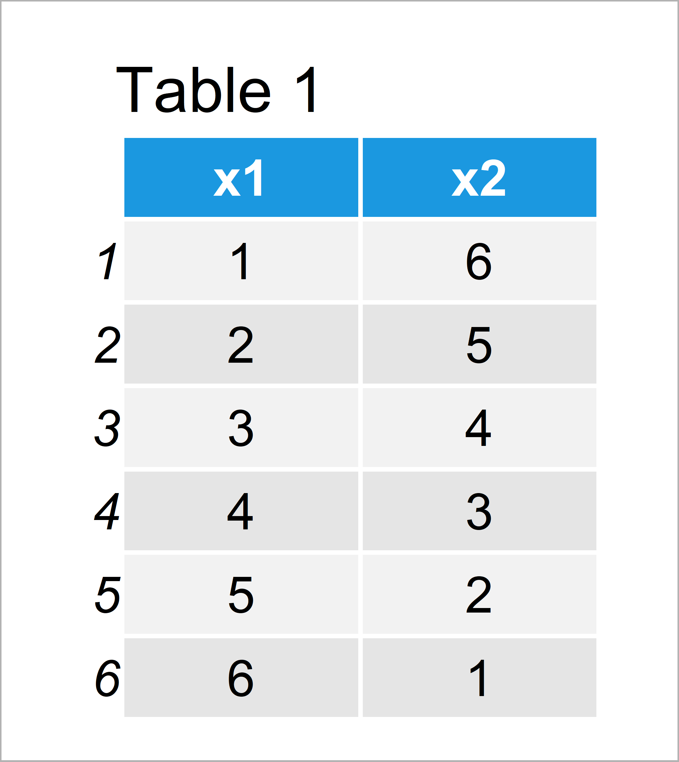
Table 1 visualizes that our example data is made up of six rows and two variables.
Example 1: Modify Color, Shape & Size of Individual Data Point in Plot Using Base R
The following code explains how to adjust the color, shape, and size of a single point in a graphic using the basic installation of the R programming language.
Let’s first draw a graph with default specifications:
plot(data$x1, data$x2) # Base R plot with default colors
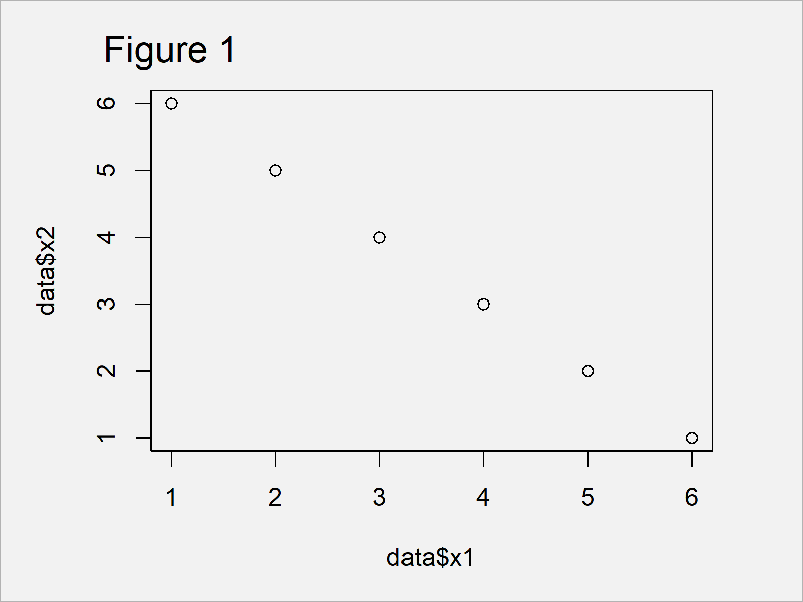
Figure 1 shows the output of the previously shown syntax – A Base R scatterplot with back points only.
We can now use the ifelse and nrow functions to specify the colors (i.e. col argument), shapes (i.e. pch argument), and sizes (i.e. cex argument) of our points within the plot function.
In this example, we change these specifications for the third data point:
plot(data$x1, data$x2,          # Base R plot with manual colors
     col = ifelse(1:nrow(data) == 3, "red", "black"),
     pch = ifelse(1:nrow(data) == 3, 15, 16),
     cex = ifelse(1:nrow(data) == 3, 5, 1))
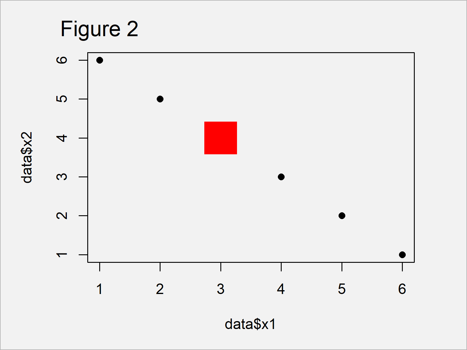
As shown in Figure 2, we have created a scatterplot with different specifications for a single observation by running the previous R syntax.
Example 2: Modify Color, Shape & Size of Individual Data Point in Plot Using ggplot2 Package
We can also change the color, shape, and size of individual points in a ggplot2 plot.
In order to use the functions of the ggplot2 package, we first need to install and load ggplot2:
install.packages("ggplot2")     # Install & load ggplot2 package
library("ggplot2")
Next, we can create a ggplot2 plot with default specifications:
ggplot(data, aes(x1, x2)) +     # ggplot2 plot with default colors
  geom_point()
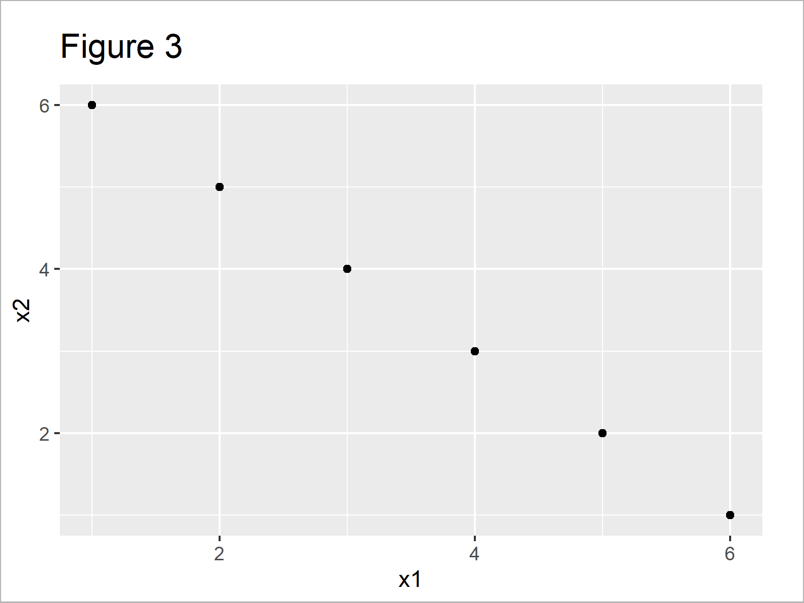
As visualized in Figure 3, we have drawn a ggplot2 xy-plot without changed colors, shapes, and point sizes.
We can now adjust these attributes for one particular case by using the col, shape, and size arguments within the geom_point function:
ggplot(data, aes(x1, x2)) +     # ggplot2 plot with manual colors
  geom_point(col = ifelse(1:nrow(data) == 3, "red", "black"),
             shape = ifelse(1:nrow(data) == 3, 15, 16),
             size = ifelse(1:nrow(data) == 3, 5, 1))
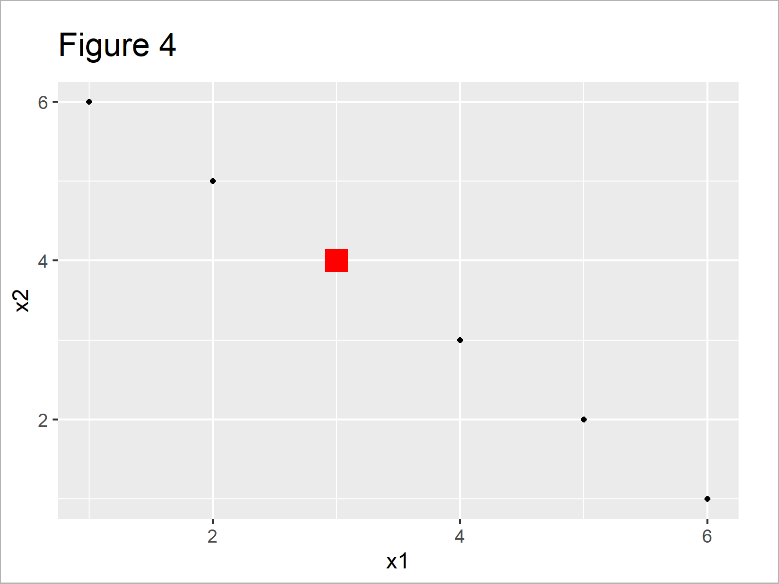
After executing the previous R programming code the ggplot2 plot shown in Figure 4 has been created. As you can see, a single data point is displayed and highlighted differently compared to the other points.
Video, Further Resources & Summary
Have a look at the following video tutorial of my YouTube channel. I’m explaining the R syntax of this page in the video:
In addition, you might want to read the related tutorials of statisticsglobe.com. I have published numerous articles about topics such as ggplot2, colors, and graphics in R.
- Change Legend Size in Base R Plot
- Change Font Size of ggplot2 Plot in R
- Change Background Color of ggplot2 Plot
- Plots in R
- R Programming Tutorials
In this tutorial you have learned how to modify color, shape, and size of points in a scatterplot in the R programming language. In case you have additional questions, let me know in the comments section. Furthermore, please subscribe to my email newsletter to receive regular updates on new tutorials.
Subscribe to the Statistics Globe Newsletter
Get regular updates on the latest tutorials, offers & news at Statistics Globe.
I hate spam & you may opt out anytime: Privacy Policy.
Thank you!
Welcome to the Statistics Globe newsletter. From now on, I’ll send you regular emails about statistics, data science, AI, and programming with R and Python.
I’m Joachim Schork. On this website, I provide statistics tutorials as well as code in Python and R programming.
Statistics Globe Newsletter
Get regular updates on the latest tutorials, offers & news at Statistics Globe. I hate spam & you may opt out anytime: Privacy Policy.
Thank you!
Please check your email inbox and click the confirmation link to complete your subscription. If you don’t see the email within a few minutes, please also check your spam/junk folder.


