Add Marginal Plot to ggplot2 Scatterplot Using ggExtra Package in R (5 Examples)
This article illustrates how to draw a graphic with marginal plot using the ggplot2 and ggExtra packages in the R programming language.
The content of the tutorial is structured as follows:
Let’s dive right into the examples.
Example Data, Packages & Basic Graphic
I use the following data as basement for this R programming tutorial:
set.seed(6897354)                      # Create example data
x <- rnorm(200)
y <- rnorm(200) + x
data <- data.frame(x, y)
head(data)                             # Head of example data
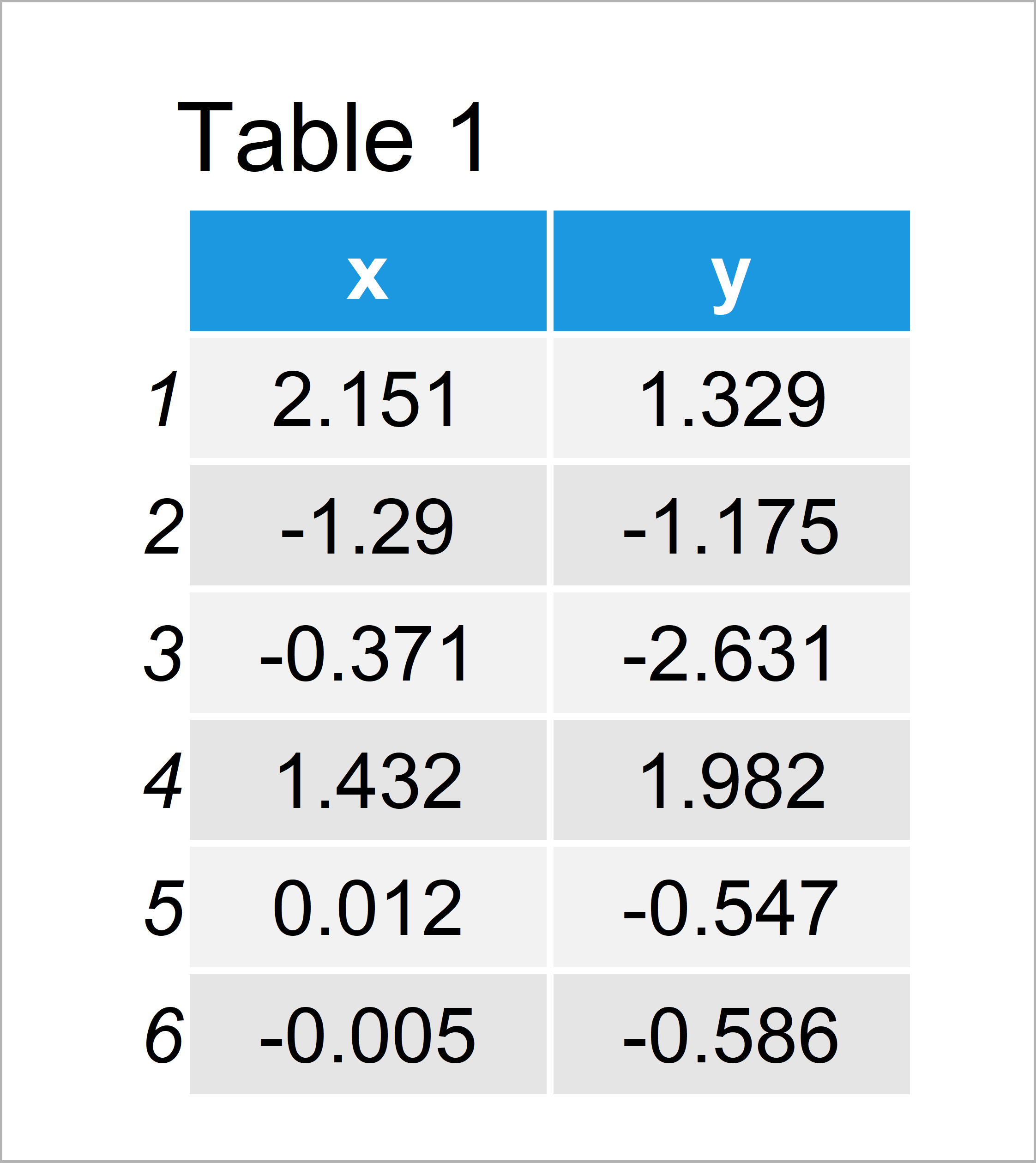
Table 1 shows the structure of our example data: It contains 200 rows and two variables.
For the following R programming language tutorial, I’ll also need to install and load the ggplot2 add-on package to R:
install.packages("ggplot2")            # Install & load ggplot2 package
library("ggplot2")
Now, we can create a graphic of the data without marginal plot borders as shown below:
ggp <- ggplot(data, aes(x, y)) +       # Create ggplot2 scatterplot
  geom_point()
ggp                                    # Draw ggplot2 scatterplot
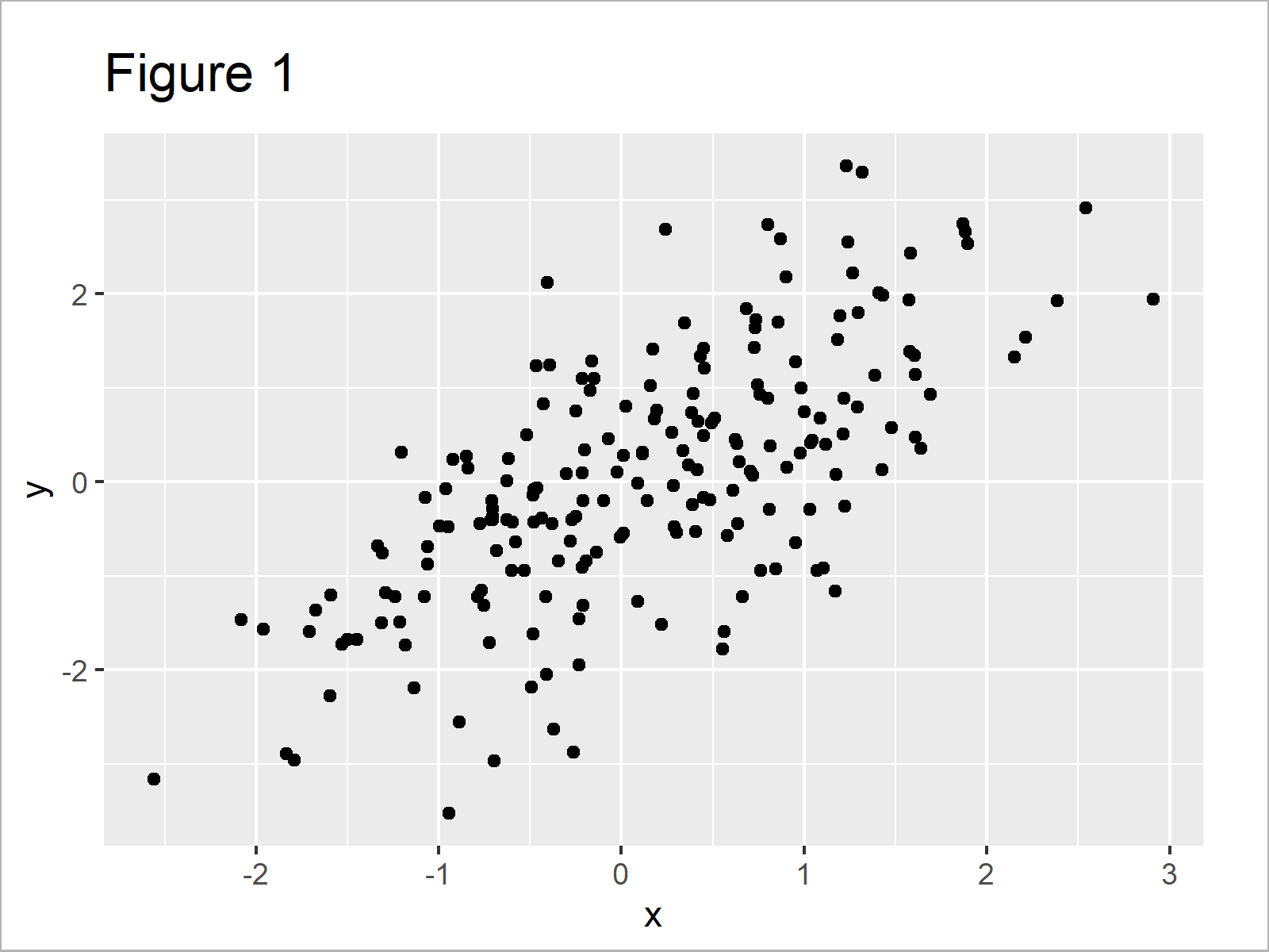
By running the previous R programming syntax we have managed to create Figure 1, i.e. a regular ggplot2 scatterplot.
For the following tutorial, we’ll also have to install and load the ggExtra package:
install.packages("ggExtra")            # Install ggExtra package
library("ggExtra")                     # Load ggExtra
We are all set! Next, we can jump into the examples…
Example 1: Add Marginal Density Plot to ggplot2 Scatterplot
This example explains how to add a marginal density plot to our previously created ggplot2 scatterplot.
For this, we can use the ggMarginal function and the type argument as shown below:
ggMarginal(ggp, type = "density") # Add marginal density plot
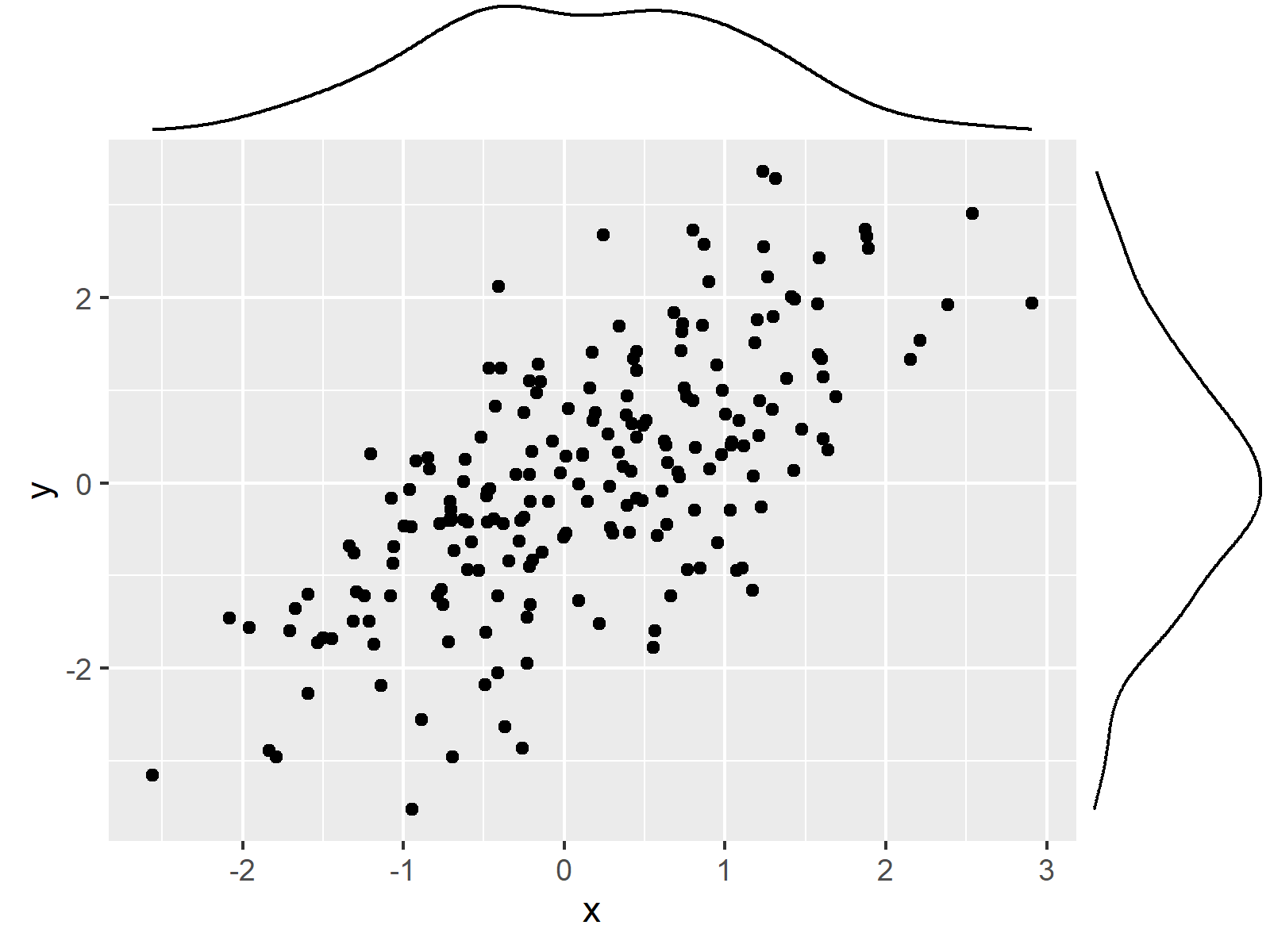
In Figure 2 you can see that we have created a ggplot2 scatterplot with marginal density plot.
Example 2: Add Marginal Histogram to ggplot2 Scatterplot
In Example 2, I’ll explain how to add a histogram to the margins of our scatterplot.
All we have to change compared to the code of Example 1 is the type argument. In this case, we have to specify the type “histogram”:
ggMarginal(ggp, type = "histogram") # Add marginal histogram
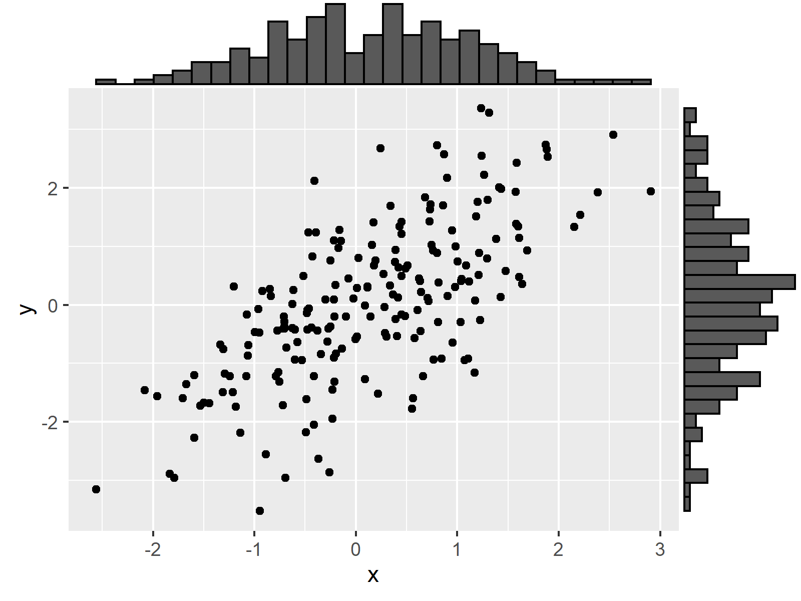
As shown in Figure 3, we have drawn a ggplot2 scatterplot with marginal histogram.
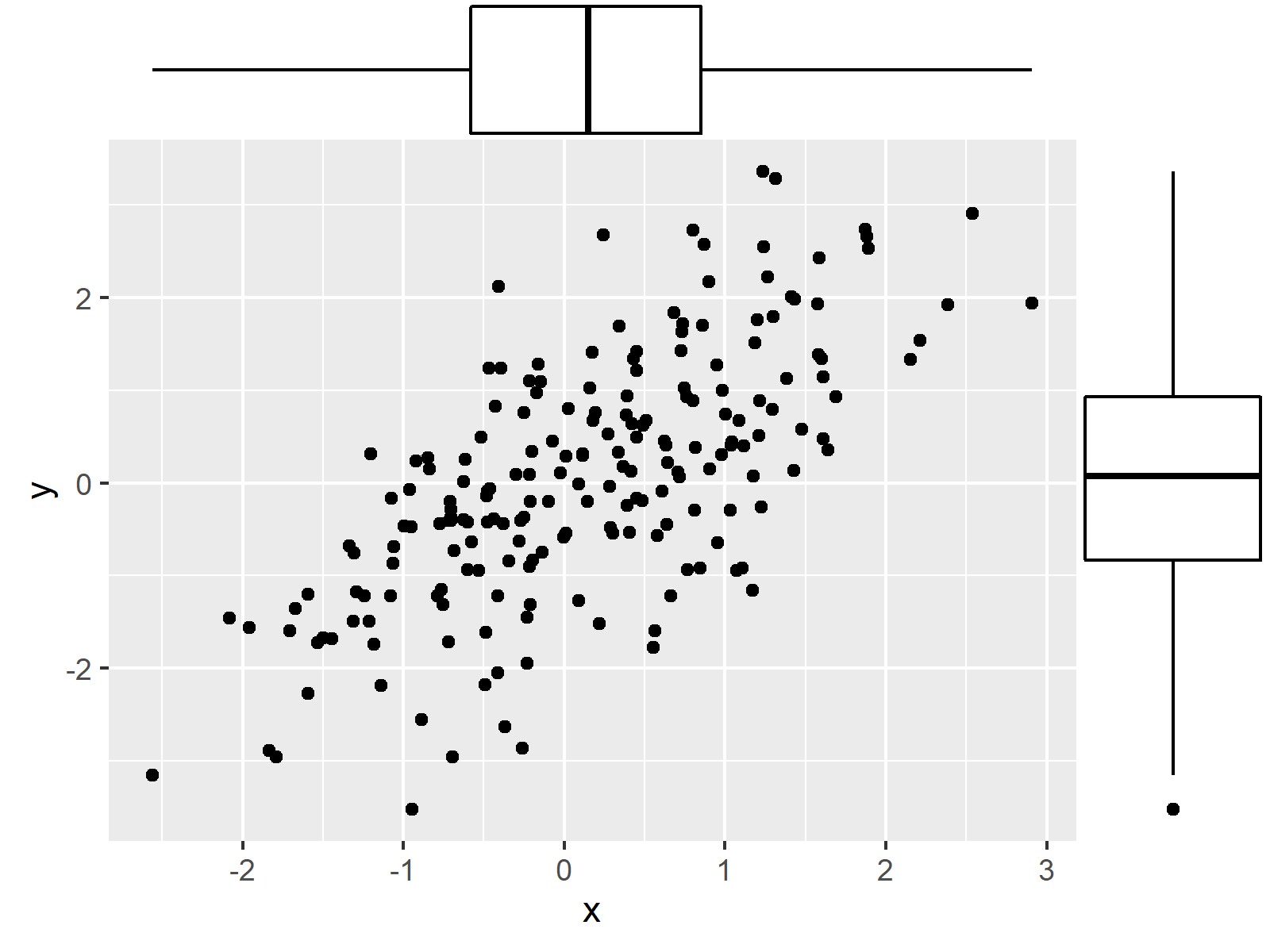
Example 3: Add Marginal Boxplot to ggplot2 Scatterplot
This example shows how to draw a ggplot2 scatterplot with marginal boxplot:
ggMarginal(ggp, type = "boxplot") # Add marginal boxplot
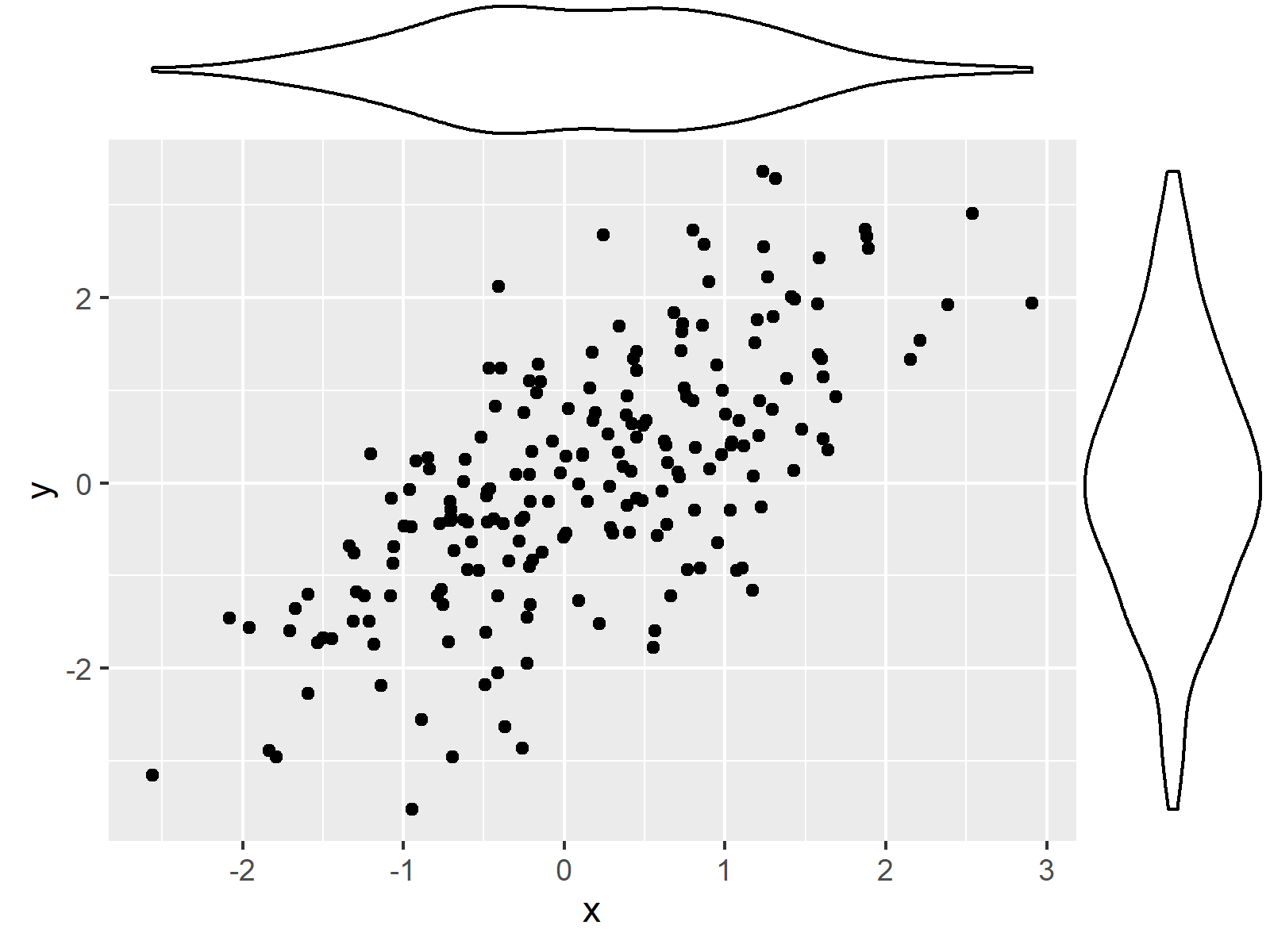
Example 4: Add Marginal Violin Plot to ggplot2 Scatterplot
Example 4 explains how to draw a marginal violin plot to our xy-plot:.
ggMarginal(ggp, type = "violin") # Add marginal violin plot
Example 5: Add Marginal Density Plot & Histogram to ggplot2 Scatterplot
At this point of the tutorial, you’ve probably got the idea of the ggMarginal function. We simply have to specify the type of marginal plot we want to draw by using the type argument.
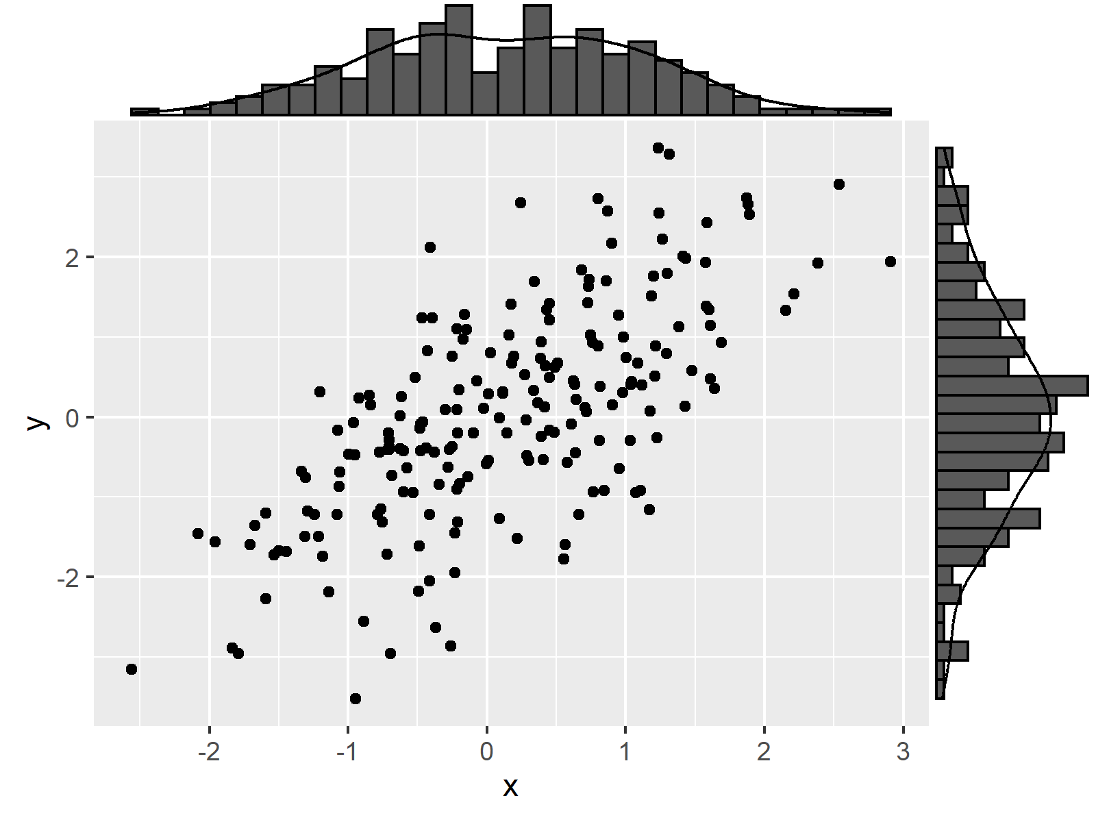
However, there’s one last example I want to show you. In this example, I’ll illustrate how to add a density plot and a histogram to our scatterplot.
For this, we have to use the type “densigram”:
ggMarginal(ggp, type = "densigram") # Add marginal density & histogram
Video, Further Resources & Summary
Have a look at the following video of my YouTube channel. I’m illustrating the R programming syntax of this article in the video:
Please note that the ggExtra package provides much more options to modify our marginal plots as shown in this tutorial.
Make sure to check out the documentation of the package to find out how to add colors or how to draw multiple groups and categories in a marginal plot.
Furthermore, you could have a look at the other articles of this website.
- Change Legend Labels of ggplot2 Plot
- Draw ggplot2 Plot with Two Y-Axes
- Change Labels of ggplot2 Facet Plot in R
- Remove Vertical or Horizontal Gridlines in ggplot2 Plot
- Graphics in R
- Introduction to R Programming
In this R tutorial you have learned how to add a marginal plot to a ggplot2 graphic. In case you have additional questions, let me know in the comments section below. Furthermore, don’t forget to subscribe to my email newsletter to receive regular updates on the newest tutorials.
Subscribe to the Statistics Globe Newsletter
Get regular updates on the latest tutorials, offers & news at Statistics Globe.
I hate spam & you may opt out anytime: Privacy Policy.
Thank you!
Welcome to the Statistics Globe newsletter. From now on, I’ll send you regular emails about statistics, data science, AI, and programming with R and Python.
I’m Joachim Schork. On this website, I provide statistics tutorials as well as code in Python and R programming.
Statistics Globe Newsletter
Get regular updates on the latest tutorials, offers & news at Statistics Globe. I hate spam & you may opt out anytime: Privacy Policy.
Thank you!
Please check your email inbox and click the confirmation link to complete your subscription. If you don’t see the email within a few minutes, please also check your spam/junk folder.


2 Comments. Leave new
Great . Thank you
Thanks a lot Mostafa, glad to hear that! 🙂