Add Individual Text to Each Facet of ggplot2 Plot in R (Example)
In this tutorial you’ll learn how to annotate different text elements to each facet of a ggplot2 facet graph in the R programming language.
The tutorial will contain one example for the creation of ggplot2 plots. To be more precise, the article consists of these contents:
Let’s do this:
Example Data, Packages & Default Graphic
The data below will be used as basement for this R programming tutorial.
data <- data.frame(x = 1:9,                                 # Create example data
                   y = 9:1,
                   group = letters[1:3])
data                                                        # Print example data

As you can see based on Table 1, our example data is a data frame consisting of nine rows and three columns. The variables y and x contain the data points and the variable group defines the different facets.
We also have to install and load the ggplot2 package, to be able to use the corresponding functions:
install.packages("ggplot2")                                 # Install & load ggplot2
library("ggplot2")
As next step, we can plot our data in a default facet plot without any text elements:
ggp <- ggplot(data, aes(x, y, group = group)) +             # Create ggplot2 facet plot
  geom_point() +
  facet_grid(. ~ group)
ggp                                                         # Draw ggplot2 facet plot

By running the previously shown code we have managed to create Figure 1, i.e. a facet plot without text elements using the ggplot2 package.
Example: Annotate Individual Text to Each Facet of ggplot2 Plot Using geom_text()
The following syntax explains how to add individual text elements to each panel of our ggplot2 facet graphic.
The difficulty of this is that the annotate function adds the same text element to every facet of our plot, if we do not explicitly specify something else:
ggp +                                                       # Add same text to all facets
  annotate("text",
           label = "My Text",
           x = 5,
           y = 5)

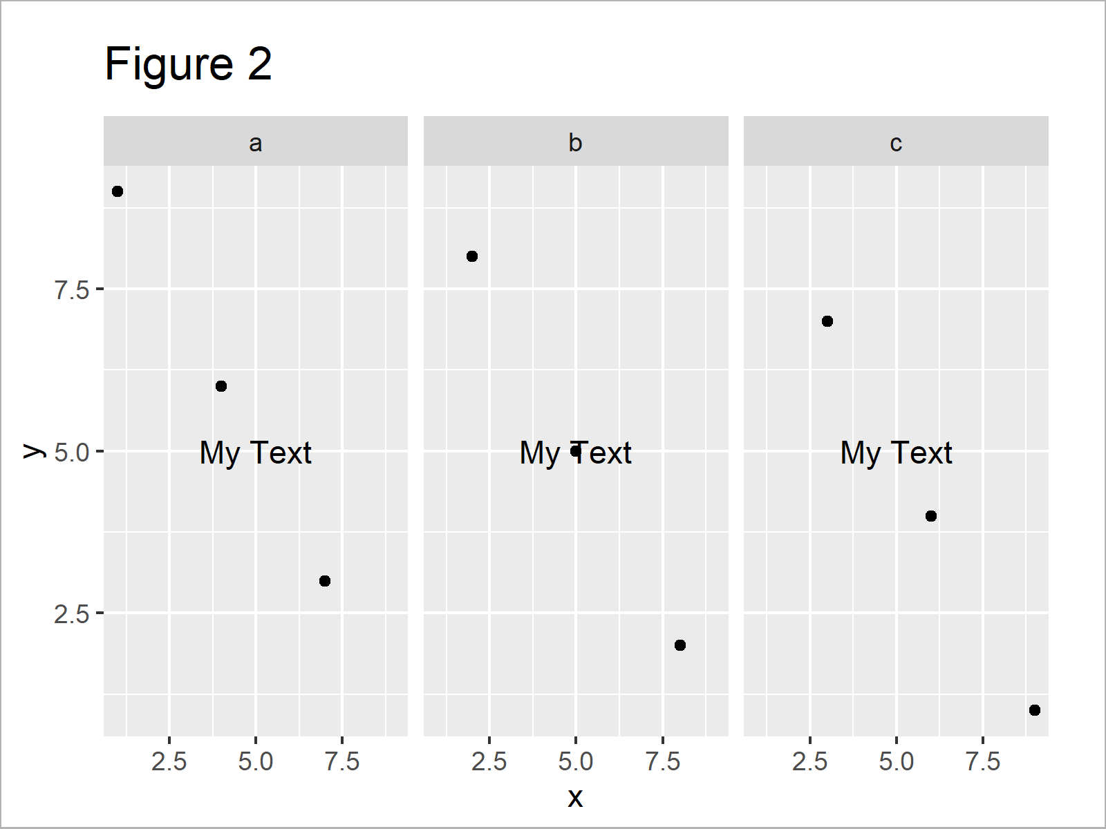
The output of the previous R programming syntax is shown in Figure 2: A facet plot with the same text in each plot window.
If we want to draw a different text element on top of every facet, we first have to create a data frame that contains text labels, facet group names, and axis positions:
data_text <- data.frame(label = c("Text_1", "", "Text_3"),  # Create data for text
                        group = names(table(data$group)),
                        x = c(5, 0, 7),
                        y = c(5, 0, 3))
data_text                                                   # Print data for text

As shown in Table 2, we have constructed a data frame consisting of all relevant information for our facet plot by running the previously shown syntax.
As next step, we can apply the geom_text function to our text data to add individual text elements:
ggp +                                                       # Add individual text to plot
  geom_text(data = data_text,
            mapping = aes(x = x,
                          y = y,
                          label = label))

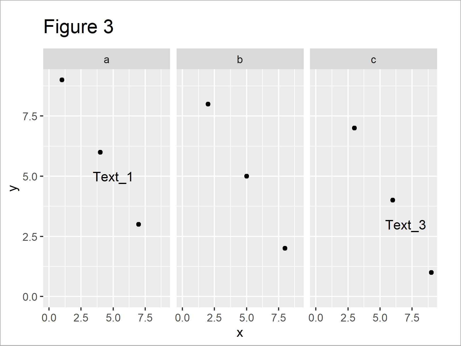
The output of the previously shown code is illustrated in Figure 3 – A facet grid graph with different text elements in each facet panel.
Video & Further Resources
In case you need more information on the R programming codes of this tutorial, I recommend having a look at the following video of the Statistics Globe YouTube channel. I explain the R syntax of this tutorial in the video.
Furthermore, you may have a look at the other tutorials on this website.
- Add Text to ggplot2 Plot
- Add X & Y Axis Labels to ggplot2 Plot
- Draw ggplot2 Plot with Two Y-Axes in R
- Annotate Text Outside of ggplot2 Plot in R
- Left-Align Text in ggplot2 Plot
- Add Regression Line to ggplot2 Plot in R
- Plotting Data in R
- All R Programming Tutorials
In summary: In this R article you have learned how to create individual text elements for each facet in a ggplot2 graphic. If you have further questions, please let me know in the comments section.
Subscribe to the Statistics Globe Newsletter
Get regular updates on the latest tutorials, offers & news at Statistics Globe.
I hate spam & you may opt out anytime: Privacy Policy.
Thank you!
Welcome to the Statistics Globe newsletter. From now on, I’ll send you regular emails about statistics, data science, AI, and programming with R and Python.
I’m Joachim Schork. On this website, I provide statistics tutorials as well as code in Python and R programming.
Statistics Globe Newsletter
Get regular updates on the latest tutorials, offers & news at Statistics Globe. I hate spam & you may opt out anytime: Privacy Policy.
Thank you!
Please check your email inbox and click the confirmation link to complete your subscription. If you don’t see the email within a few minutes, please also check your spam/junk folder.


14 Comments. Leave new
Thanks for sharing! I can’t quite get this to work on my dataset because I don’t have numbers on my x-axis, only categories. I have 4 categories in Group.2 and 7 categories in Group.1.
PLOT <- ggplot(table_of_means, aes(x=Group.2, y=SOC, fill=Group.2)) +
geom_bar(stat="summary", fun=mean, color="black", position="dodge") +
facet_grid(cols = vars(Group.1))
I have tried adding this:
dat_text <- data.frame(label = c("cd", "cd", "d", "cd", "c", "b", "a"),
Group.1 = c("0-5", "5-10", "10-15", "15-20", "20-30", "30-50", "50-100"))
PLOT + dat_text
but get Error in FUN(X[[i]], …) : object 'Group.2' not found. Do you know how to fix this? Thanks so much in advance, really appreciate your videos.
Hey Nora,
Thank you for the kind words, glad you like my tutorials!
Could you check if your code works without the facet_grid line? I.e.
Regards,
Joachim
Hi, how could I add multiple labels in each facet panel? I want to add an “*” to a boxplot to indicate significance but I can’t get it to work. Using your example, how could I add this?
Thanks!
Hey Gustavo,
You can use the code shown in this tutorial to add as many text elements as you want. Have a look at the following example and its output:
I hope that helps!
Joachim
Hi Joachim,
thanks so much for your reply! This is exactly what I was looking for!
Gustavo
That’s great to hear Gustavo, glad it helped!
Gustavo’s Q&A was really helpful as I had missed that you made the label in a dedicated dataframe and initially made the label in the main data frame. So it drew the label as many time as there are dots! It sort of worked but it didn’t look good.
Thanks for the comment Chris. Glad the Q&A was helpful to you as well! 🙂
Hi! Thanks for sharing this. My plot has three facets and each facet has two groups (same grouping for each). I tried using the code you shared but it actually created three additional “groups” on my plot. Any idea of how to fix this?
Hey Lex,
Thanks for the kind comment. Could you share the code you have used?
Regards,
Joachim
Hi Joachim, this tutorial was so helpful! I have TWO groups in my facet which renders a 3×3 plot. I have a similar situation to Gustavo above, but I want to add asterisks to some of the facets, not all. Do you have an approach for that? Thank you so much!
Ex:
|*| | | |*|
| | |*| |*|
| | | | |*|
Hi Laura,
Thank you so much for your very kind words, it’s great to hear that our tutorial is helpful to you! 🙂
I have tried to reproduce your situation. Please have a look at the R code and the resulting graph below:
I hope this helps!
Cansu
Hi Cansu, I have a similar case. However, I have an unpaired design.
I have 3 sites and 4 locations:
Site 1 locations A, B, and D;
Site 2 locations A, B, and D;
Site 3 locations B, C, and D.
I created a column SiteLocation that is 1A, 1B, 1D, 2A,…, 3D.
When I use face_grid I get 12 graphs with 3 blank graphs.
When I use face_wrap I have 9 graphs but can’t label them.
I am ok to learn how to exclude blank graphs or label face wrap
Thanks
Hello Fausto,
Is it possible that you to share your code?
Regards,
Cansu