Add Label to Outliers in R – Boxplot & Scatterplot (5 Examples)
In this post, I’ll demonstrate how to add text to outliers (like labels and values) in the R programming language, with base R and ggplot. For general information on graphics in R, we have a blog post here.
The content is structured as follows:
Let’s dive into it.
Example Data & Add-On Packages
For the code, we make use of the car and ggplot2 package.
install.packages("car")                                                      # Install & load car package
library("car")

install.packages("ggplot2")                                                  # Install & load ggplot2 package
library("ggplot2")
Let us create some example data containing a numeric outcome y for three groups group.
N <- 100                                                                     # Data rows per group
set.seed(8544)                                                               # Seed for reproducible results
data <- data.frame(y     = c(rnorm(N),                                       # Generate data
                             rnorm(N, mean = 1),
                             rnorm(N, mean = -1)),
                   group = factor(rep(c("A", "B", "C"), each = N)))
head(data)                                                                   # Print head of data
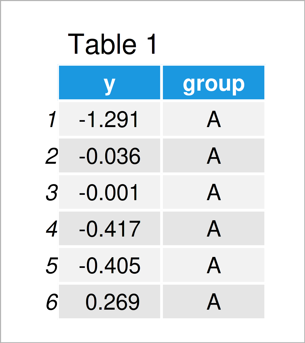
As you can see based on Table 1, our example data is a data frame containing two columns.
Example 1: Boxplot Without Labelled Outliers
This example shows how to create a simple boxplot of the generated data.
boxplot(y ~ group, data = data) # Boxplot without outlier labels
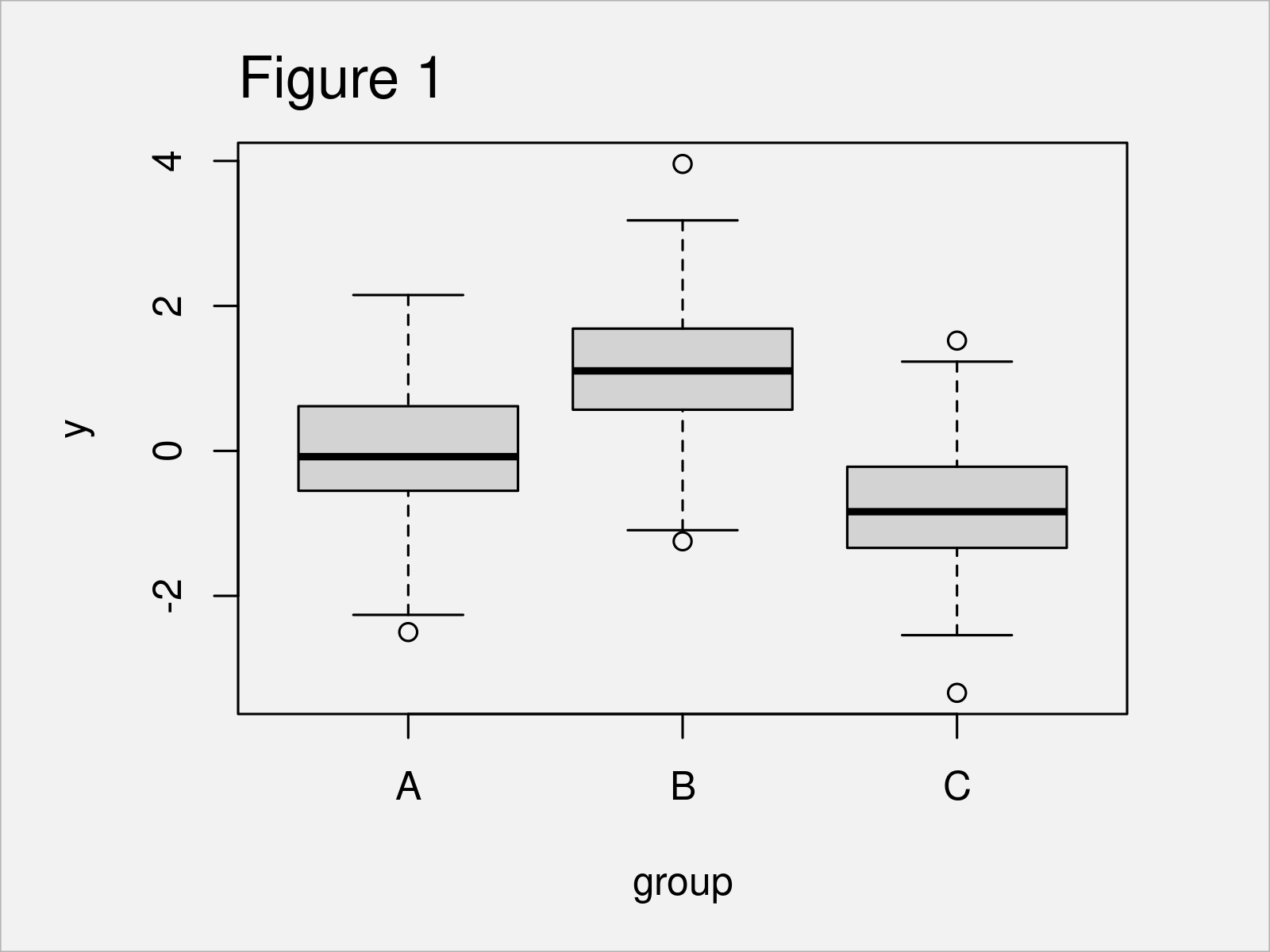
In Figure 1 you can see that we have managed to create a boxplot by running the previous code. You can also see that in the boxplot the observations outside the whiskers are displayed as single points, so-called outliers. We refer you to this article in the R Graph Gallery for a description of the components of a boxplot, like how to calculate the width of the box and which points are displayed as outliers.
We take a closer look at the outliers in the plot with function boxplot.stats(). Function boxplot.stats() is used within boxplot() for calculating the statistics and deciding which points to display as outliers.
?boxplot.stats # Documentation of function boxplot.stats
Calculate the outliers, which are visible in the previous plot, for all three group classes.
stats <- lapply(levels(data$group),                                          # Get outliers for each group
                function (x) {
                  round(boxplot.stats(data[data$group == x,]$y)$out, 2)
                })
stats
# [[1]]
# [1] -2.5
#
# [[2]]
# [1]  3.96 -1.25
#
# [[3]]
# [1]  1.52 -3.34
From the previous code, you see the values of the outliers in each group, which are displayed as extra dots in Figure 1. In the next example, we show how to add text for these outliers into the plot.
Example 2: Boxplot With Labelled Outliers Using the car Package
The following R code illustrates how to add extra labels for the outliers in Figure 1. For that, we use the car package with its function Boxplot().
car::Boxplot(y ~ group, data = data) # Boxplot with labelled outliers
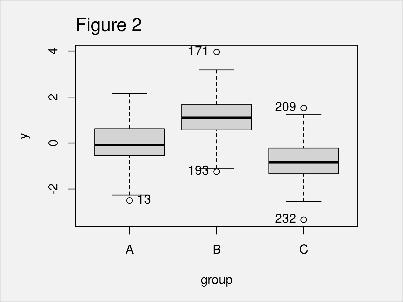
After running the previous R syntax, the boxplot shown in Figure 2 has been created. To each plot, there is extra text indicating the observation number (which corresponds to the row number) of the outliers.
Example 3: Scatterplot With Labelled Outliers
This example shows how to add outlier labels to a scatterplot in base R. We first identify the outliers in the data (for the formulas of the outliers see the description here).
stats       <- stats::fivenum(data$y, na.rm = TRUE)                                  # Statistics of the data
iqr         <- diff(stats[c(2, 4)])                                                  # Inter quartile range
out         <- data$y < (stats[2L] - 1.5 * iqr) | data$y > (stats[4L] + 1.5 * iqr)   # Outlier identifier
outlier_tmp <- (1:nrow(data))[out]                                                   # Outlier position
We create a scatterplot.
plot(data$y ~ rownames(data)) # Create scatterplot
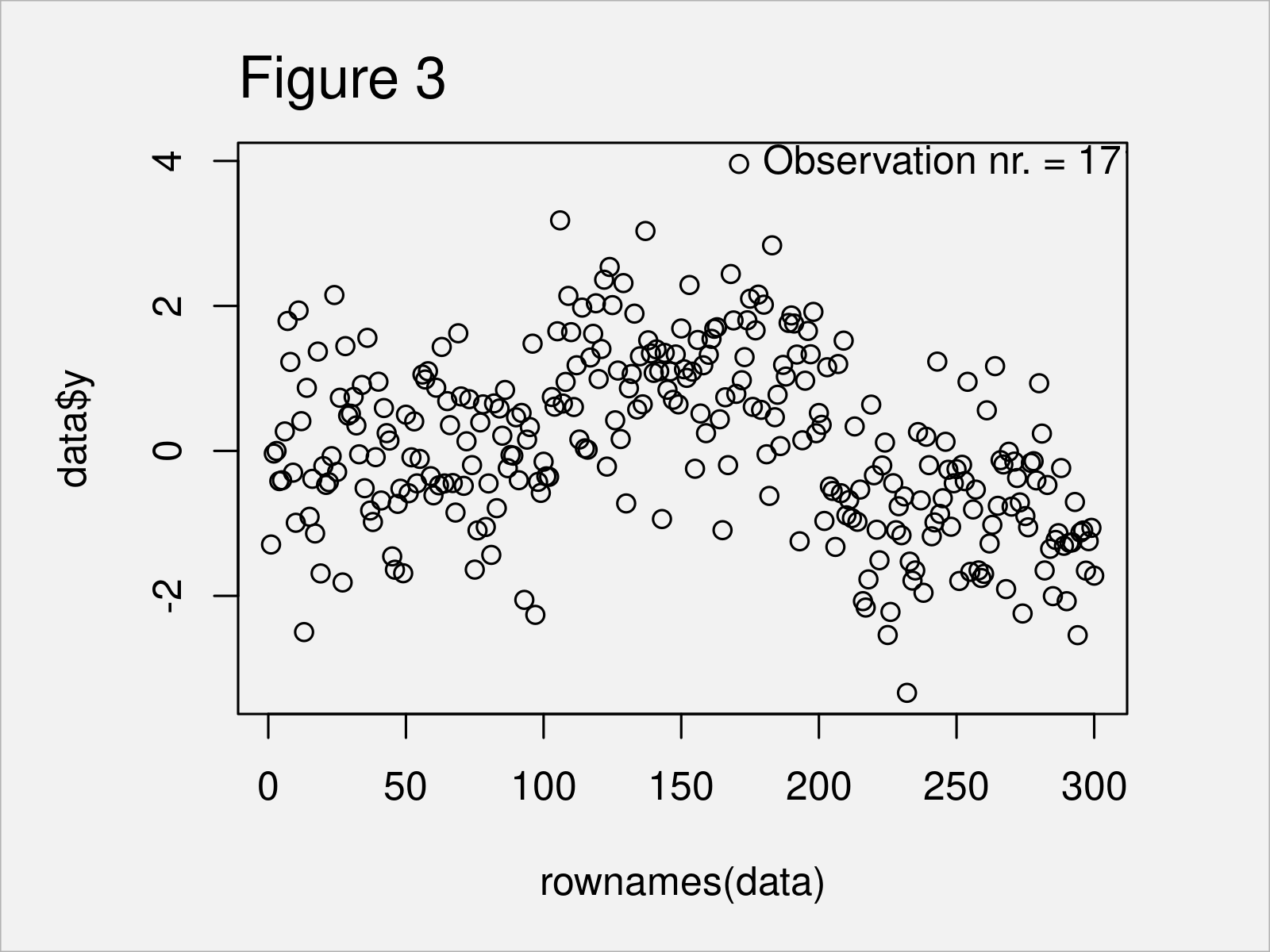
Now, run the following code to add text to the plot, i.e. to add text to the outlier value. Try it!
text(outlier_tmp,                                                                     # Add text for outliers to the plot
     data[outlier_tmp,]$y,
     paste0("Observation nr. = ", outlier_tmp,
            ", value = ", round(data[outlier_tmp,]$y, digits = 2)),
     pos = 4)
Example 4: Boxplot With Labelled Outliers Using the ggplot2 Package
The following code explains how to create a boxplot with labelled outliers using the ggplot2 package.
First, we identify the outliers in the data and store them in outlier_data.
outlier_tmp <- lapply(unique(data$group),                                                                                               # Get outlier information
                      function (g) {
                        stats <- quantile(data$y[data$group == g], na.rm = TRUE)                                                        # Quantiles
                        iqr   <- diff(stats[c(2, 4)])                                                                                   # Inter quartile range
                        out   <- data$y[data$group == g] < (stats[2L] - 1.5 * iqr) | data$y[data$group == g] > (stats[4L] + 1.5 * iqr)  # Outlier identifier
                        outlier_tmp <- (1:nrow(data))[data$group == g][out]                                                             # Outlier position
                      })
names(outlier_tmp) <- levels(data$group)
outlier_data <- data.frame(label = unlist(outlier_tmp),                                                                                 # Transform outlier information into data.frame
                           value = data$y[unlist(outlier_tmp)],
                           group = substr(names(unlist(outlier_tmp)), 1, 1))
outlier_data                                                                                                                            # Display outlier information
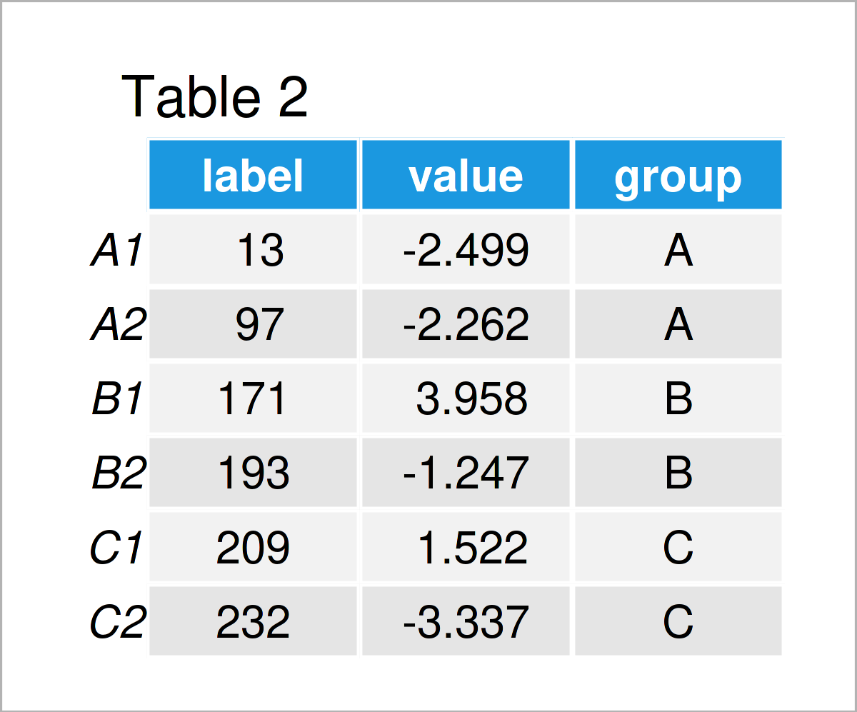
In Table 2 you can see that we have created a data.frame with the outlier values of each group.
Now, we plot the data and add the outlier values via geom_text().
ggplot2::ggplot(data,                                                                                                                   # Plot data plus outlier values
                aes(x = group, y = y, group = group, fill = group)) +
  geom_boxplot() +
  geom_text(data = outlier_data,
            aes(x = group, y = value, label = round(value, 2)),
            hjust = -.3) +
  theme(legend.position = "none")
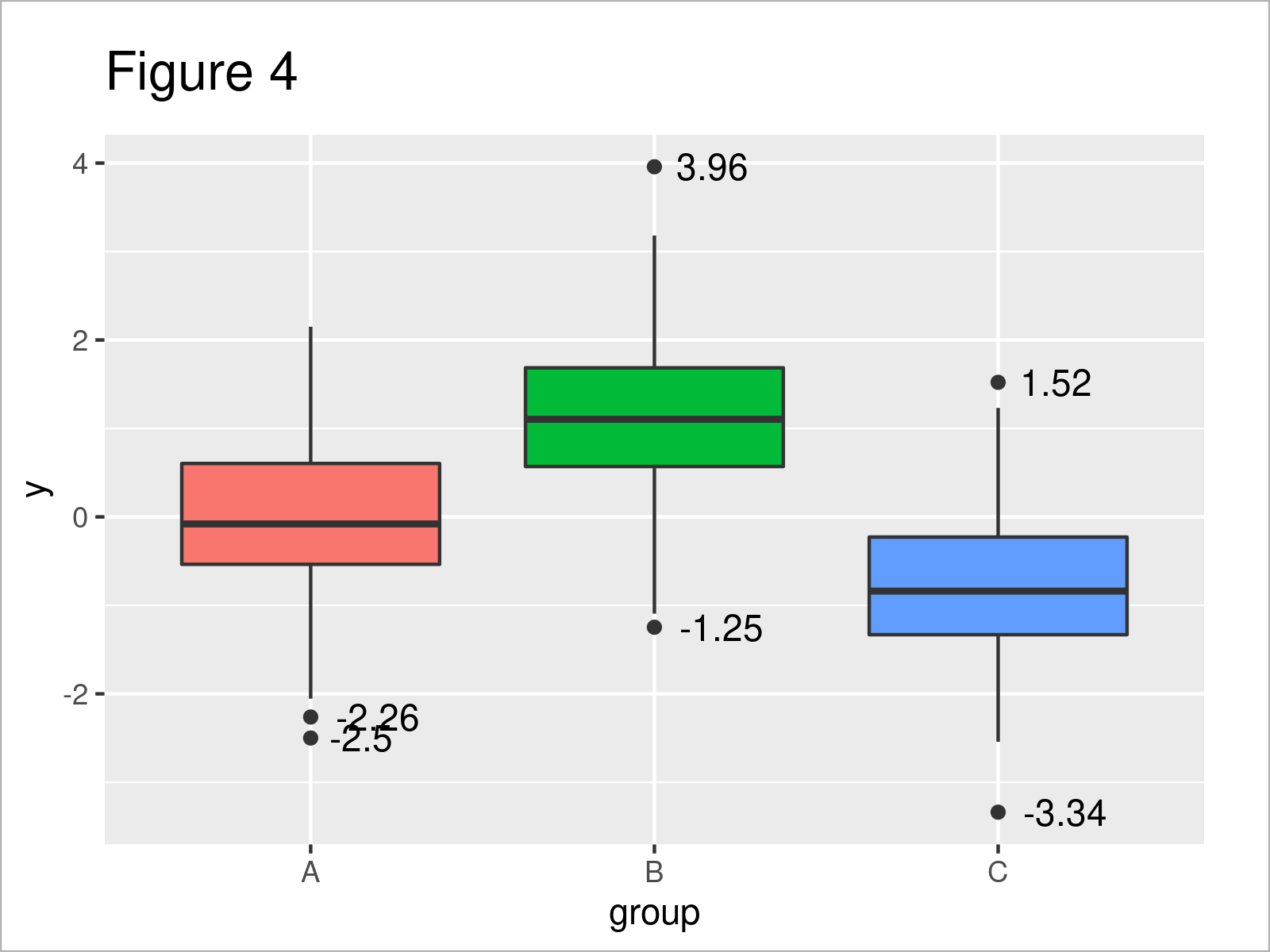
As an alternative, we can create the same plot, only that now we add the outlier labels instead of their values.
ggplot2::ggplot(data,                                                                                                                   # Plot data plus outlier labels
                aes(x = group, y = y, group = group, fill = group)) +
  geom_boxplot() +
  geom_text(data = outlier_data,
            aes(x = group, y = value, label = label),
            hjust = -.3) +
  theme(legend.position = "none")
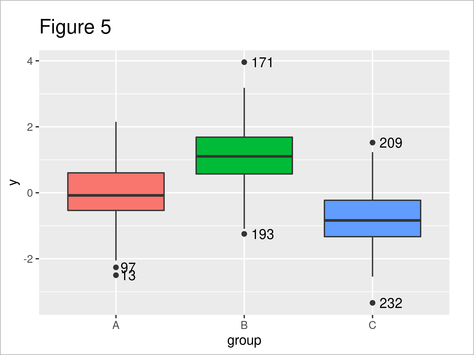
After running the previous code, the boxplot shown in Figure 5 has been drawn.
Example 5: Scatterplot With Labelled Outliers Using the ggplot2 Package
In Example 5, I’ll illustrate how to create a scatterplot with ggplot and add outlier labels and values.
We first plot the data and add the values of the outliers as text.
ggplot2::ggplot(data,                                                                                                                   # Plot data plus outlier values
                aes(x = group, y = y, group = group, color = group)) +
  geom_jitter() +
  stat_summary( aes(label = round(stat(y), 2)),
                geom = "text",
                fun = function(y) {
                  boxplot.stats(y)$out
                },
                hjust = -1) +
  theme(legend.position = "none")
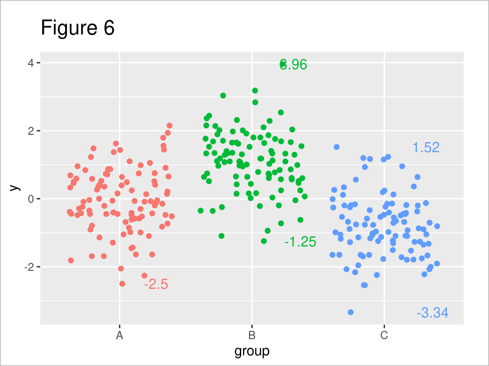
In Figure 6 you can see that we have plotted the values using the previous R syntax. You can also see that as we used geom_jitter(), the text is not aligned with the points in the plot. We correct for that with the next plot.
In the next plot, we also want to add the labels of the outliers instead of their values. Furthermore, we avoid displaying the extra text in color. For the plot, we create a second dataset which contains non NA entries only for the outliers.
data2                            <- data
data2$label                      <- 1:nrow(data2)
data2$y[-outlier_data$label]     <- NA
data2$group[-outlier_data$label] <- NA
data2$label[-outlier_data$label] <- NA
Let us plot the data
ggplot2::ggplot(data,                                                                                                                   # Plot data plus outlier labels
                aes(x = group, y = y, group = group, color = group)) +
  geom_jitter(position = position_jitter(seed = 5)) +
  geom_text(data = data2,
            aes(x = group, y = y, label = label, color = NA),
            hjust = -.3,
            position = position_jitter(seed = 5)) +
  theme(legend.position = "none")
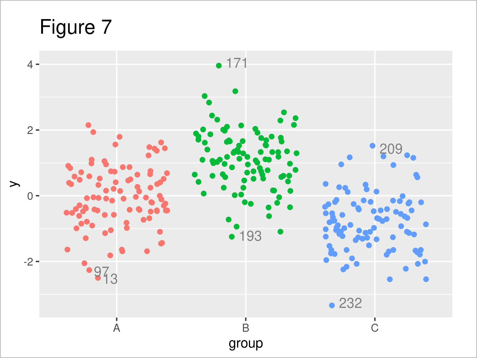
After executing the previous R code, Figure 7 has been created. You can see that now, as we used position_jitter() for both the points and the text, both are aligned.
For further info on the jitter function, we have a post here.
Video, Further Resources & Summary
Do you want to know more about the labeling of outliers? Then I recommend watching the following video on my YouTube channel. In the video instruction, I’m explaining the R code of this article.
The YouTube video will be added soon.
In addition, you might want to read the related RStudio tutorials on my website. A selection of related tutorials about topics such as numeric values, ggplot2, and lines is shown below:
- Add Marginal Plot to ggplot2 Scatterplot Using ggExtra Package
- Add Label to Straight Line in ggplot2 Plot
- Ignore Outliers in ggplot2 Boxplot in R
- Add Number of Observations by Group to ggplot2 Boxplot
- Creating Plots in R
- R Programming Language
In this R post, you have learned how to add outliers values and labels to plots in R. If you have further comments or questions, tell me about it in the comments.
This page was created in collaboration with Anna-Lena Wölwer. Have a look at Anna-Lena’s author page to get further details about her academic background and the other articles she has written for Statistics Globe.
Subscribe to the Statistics Globe Newsletter
Get regular updates on the latest tutorials, offers & news at Statistics Globe.
I hate spam & you may opt out anytime: Privacy Policy.
Thank you!
Welcome to the Statistics Globe newsletter. From now on, I’ll send you regular emails about statistics, data science, AI, and programming with R and Python.
I’m Joachim Schork. On this website, I provide statistics tutorials as well as code in Python and R programming.
Statistics Globe Newsletter
Get regular updates on the latest tutorials, offers & news at Statistics Globe. I hate spam & you may opt out anytime: Privacy Policy.
Thank you!
Please check your email inbox and click the confirmation link to complete your subscription. If you don’t see the email within a few minutes, please also check your spam/junk folder.


