Change y-Axis Limits of Boxplot (Base R & ggplot2 Examples)
In this post you’ll learn how to set the y-axis limits of a boxplot in R programming.
The content is structured as follows:
So now the part you have been waiting for – the examples.
Example Data
Consider the following example data:
set.seed(328745)                # Create random example data frame
data <- data.frame(values = rnorm(100),
                   groups = letters[1:4])
head(data)                      # Print head of example data frame
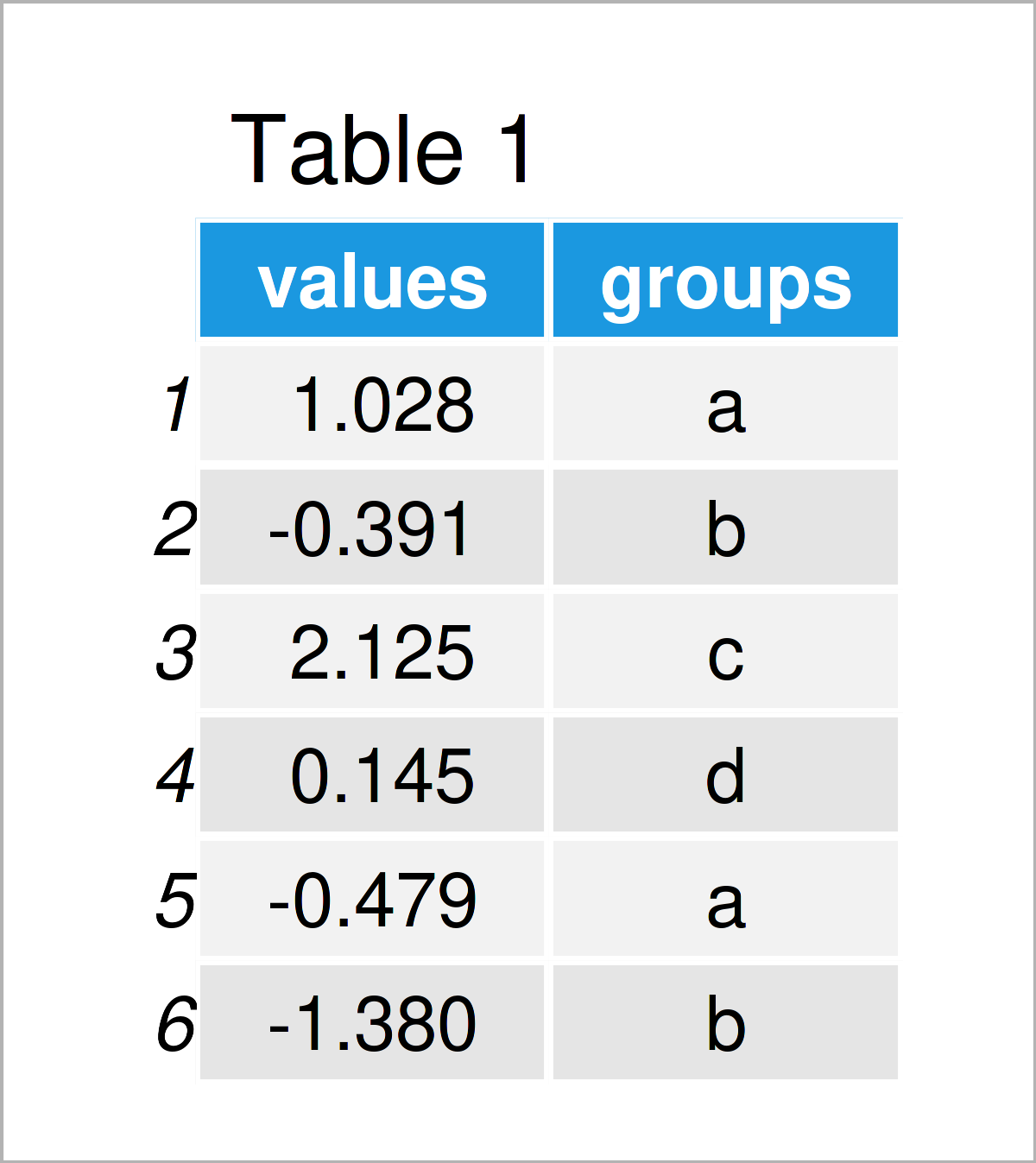
Table 1 shows the head of our example data: it is also visualized that our exemplifying data consists of two columns.
Example 1: Change y-Axis Limits of Base R Boxplot
This example explains how to modify the y-axis scales of a box-and-whisker plot created with Base R.
Let’s first draw a Base R boxplot with default settings:
boxplot(values ~ groups,        # Base R boxplot with default axes
        data)
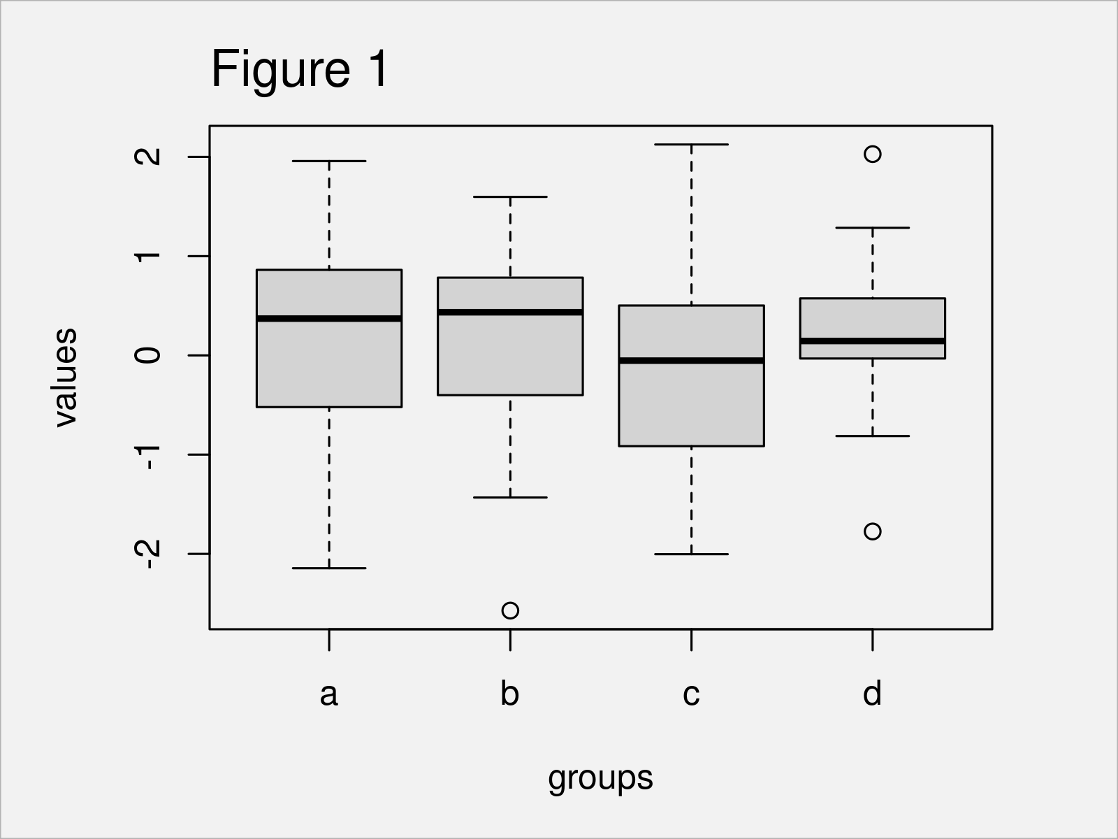
Figure 1 shows the output of the previous R code: A Base R boxchart with default axis limits.
If we want to change the axis limits of the y-axis, we can use the ylim argument and the c() function as shown below:
boxplot(values ~ groups,        # Base R boxplot with manual y-axis
        data,
        ylim = c(- 4, 7))
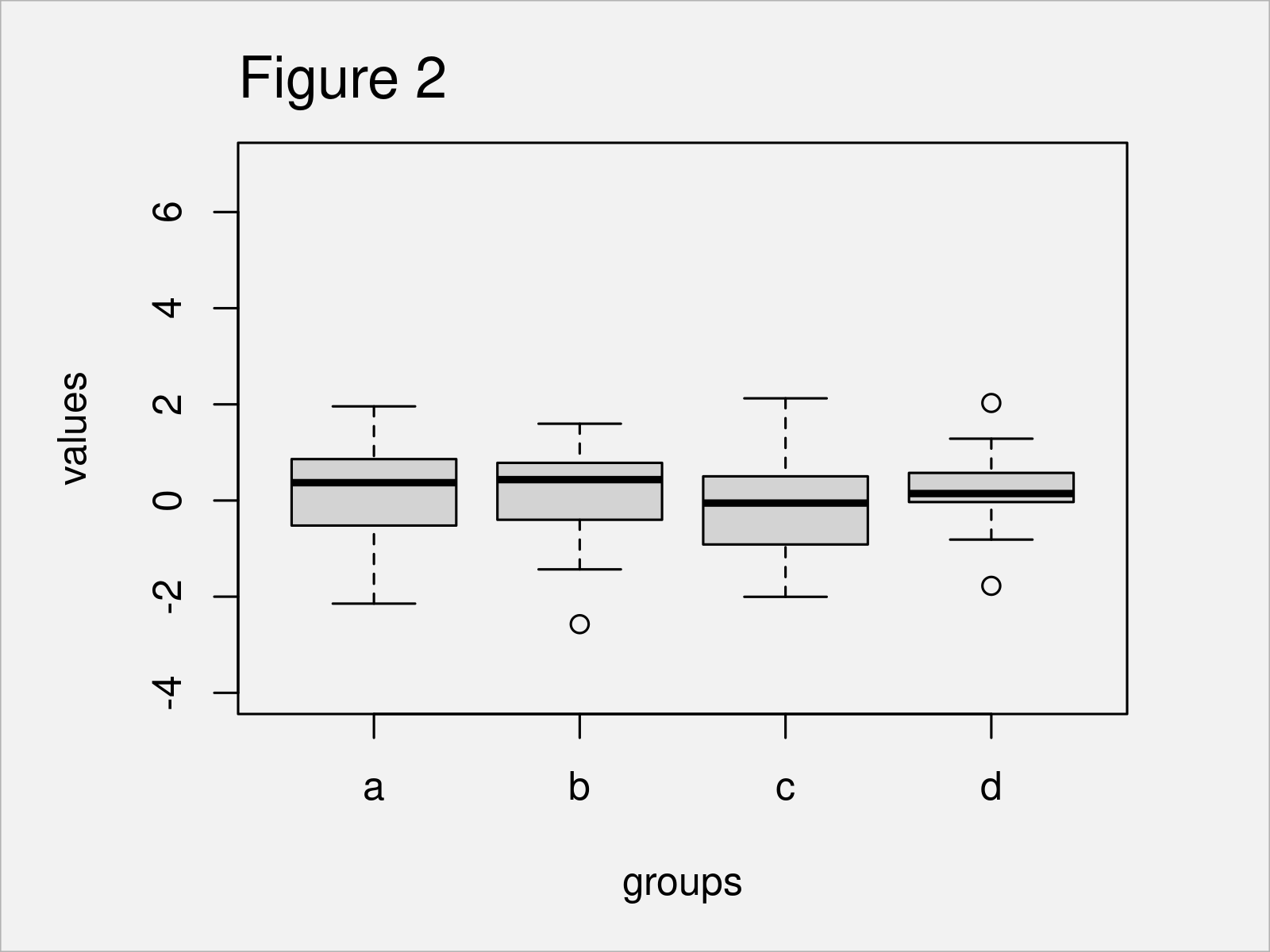
By running the previously shown R programming syntax, we have managed to create Figure 2, i.e. a boxgraph with manually specified y-axis limits.
Example 2: Change y-Axis Limits of ggplot2 Boxplot
The following code demonstrates how to create a ggplot2 boxplot with a manually changed y-axis.
We first need to install and load the ggplot2 software package, in order to use the functions that are included in the package:
install.packages("ggplot2")     # Install & load ggplot2 package
library("ggplot2")
In the next step, we can draw a default ggplot2 boxplot:
ggp <- ggplot(data,             # ggplot2 boxplot with default axes
              aes(groups,
                  values)) +
  geom_boxplot()
ggp
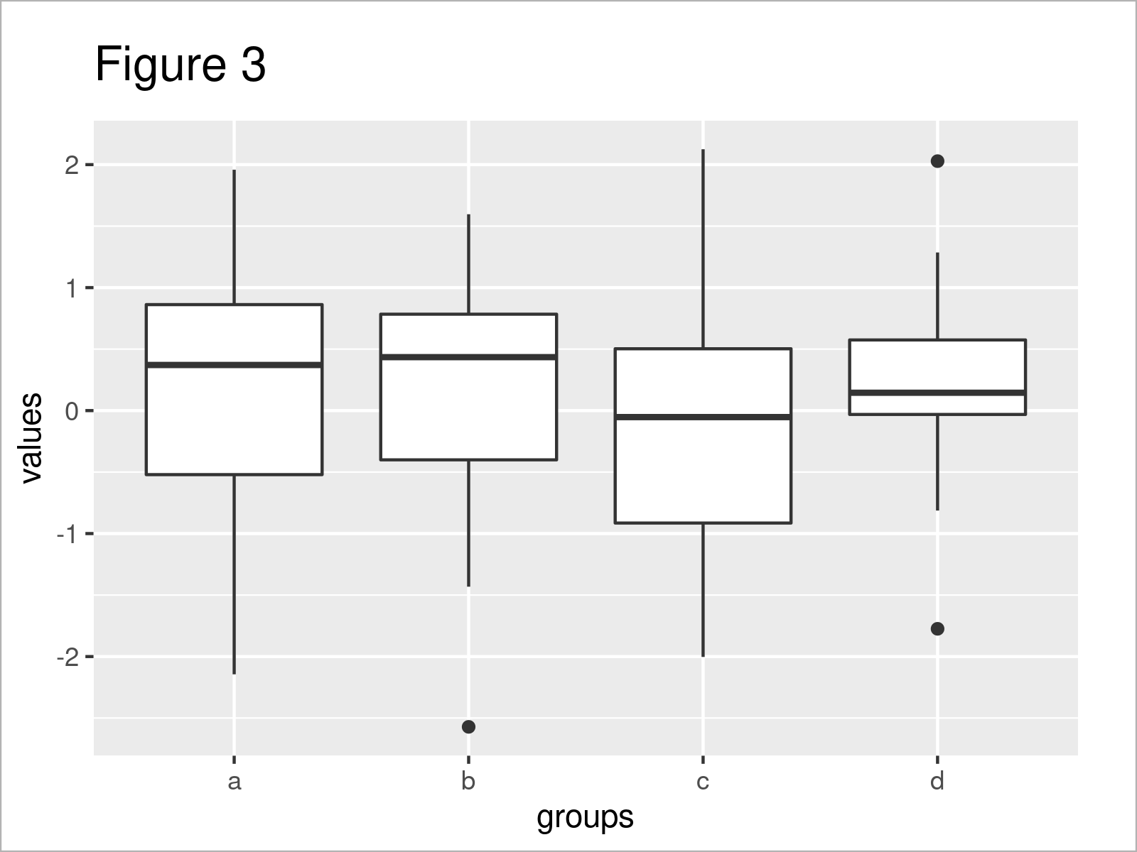
As shown in Figure 3, the previous R syntax has created a ggplot2 boxplot with automatically defined axis scales.
We can now use the ylim function to adjust the limits of the y-axis:
ggp +                           # Manual y-axis using ylim()
  ylim(- 4, 7)
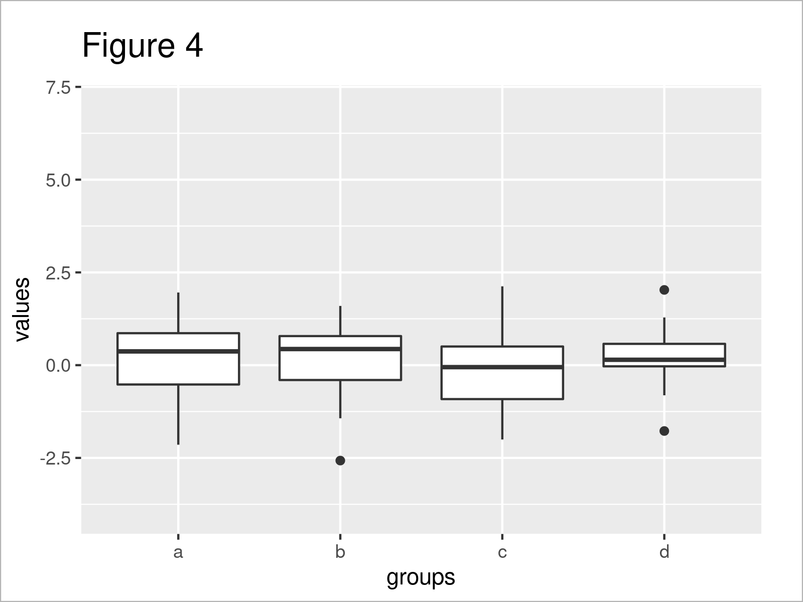
As shown in Figure 4, the previously shown R programming code has created a new ggplot2 boxplot with manually specified y-axis limits.
Alternatively to the ylim function, we may use the coord_cartesian function and the ylim argument:
ggp +                           # Manual y-axis using coord_cartesian()
  coord_cartesian(ylim = c(- 4, 7))

The output of the previous R code is illustrated in Figure 5 – You can see the same graphic as created by the ylim function.
Video, Further Resources & Summary
Would you like to learn more about the specification of the y-axis limits of a boxplot? Then you might want to have a look at the following video instruction that I have published on my YouTube channel. In the video, I demonstrate the R programming code of this post:
In addition, you may want to read some of the related tutorials on https://www.statisticsglobe.com/. I have released numerous tutorials on similar topics such as labels, ggplot2, colors, and graphics in R:
- Change Axis Labels of Boxplot in R
- Change Color of ggplot2 Boxplot in R
- Change Y-Axis to Percentage Points in ggplot2 Barplot
- Drawing Plots in R
- R Programming Tutorials
In this tutorial you have learned how to modify the y-axis scales of a boxplot graph in the R programming language. In case you have additional questions and/or comments, please let me know in the comments section.


