Transparent Scatterplot Points in Base R & ggplot2 (2 Examples)
In this R tutorial you’ll learn how to decrease the alpha of points in an xy-plot using Base R and the ggplot2 package.
The post will contain these contents:
Let’s just jump right in:
Creation of Example Data
We’ll use the following data as basement for this R tutorial:
data <- data.frame(x = c(1, 1.1, 2, 2.1, 3, 3.1, 4, 4.1, 5, 5.1),  # Example data
                   y = c(1, 1.1, 2, 2.1, 3, 3.1, 4, 4.1, 5, 5.1),
                   group = as.factor(1:2))
data                                                               # Print example data
#      x   y group
# 1  1.0 1.0     1
# 2  1.1 1.1     2
# 3  2.0 2.0     1
# 4  2.1 2.1     2
# 5  3.0 3.0     1
# 6  3.1 3.1     2
# 7  4.0 4.0     1
# 8  4.1 4.1     2
# 9  5.0 5.0     1
# 10 5.1 5.1     2
Have a look at the previous RStudio console output. It shows that our example data has ten rows and three columns. The variables x and y contain numeric values and the variable group defines two different groups of observations.
Example 1: Drawing Plot with Transparent Points Using Base R
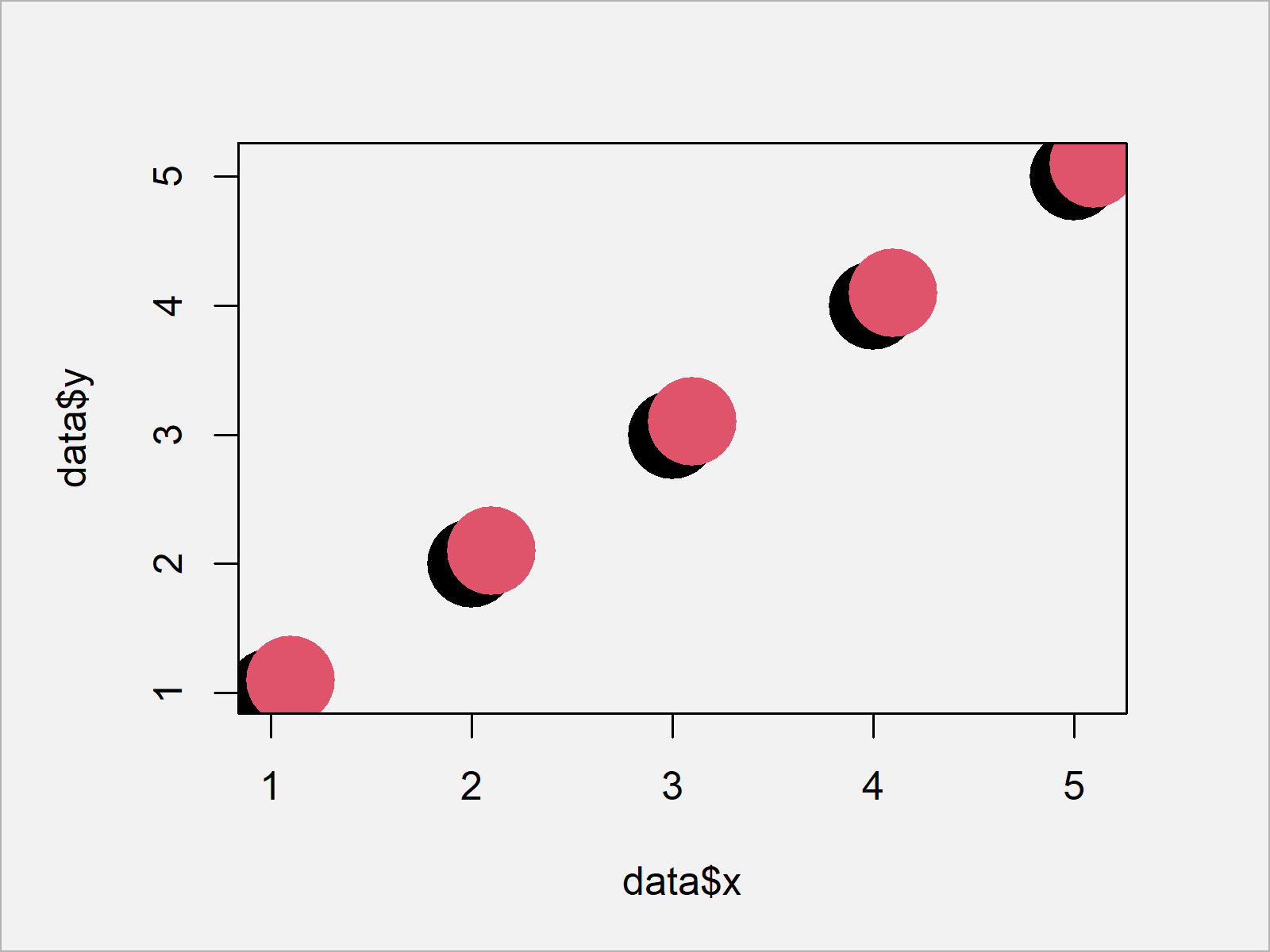
In this example, I’ll explain how to decrease the opacity in a Base R plot. First, let’s create a scatterplot with default opacity (i.e. alpha = 1):
plot(data$x,                                                       # Draw non-transparent plot
     data$y,
     pch = 16,
     cex = 5,
     col = data$group)

As shown in Figure 1, we created an xy-plot showing our data points with full opacity with the previous R programming syntax.
In order to adjust the alpha of our points, we have to install and load the scales add-on package in R.
install.packages("scales")                                         # Install scales package
library("scales")                                                  # Load scales package
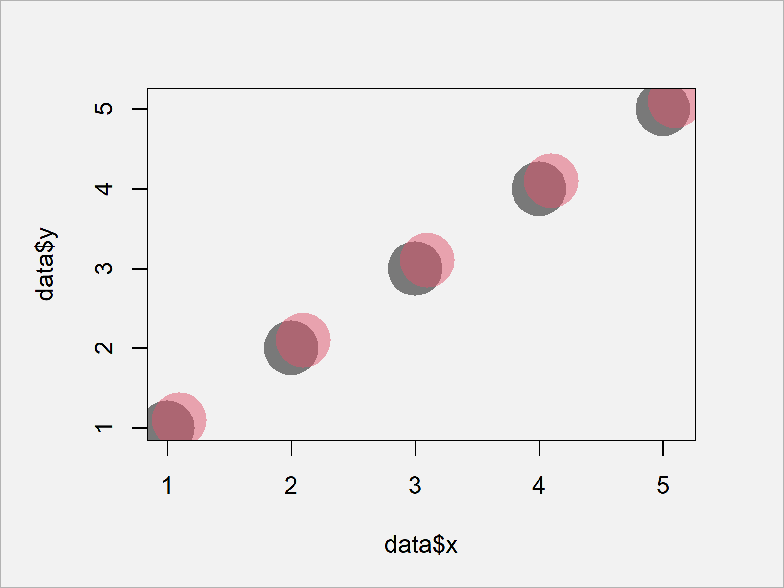
Now, we can use the alpha function provided by the scales package to make our points more transparent:
plot(data$x,                                                       # Draw transparent plot
     data$y,
     pch = 16,
     cex = 5,
     col = alpha(data$group, 0.5))

As shown in Figure 2, we drew a Base R scatterplot with transparent points with the previous R programming code.
Example 2: Drawing Plot with Transparent Points Using ggplot2 Package
The following code explains how to adjust the point opacity in a ggplot2 graph.
If we want to use the functions of the ggplot2 package, we first need to install and load ggplot2:
install.packages("ggplot2")                                        # Install ggplot2 package
library("ggplot2")                                                 # Load ggplot2 package
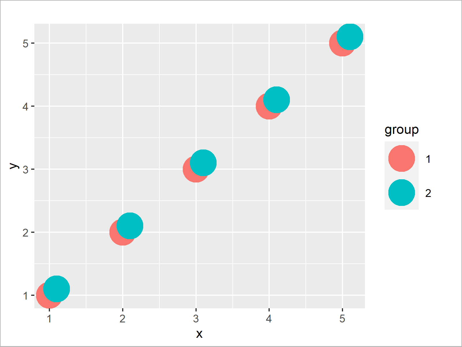
First, I’m creating a ggplot2 scatterplot with default opacity:
ggplot(data, aes(x, y, col = group)) +                             # Draw non-transparent plot
  geom_point(size = 10)

As shown in Figure 3, we created a ggplot2 graph with alpha equal to 1 with the previous R programming syntax.
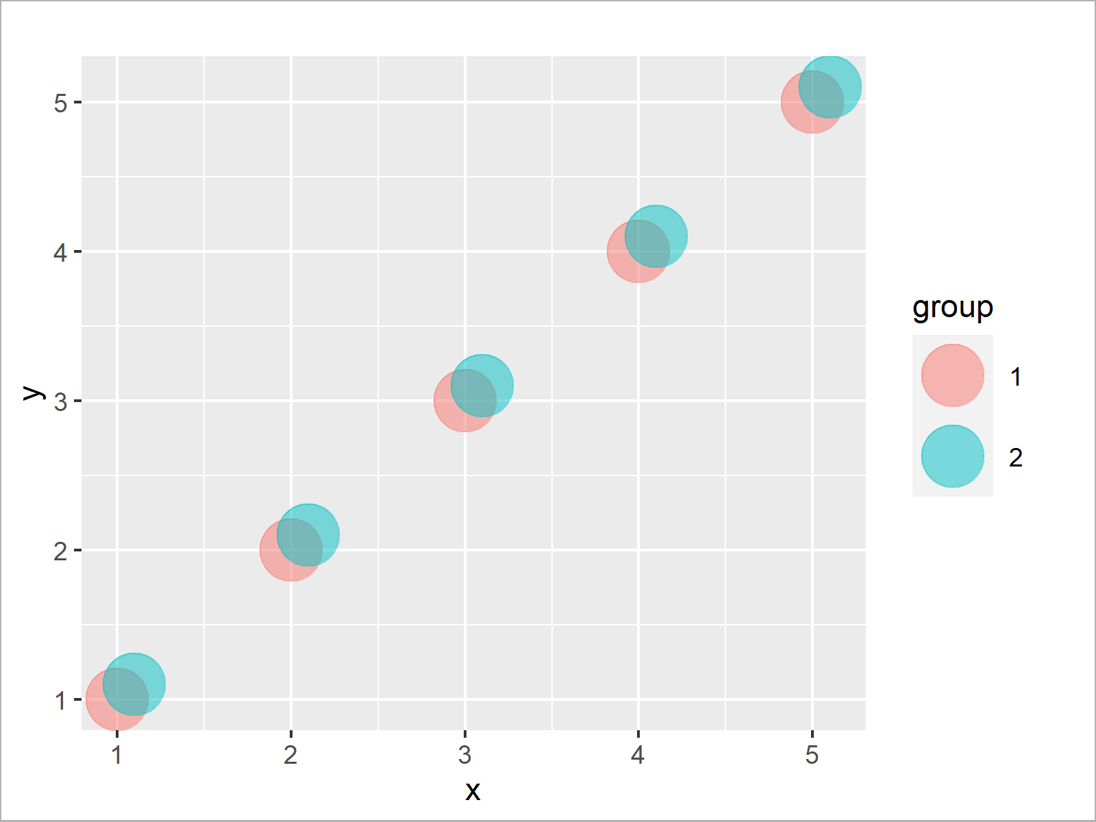
If we want to decrease the opacity of our points, we can use the alpha argument within the geom_point function as shown below:
ggplot(data, aes(x, y, col = group)) +                             # Draw transparent plot
  geom_point(size = 10, alpha = 0.5)

As shown in Figure 4, the previous syntax created a ggplot2 graphic where the data points have low opacity.
Video, Further Resources & Summary
If you need more explanations on the R programming syntax of this article, you may want to watch the following video that I have published on my YouTube channel. I illustrate the topics of this article in the video.
Additionally, you may have a look at the related tutorials which I have published on my website.
- Set Legend Alpha of ggplot2 Plot
- Draw Multiple Overlaid Histograms with ggplot2 Package
- Graphics Overview in R
- R Programming Examples
In this R tutorial you learned how to change the opacity of points in a graphic. In case you have additional questions, let me know in the comments.


2 Comments. Leave new
Thanks but doesn’t work. Running method 1 I get:
Warning message:
In plot.xy(xy, type, …) :
semi-transparency is not supported on this device: reported only once per page
Hello Mark,
I understand from the error that the plot does not support transparency.xy() function. Maybe you can try to find an alternative using the plot() or ggplot() functions.
Best,
Cansu