Draw Point Cloud of PCA in Python (2 Examples)
In this tutorial, you’ll learn how to draw a point cloud based on a Principal Component Analysis (PCA) in the Python programming language.
We will show the following content:
Let’s go straight to the code!
Data Sample & Add-On Libraries
First, you should install the PyVista library using the following code. It is assumed that the other libraries are already installed in your IDLE.
pip install pyvista
Then, you can import the libraries:
import pyvista as pv
import numpy as np
import pandas as pd
import matplotlib.pyplot as plt
import seaborn as sns
from pyvista import examples
from sklearn.preprocessing import StandardScaler
from sklearn.decomposition import PCA
Now, we will create our point cloud data set using the lidar dataset from the examples module of PyVista. To do this, we will define a function called generate_cloud that returns a point cloud array point_cloud.
def generate_cloud(subset=0.02):

    dataset = examples.download_lidar()
    ids = np.random.randint(low=0,
                            high=dataset.n_points - 1,
                            size=int(dataset.n_points * subset))

    return dataset.points[ids]

point_cloud = generate_cloud()
Once we have our data ready, we can perform our PCA.
Standardize Data & Perform PCA
Before performing the PCA, we will standardize the data by using the StandardScaler() class to avoid biased PCA results.
scaler = StandardScaler()

scaler.fit(point_cloud)

Pcloud_scaled = scaler.transform(point_cloud)
Next, we will run the PCA to get three principal components, but you may need some more information in order to choose the optimal number of components for your PCA.
pca = PCA(n_components=3)

PC = pca.fit_transform(Pcloud_scaled)
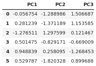
As the final step, we will transform the output of principal component scores to a DataFrame with three columns (one for each principal component) using the pandas DataFrame() function. See what the first rows look like below.
pca_cloud = pd.DataFrame(data = PC,
              columns = ['PC1', 'PC2','PC3'])

pca_cloud.head(6)

Example 1: Visualize Point Cloud in 2D after PCA
Now, we can plot the point cloud of the PCA in 2D using the seaborn package.
sns.set()

fig = sns.scatterplot(
    x='PC1',
    y='PC2',
    s=0.5,
    data=pca_cloud
    )

plt.title('2D PCA Point Cloud')
plt.show()
If you are interested in other ways of visualizing the point cloud in 2D, see our tutorial: Scatterplot of PCA in Python.
Example 2: Visualize Point Cloud in 3D after PCA
We can also plot the point cloud in 3D. To achieve this, we will first define the axes of our plot, which are the three principal components that we previously defined.
Xax = PC[:,0]
Yax = PC[:,1]
Zax = PC[:,2]
Now, we can plot the point cloud of the PCA by defining the figure and the axes in our 3D scatterplot.
fig = plt.figure(figsize=(14,9))
ax = fig.add_subplot(111,
                     projection='3d')

ax.scatter(Xax,
            Yax,
            Zax,
            s=0.05,
           c="magenta")

ax.set_xlabel("PC1",
              fontsize=14)
ax.set_ylabel("PC2",
              fontsize=14)
ax.set_zlabel("PC3",
              fontsize=14)

ax.view_init(30, 125)
plt.title("3D PCA plot")
plt.show()
If you are interested in another alternative to 3D point cloud visualization, see our tutorial: 3D Plot of PCA in Python.
Video, Further Resources & Summary
Do you want to learn more about how to perform a PCA in the Python programming language? Then you should have a look at the following YouTube video of the Statistics Globe YouTube channel.
You can also have a look at the other tutorials available on Statistics Globe:
- What is PCA?
- PCA Using Correlation & Covariance Matrix
- Choose Optimal Number of Components for PCA
- Principal Component Analysis in Python
- Scatterplot of PCA in Python
- 3D Scatterplot of PCA in Python
This post has shown how to draw a point cloud of a PCA in the Python language. In case you have further questions, don’t hesitate to leave a comment below.
This page was created in collaboration with Paula Villasante Soriano. Please have a look at Paula’s author page to get further information about her academic background and the other articles she has written for Statistics Globe.
Subscribe to the Statistics Globe Newsletter
Get regular updates on the latest tutorials, offers & news at Statistics Globe.
I hate spam & you may opt out anytime: Privacy Policy.
Thank you!
Welcome to the Statistics Globe newsletter. From now on, I’ll send you regular emails about statistics, data science, AI, and programming with R and Python.
I’m Joachim Schork. On this website, I provide statistics tutorials as well as code in Python and R programming.
Statistics Globe Newsletter
Get regular updates on the latest tutorials, offers & news at Statistics Globe. I hate spam & you may opt out anytime: Privacy Policy.
Thank you!
Please check your email inbox and click the confirmation link to complete your subscription. If you don’t see the email within a few minutes, please also check your spam/junk folder.


