Loading Plot in R (8 Examples)
In this tutorial, I’ll explain how to plot loading plots for principal component analysis (PCA) using the R programming language.
The table of content is structured as follows:
Let’s dive into it!
Relevant Packages & Dataset
First, we should load the necessary libraries for the implementation. If they are not installed yet, first you should install them. If they are already installed, then you can skip this step and directly run the next code chunk.
install.packages("factoextra") # install packages
install.packages("MASS")
install.packages("ggplot2")
To load the libraries into your environment, you should run the following codelines.
library(factoextra) # load libraries
library(MASS)
library(ggplot2)
Once all libraries are installed and loaded, we can load our sample data. In this tutorial, we will utilize the Boston dataset, which contains information collected by the U.S Census Service concerning housing in the area of Boston Mass.
It’s a favorable dataset for PCA since most of the variables are continuous. Non-continuous ones will be omitted after the data importation.
data("Boston") # upload dataset
Boston_cont <- Boston[, !(names(Boston) %in% c("chas", "rad"))] # filter dataset
Let’s take a look what the final data looks like.
#      crim zn indus   nox    rm  age    dis tax ptratio  black lstat medv
# 1 0.00632 18  2.31 0.538 6.575 65.2 4.0900 296    15.3 396.90  4.98 24.0
# 2 0.02731  0  7.07 0.469 6.421 78.9 4.9671 242    17.8 396.90  9.14 21.6
# 3 0.02729  0  7.07 0.469 7.185 61.1 4.9671 242    17.8 392.83  4.03 34.7
# 4 0.03237  0  2.18 0.458 6.998 45.8 6.0622 222    18.7 394.63  2.94 33.4
# 5 0.06905  0  2.18 0.458 7.147 54.2 6.0622 222    18.7 396.90  5.33 36.2
# 6 0.02985  0  2.18 0.458 6.430 58.7 6.0622 222    18.7 394.12  5.21 28.7
Now all libraries and the dataset are loaded. The next step is to perform PCA.
Principal Component Analysis
In order to run a PCA, we will employ the prcomp() function. See Principal Component Analysis (PCA) in R.
pca_result <- prcomp(Boston_cont,  # perform PCA
                     scale = TRUE)
We have performed PCA, now we can visualize the computed loadings via loading plots, also referred to as correlation circles.
Example 1: Basic Loading Plot
Let’s start with a basic loading plot. We simply need to pass our pca object, pca_result, into the fviz_pca_var() function.
basic_lp <- fviz_pca_var(pca_result) # plot loading plot
basic_lp # print basic_plot
The execution of the previous R code returns the following output.
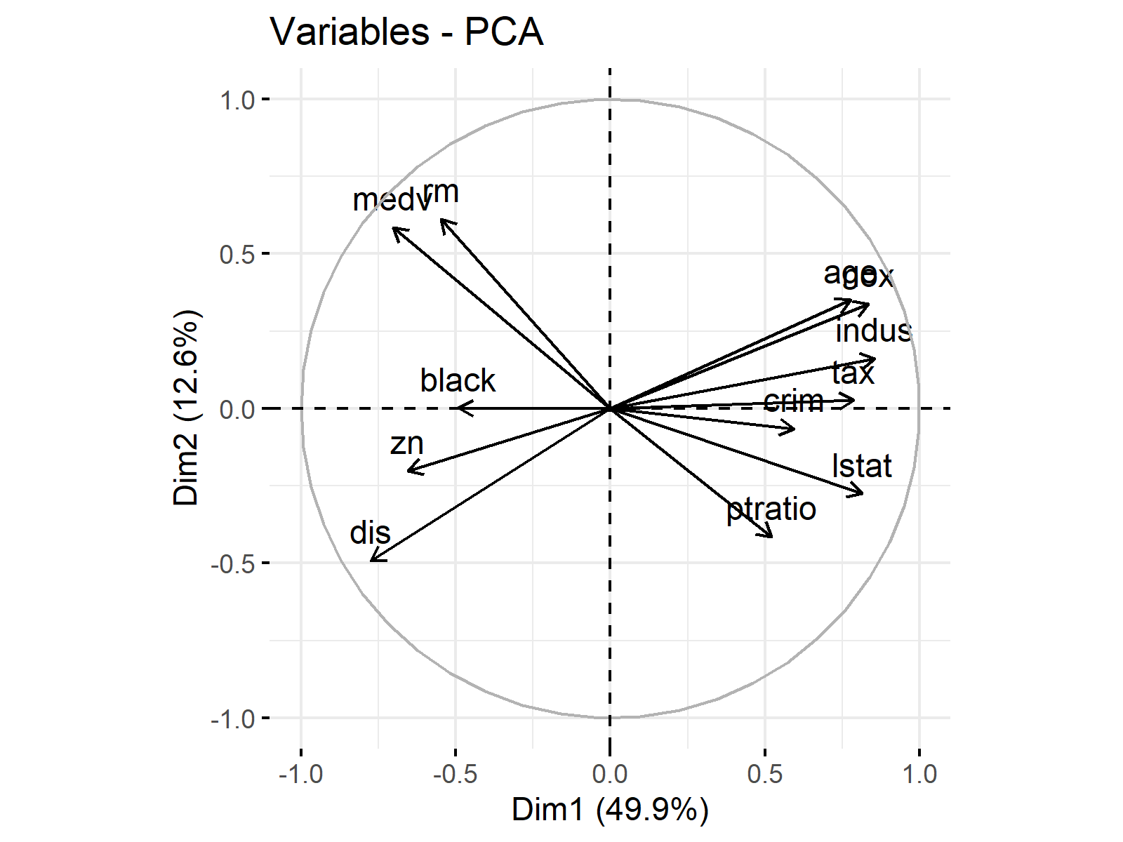
It already looks nice, however, there are many customizations we can apply to improve the representation. In the next step, we will see how the loading vector color can be changed.
Example 2: Loading Plot Colored
To color the loading vectors in the loading plot, we will use the col.var argument. We will define green4 as the color of choice, you can use any color you want.
col_lp <- fviz_pca_var(pca_result, # plot colored loading plot
                       col.var = "green4")
col_lp # print col_lp
The execution of the code leads to the following change.
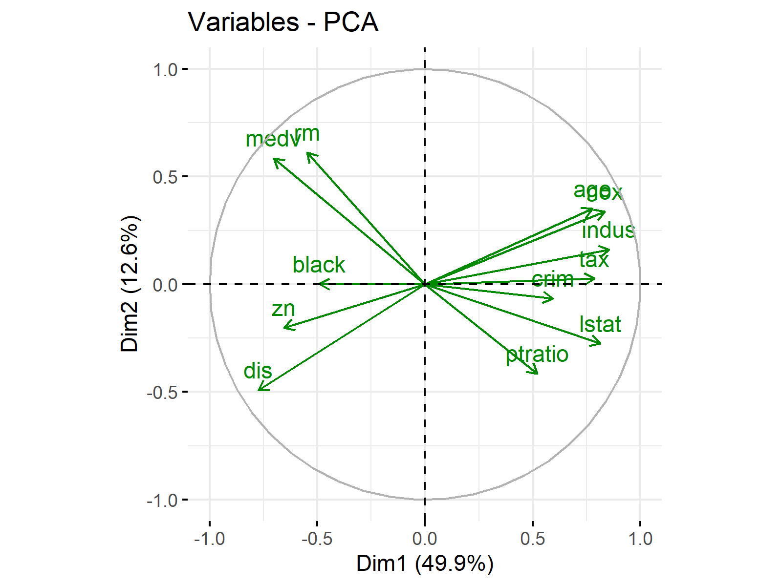
Well done! It appears like our attempt was successful. The good news is that there are more advanced ways to color the loading vectors. Let’s move on to the next example!
Example 3: Loading Plot Colored by Contribution
In this example, we will color the loading vectors by their contributions (in percentage) to the principal components. To do this, we will utilize the col.var argument.
col_cont_lp <- fviz_pca_var(pca_result, # color by contribution
                            col.var = "contrib")
col_cont_lp # print col_cont_lp
See the visual below for the result.
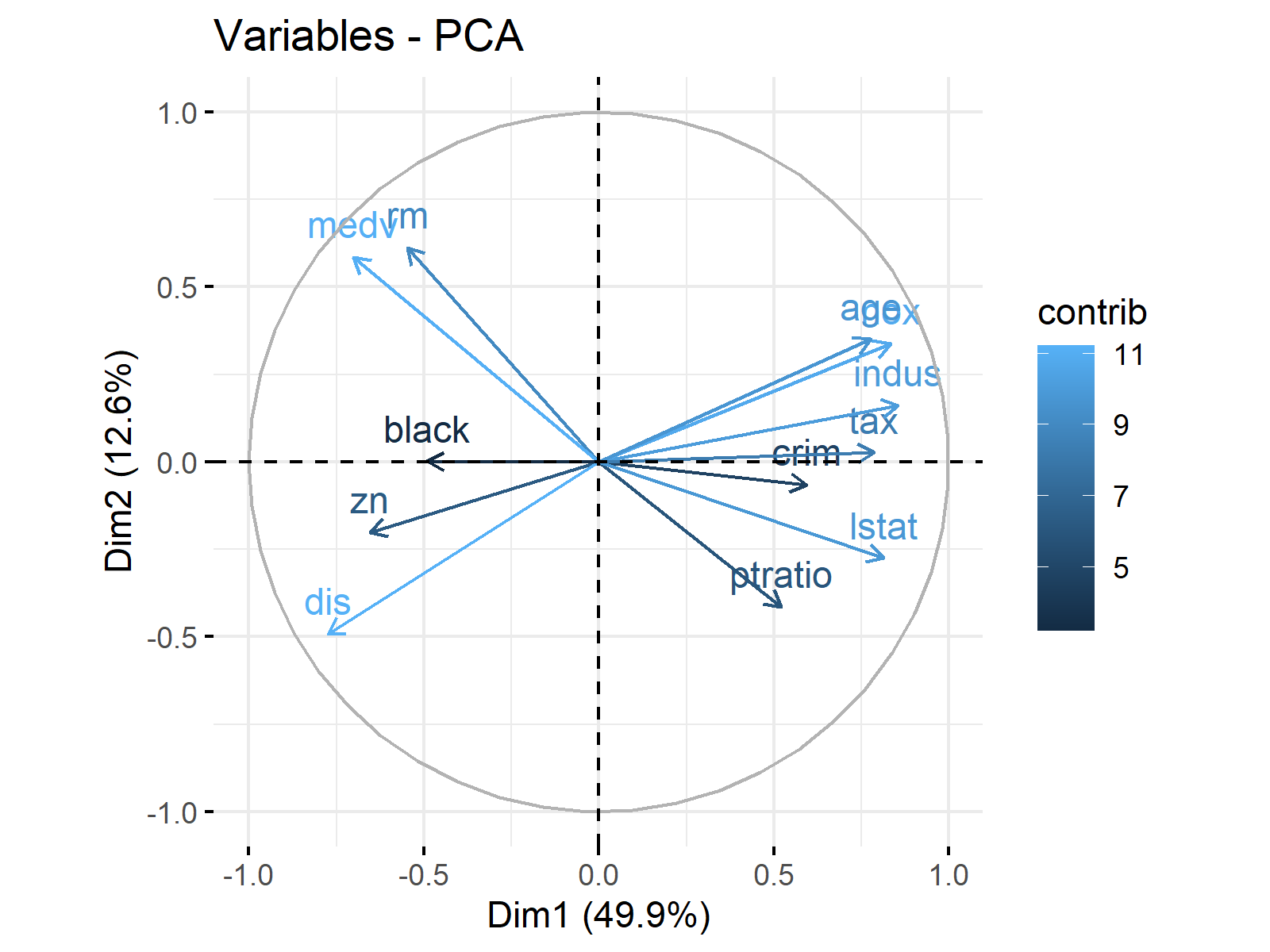
As you can see, longer vectors are associated with higher contributions. For further details, see Loading Plot Explained.
One may also want to change the color palette used in coloring by contribution. Let’s explore how this is done in the next example!
Example 4: Loading Plot Colored by Contribution (Customized)
In order to change the colors used in coloring by contribution, we need to use the gradient.cols argument.
col_cont_cus_lp <- fviz_pca_var(pca_result, # change contribution colors
                                col.var = "contrib",
                                gradient.cols = c("white", "steelblue", "red3"))
col_cont_cus_lp # print col_cont_lp
We have defined white, steelblue and red3 as gradient colors. See how this intervantion affected our graph below.
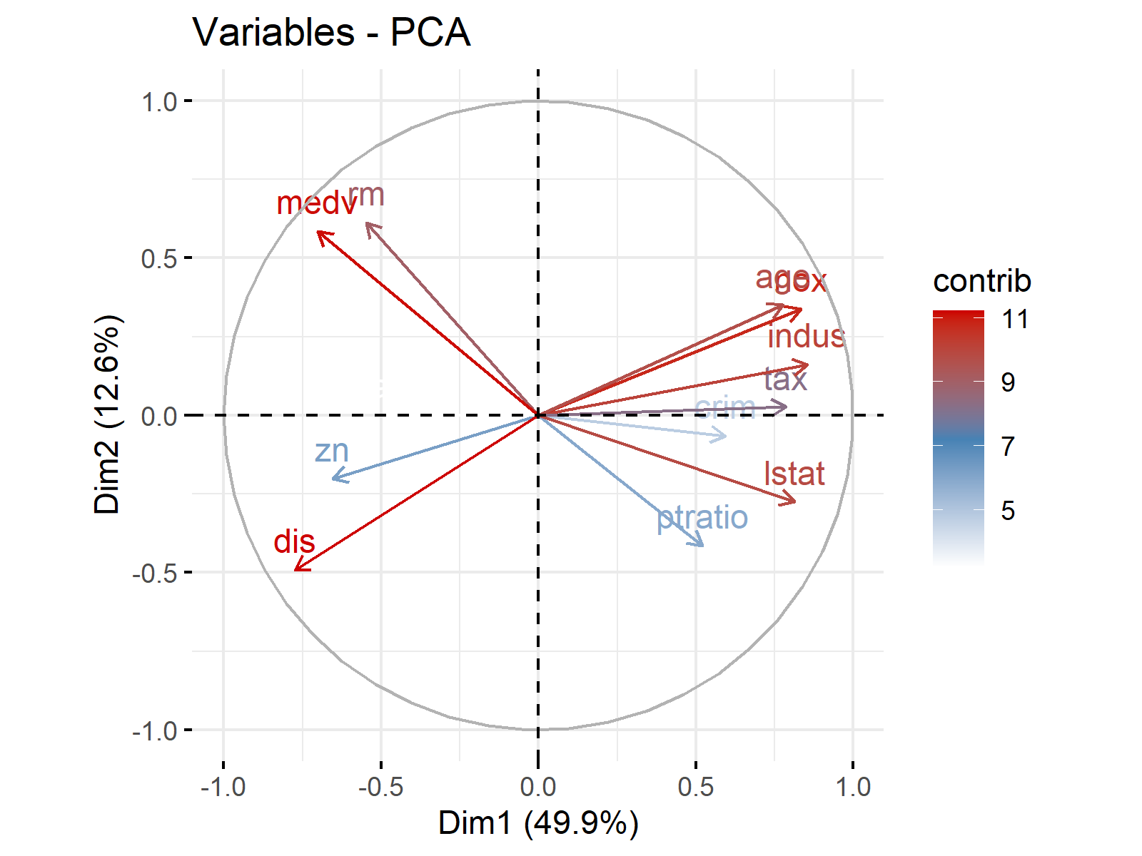
As seen, less contributing variables are colored pale blue, while more contributing variables are colored red.
If one is only interested in top contributing variables, she can also filter out the rest. Let’s demonstrate it with an example!
Example 5: Loading Plot Filtered by Contribution
Here we will show how to filter variables based on their contributions. In this example, the select.var argument will help us to visualize the top 6 variables with the highest contribution and discard the rest.
filt_cont_lp <- fviz_pca_var(pca_result, # filter by contribution
                             select.var = list(contrib = 6),
                             col.var = "red3")
filt_cont_lp # print filt_cont_lp
You can see the filtered graph below.
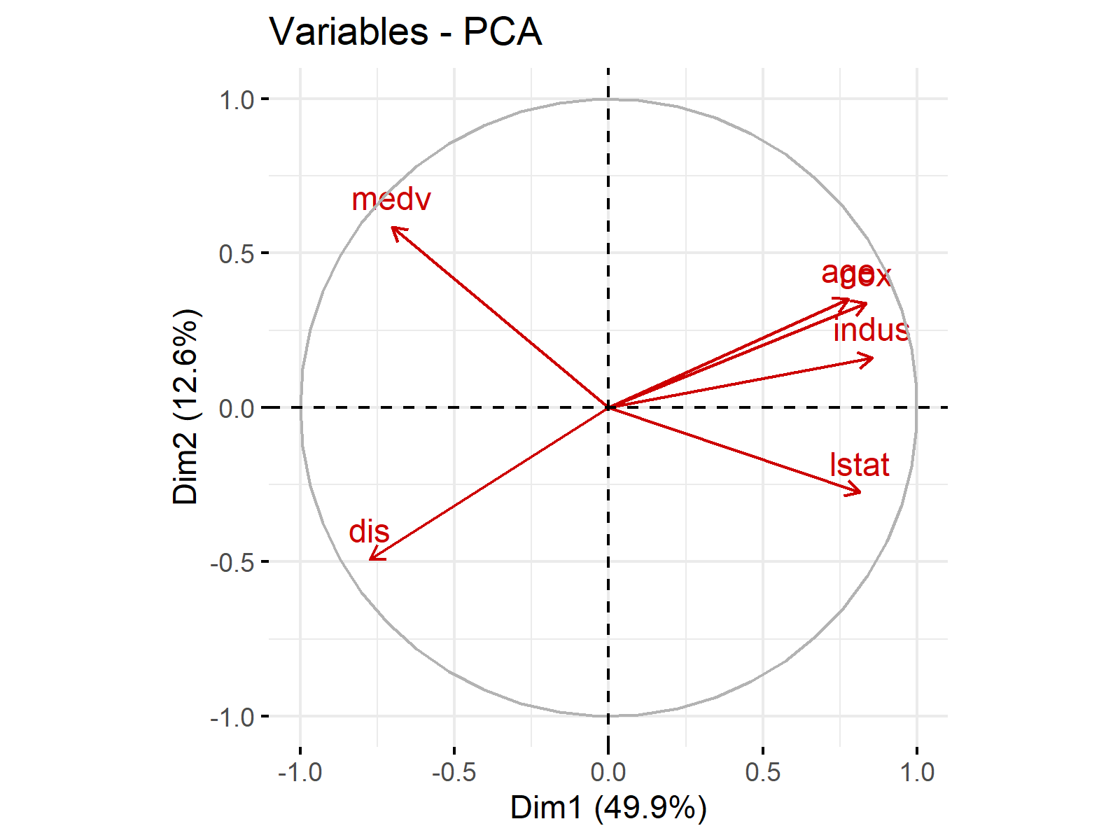
We have successfully filtered out the variables that do not contribute significantly to the construction of principal components.
If you would like to filter variables based on their contribution values, it is better to filter based on cos2, which is a related measure. For instance, select.var = list(cos2 > 0.5) filters variables with cos2 values higher than 0.5. See here for the mathematical relation.
Next, we will filter the variables based on preference. Let’s jump into the example!
Example 6: Loading Plot Filtered by Variable
If you want to show only certain variables in your loading plot, you can use the following code script as a template.
filt_var_lp <- fviz_pca_var(pca_result, # filter variables
                            select.var = list(name = c("zn",
                                                      "indus",
                                                      "age")),
                            col.var ="green4")
filt_var_lp # print filt_var_lp
We have selected the "zn", "indus" and "age" variables to visualize in our graph. See the output below.
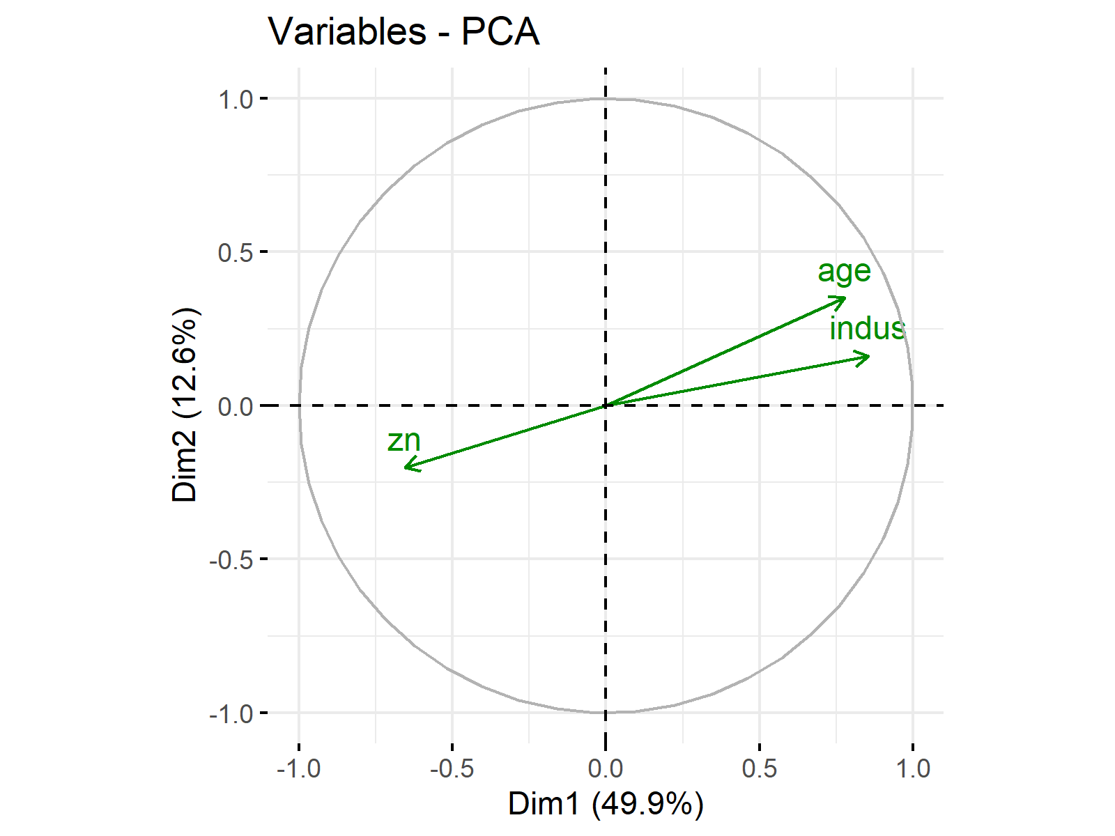
In the next section, we will make a different arrangement in visualisation. As you observed in previous plots, some vector labels were overlapping. In the next example, we will learn how to avoid overlapping and other tactics to increase the readability of the graph.
Example 7: Loading Plot with Increased Readability
To increase the readability of the graph, we will increase the size of vectors and labels, and implement label repulsion to prevent overlap.
arsz_inc_lp <- fviz_pca_var(pca_result, # increase arrows and label size
                              repel = TRUE,
                              arrowsize = 0.8,
                              labelsize = 6)
arsz_inc_lp # print arsz_inc_lp
As shown, the repel argument have been set to TRUE; arrowsize and labelsize have been increased to 0.8 and 6. See the adjusted graph below.
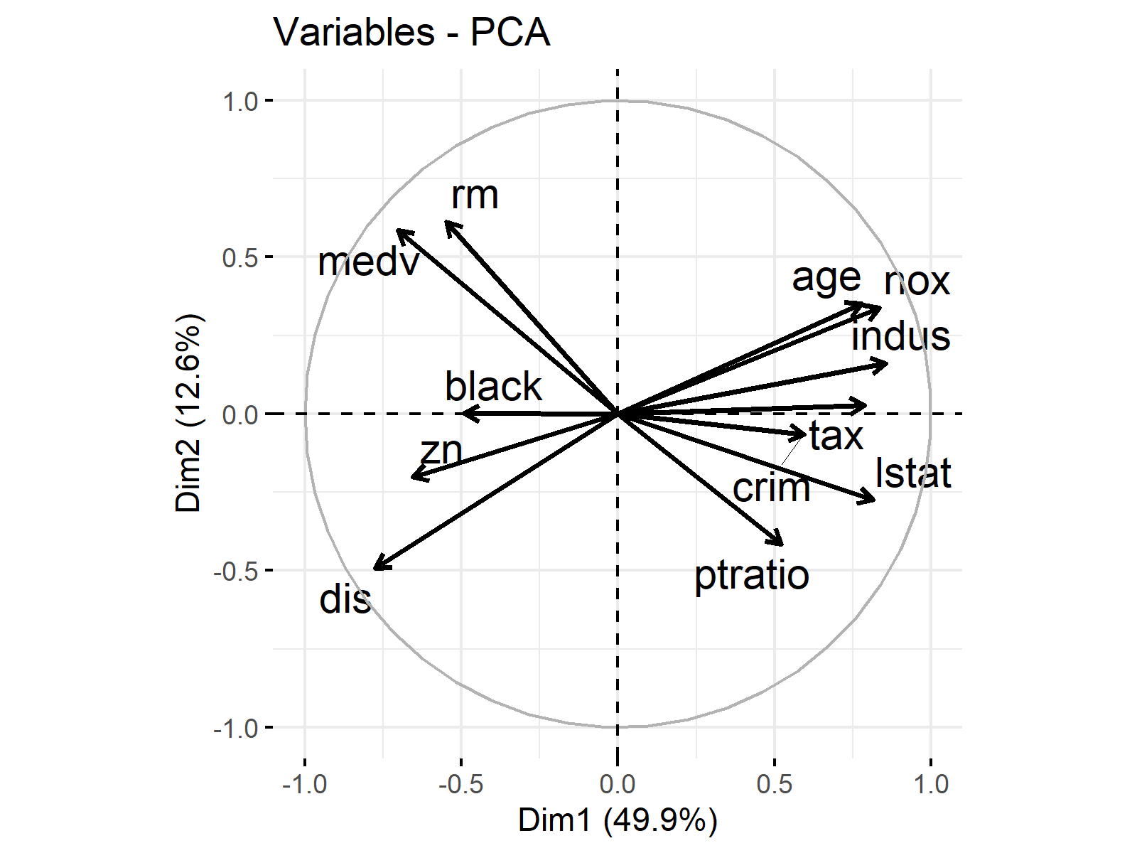
Now, we have a loading plot, where the vectors and labels are emphasized. You should experiment with the sizes to determine the optimal appearance for your plot. Please also be aware that the vector labels are repelled away from each other successfully.
In the next section, we will discover relabelling the main and axis titles. Without further ado let’s jump into the example!
Example 8: Loading Plot with Customized Titles
We have covered different visual adjustments of loading vectors in previous examples. Differently, here, we will modify the main title and axis labels.
cus_ttl_lp <- fviz_pca_var(pca_result, # change axes and plot titles
                           title = "Principal Component Analysis (PCA) Loadings",
                           xlab = "PC1 (49.9%)",
                           ylab = "PC2 (12.6%)"
)
cus_ttl_lp # print cus_ttl_lp
As you can see, the arguments, title, xlab and ylab have been used to redefine our plot title and axis labels. Let’s take a look at the result.
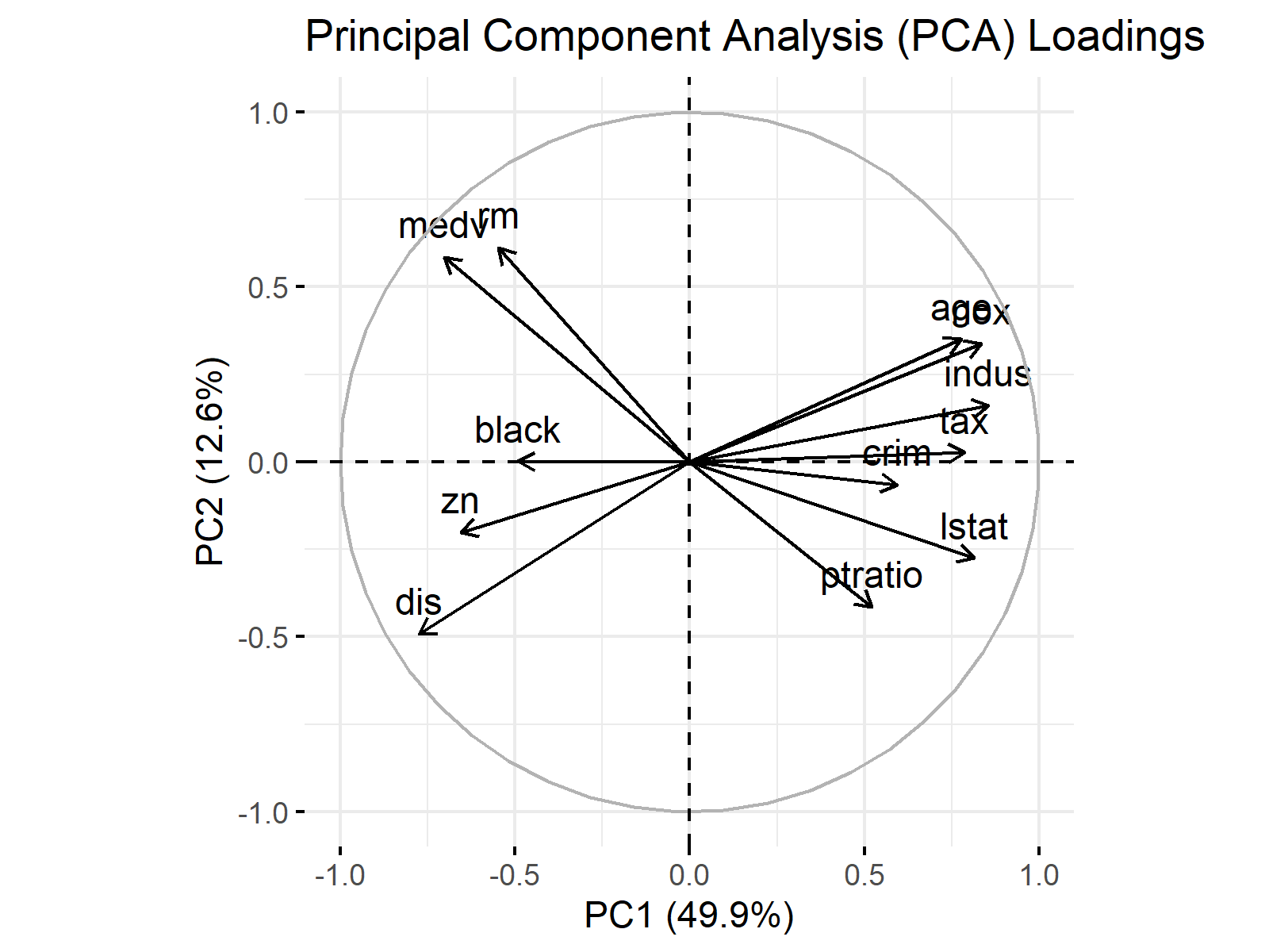
By modifying the titles in your plot, you can present the information in a way that is more comprehensible and relatable to your audience.
Video, Further Resources & Summary
Do you need more explanations on how to visualize loadings after performing PCA in R? Then you might check out the following video of the Statistics Globe YouTube channel.
In the video tutorial, we explain how to draw loading plots in PCA using R programming.
Furthermore, you could have a look at some of the other tutorials on Statistics Globe:
- What are Loadings in PCA?
- Loading Plot Explained
- Principal Component Analysis (PCA) in R
- What is Principal Component Analysis (PCA)?
- Visualization of PCA in R
This article has demonstrated how to create loading plots in R. If you have further questions, you may leave a comment below.
This page was created in collaboration with Cansu Kebabci. You might have a look at Cansu’s author page to get more information about academic background and the other articles she has written for Statistics Globe.


