Display Legend Outside of Plot in Python Matplotlib & seaborn (2 Examples)
Hi! This tutorial will demonstrate how to show legend outside of plot in Matplotlib and seaborn in the Python programming language.
Here is an overview:
Let’s get into the Python code!
Install & Import Matplotlib, seaborn & pandas Libraries
If you do not have Matplotlib, seaborn and pandas already installed and imported in your Python programming environment, then in your Python programming IDE, run the lines of code below to install and import all three libraries:
# install Matplotlib, seaborn & pandas
!pip install matplotlib seaborn pandas

# import Matplotlib, seaborn & pandas
import matplotlib.pyplot as plt

import seaborn as sns

import pandas as pd
The pandas library is the foremost library in Python for data analysis and data manipulation, and it enables us to build DataFrames, wherein we can store data in the form of a table.
Create Example Dataset
Having installed and imported the necessary libraries, we will create the example dataset that we will use in the examples in this tutorial. Therefore, run the lines of code below to create the dataset:
data = {
  "year": [2017,2018,2019,2020,2021,2022],
  "SalesA": [100,80,170,110,250,180],
  "SalesB": [50,150,90,210,220,300],
  "Branch": ["Branch A","Branch B","Branch B","Branch A","Branch A","Branch B"]
}

df = pd.DataFrame(data)

print(df)
#    year  SalesA  SalesB    Branch
# 0  2017     100      50  Branch A
# 1  2018      80     150  Branch B
# 2  2019     170      90  Branch B
# 3  2020     110     210  Branch A
# 4  2021     250     220  Branch A
# 5  2022     180     300  Branch B
We first created a Python dictionary containing our data. The dictionary was then converted to a DataFrame using the pd.DataFrame() function.
So, with the dataset created, let us now explore how to set plot legend outside the plot in Matplotlib and seaborn.
Example 1: Show Legend Outside of Plot in Matplotlib
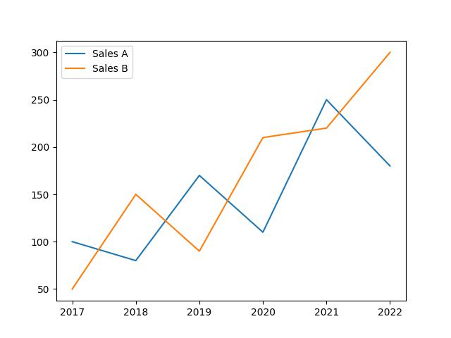
In this example, we will first build a basic line plot with the legend displayed in the default position inside the plot:
plt.plot(df["year"], df["SalesA"], label = "Sales A")

plt.plot(df["year"], df["SalesB"], label = "Sales B")

plt.legend()

plt.show()

In the above example, plt.plot() function is used twice to plot both sets of sales data on the same graph.
The first plt.plot() call plots the year values on the x-axis and the SalesA values on the y-axis, with the label “Sales A” assigned to the line. The second plt.plot() call plots the year values on the x-axis and the SalesB values on the y-axis, with the label “Sales B” assigned to the line.
The plt.legend() function is then called to display a legend on the graph, indicating which line corresponds to which set of sales data.
Finally, the plt.show() function is used to display the graph with the plotted sales data.
But as you can see, the legend is displayed right inside the plot, which we do not want. Now, we will demonstrate how to move the legend outside the plot.
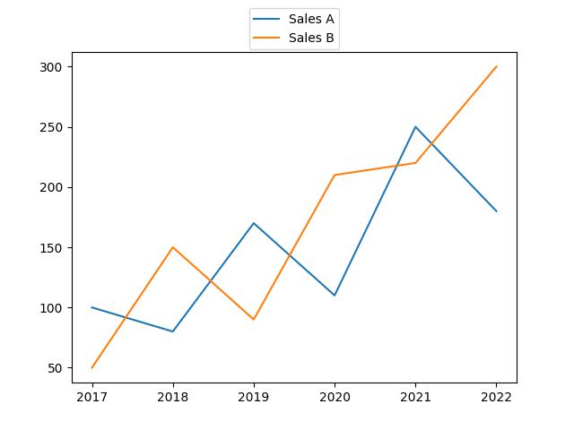
In this next example, we will show the legend at the top outside the plot:
plt.plot(df["year"], df["SalesA"], label = "Sales A")

plt.plot(df["year"], df["SalesB"], label = "Sales B")

plt.legend(bbox_to_anchor = (0.5, 1.15), loc="upper center")

plt.show()

Above, we modified the plot legend position by defining two arguments in the plt.legend() function. The bbox_to_anchor = argument specifies the anchor point of the legend, with coordinates (0.5, 1.15), placing it slightly above the center of the plot, while the loc = argument, which stands for “location”, is set to “upper center” to position the legend in the upper center part of the plot.
Now, the legend is displayed outside the plot just as we want it. The legend can be shown in other places outside the plot as well, such as beside the plot and below the plot. You only need to set the x and y coordinates and specify the location where you want the legend displayed.
Example 2: Show Legend Outside of Plot in seaborn
In this example, we will build a basic bar plot whose legend is set in its default position:
sns.barplot(df,
            x = "Branch",
            y = "SalesB",
            hue = "Branch",
            palette=['purple', 'steelblue'],
            errorbar = None)

plt.legend()

plt.show()

In the above example, the sns.barplot() function is used to build the bar plot, wherein we parsed the Branch and SalesB columns of the DataFrame to the x and y arguments and then defined the hue and set the color palette.
The plt.legend() function is used to display the legend.
But as you can see, the legend is situated in its default position inside the plot, which we would like to change. In this next example, we would move the legend outside the plot. Therefore, run the code below:
sns.barplot(df,
            x = "Branch",
            y = "SalesB",
            hue = "Branch",
            palette=['purple', 'steelblue'],
            errorbar = None)

plt.legend(bbox_to_anchor = (0.01,-0.17), loc="lower center")

plt.show()

Here, in the plt.legend() function, we parsed the tuple (0.001,-0.17) to the bbox_to_anchor = argument to set the coordinates of the legend, and also defined the location as “lower center”.
Because of the plot axis label, we used the coordinates to move the legend to the bottom left position so that it does not cover the axis label.
Just as in Matplotlib, you can play around with the coordinates and locations of the legend to see where else outside the plot it can be shown.
Video, Further Resources & Summary
This post has shown how to display legend outside of the plot in Python Matplotlib and seaborn. We have displayed the legend outside of a line plot and a barplot. However, you may use the same approach to display the legend outside of other types of plots, such as boxplots, histograms, heatmaps, density plots, and so on.
Do you need more explanations on how to display legend outside of the plot in Python Matplotlib and seaborn? Then you should have a look at the following YouTube video of the Statistics Globe YouTube channel.
In the video, we explain in some more detail how to display legend outside of the plot in Python Matplotlib and seaborn.
The YouTube video will be added soon.
You can check out the links below for more interesting Matplotlib and seaborn tutorials on Statistics Globe:
- Change Axis Labels of Plot in Python Matplotlib & seaborn (2 Examples)
- Add Legend to Plot in Python Matplotlib & seaborn (4 Examples)
- Change Font Size of Plot in Python Matplotlib & seaborn (2 Examples)
- Change Legend Size of Plot in Python Matplotlib & seaborn (2 Examples)
- Introduction to Python Programming
In case you have further questions, you may leave a comment below. I do hope you found this tutorial helpful!
This page was created in collaboration with Ifeanyi Idiaye. You might check out Ifeanyi’s personal author page to read more about his academic background and the other articles he has written for the Statistics Globe website.
Subscribe to the Statistics Globe Newsletter
Get regular updates on the latest tutorials, offers & news at Statistics Globe.
I hate spam & you may opt out anytime: Privacy Policy.
Thank you!
Welcome to the Statistics Globe newsletter. From now on, I’ll send you regular emails about statistics, data science, AI, and programming with R and Python.
I’m Joachim Schork. On this website, I provide statistics tutorials as well as code in Python and R programming.
Statistics Globe Newsletter
Get regular updates on the latest tutorials, offers & news at Statistics Globe. I hate spam & you may opt out anytime: Privacy Policy.
Thank you!
Please check your email inbox and click the confirmation link to complete your subscription. If you don’t see the email within a few minutes, please also check your spam/junk folder.


